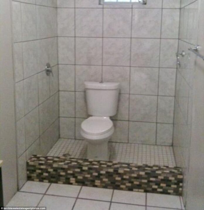
While poorly designed rooms in a house are inconvenient, bad bathroom designs can make a home unlivable. Sometimes, we get caught up in making our bathrooms look beautiful and forget they are function-first facilities. At other times, we cram as many functions into space as possible, but accessing them has become impossible.
Worst Bathroom Designs Found Online – And How To Fix Them
These are real examples of the worst bathrooms and bath interior designs found on the internet. But we’ll also talk about what could have been done to fix this (if we can fix it):
Where Style Has No Common Sense in Interior Design
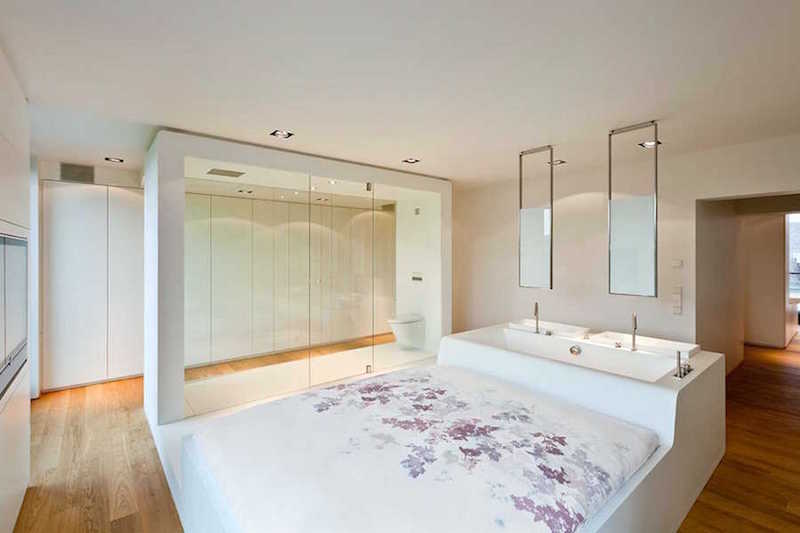
This combination master suite combines the bedroom and bathroom into one seamless room. And that is probably the biggest mistake in this space.
First of all, the toilet. The exposed toilet behind a glass wall gives no sense of privacy. No one needs to see this, especially since there appears to be no door to this bedroom.
Secondly, the combined bed and bathtub may be space-saving but headache-inducing. Having the tub as a makeshift headboard is awkward. However, the water damping your bedroom comforter and sheets is problematic with this setup. This problem isn’t one that most bedrooms have to deal with!
Third, hardwood floors are not the most practical when exposed to water and can warp or rot with moisture.
It makes no sense to put a bed in a bathroom. However, removing the bed and expanding the tub could make this one of the most epic bathrooms in any house!
The Most Excessive Exposed Plumbing in a Picture
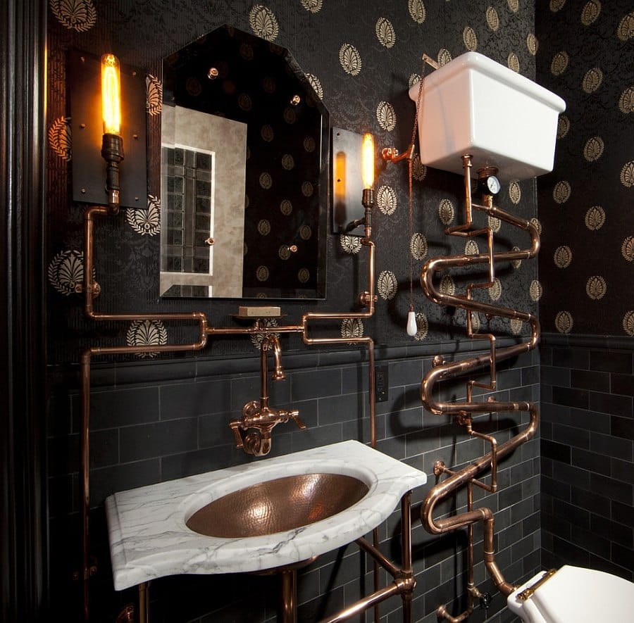
While the industrial look is in trend, there’s a difference between glints of metal and becoming Super Mario World. There is so much pipe in this layout that it looks messy.
Putting the water tank several feet in the air seems inconvenient to fix if there’s a problem. The extra plumbing covers part of the wallpaper, and these two patterns conflict in this picture.
A dark bathroom can always be attractive, but dark fixtures, dark walls, and insufficient lighting spell disaster. Spills and liquids will be harder to see on the floor or counters.
Removing 80% of the excess plumbing would go a long way to clean up this look. With the white marble counter and the toilet more prominent to balance the dark areas, that’s a good start.
The other concern is that this bathroom looks like it has no storage whatsoever, and it is pretty small. Having a cabinet vanity would mean having places to put personal accessories, toilet tissue, and cleaning supplies.
Tiny Tiles in a Tiny Bathroom
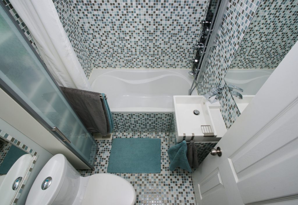
How do you make a tiny bathroom feel uncomfortably minuscule? This.
For a while, tiny mosaic tiles had been trending in bathrooms because of their unique, opulent look. That was until people realized that mosaic tiles this size were a pain to install due to the details. There are also more grout lines that can mildew, and we need to clean them.
The floor is also lined with tiny tiles, so the bathroom loses depth and looks like pixels on a computer screen. The use of all these small details makes this room look even smaller.
How do you fix this? At least remove the tile from the floor and make it contrast with the rest of the bathroom. Remove the tiny tiles from the bathroom entirely and use a lighter-colored, bigger tile to look spacious.
Small bathrooms using larger pieces with simple patterns or solid colored tile make the bathroom brighter and not cramped.
Making Room For The Commode
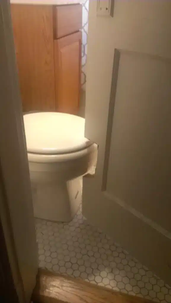
We know how much more critical the toilet is than the door in a bathroom. Since you can’t cut a toilet to make the door fit, the solution is to cut out the door. The peekaboo notch in the door is a bonus design choice that makes your bathroom interior… memorable.
There are a couple of solutions to prevent this unfortunate mishap in bathroom design:
The first is to relocate the toilet, which is the more apparent but costlier solution. This requires moving the waste pipe and undoing the tile to position the commode so that the door can swing freely.
However, another solution is to change the door type and how it opens. Using a sliding door reworks the door path and allows access without others observing your private matters.
But before doing either of those things if you can’t get to the remodel? Replace the door.
The Water Misses Its Mark
There are different ways to do a waterfall faucet. This is not one of them.
The faucet is positioned too far back for the water spout to enter the basin. This creates a lot of unnecessary splash, and to be frank, it looks like an idiot built your sink.
The solution is to install the right faucet into your bathroom vanity countertop. While it looks like this counter needs a single-hole faucet, the longer extension over the basin was key. Selecting a faucet whose length clears the gap is a necessity so the water pours into the basin properly.
This is Not What We Mean by “Bath Tissue”
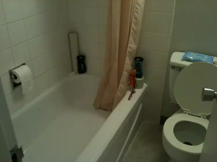
Unless we have exceptionally long arms, this is the most inconvenient placement for toilet paper ever. While we try to squeeze all the amenities into a bathroom, they must make sense in relation to each other. The bathroom is a “function first” room, and this doesn’t make any sense.
We don’t need to use misplaced toilet roll dispensers just because it is there. There are a couple of practical solutions we can implement.
We can install a toilet roll dispenser next to the toilet on the opposite wall or side of the vanity. If we cannot do that, then we can purchase a freestanding toilet paper holder.
As for the slot, where is the toilet paper? Change it to a nook in the bath tile that holds bars of soap or small bathing supplies. That is probably the original purpose of that space in the first place.
Some Decorative Choices Are Less Pleasant Than Others
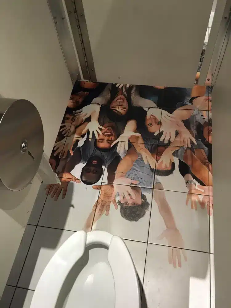
This is not the pattern I want to see in a bathroom, let alone a public restroom. We will not detail what this looks like, but it invokes something unpleasant due to context.
The setting and placement will affect specific patterns and décor. For example, some people don’t like pictures with eyes placed opposite the toilet because they don’t like being watched.
However, the best rule of thumb in any bathroom is to avoid décor that can be mistaken for dirty stains, especially on the countertops, floors, and any surface that should remain clean.
It’s Not The Pink Tile That’s The Problem
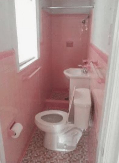
This layout makes me very uncomfortable because the builder tried to squeeze everything into a narrow space. Placing the toilet sideways ANYWHERE so that you can jump it to get to the shower is incredibly poor design.
One way to salvage this bathroom is to remove the commode, leaving only the shower. The other way is to reposition the toilet where the shower is. Changing the shower drain into a waste drain, resulting in a long, narrow hall to the toilet, makes more sense.
Toilet for Hunchbacks
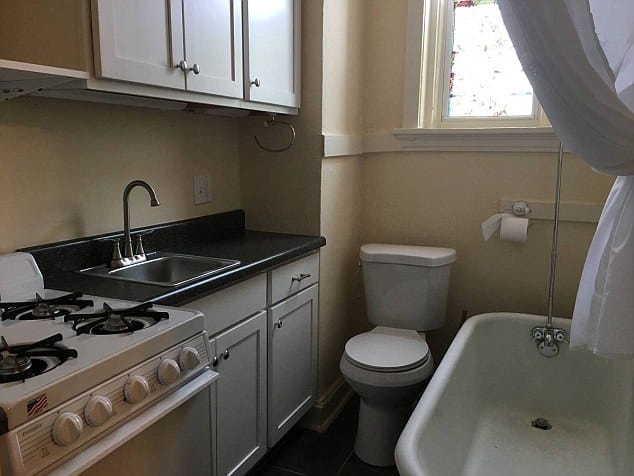
My neck hurts just looking at this toilet. I understand trying to squeeze every ounce of space into a bathroom if it’s cozy. But I draw the line contorting your body to take a seat for an essential function.
That counter doesn’t need to be there. Removing it will also open up the space so that part of the bathroom doesn’t look so crowded. Also, placing the counter edge against the glass shower tile looks odd, with widely different materials next to each other.
If you cannot move the toilet, the other suggestion is to cut the countertop. If you lift up the lid, we can guess it will bump into that existing extraneous surface. We wouldn’t need to remove the wall cabinet above the toilet and would use more of that storage.
Going All-in On One Trend
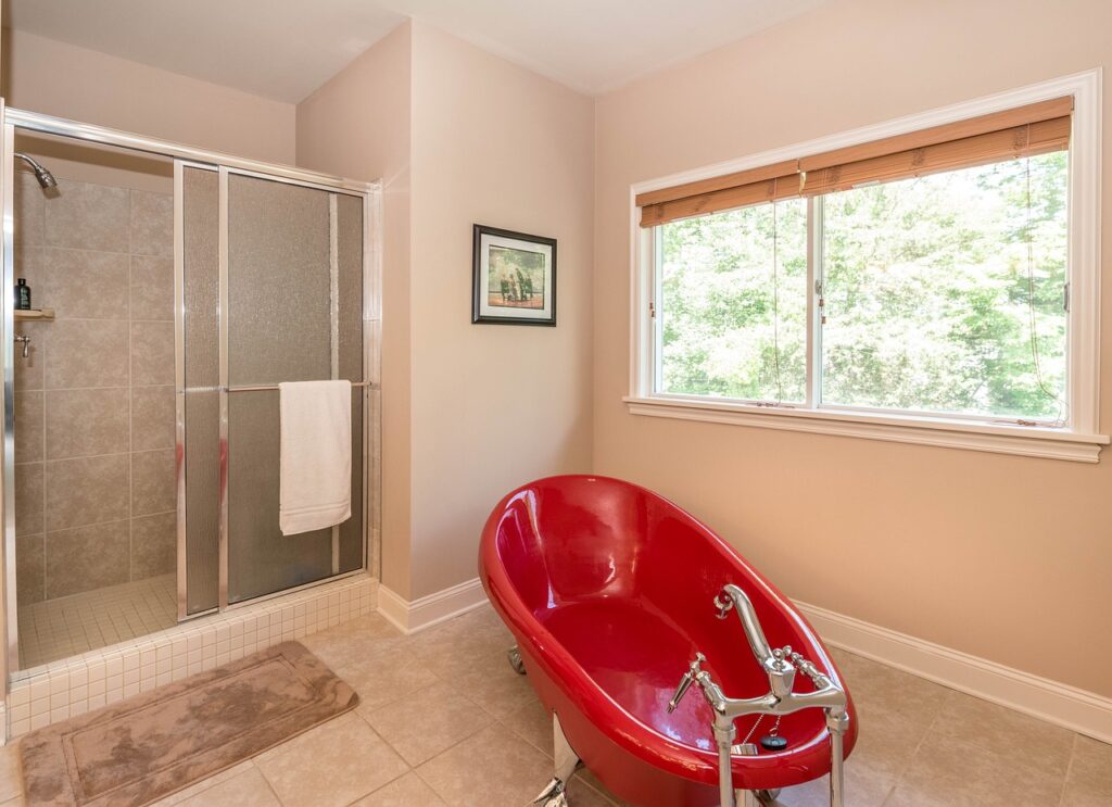
While it is fun to have trendy bathroom pieces, make sure they fit with the rest of the space. Otherwise, they unintentionally make the rest of the room look plain, even dated.
The recommendation would be not to get this bright red bathtub at all. However, we can fix this by adding warm colors to the bathroom. Changing the art, shower, and towel helps, but painting the walls warmer would better integrate the tub into the design.
The bathtub’s askew position and the exposed metal plumbing that doesn’t match any metal trim do not help either. Moving this tub to the wall would clean up the look of the extra plumbing.
Everything That Could Be Wrong in One Bathroom
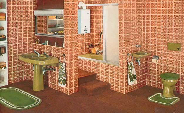
Most likely, this was probably a stylish bathroom 50 years ago. This should never come back.
First of all, there’s carpet in the bathroom. The carpet NEVER belongs in a bathroom.
Between water spilling everywhere and using the toilet, I hate to think about how soiled the carpet fibers were here. The carpeted steps near the tub seem odd; unless someone has trouble entering a tub, the steps do not belong there.
Then you have the tile everywhere in this bathroom, and I hope it is tile and not wallpaper. Again, with the same pattern everywhere, this room has no depth. Everything matches so much in this room that it becomes both busy and dull at the same time.
The pea-green color of the ceramics is dated, which shows why we should avoid trending colors in our appliances.
Aside from burning down the whole bathroom and starting over, at least get rid of the carpet. Wall-to-wall carpets do not belong in the bathroom.
What other lousy bathroom designs have you encountered on the internet? Comment below with bathroom designs that belong on this list!

