Any kitchen or interior can appear nicely decorated, but statement pieces personalize the décor and make it your own.
When we think of statement pieces, we usually think of “BOLD statement” because we imply it in the name. But to maximize the effectiveness, you don’t want to drown the piece out with things that could hide its shine.
Tips on How To Decorate with Your Kitchen Statement Pieces
These tips can help enhance the natural charm of your kitchen statement pieces by placing them in the context of their interiors.
Get The Feel of Your Current Interior
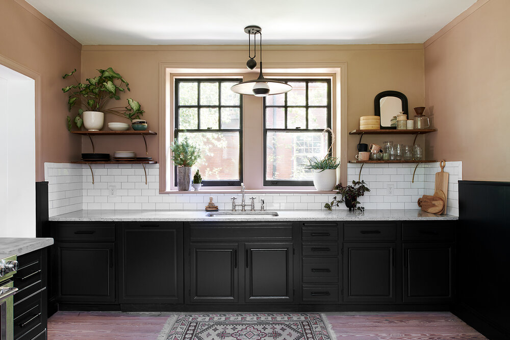
If you examine any room in your home, you will see it already has a style. Take stock of what ties a room together, whether by color scheme, hobby, or material texture.
The key to making a statement piece stand out is CONTRAST. If your room has corners and straight edges, anything curvy or round gets other’s attention.
A white table will become a focal point if your whole room is red or blue. Yet, if your kitchen is nautical-themed, a hemp rope basket will look like it’s part of the theme and stand out less.
Placement of Your Kitchen Statement Pieces
When you enter the room, what is someone going to notice first?
As a rule of thumb, people see first items directly in line with the doorway and at eye level. If a room entrance is without a wall, the horizontal center of the room draws the first notice.
This is often the case for backsplashes, which are located approximately in the vertical center of a room above countertops. The recent trend towards bold designs, shapes, and materials for backsplash areas takes advantage of their positioning in kitchen design.
For your kitchen statement pieces to have more impact, place them in direct eyesight. People usually place wall art and centerpieces in these visual regions.
However, maybe you want more indirect detail rather than a robust head-on effect. Anything that isn’t a straight view can work as a surprise element (finish)
Interaction With The Elements
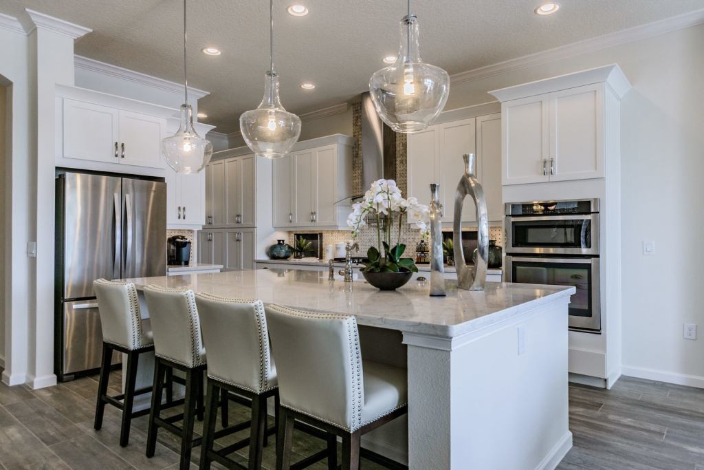
Anything you or your guests interact with will attract more attention (change, attract more attention). Kitchen islands and bar stools are potential statement pieces due to the nature of their functions.
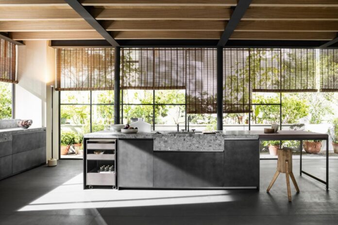
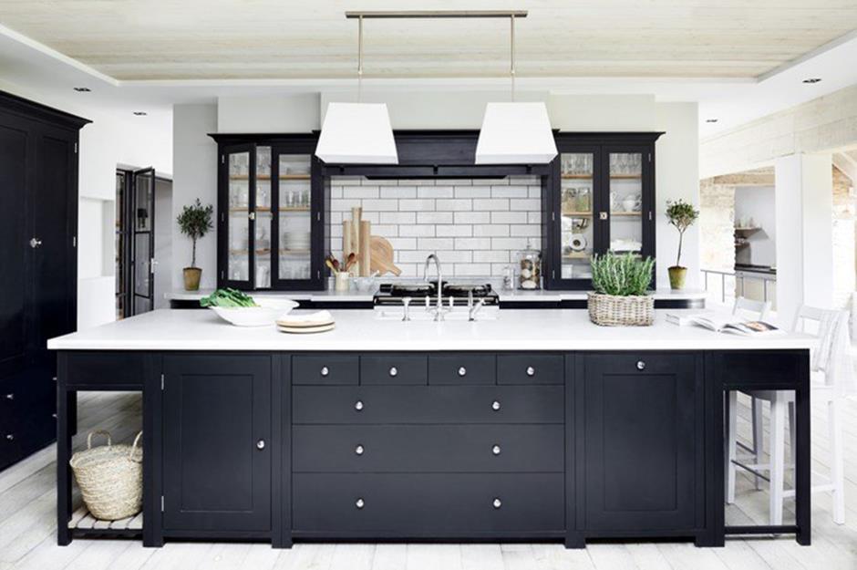
A kitchen island is both the center view of a kitchen and a useful surface. It automatically attracts curiosity if it is different from the rest of the interior. For example, if the barstools have purple velvet cushions for a pop of color and texture, they become subtle but noticeable.
Other interaction places are the major kitchen appliances, especially any appliance part of the golden kitchen triangle. The major elements of the kitchen triangle are the refrigerator, the sink, and the stove.
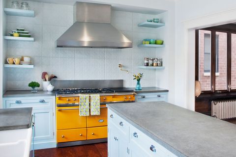
If you have any of these elements that contrast in color, material, or even gloss, they become statement pieces. With the recent trend of retro appliances, a retro mint green refrigerator becomes a focal point in a modern kitchen.
With a kitchen sink, the farmhouse apron style has been trending, gaining more attention than in years past. Interior designers also embrace bold sink colors, veering away from the ubiquitous stainless steel and chrome finishes.
Kitchen faucets, especially those from higher-end brands like Brizo and Hansgrohe, are not only developing different functions with technology but also looking sculptural.
Saturated, Bold Colors
Different colors from the rest of the room will stand out, but some colors are more pronounced naturally. Saturated color is a difficult concept, but it is how much “red” a “red” has.
In computer programs like Adobe Photoshop, we can see only the maximum red or blue using that hue.
The other way to explain saturation is that a lighter or darker version of yellow is “less saturated” or “desaturated.” If a yellow or blue has white or black mixed with it, that yellow will not be as intense. While yellow and white produce a lighter yellow, a light yellow does not always translate to bright yellow.
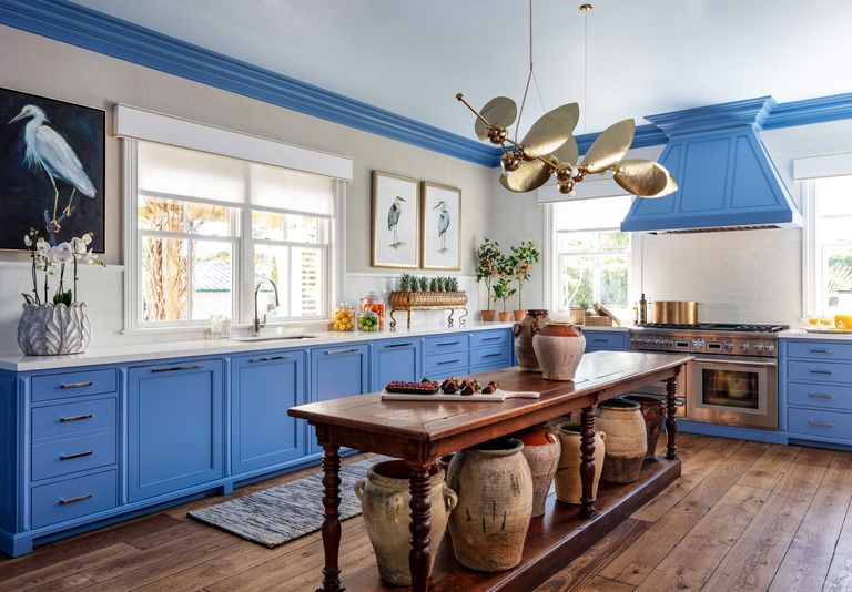
Intense (saturated) colors will catch the eye, even if you place them in a remote corner. However, decorating the entire room with too many intense colors can be overwhelming.
That’s why many kitchens are decorated with a neutral palette or more desaturated colors: They are less stimulating.
Bold colors should be tactfully and strategically used as they frequently appear in kitchen statement pieces.
Shapes
As mentioned earlier, curvy or circular shapes will gain more notice in an angular space. Kitchens tend to be more square and cubic because of the storage construction of cabinetry and surfaces of most counters.
Also, most major appliances, such as refrigerators and ovens, are built as cubes, so they fit along kitchen walls.
One natural wood trend kitchen designers embrace is live-edge wood, which uses organic margins as points of interest. Since the shape is neither straight nor round, live-edge items become statement materials.
In minimalist design, an atypical edge, curve, or proportion looks more pronounced and is preferred over something outlandish or garish.
Spotlight or Lighting
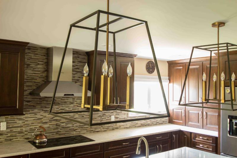
Like a theatre lighting cue, whatever the light shines on will be emphasized. Accent lighting is specifically built to spotlight items in the room. However, if pendant or recessed lights shine on the reflective surface of a glossy countertop, the countertop becomes a focus.
While this is not directly related to kitchen statement pieces, lighting supports the prominence of elements in the room. Some kitchens already have range hood lighting that shows off an oven or stove.
Other illumination, like undercabinet lighting, can accentuate the cabinet, backsplash, and countertop all at once. The eyes are drawn to light not just because of brightness but also the necessity to illuminate the room.

