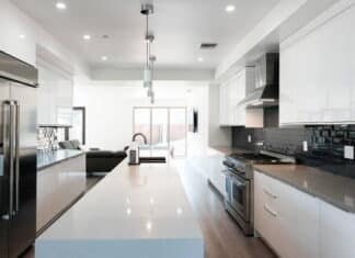
Gone are the days when kitchen spaces were cluttered with accessories, busy patterns, and designs. Today, the modern kitchen is defined by minimalism.
What Do We Mean by a Minimalist Design Style?
A minimalist design style uses bare essentials to create an uncluttered and simple space. This style is very similar to the modern interior design style many homeowners and interior designers embrace today.
So, what exactly do you need in a minimalist kitchen? As far as design is concerned, a minimalist kitchen’s “bare essentials” include clean lines, simplicity, and a monochromatic color palette. The color, in this case, is used mostly as an accent.
What about the exact equipment and accessories? Well, to get you started, a spatula, oven mitts, cutlery, a few glasses/cups, a medium-size pot/10-inch pan, a few plates, and a large stirring spoon are what you need.
Minimalist European Kitchen Design Ideas You’ll Love To Try
Okay, I have a small kitchen. Will a minimalist European kitchen design work? Yes. The minimalist design can be used with the one-wall layout, the most preferred layout for a small kitchen.
But is it efficient? Some argue that the galley layout is the most efficient. But no matter your specific layout, you can explore these few minimalist European kitchen designs.
So, dig in.
1. Invest in Lighting
Adequate lighting makes a minimalist European kitchen design shine. There are two ways to achieve this: natural lighting (preferred) or a mix of natural and artificial lighting.
So, how do you ensure the space gets enough light? First, ensure the kitchen efficiently bounces light off its surfaces. If your kitchen is positioned so that natural lighting is limited, you should invest in fancy countertops, classic laminated drawers, and European kitchen cabinets.
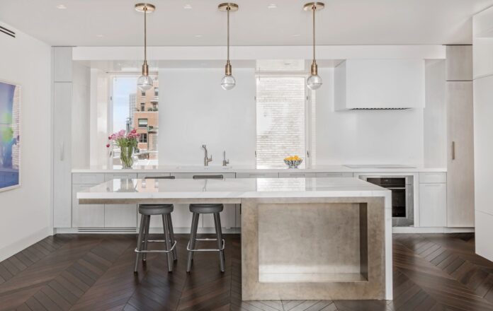
You can add pendant and ceiling lighting above the kitchen island to add more light to the kitchen. This can still work well even if you don’t use a full white monochromatic color palette.
2. White Will Never Go Wrong
If you’re looking for inspiring minimalist kitchen designs, you’ll be flooded with numerous designs donning a white monochrome palette.
Why? Because you can never go wrong with white when it comes to expressing minimalism. White is easily associated with clean and simple. Plus, it allows natural light to flood the kitchen, creating a light and airy feel.
To nail this color even better, you can extend it to the rest of the place. Since most minimalist designs are used in small kitchens, painting the adjoining room or space white creates unity, making the kitchen appear larger.
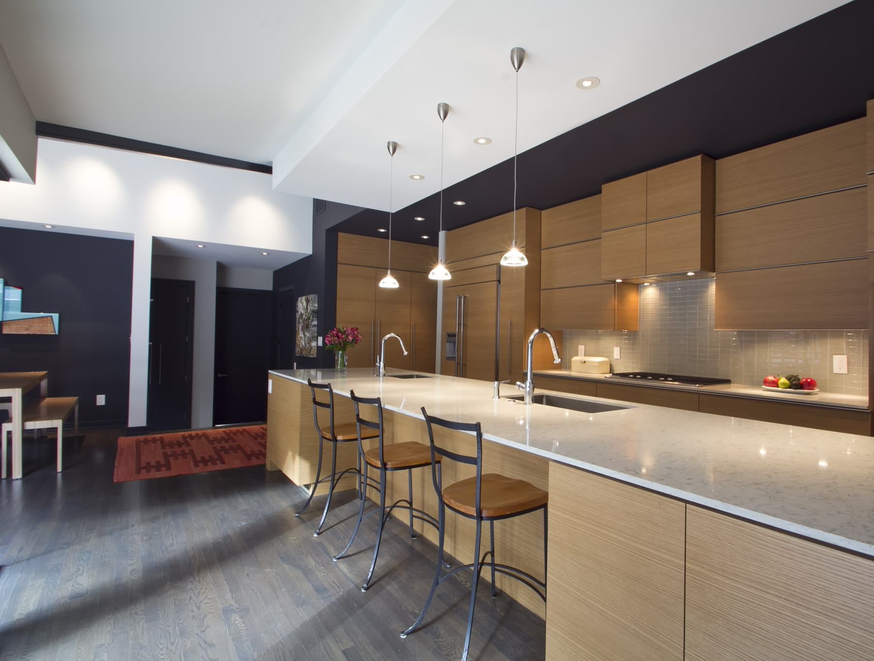
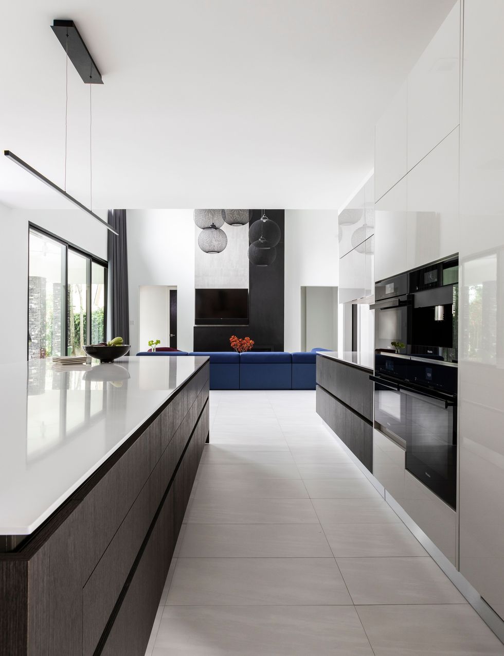
What if I want to go for a stronger contemporary feel? Mix the white with black. Two-tone minimalist kitchens featuring black and white are getting trendier by the day. The black helps break the monotony of the white, creating a contrast that adds sophistication and a modern feel to the kitchen design.
3. Keep Everything Low Profile
Minimalist kitchen design not only involves using the bare essentials but also structured design features. As far as the latter goes, you can keep the Kitchen Island and countertops low-profile for a great minimalist effect.
How does that work? The cooktops and countertops appear smooth and continuous at the same level. You can then declutter these surfaces for a greater sense of continuity.
You can extend this low-profile aesthetic to the pendant lighting as well. You can drop them a bit lower, making sure they all align horizontally. The seats at the kitchen island should also not be too tall.
4. Play with Colors
Yes, the minimalist design is made prominent by the color white. But that doesn’t mean that white is the only color that can pull off this European kitchen design.
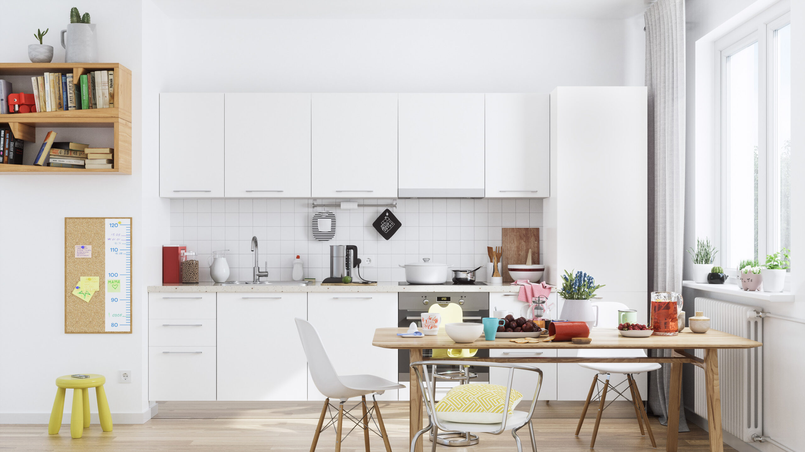
In the simplest case, you can mix bright colors in a predominantly white minimalist kitchen to add a nice pop of color. You can do this by subtly incorporating natural wood in the furniture and bright colors such as red and yellow in kitchen accessories such as the dishcloth and stool and patterns on the seat cushions or cups.
If you want to go all out, you can have a white tile backsplash and white countertop mixed with crimson green cabinetry, a red stove, and a bright yellow fridge.
At the top, you can open things up using open shelving while incorporating a creative splash of colors. For instance, you can have the shelves painted white at the frame, with the inside in the same bright yellow as the fridge.
5. Match the Countertops and the Backsplash
Matchy Countertops and Backsplash
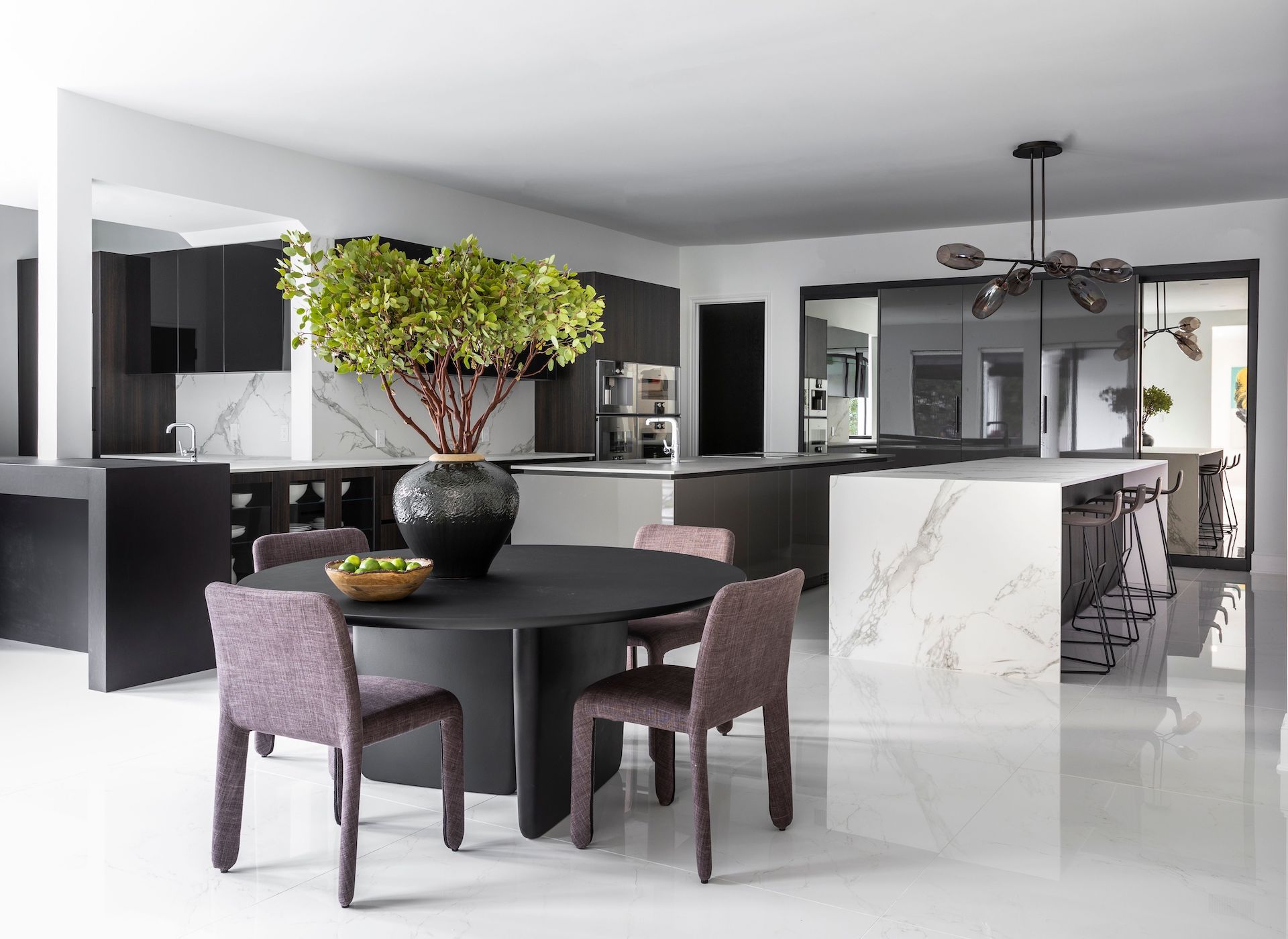
Assuming you want to use a two-tone color palette, one of the best ways to exude a minimalist design is to match the countertops with the backsplash. In this case, you’ll need to use a light color to maintain the spacey, airy feeling.
You ask which one? Ideally, marble. First, using marble adds a touch of sophistication to your kitchen design.
Second, since the colors, patterns, texture, and graining match, the backsplash and countertops create a waterfall effect, resulting in a calm and simplistic aesthetic.
What about the rest of the kitchen? A dark matte color would do. Plus, you’re not strictly confined to one color choice.
For instance, you can have the dining table and cabinets in matte black. The seats can be dark brown, and dark brown pendant lighting can hang over the kitchen island.
6. Mix Wood and Tile
Wood and tile mixed work magic in creating a minimalist European kitchen design. How?
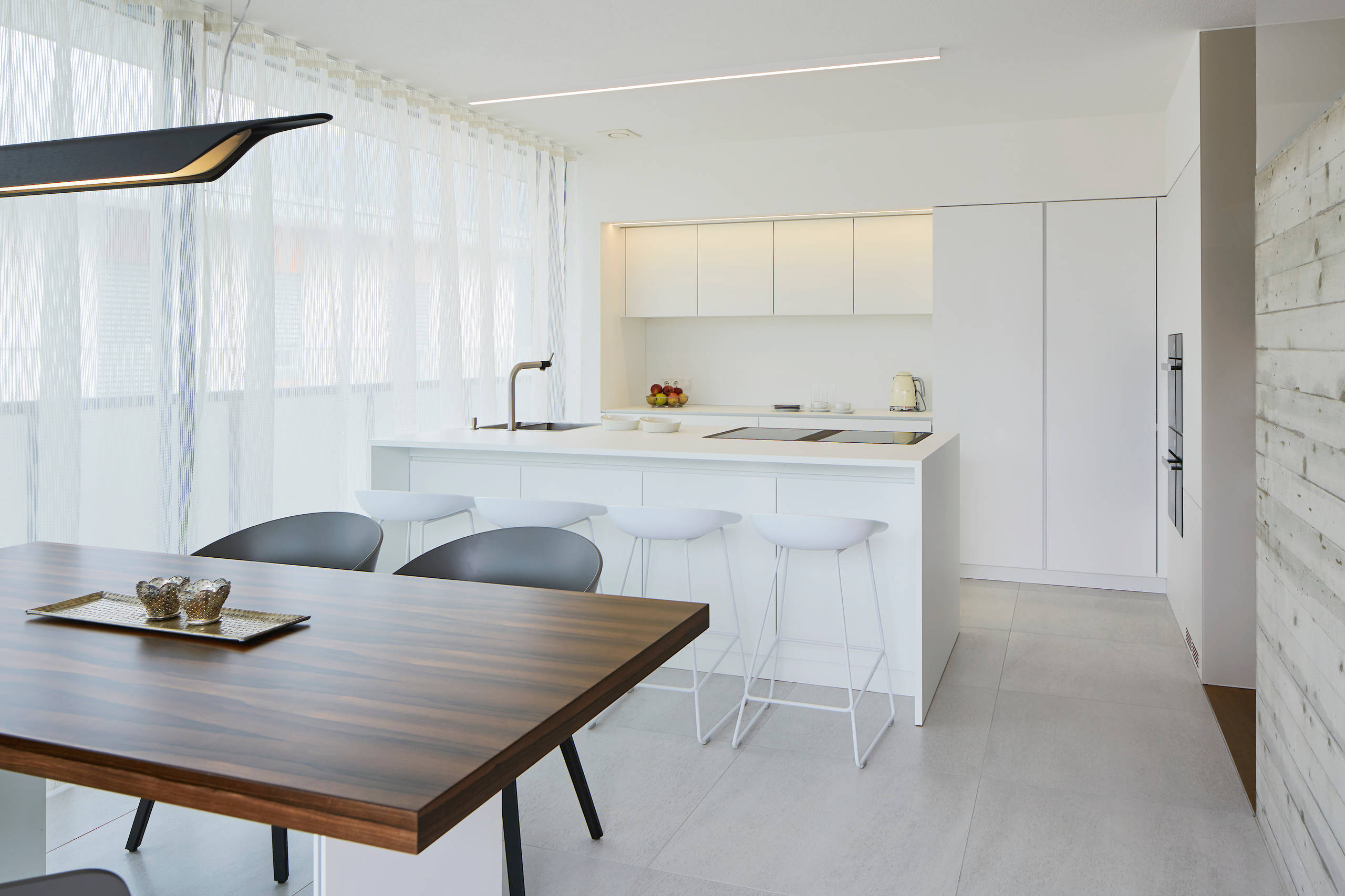
For instance, you can have a pure white kitchen with a redwood dining table coupled with black or midnight-colored seats right at the front. The stark contrast between the white kitchen and the wood dining table creates airiness and space.
Alternatively, if you’ve installed a kitchen island with white seats, you can break off the monotony using a wooden floor. A bit of grain should be visible, with a lighter white or ash gray coloring the wooden floor.
You can then break the background using a white subway tile backsplash. It doesn’t entirely break the white tone in the room. Rather, it cools down the warm white, chilling the kitchen.
7. Remove the Plugs
This can be termed minimalism at its extreme. And sure thing, it looks gorgeous.
Instead of reducing the clutter of kitchen accessories and settling on a monochromatic or two-tone palette, you can also remove the electric plugs completely from the backsplash and countertops, leaving you with a flush, sleek, and clean surface.
Where will the sockets go, then? If you take this route, you should invest in pop-up plugs instead. These plugs only appear on the surface when you need to use them. Otherwise, they’re tucked in flush with the backsplash or countertop surface.
You can even change the lighting, replacing the wide lighting with strip pendant lights that hang over the countertop.
With this design, since the aim is to achieve extreme minimalism, you should eliminate any kitchen accessory, tool, or appliance on the countertop. Preferably, only one item should remain on the surface.

