Sometimes, we take good kitchen design for granted. It isn’t until we have either a displeasing or impractical aspect that we appreciate the qualities of a functional kitchen.
Bad Kitchen Design Found Online – and Tips on How To Make A Bad Kitchen Look Good
A kitchen is one of the most functional rooms in the house. Bad design is not something that just looks unpleasant. It also limits the full possibilities and use of your kitchen.
We gathered here some of the worst internet offenders. Some might be hideous, and others might be obvious. With all these examples, we address what is wrong with the kitchen designs and how to fix them.
1. This could be a kitchen or a morgue
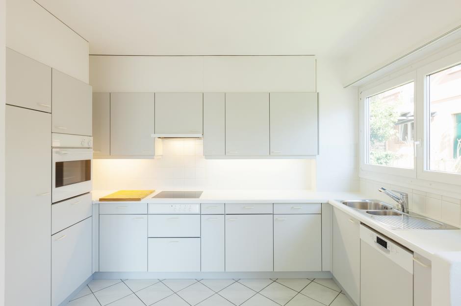
White kitchens were all the rage at one point in kitchen design. But if you look at this, it’s so sterile that you think you were in a hospital, not someone’s home. It’s also so safe that it lacks any personality, even though it has European-style cabinets.
How To Fix:
Luckily, fixing this kitchen is easy. We can start by adding splashes of color with small appliances or details. You can hang kitchen curtains with a pop of color and add towels or even a similar-colored cutting board.
The biggest complaint is that this kitchen doesn’t look “lived in” and feels like a showroom, not a home. So, while clean in aesthetic, it’s not uninviting to the point where I would not want to use it.
However, a far better solution is to repaint the cabinets so the contrast adds depth to this room. Even if you painted only the bottom cabinets, it would bring this kitchen to life.
2. This upside-down bean bag should not double as a kitchen island
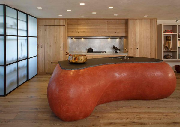
Having a copy of the Chicago art installation “The Bean” might make a statement in your kitchen design. That statement is, “What were you thinking?”
This obtuse red organ may have been a trendy contemporary piece at one point. However, this unique island countertop does not fit with the rest of the kitchen space. It is awkward, and there is no storage capacity. That’s a missed opportunity.
How To Fix:
The most natural solution is to get rid of it. But what if you want to keep it? Then, you need to design more of the kitchen around this piece.
This can include adding accessories that nod to this color or shape, repainting the cabinets to match the countertop, and so on.
3. While appliances can match the cabinets, this is TOO much
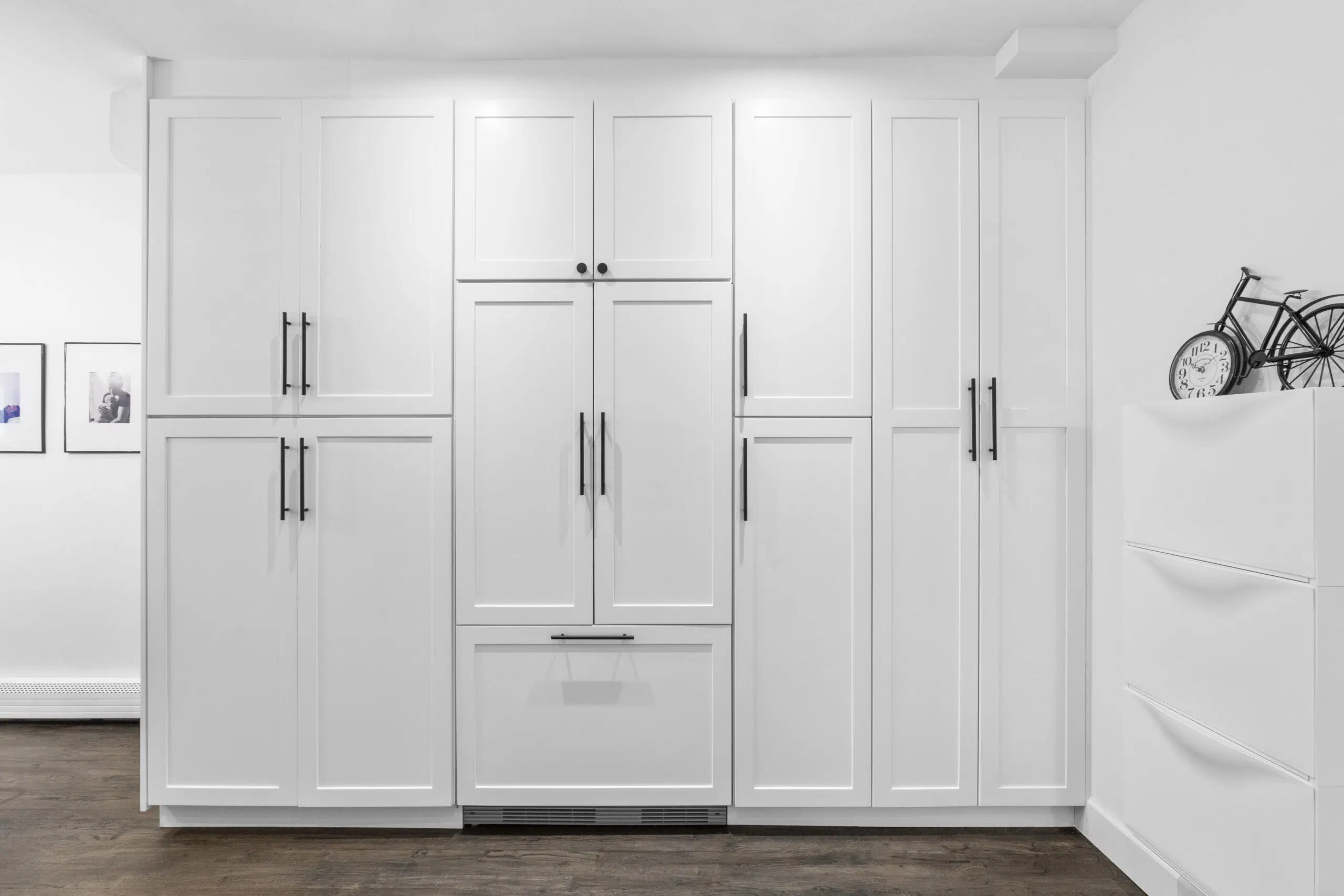
This trend only existed in the 1970s and 1980s: making the refrigerator match the cabinets. However, some homes still have this type of dated refrigerator design.
Let’s say this to get it out of the way: “It’s OK that your refrigerator doesn’t match your cabinets.”
Not only does this look unnatural, but the refrigerator is such an essential appliance that it needs to stand out. You don’t want to guess in the middle of the night what a fridge is and what isn’t. It’s also an unnecessary effort to get everything to conform for beauty’s sake, not for practicality.
How To Fix:
While the solution is to remove the panels from the refrigerator doors, what if you wanted to keep them? At least repaint them to differentiate them from the rest of the kitchen.
4. Having two corner sinks does not improve the situation
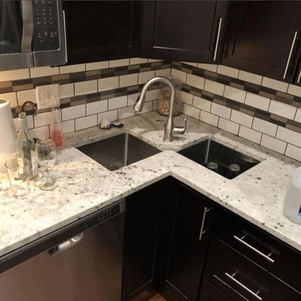
Location, location, location. Haven’t we learned this in real estate? That doesn’t just apply to finding a home; it also applies to a home’s interior as well!
How inconvenient is having so little space to stand to use these two sinks? Moving the gooseneck faucet from one basin to another can cause a potential splash on the counter and floor, which is annoying!
Also, the person standing in that space using the sinks will block access to the base drawers on either side.
How To Fix:
Fixing this is not going to be a small remodel. The under-mounted sinks and openings in the countertop mean you need a new countertop with new sink openings, at least.
There are not many scenarios where you would salvage this design. You could cover one of the openings with a cutting board and expand the other opening to accommodate a larger sink, but that would be a temporary solution to such an abstract design.
5. With two corner drawers, only one has the right of way
No one puts drawers in the corner because of scenarios like this.
Neither drawer can fully extend with protruding arch handles mounted on each drawer. Thus, we lose storage space in both drawers, not just one.
How To Fix:
The solution to this kitchen design is to use drawers that don’t rely on pulls that block each other from opening. Drawer panels like these can have a notch at the top section for fingers to pull the drawer.
You can get handleless drawers, where the drawer panel edge has a lip that you can pull. Both of these are attractive ideas, although you will want to conform all the drawers similarly. Removing the silver arch handle pulls will give this a cleaner appearance in this case!
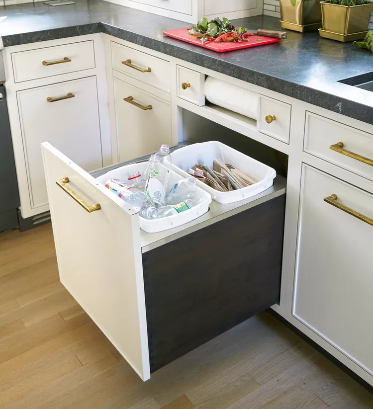
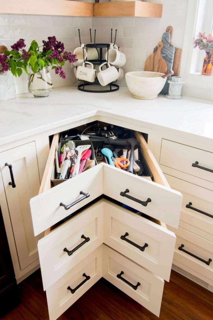
Another option is to design the drawer to look like there are two on the outside, but there is actually just one drawer when you open it, just like the one you see below.
6. Too much open shelving
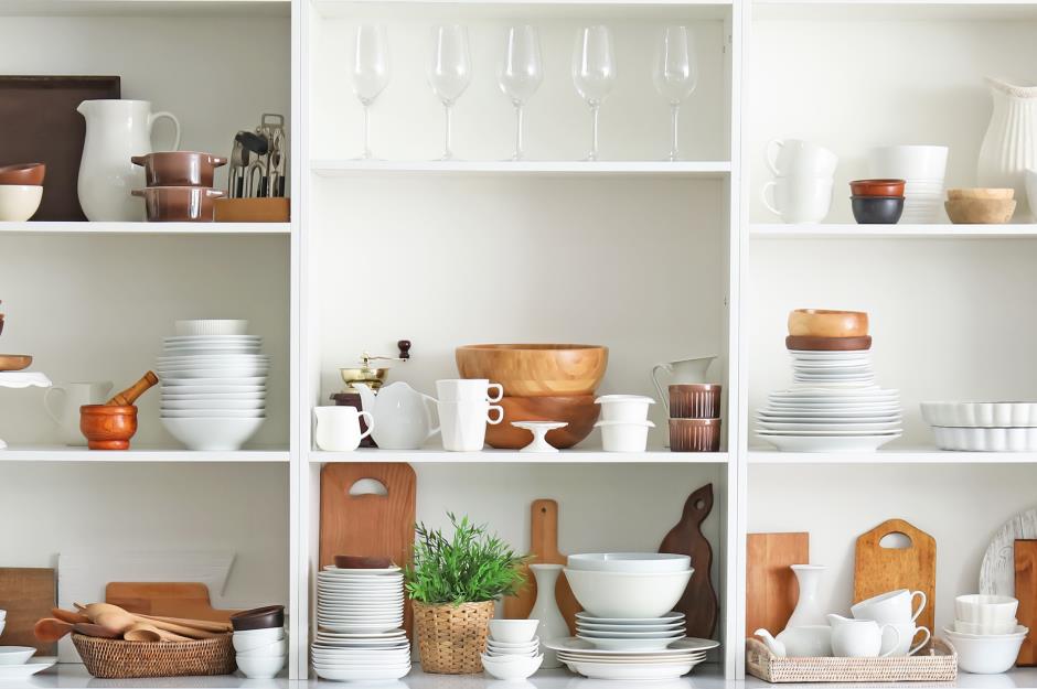
Open shelving continues to be a trend in kitchens. Yet, while it’s ideal if you are in a showroom, it is less practical in real life.
To take advantage of open shelving, you must organize the items on the shelves. Otherwise, the shelves are prone to look messy unless you have specific things placed on them. Treating open shelves like general storage will make them look disorganized.
How To Fix:
One solution is to replace the open shelving with cabinets. Cabinets can hide storage, and you don’t need to be as meticulous to keep your kitchen clean.
If you want to keep your open shelving, then canisters with labels will keep your items systematic. Otherwise, give homes for specific items so that there is an order for your wares.
7. A tiny island that looks like the loneliest island in the world
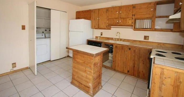
Many would love an island in their kitchen for the extra counter and storage space. However, this island looks tiny compared to the rest of the kitchen. While this setup isn’t horrible, we could use a bigger island or remove it altogether.
How To Fix:
Luckily, this problem looks easy to fix. Using another island of the same size with a countertop over both base cabinets would strengthen the look.
The owner might be unsure if they need an island, hence committing to only half an island. Another solution is to use a rolling baker’s table as another surface built for cooking. Some baker’s tables have casters that can be rolled wherever needed to function best.
Before deciding to get an island, it is crucial to visualize why you use it in your home. This is better than having an island just to have it.
8. A sink for grapes, but not for anything else
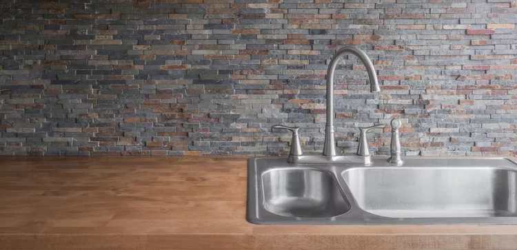
I’ve heard of small and shallow sinks, but this is ridiculous.
A platform with a drain? You cannot wash anything on the left-hand side of this sink without making a mess. When you swing the faucet to the other side, you can only fit a shallow bowl under the tap.
That section of the sink would be replaced with a countertop surface, a cutting board, or a dish rack mat. If you can substitute a part of the appliance design with something you get from the dollar store, that thing needs better design.
How To Fix:
Solution? A proper sink with a deep basin works better here. Should you keep this kind of sink, it is essential to have a dishtowel within reach.
9. Fakes are meant to be convincing – but this is not
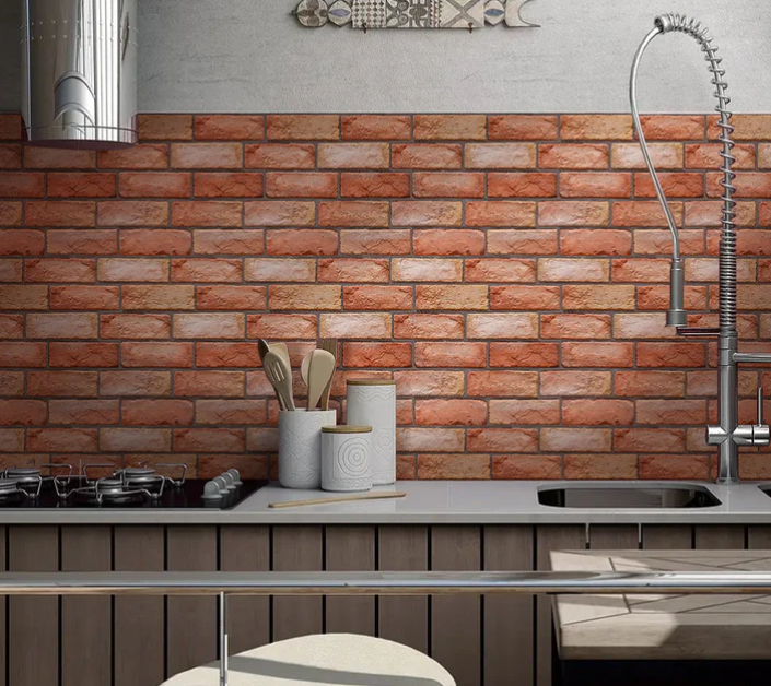
Texture creates visual interest that appeals to the eye. But this fake red brick pattern looks more like an eyesore than a sight for sore eyes.
The flatness of the magenta brick coloring and simulated gray grout make the background look unnatural. When paired with the green-patterned floor tile, it makes that floor look cheap rather than elegant. Since the patterns synch off each other, the quality of the different parts of the room is lower.
How To Fix:
The solution is simple: replace the fake brick wallpaper with… anything. There is no reason to save it. If the owner wants bricks without building a wall, brick veneers are used for walls and backsplashes. The appearance can have realistic textures that can be seen AND felt when dealing with it closely.
Another solution for this kitchen design is to paint or decorate the wall with something that resonates with the floor. Not taking advantage of the current strengths of the room is a waste.
Shy Away With Bad Kitchen Design
A bad kitchen design causes more headaches than you realize. That is why getting the best kitchen design at the onset of your kitchen remodel is important—if you do not want to spend more on a kitchen renovation later.
Yet, as much as we want to know about kitchen designs and other design elements, it would be best to ask a kitchen design professional to prevent or fix bad kitchen designs. By asking for assistance, we can get the best advice and achieve a kitchen design that is aesthetically pleasing and functional.

