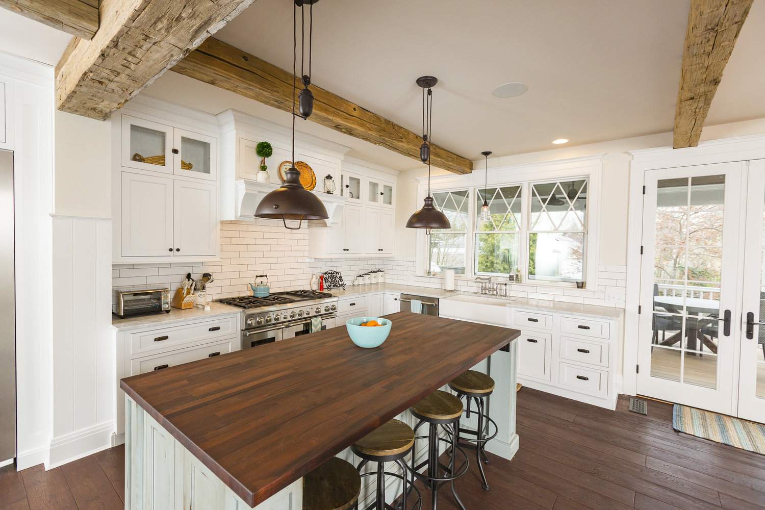
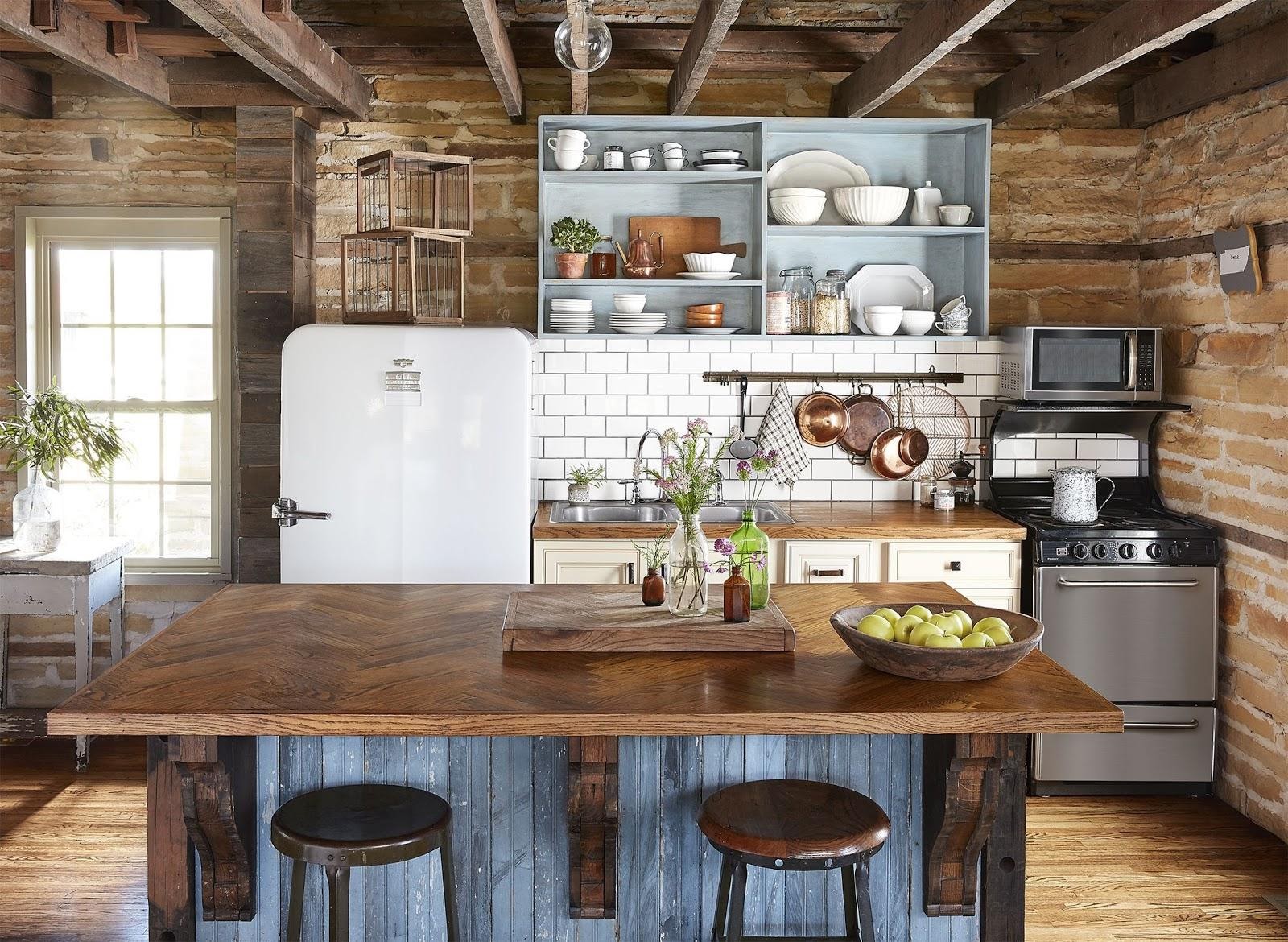
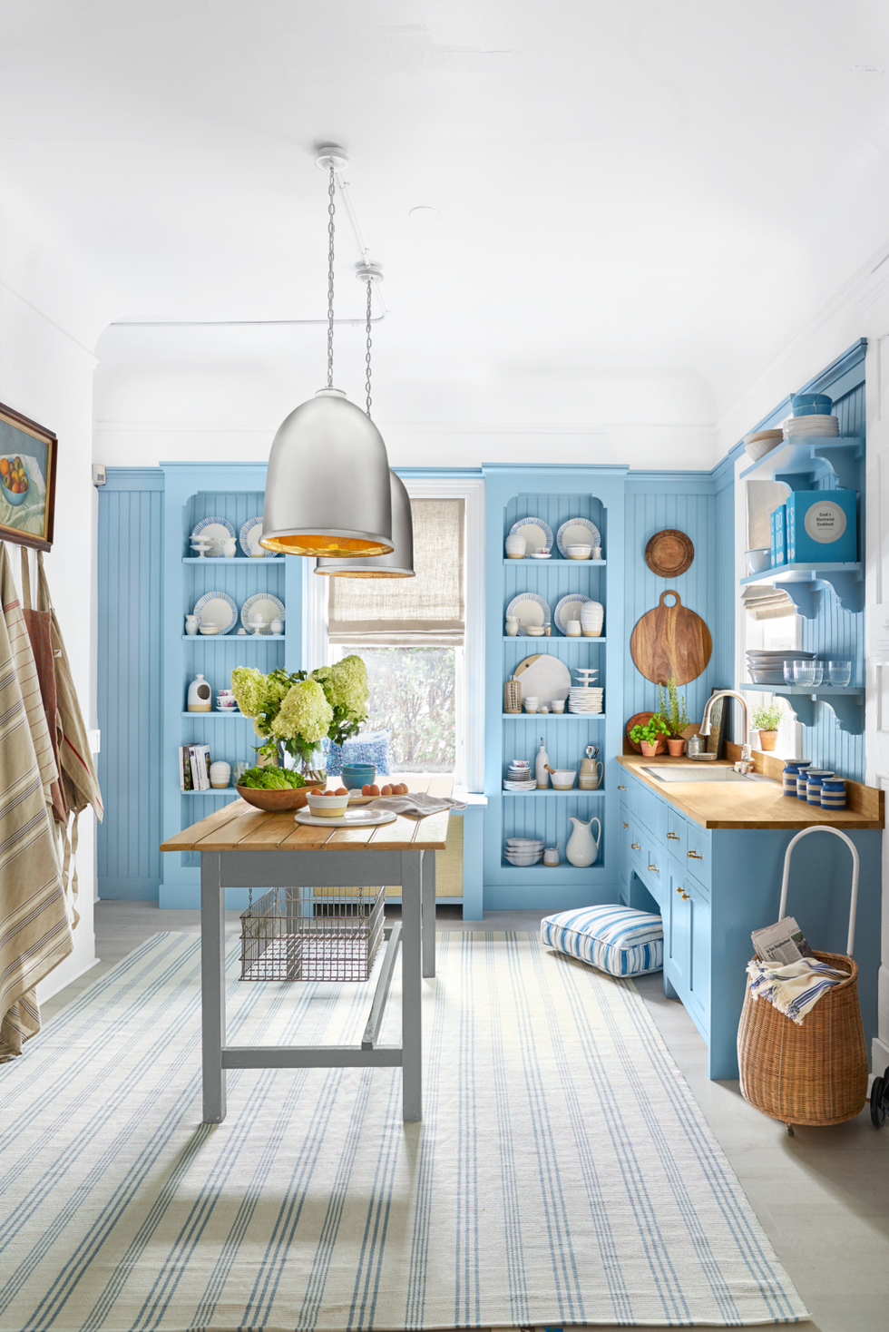
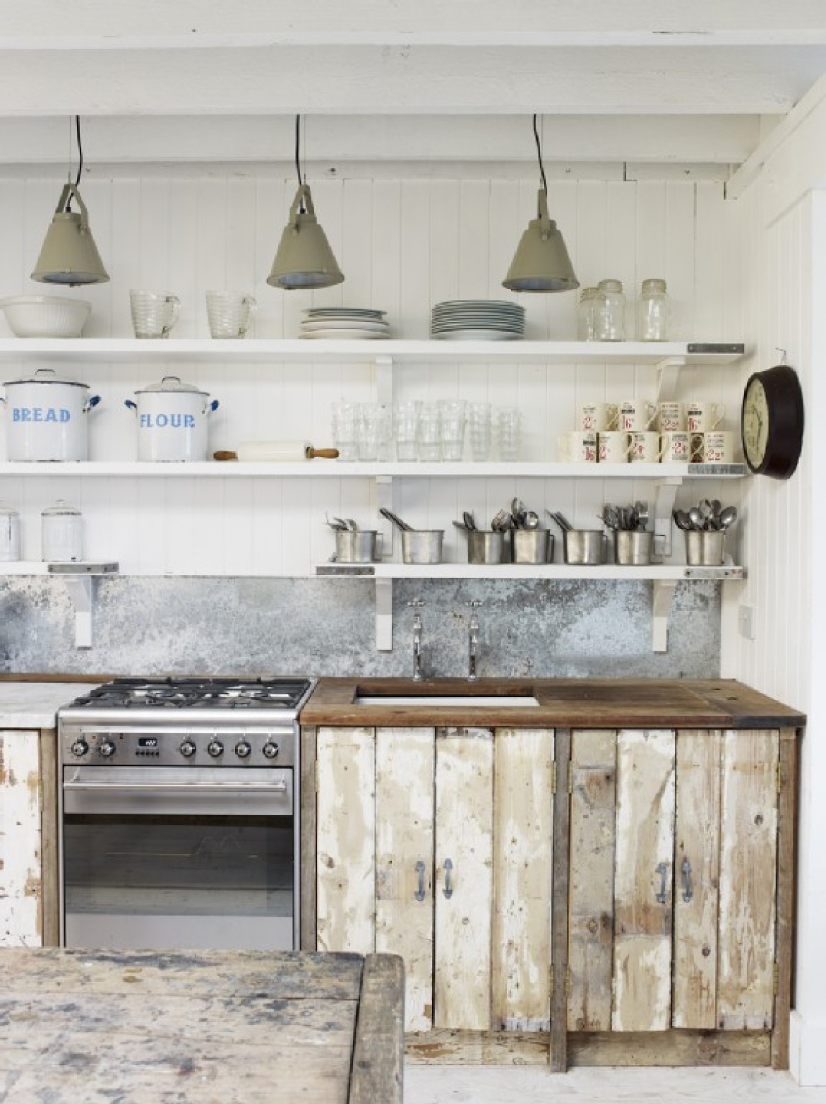
We’ve pulled some of the best kitchen design ideas for 2025. This year has been less than ideal for the most part, but that doesn’t mean your kitchen has to be subpar. Some simple changes can elevate your kitchen design to a new level.
Kitchen Design Ideas For Every Home Style
Let’s be honest. You’ve been stuck in your house and staring at it for months. You know it needs to change, but do you know exactly what needs to change?
Maybe you love the look of an all-white kitchen or are drawn to bold color schemes. Perhaps you love open shelving but don’t know what to do with your kitchen cabinets.
Or maybe you’ve stared at them for so long that you feel completely directionless. That’s why we’ve pulled many different design examples from various interior design styles.
Continue reading to find some of the best kitchen ideas in 2025. Whether you love the open shelves of the Scandinavian style, the stainless steel appliances of the industrial style, or the ornate cabinets of the traditional style, we think we’ve got at least one example to inspire you.
So grab a cup of coffee and a notepad and get ready to be inspired by these ideas. We can’t wait to help you turn your kitchen ideas into a reality.
1. Dark walls and bright accents
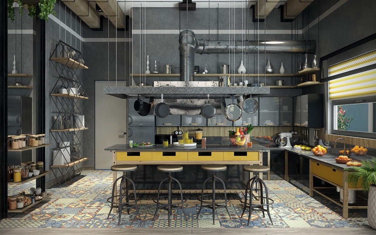
Dark Grey Walls and Bright Yellow Accents for Industrial Kitchen Design
If you still believe that industrial kitchen design always equals minimalism, this gorgeous kitchen is here to prove you wrong. Bright yellow drawers on this kitchen island and eccentric kitchen tiles contrast dark grey walls and industrial appliances to provide a more energetic feel.
2. White walls and wood countertops
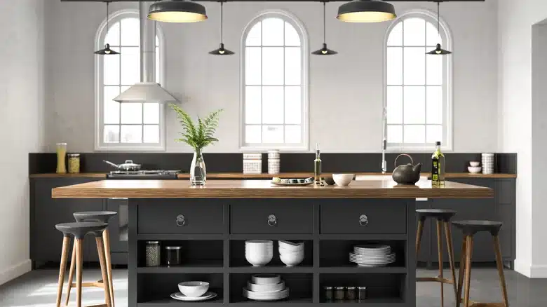
Industrial Kitchen Design Featuring Wood Countertops, White Walls, and Black Cabinetry
Okay, so sometimes industrial kitchen design does equal minimalism. In this example, a light brown wood countertop warms up the otherwise monochromatic industrial-inspired kitchen design.
Sleek black cabinetry provides ample storage for an avid home cook. This minimal color palette works well in a kitchen with lots of natural lighting.
3. Brick and wood and metal, oh my!
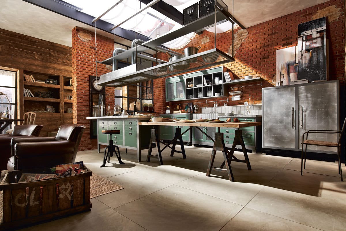
More Bricks and Metal Combination for Industrial Kitchen Design
Here’s an example of how different materials combine to create a unique industrial kitchen look. This open-concept kitchen floor plan seems to bleed into a living room space, giving the kitchen a relaxing vibe. Industrial appliances are warmed up with pops of color and natural lighting.
4. When your favorite pub is your house
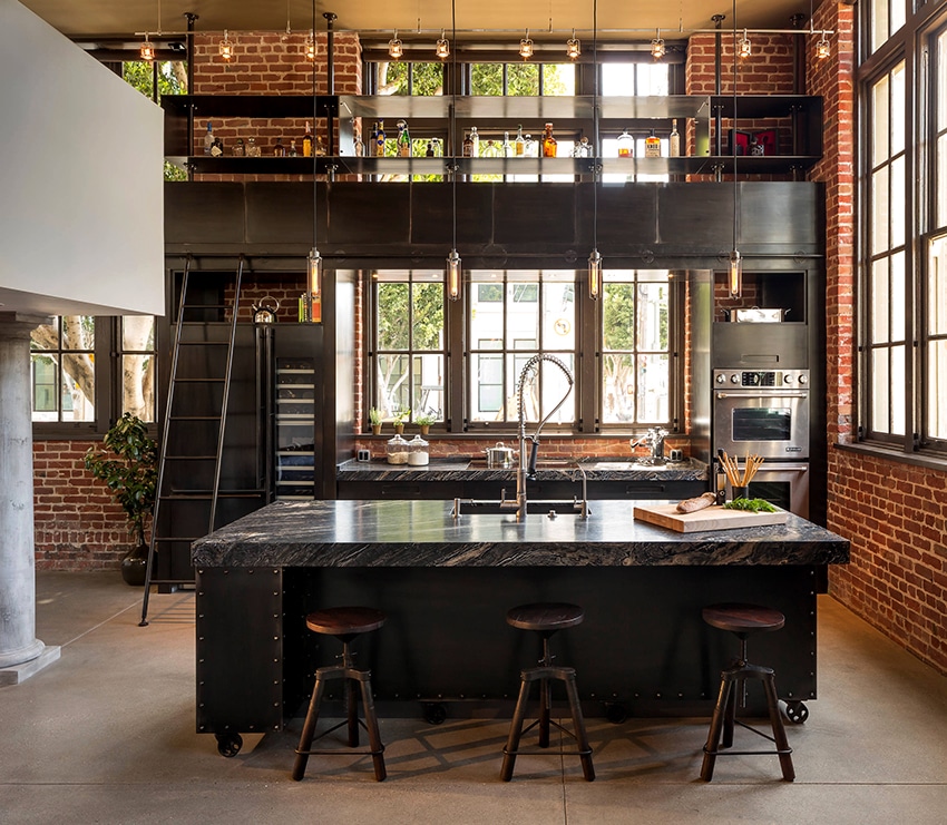
Loft-Style Industrial Kitchen Design
This industrial-inspired kitchen offers a real hip pub vibe in your favorite American city. This gorgeous kitchen might be your perfect muse if you love good books and a strong old-fashioned.
Dark marble countertops sit atop a black kitchen island with leather-seated industrial bar stools. I mean, come on. You know this kitchen owner makes a good Negroni.
5. Show me some color!
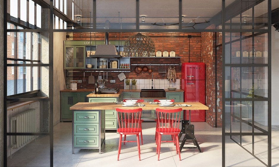
Industrial-style Kitchen Design with a Vibrant and Contrasting Theme
So, maybe you’re sold on some industrial appliances, but where’s the color? Here’s a great example of incorporating multiple vibrant accents into an industrial kitchen concept.
A vintage red refrigerator pops against exposed brick walls. Open industrial shelving pairs nicely with light green cabinets. Lots of natural and overhead lighting contributes to the warmth of this design.
6. Cafeteria setting, but make it fashion
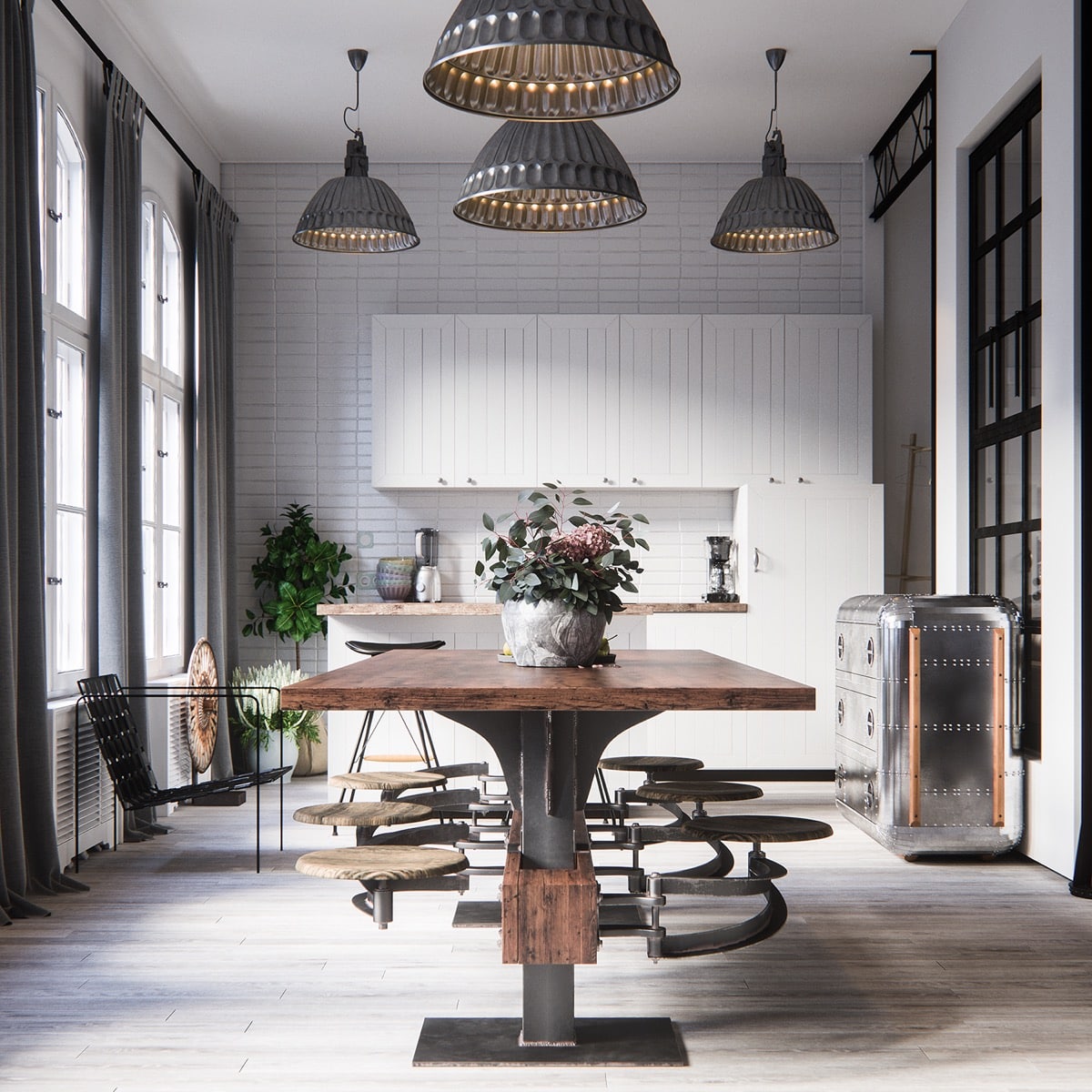
Doesn’t this table remind you of a more fantastic version of your elementary school cafeteria tables? I mean, way cooler.
This wood/metal combination is a staple of industrial interior design and contrasts with the white kitchen cabinets. If you need to conserve space in your industrial-inspired kitchen design, the tall cabinetry and utilitarian furniture displayed here might help you achieve the right balance.
7. Open shelves and black accents
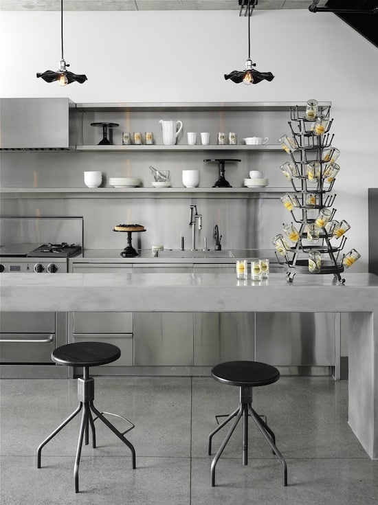
Industrial-style Kitchen Design Incorporating Open Shelves and Dark Accents
Using sleek, open shelves in your kitchen can provide extra storage and display appliances that fit within your kitchen’s color scheme. In this kitchen, black and yellow accents boldly pop against the industrial grey backdrop.
8. Sharp lines and geometric light fixtures
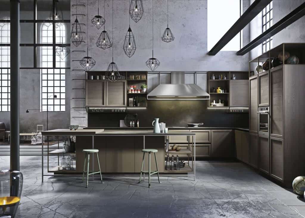
Interesting Blend of Industrial, Modern, and Classical Influences
This industrial-inspired kitchen pairs cool grey concrete walls and flooring with warmer grey cabinets and a kitchen island. The sharp lines of the industrial appliances highlight mint green bar stools and a smattering of geometric lamps.
9. Reclaimed meets industrial
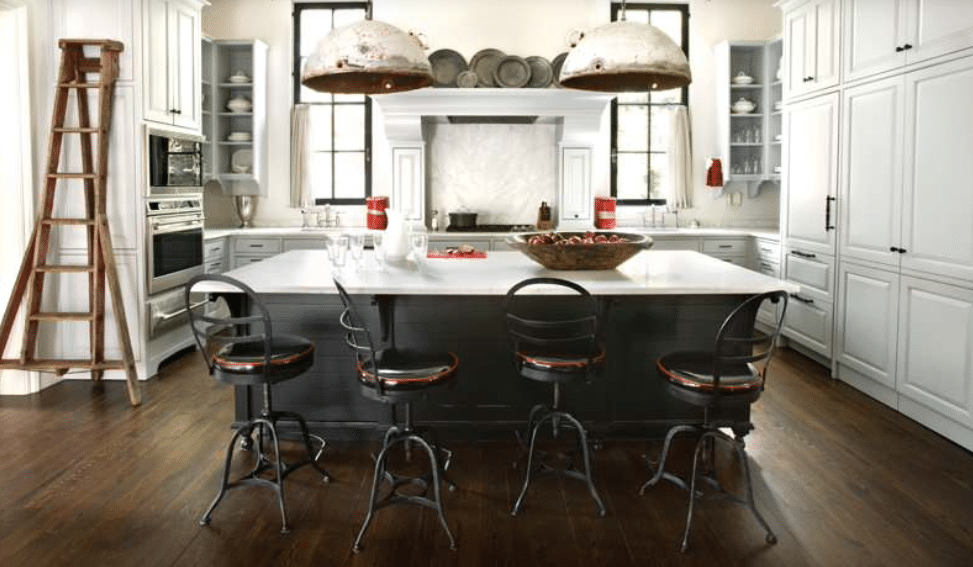
Mixtures of Different Kitchen Pieces
We’re bouncing back from minimalism here with a real curveball. When you think of “industrial appliances,” you likely don’t imagine rustic, reclaimed light fixtures with a slight farmhouse vibe.
However, sometimes opposites attract; in this example, they combine to make a unique kitchen concept. Check out the vast white kitchen cabinets. Talk about utilitarian design!
10. The tile backsplash to conquer all tile backsplashes
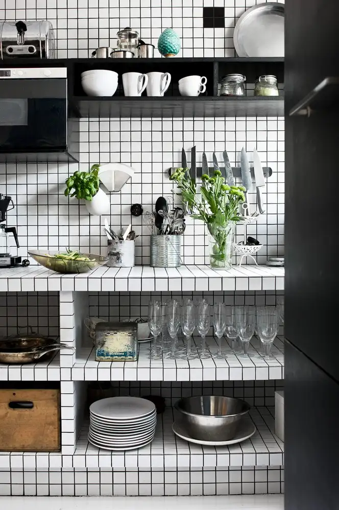
White Tile Backsplash For Industrial Kitchen Design
If you’ve ever watched HGTV, you’ve probably caught a realtor touting the kitchen’s “tile backsplash.” Like industrial kitchen design, tiles are both of aesthetic and utilitarian value.
So, if you’re a tile-file, here’s some bold inspiration. Open shelving displays cookware and allows fresh produce or decorative plants to pop.
11. The Parasite kitchen
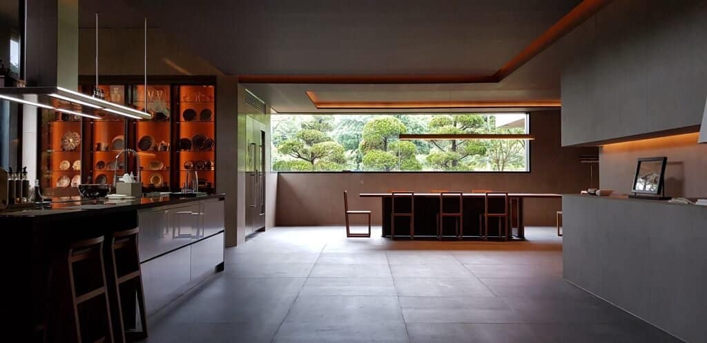
Industrial Style Kitchen Featured in the Film Parasite
Do you recognize this kitchen? This absolutely stunning kitchen was featured in the Oscar-winning film Parasite.
If you’ve seen the film, you are probably laughing about this being included in the list, but hopefully, you’ll also remember how truly stunning this entire house is. This massive kitchen island is the perfect prep space for your Ram-Don or whatever your comfort food of choice may be.
Concrete flooring and walls contrast with backlit cabinets, and dark ceilings help to highlight the beauty of the industrial metal kitchen appliances.
12. High hopes and higher ceilings
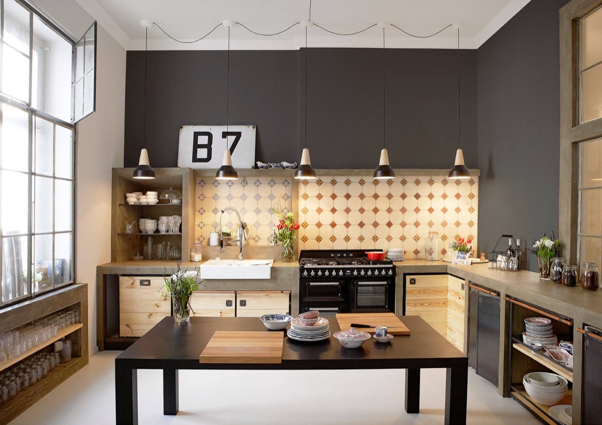
High Ceiling for Industrial Style Kitchen
If you’re a city dweller, you may be blessed with a condo's high ceilings (lucky you!). High ceilings are a great canvas for industrial kitchens because they create plenty of space for large appliances and light fixtures. Raw wood cabinets pop with the contrast of dark grey accent walls.
13. An Anglophile’s paradise
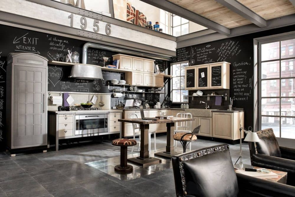
Vintage Industrial Style Kitchen Design Idea
This kitchen fulfills a very specific niche. Have you spotted all the union jacks yet? Is that fridge a Dr. Who Tardis replica?
Even if you don’t like these accessories, this kitchen is a beautiful example of how industrial kitchen appliances pop against a black wall. The chalkboard-painted walls also highlight the stunning light wood kitchen cabinets.
14. Industrial kitchen in a loft
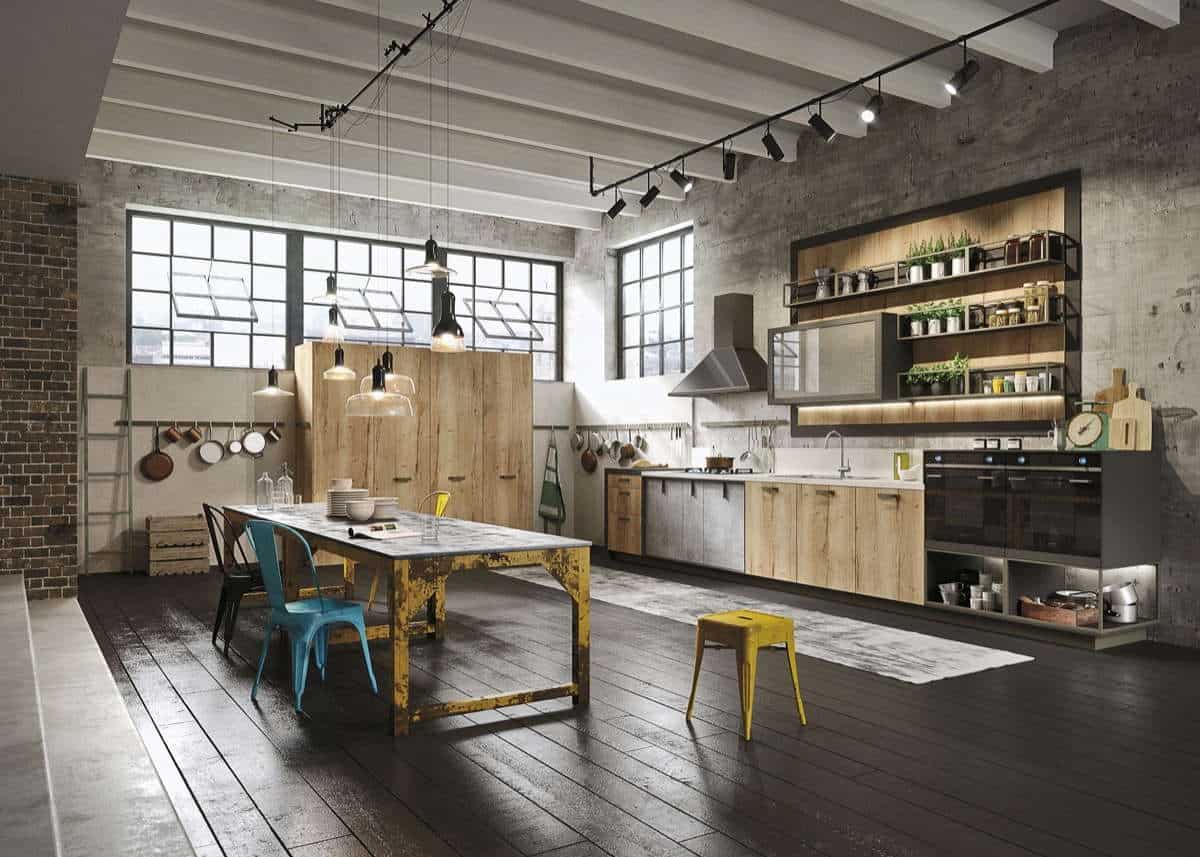
Loft Spaces for Industrial Style Kitchen
Loft spaces are often developed in former warehouses or factories, as in this example. By embracing its industrial roots, this kitchen design feels warm and down-to-earth.
Again, bright colors pop against a more neutral palette—lots of open shelving highlights kitchen appliances and plants. Huge locker-style cabinets allow for plenty of storage space, minimizing clutter.
15. Shades of Grey
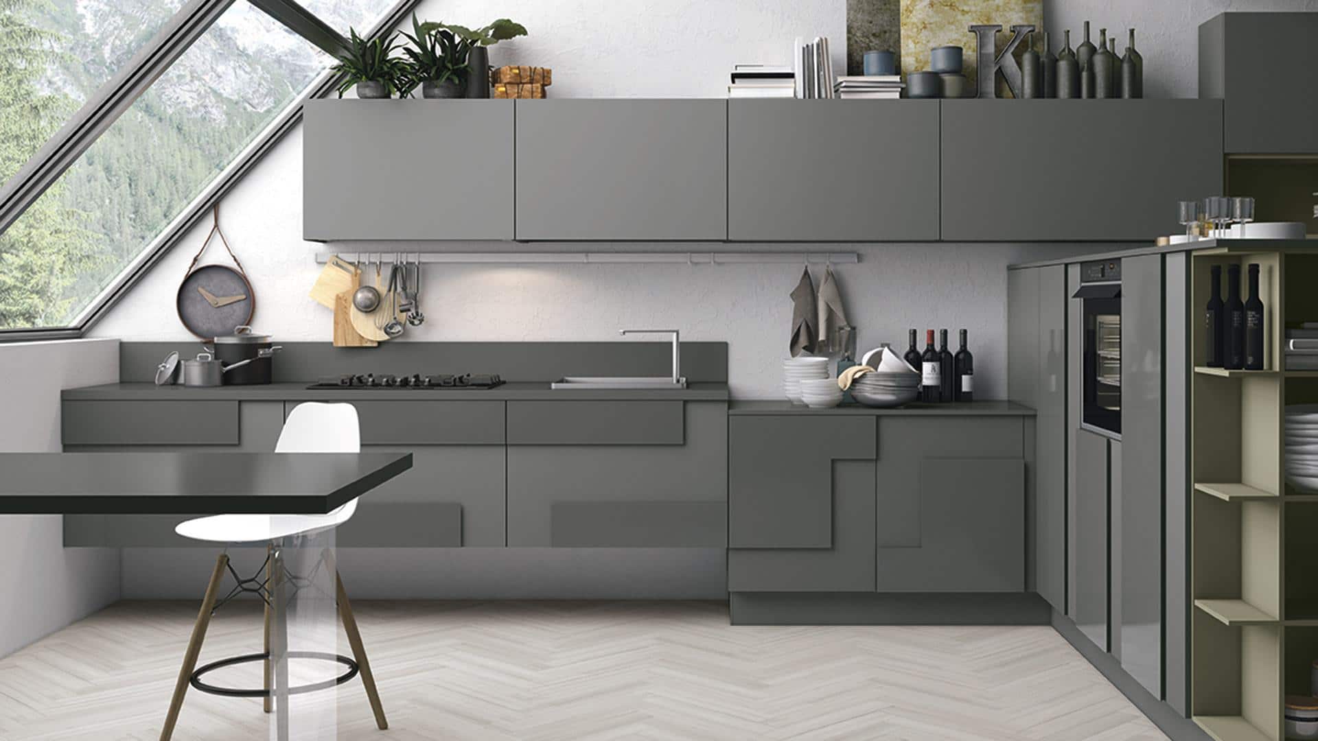
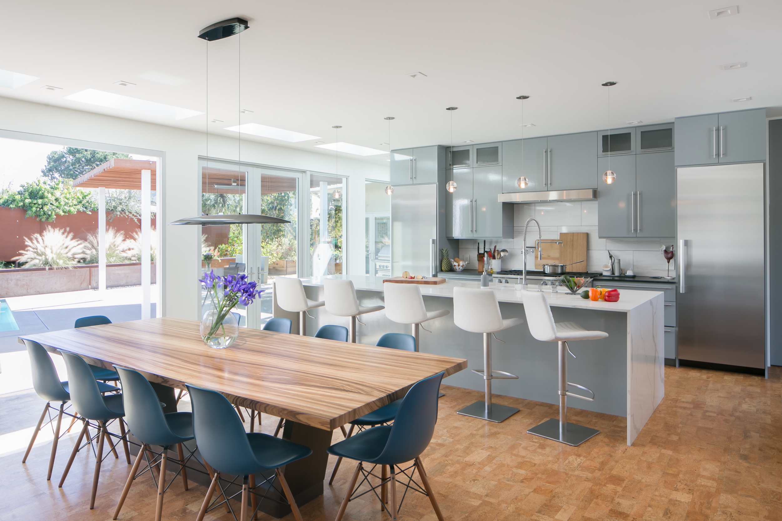
Modern kitchen design doesn’t need all white to achieve a contemporary look. However, as evidenced by this all-grey kitchen, a monochromatic color scheme can certainly make your kitchen look sleek and current. These sharp grey upper cabinets leave enough room to display some kitchen decor above.
Lower cabinets adorn the fronts with unique geometric paneling. This kitchen’s futuristic modernity makes it look like it could be used in the set of a 2025 sci-fi drama—owned by the protagonist, the lead scientist.
16. Ocean-Inspired Cabinets
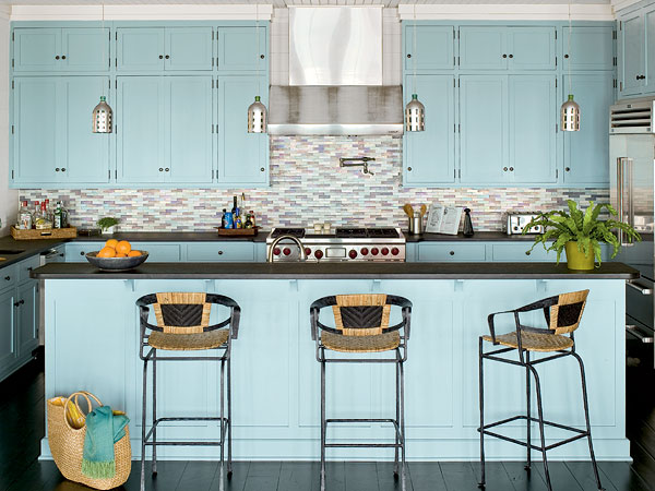
Soft Teal Blue for a Coastal Kitchen Design
Different shades of blue will bring different shores to your kitchen decor. This beach house kitchen uses a soft teal blue. It’s as if the kitchen designer plucked the pigment from the beaches of Fiji and dropped it onto these cabinets. This kitchen also might give you a few ideas for repurposing beach resort materials for your kitchen design.
These metal pendant lights mimic the shape and texture of the base of a tiki torch. Thick, woven chairs look as sturdy as the basket you’d take to an island farmer’s market. Thoughtful decor choices like these will liven up your coastal kitchen design.
17. Muted tones
Neutral Palette of Muted Tones
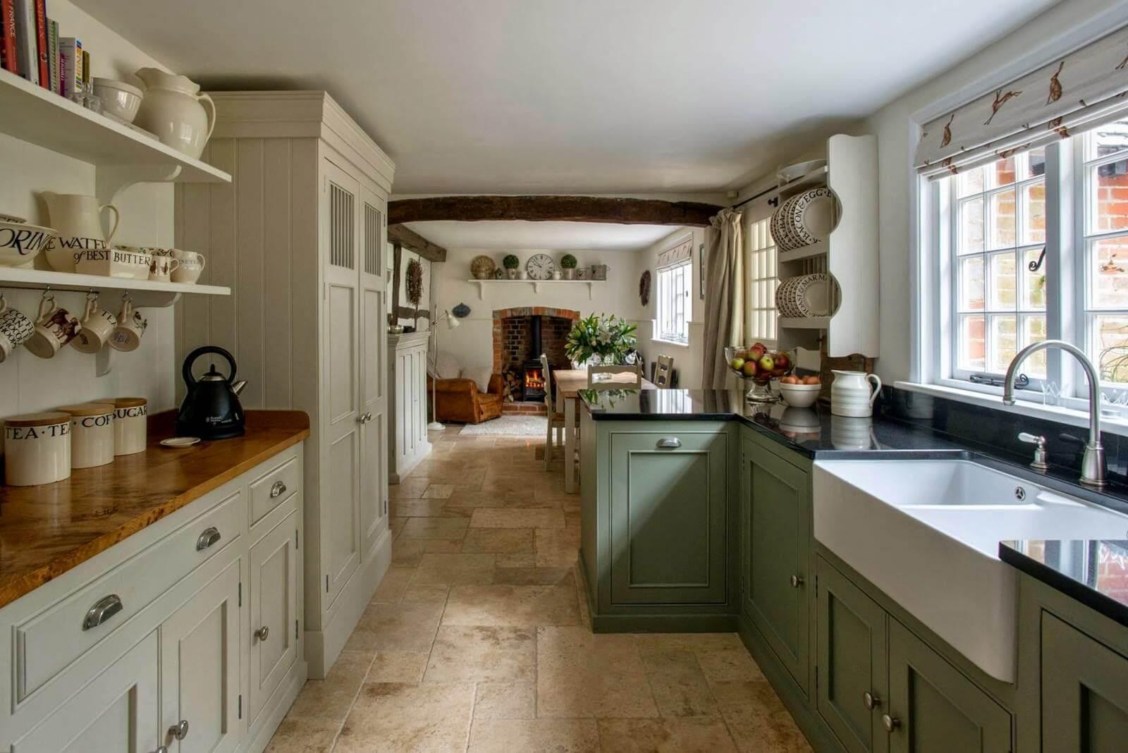
There’s something comforting about a neutral palette of muted tones. This modern farmhouse kitchen uses a soft green color for the cabinets on one side of the kitchen and an olive-toned beige color on the other. This kitchen is another example of maximizing value in a smaller space with the addition of open shelving.
18. Modern Breakfast Nook
Modern Kitchen Design with a Bright Yellow Breakfast Nook Seating
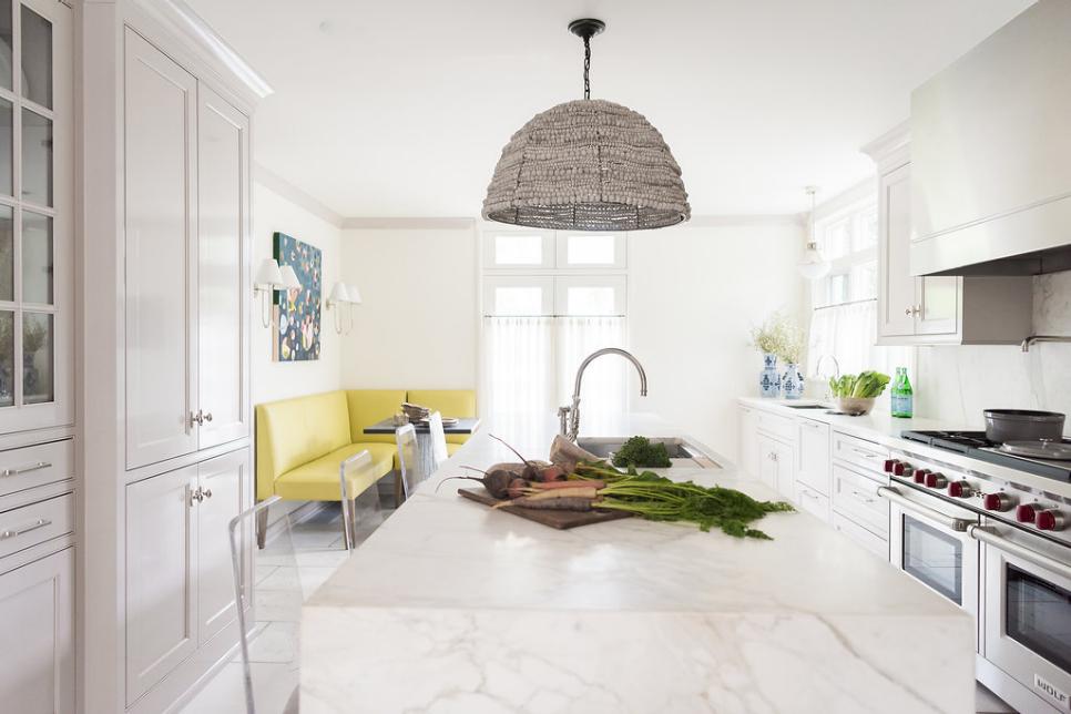
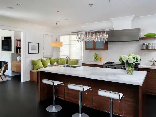
Not all modern kitchens are created equal. This one gets a leg up with its bright yellow breakfast nook seating. This white kitchen uses a variety of textures, including marble, tile, wood, and stainless steel. With a simple color scheme like this, you can use many materials without fear of clashing.
19. Traditional Colors, Rustic Accents
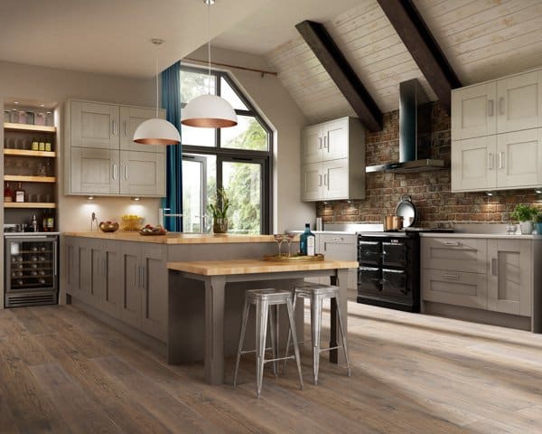
Modern Twist to a Timeless Classic
First of all, the sheer size of this kitchen is enviable. Beyond its magnitude, a marriage of textures and styles makes this kitchen a formidable inspiration source. A traditional-inspired palette pairs well with rustic wood elements, stainless steel appliances, modern open shelving, and a brick wall backsplash.
This massive cabinet-filled kitchen island has plenty of storage for the avid home chef, and a mini kitchen island juts out to serve as a small bar. This kitchen design is suitable for either a home or a hip new restaurant.
20. Black, white, and retro all over
Retro Kitchen Design Incorporating Black and White Color Palette
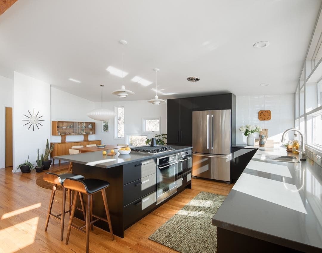
This kitchen is a prime example of bringing Aunt Connie’s retro kitchen into 2020. Some classic mid-century modern furniture pieces, including the wall clock and those Eames-inspired bar stools, pair nicely with the modern appliances in this kitchen.
Black kitchen cabinets look sharp next to wood floors and white walls. A simple black-and-white color palette can be just as effective as more pigmented mid-century modern kitchens.
21. In mint condition
Mid-century Modern Kitchen Design
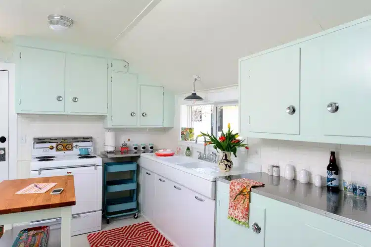
An ode to the past can be made through color choice, which is exactly what’s happening here. This mid-century modern kitchen delivers a wave of nostalgia by choosing these mint green/light teal cabinets.
22. A seat for everyone at the kitchen table
Midcentury Chairs
Midcentury modern kitchens often incorporate a variety of textures like this: Stainless steel contrasts with a large white tile backsplash. These midcentury bucket chairs at the kitchen table are a style you’ll see across several major retailers.
There’s a reason this design style is so popular—it strikes the right balance between being aesthetically interesting and functional.
23. Contemporary Interior
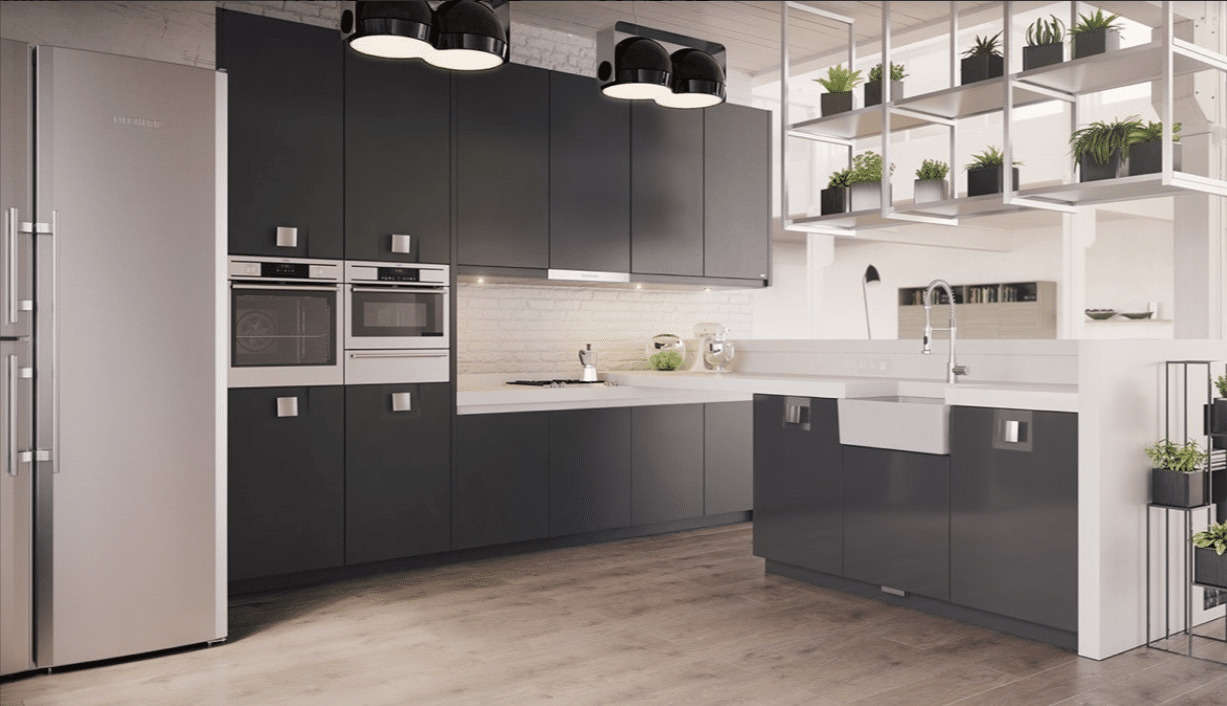
Contemporary Kitchen Interior Design
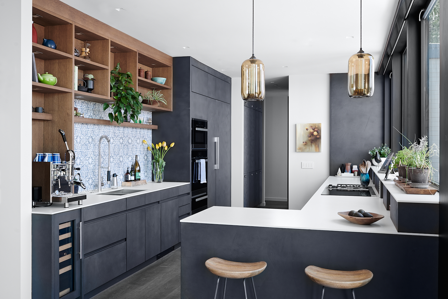
This contemporary interior design uses cubist shelving units to display a smattering of potted plants proudly. The staging certainly adds a unified pop of green to this otherwise greyscale kitchen, but a more active home chef might want to use the extra space to store cookware.
Here, we have another example of appliances tucked away within the interior design concept. Stainless steel ovens are tucked into tall black cabinets. This black-and-white kitchen uses simplicity in an interesting and modern way.
24. All of the light(s)
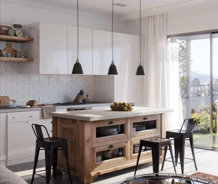
No, this kitchen isn’t as flashy as a Kanye West song. However, hanging light fixtures and an emphasis on natural light highlight the Scandinavian kitchen concept.
Industrial stools sit around a freestanding natural wood kitchen island, which uses internal glass-paneled cabinetry to store neutral-colored kitchenware. Large white knob-less upper cabinets also add storage space in this Scandinavian-style kitchen.
25. Lime time
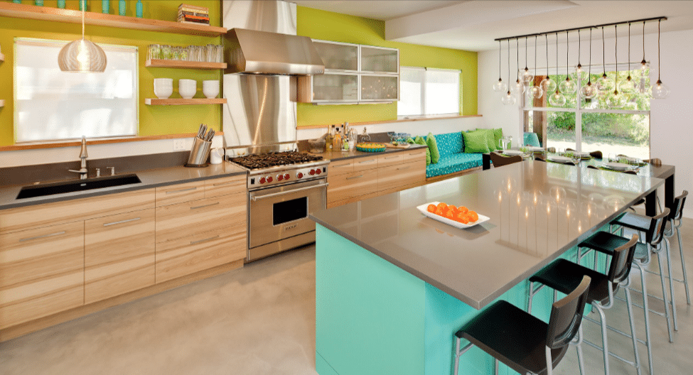
Lime Accent
This bold accent wall and the equally bold kitchen island are not for the faint of heart. But there’s a reason color works so well with mid-century kitchen design.
Mid-Century Modern furniture is designed with simplicity in mind, so it doesn’t compete with the boldness of the color choice here. Instead, simple pieces like the light wood kitchen cabinets and metal countertops enhance the impact of the bright colors.
26. A modern perspective
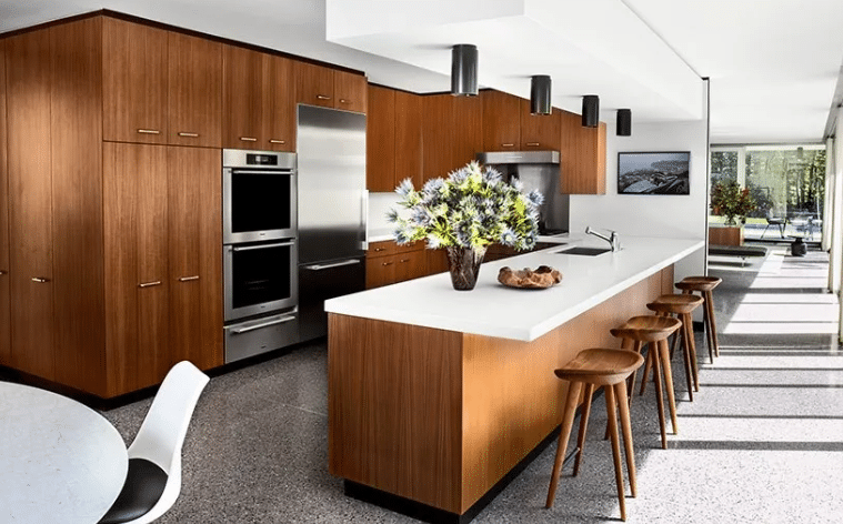
Modern Kitchen
This modern kitchen design incorporates minimal mid-century elements in a sleek, simple layout. Large, stained wood cabinets sit above and beside sharp stainless steel appliances. This kitchen design also uses a more modern-style light fixture (as opposed to the stylized mid-century light fixtures you’ll see in several other inspiration images).
27. Green and red
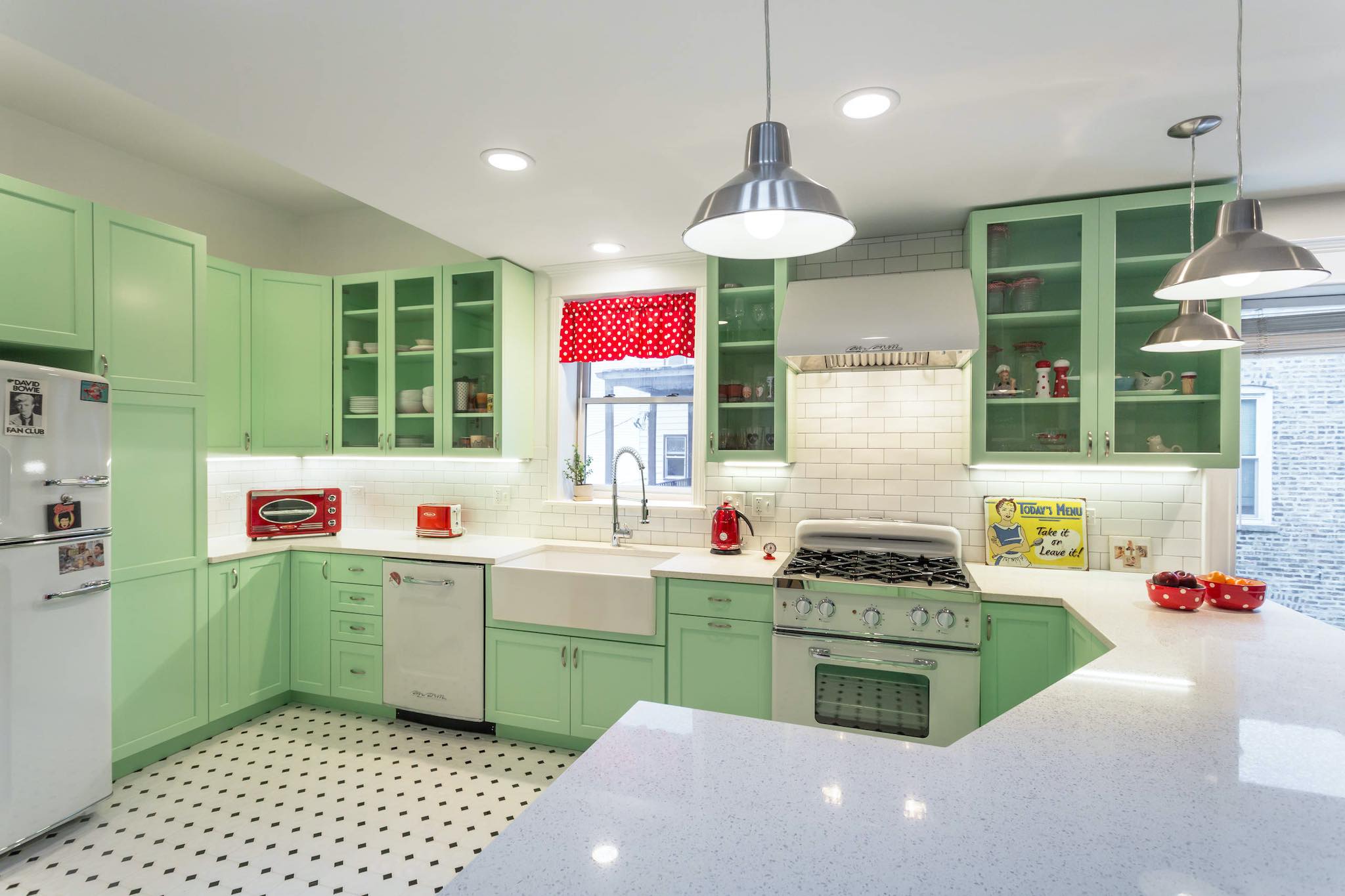
This mid-century modern color scheme feels like it shouldn’t work together. Green and red almost always denote Christmas, but there’s no winter vibe. Pale green cabinets and red accessories are ready for a 1950s-style diner breakfast.
If your midcentury modern design taste is rooted in the vintage aesthetic, incorporating bold swatches of color throughout your cabinetry like this could be a great move.
28. Hexagon tiles
Hexagon Design Backsplash
This hexagon tile backsplash is a unique feature of this midcentury modern kitchen design. But wait—what if I told you it was peel-and-stick wallpaper?
Using a fun, patterned wallpaper in your kitchen design can help save room in the budget for heavier expenses, like industrial appliances or these lovely leather Eames barstools. This color palette is also worth consideration. A dark forest green is on the upper cabinets, and the kitchen island looks sharp with the white wallpaper.
29. Slate grey and clean lines
This mid-century modern kitchen combines a few design style inspirations. You may not immediately think of pairing a Tuscan-looking tile backsplash with hanging Edison bulb pendant lights, but this kitchen makes it work.
Large, slate-grey cabinets span the length of the kitchen, and the color is even brought through on a section of the back wall. And, of course, some very midcentury bar stools sit at the edge of the kitchen.
30. It’s all about the geometry
Geometric Designs
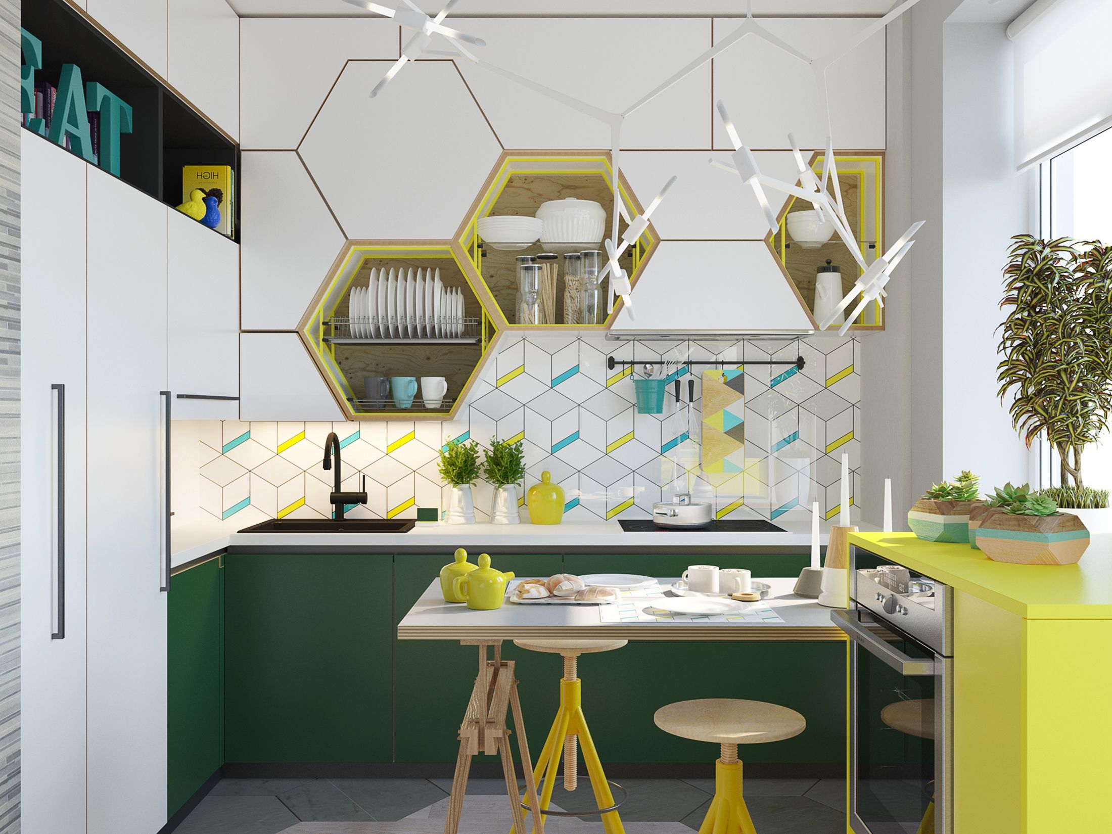
Do you remember those little geometric wood blocks teachers would hand out in math class and ask you to construct patterns? These custom cabinets are a masterclass in pattern matching. Hexagonal cabinets with yellow features read like a honeycomb, which feels appropriate for a charming little breakfast nook.
Yellow, green, and turquoise accents contrast brightly with white cabinetry and countertops. In this midcentury modern kitchen, you could become a real breakfast influencer.
31. Blue and white
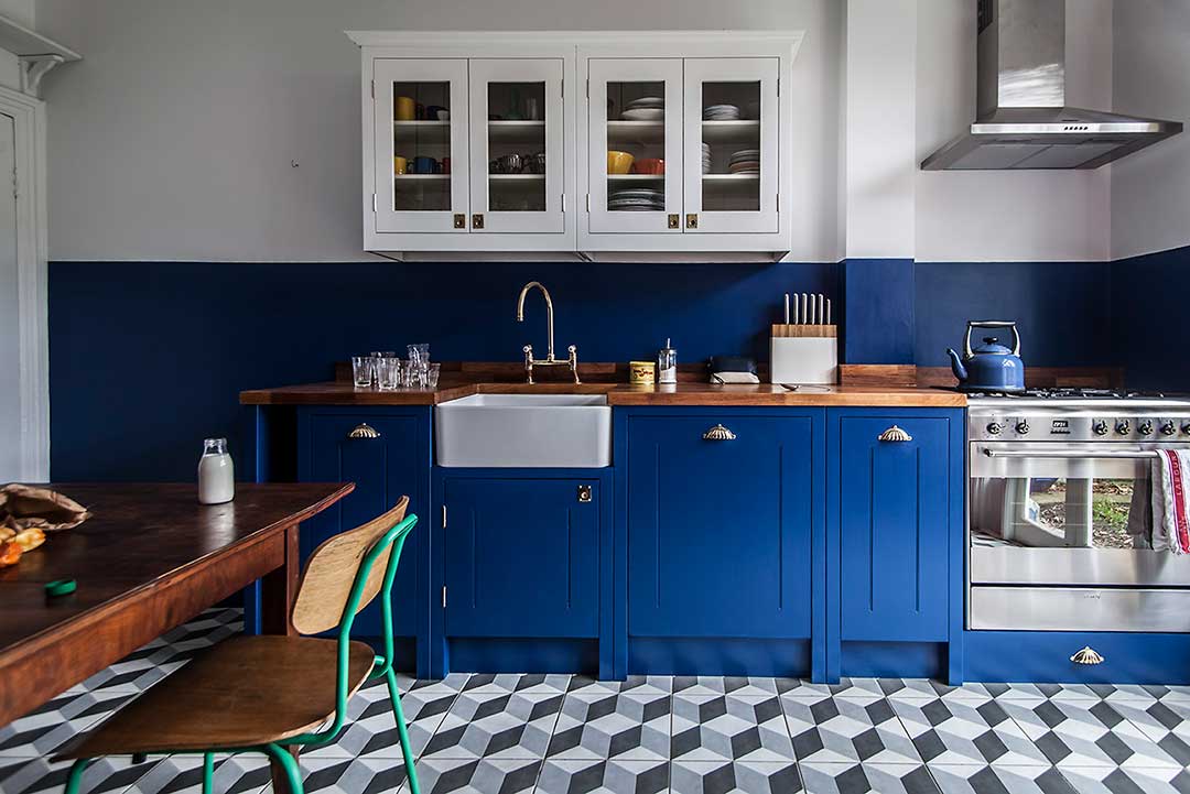
A simple but bold color scheme can elevate midcentury modern kitchen designs. This deep, bold blue color sits prominently on the cabinets and wraps around the wall behind. White windowed upper cabinets allow for the display of proudly collected kitchen items.
The green metal framing on this kitchen chair is a deliberate choice to break away from the blue-and-white color scheme. If you love the impact of bold color choices, some orange or yellow pieces could amp up the vibrancy in a kitchen like this.
32. Light blue and white
Light Blue and White Combo
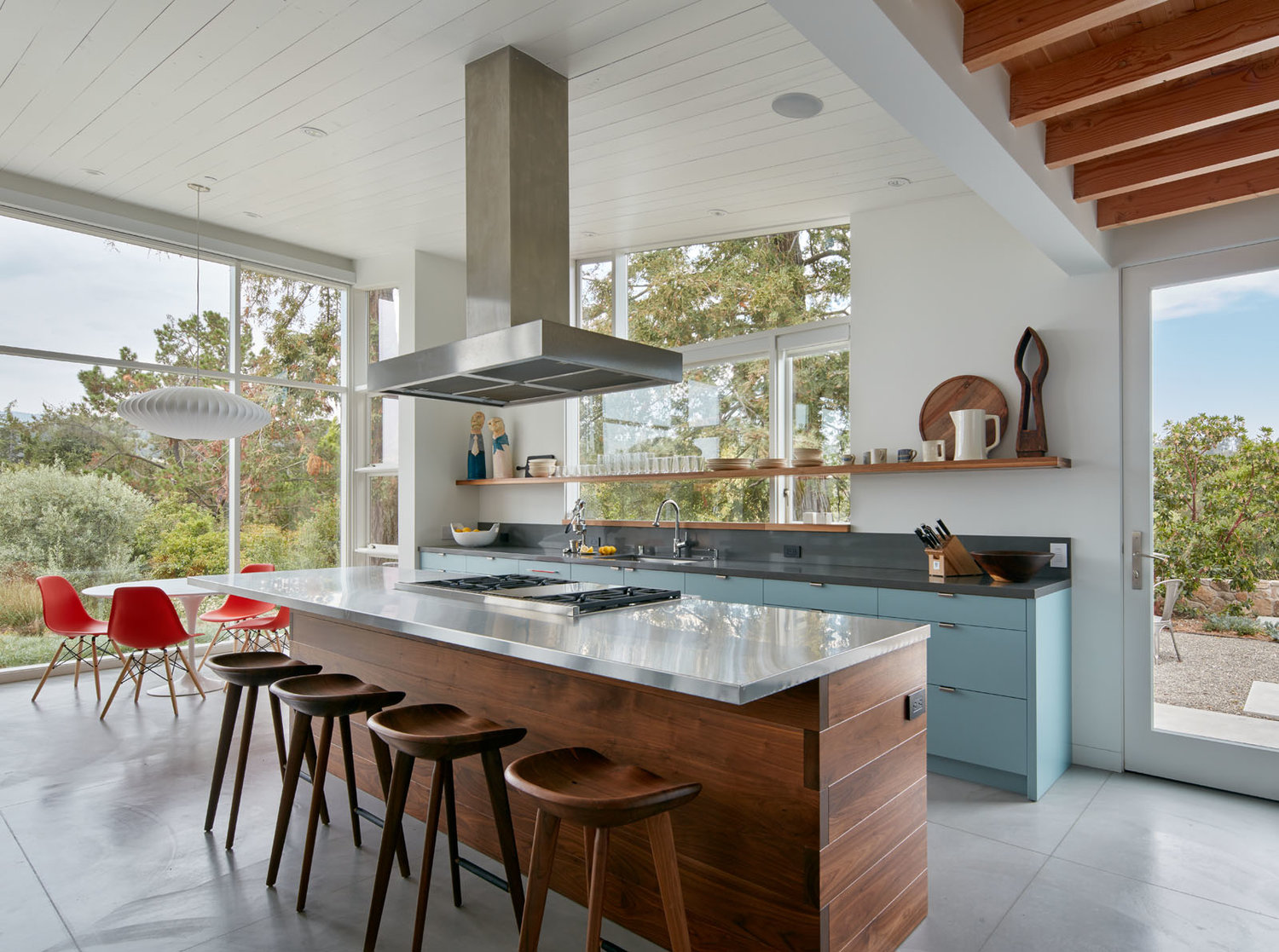
Do you love color but want to incorporate it in a more subtle way? This set of light blue cabinets with a slate grey countertop embraces the tenant of simplicity in midcentury modern kitchen design.
Red bucket chairs in the kitchen add another splash of color without overwhelming the overall aesthetic. Dark wood looks elegant in a space with lots of natural lighting.
33. A minimalist approach
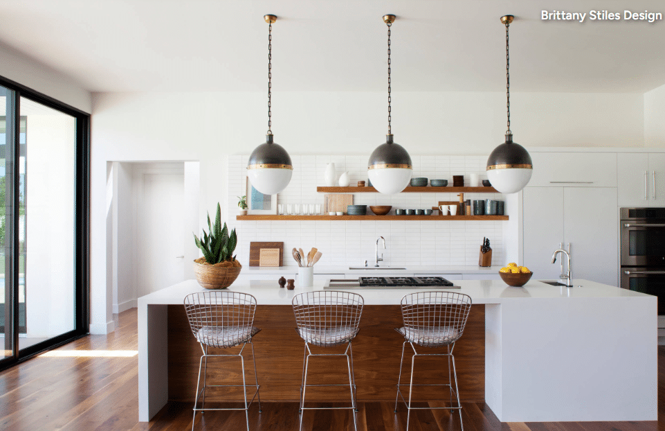
Minimalist Design
Here’s another example of the beauty of dark wood highlighted by lots of natural lighting in a mid-century modern kitchen. Large white cabinets and open shelving allow for plenty of storage space. By using such a minimal color palette, this kitchen design highlights mid-century light fixtures and metal barstools.
34. A maximalist approach
Maximalist Design Approach
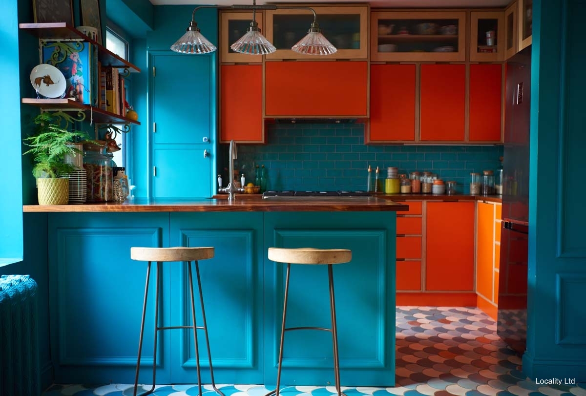
In a complete 180 from the previous mid-century modern kitchen design example, this design embraces color to its fullest extent. Teal dominates this design—even the radiator is painted teal. Because teal is the dominant color choice, orange cabinets stand out as the focal point.
When choosing bold, complementary colors like this, it’s important to decide which color you want to be the focus and which color you’d like to use as an accent.
35. Something in between minimalist and maximalist
Something in Between
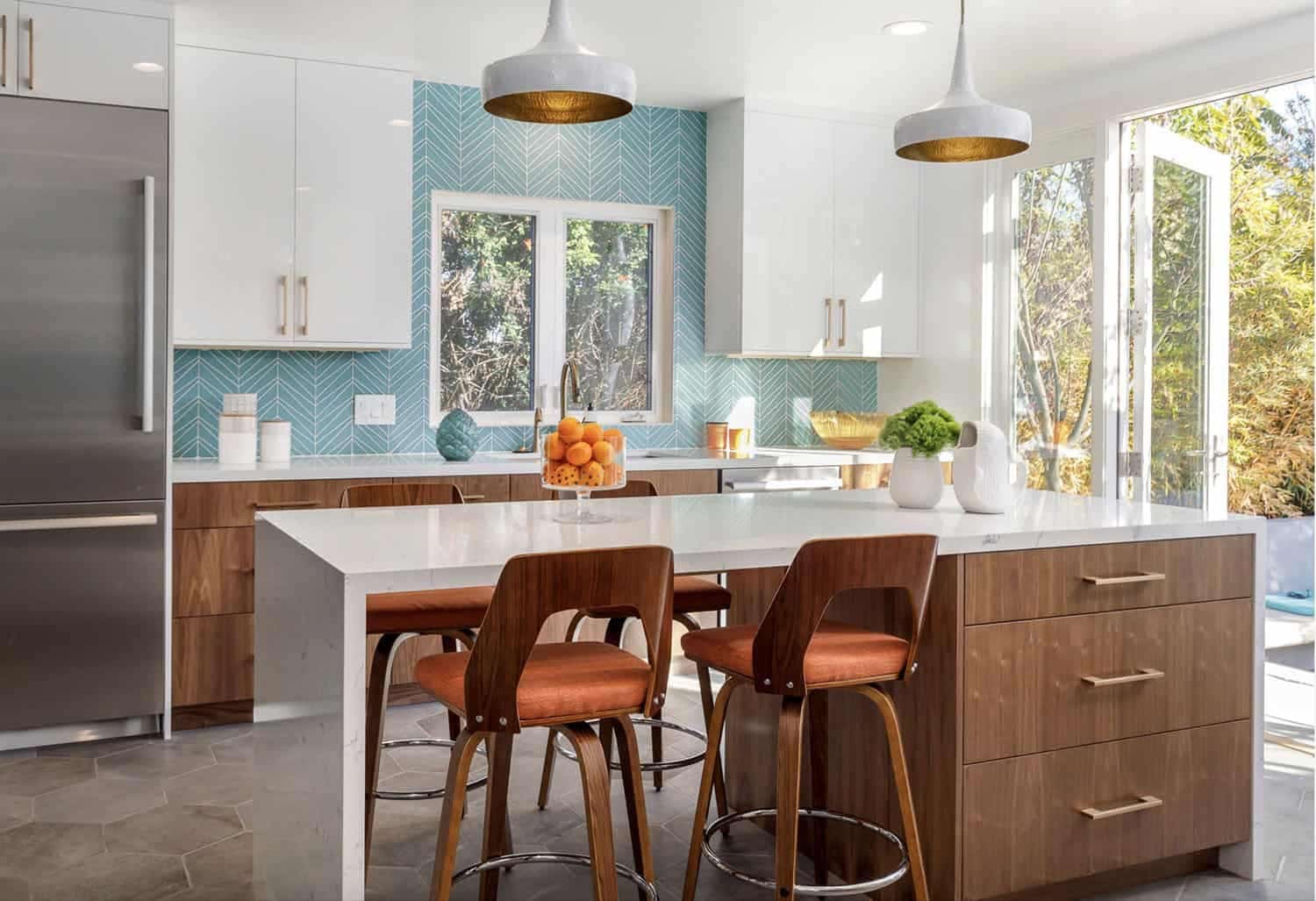
If you love color but don’t necessarily want bright orange cabinets in your mid-century modern kitchen, here’s a design that finds a nice middle ground between design ideas #12 and #13. This kitchen primarily uses white and dark wood design elements, adding orange and teal accents sparingly.
Large white upper cabinets and countertops contrast with large wooden drawers. Beauty and function are top priorities. Early mid-century designers would be proud.
Which of these midcentury modern kitchen ideas inspired you the most? Let us know in the comments. We’d love to help you achieve the mid-century modern kitchen of your dreams.
36. Incorporating antiques
Antiques For Farmhouse Kitchen
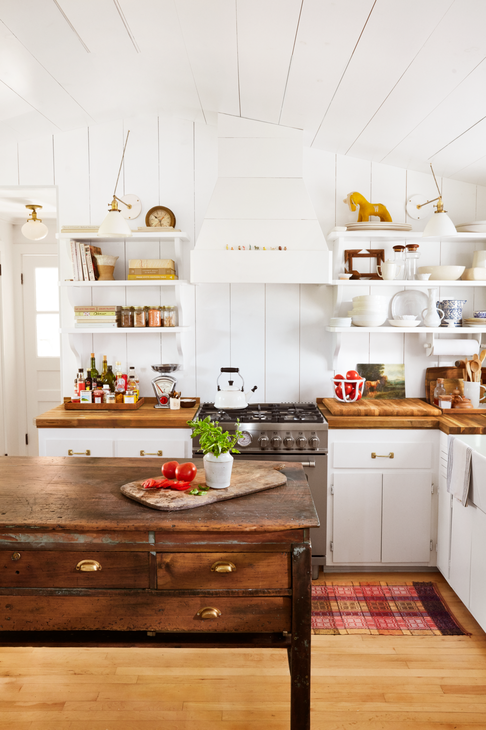
This stunning antique kitchen island probably once held great-grandpa Eugene’s long johns. Now, it serves as a beautiful reminder of the past, combined with modern-looking white cabinets and shelves. You don’t need to overwhelm the kitchen with antique pieces to achieve the modern farmhouse look.
37. Everyone Loves an Open Bar
Open Bar Kitchen Design
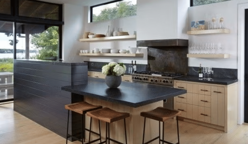
This kitchen has light wood floating shelves to display its solid collection of wine glass and a high-topped kitchen island/bar. I’ll take a tall glass of merlot, please.
White walls and light wood highlight the room’s natural lighting, while dark countertops and a black partition wall add a bit of moodiness. This color palette easily transitions from day to night.
38. Bold Patterns
Bold Patterns
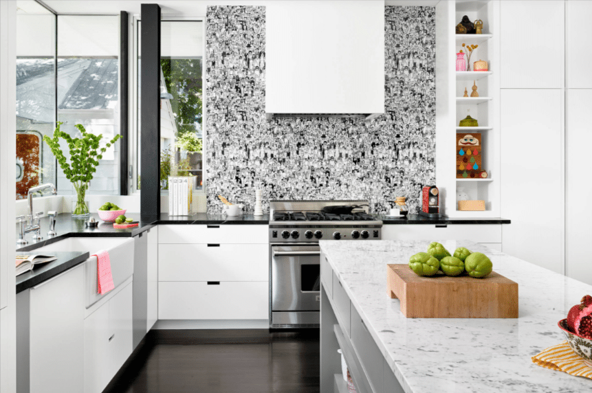
While modern kitchens are often characterized by simplicity, sprinkling in a few bold patterns can be a nice touch. Here, white cabinetry and shelving frame an intricately patterned tile backsplash. This designer also displays a collection of colorful items for a burst of energy in the room.
39. Modern Michelangelo
Michelangelo Inspired
During the Italian Renaissance, Michelangelo used marble slabs to carve ornate, lifelike statues. But in 2024? Maybe he would have used them as countertops or backsplashes in his home.
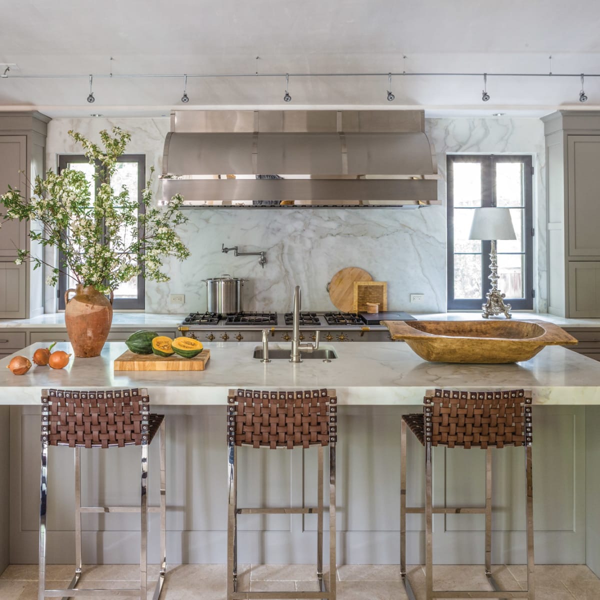
These marble accents are a statement piece in this Mediterranean kitchen. Woven-backed bar stools also feel Italian-inspired. This modern, elegant kitchen is a great inspiration source for someone who would love to incorporate some ornate features without decorating the room.
40. Deep Blue and Brown
Blue and Brown Colors
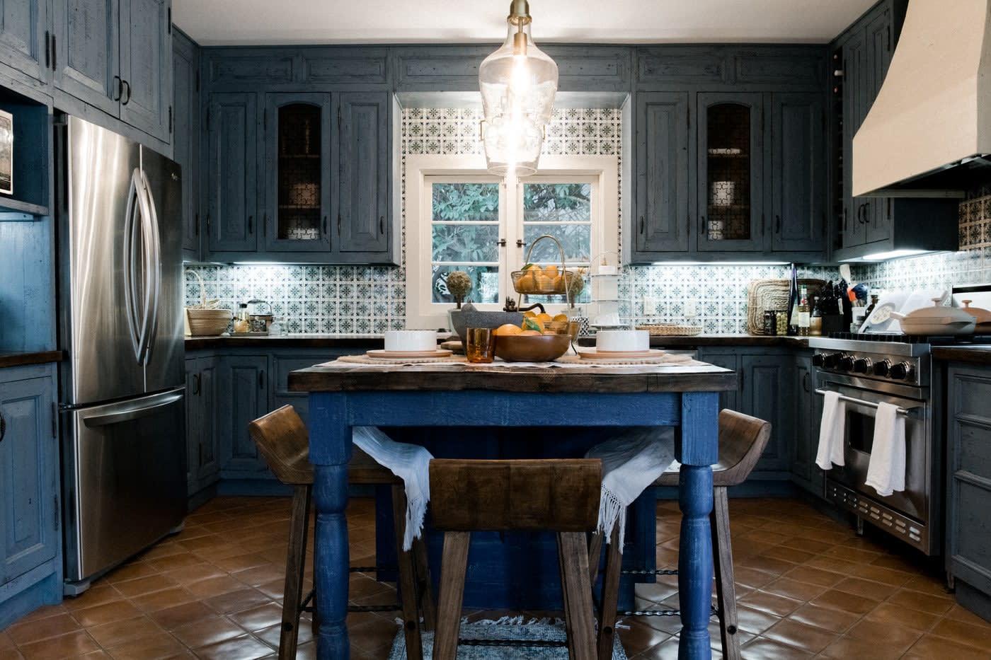
The deep blue and brown color scheme in this modern kitchen feels simultaneously warm and cool, earthy and seabound. A dichotomy of textures unifies this Mediterranean kitchen design with a bit of rustic charm.
Spanish-style tiles wrap around underneath slate-blue upper cabinets. Stainless steel appliances contrast against brown tile floors, and a large hanging lantern offsets minimal natural lighting.
41. Beyond the Blue Horizon
Beyond the Blue Horizon
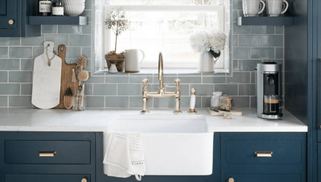
This beach-themed kitchen shows what you can do with shades of a single color. A light blue subway tile backsplash accents dark blue cabinets and floating shelves, and an even softer blue color decorates the kitchen island.
Hanging pendant globe lights are accented with gold and navy blue, giving the room the full blue spectrum. Sand-colored furniture pieces, like these cross-hatched kitchen stools, help to place this kitchen design on the beach.
42. White tiles and wood beams
White Tiles and Wooden Beams
Do you hear HGTV realtors gushing over these gorgeous white subway tiles in the background? This kitchen’s combination of dark wood and white cabinets embraces the concept of contrast.
Notice how the kitchen island allows bar stools to be tucked underneath. This allows for more kitchen space throughout the day when the stools aren’t being used. And, of course, no farmhouse kitchen would be complete without a kettle on the stove.
43. A farmhouse kitchen for the pottery fanatic
Pottery Fanatic Farmhouse Kitchen
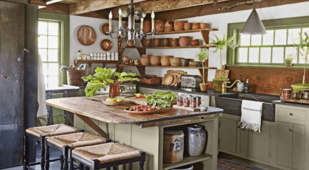
This kitchen’s open shelving units provide ample room to display all 30 pieces of clay pottery you own. Or, if you’re not a pottery fanatic, you could use it to store more practical kitchen appliances and cookware.
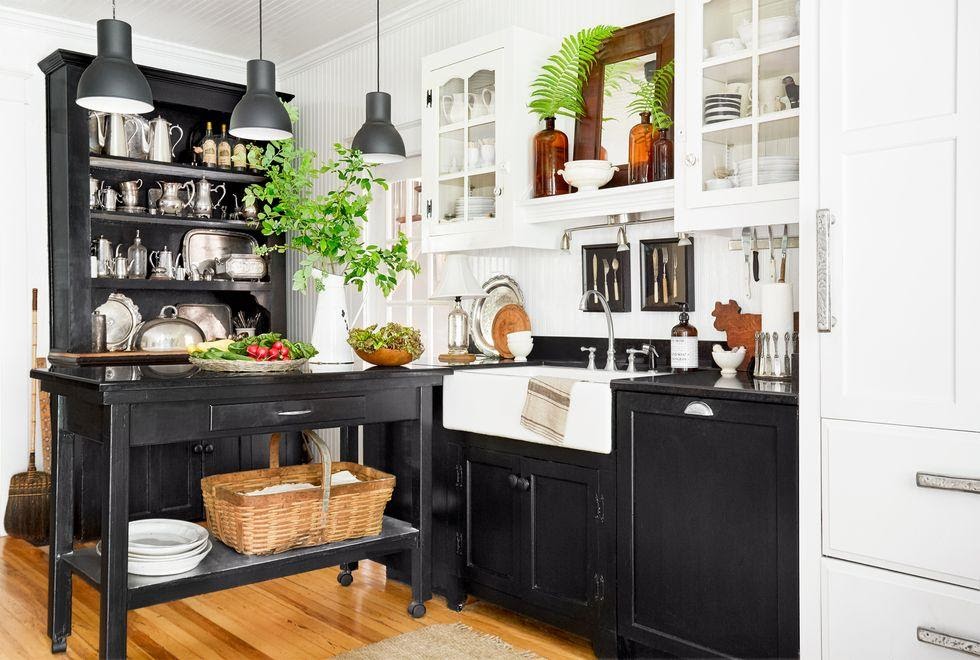
Green accents contrast nicely with wooden accents. This is a nice example of executing farmhouse design in a smaller space. Creating more storage throughout the kitchen using cabinets and shelving allows for plenty of prep space.
44. Feeling blue (part 1)
Blue Accents and Natural Textures
The next three examples demonstrate how the color blue can be incorporated into a modern farmhouse kitchen. If that’s not your thing, move on to number 6.
Okay, now that only the cool people are left, let’s look at this gorgeous example of using color accents in a farmhouse-inspired kitchen. This is another great example of maximizing a smaller space's value by incorporating storage creatively.
Open blue shelving above the sink adds aesthetic and utilitarian value. This kitchen embraces textures with a lovely combination of dark and light wood elements, a white subway tile backsplash, exposed brick, and industrial-looking bar stools.
45. Feeling blue (part 2)
Blue as the Focal Point
Quick! Grab an apron and chop the celery we grew in the garden. (This kitchen screams, “We grow our own vegetables,” right?)
Here, we shift to a completely different way to incorporate blue into a farmhouse kitchen design. You’ll notice that blue is not the accent color here. It is the focal point.
Baby blue cabinets and shelves amplify this modern interpretation of a farmhouse kitchen. White elements help highlight the natural light coming into the room.
46. Feeling blue (part 3)
Blue Wooden Floors
Have you ever considered blue wooden floors? I haven't, but now I am. Here, we do another full 180 to prove that there are several ways to incorporate the color blue into a modern farmhouse kitchen. This kitchen incorporates some elements of mid-century design.
Notice the style of the cabinets and stools on the kitchen island. With a large concentration of blue in the lower half of this image, the sheer magnitude and height of these gorgeous wood walls and ceilings are amplified.
47. Reclaimed wood
Reclaimed Wood Design Elements
This one might come to mind when you think of classic farmhouse kitchens. This kitchen fully embraces texture with the combination of a stainless steel oven and stove, reclaimed wood cabinet doors, and minimalist white shelves that seem to span the width of the kitchen.
While modernity improves the functionality of this kitchen, the vintage aesthetic dominates. This is a great example of how to embrace an antique look in 2024.
48. It’s not all black and white
Mostly Black and White Farmhouse Kitchen Design
…but mostly black and white. This is not only an interesting example of a modern farmhouse kitchen but also an interesting example of mixing black and white cabinets.
Mom told you always to match your tops and bottoms, but mom’s not here, so why not break the rules? The bold contrast of black lower cabinets and crisp white upper cabinets highlights the warm hardwood flooring and decorative greenery.
49. It’s not all black and white...because it’s grey and white
Grey and White Farmhouse Kitchen Design
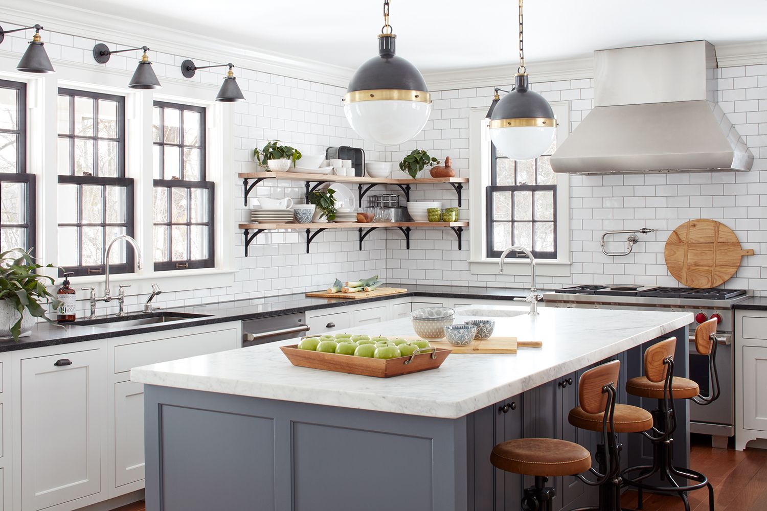
A cool grey base accents this marble-topped kitchen island. Dark grey hanging light fixtures pop against a white subway-tiled backdrop. This modern farmhouse kitchen also features industrial stainless steel appliances and fully embraces modernity while tipping its cap to more classically styled farmhouse kitchens.
50. Rustic to the max
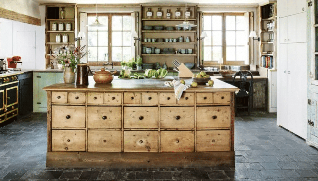
Rustic Farmhouse Kitchen Design To The Maximum
There is truly so much texture happening in this farmhouse-inspired kitchen. Even the ceiling beams have that intentionally worn-down look. This stunning center kitchen island appears to use some reclaimed wood, and its sheer amount of drawers would be a dream for a kitchen appliance packrat.
51. A thrifter’s paradise
Thrifty Farmhouse Kitchen Design
Are you the type of person who can’t get enough of flea markets and estate sales? This farmhouse kitchen design may be the perfect inspiration for you.
Open shelving perfectly displays an eclectic collection of kitchen decors. And can we talk about that oven sitting inside a stone-covered wall? This kitchen owner is living the colorful cottage dream!
52. Lemon yellow
Lemon Yellow Farmhouse Kitchen Design
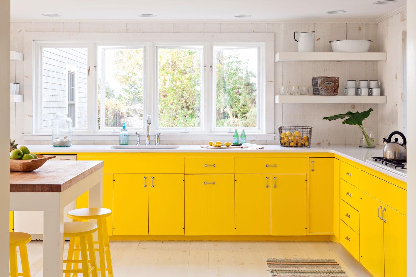
Yellow provides a burst of energy to any room. For the active home cook, a yellow kitchen could be the dream. Paired with off-white walls and shelves, these yellow cabinets bring the sunshine inside.
And, of course, this farmhouse-style kitchen has a kettle on the stove waiting for you.
Which of these farmhouse kitchen ideas inspired you the most? Did you love the blue hardwood floors, or are you more intrigued by a classic white look? Whether you love a modern farmhouse kitchen or are interested in a hybrid mid-century kitchen, there are plenty of ways to incorporate this design style into your home.
53. Simple Grey
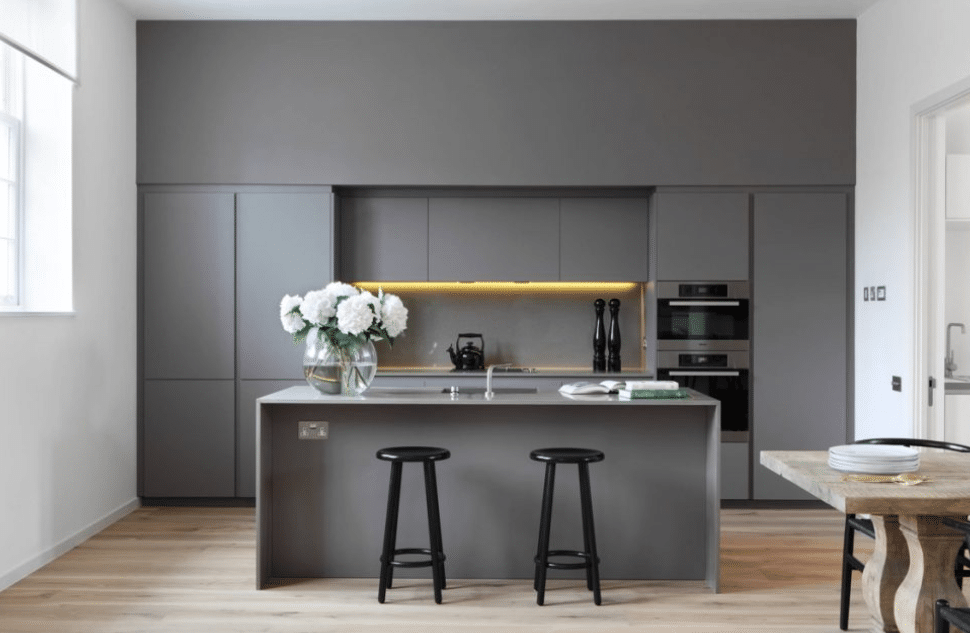
Simple Grey
In this example, simple, medium grey adorn the walls, cabinets, and kitchen island. This designer can unify the whole room by using the same shade of grey on multiple furniture pieces. Simple black barstools rest below the kitchen island, providing subtle contrast.
54. Oak and Slate Grey Kitchen
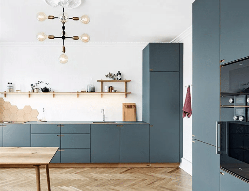
Oak and Slate Grey Kitchen
Oak and slate grey cabinets deviate from a traditionally more neutral modern kitchen color palette. This bold color choice emphasizes other modern elements in the room. Light wood floors and simple, open shelving give this kitchen a hint of humility.
White walls highlight the natural lighting. Choosing a bold accent color for your cabinetry can help your modern-inspired kitchen design stand out.
55. Expressive Dark Wood Cabinet Surface
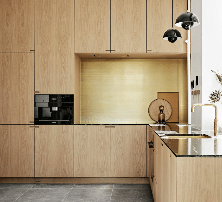
Expressive Dark Wood Cabinet Surface
Are you the type that cringes when someone paints over a perfectly good wood surface? We get it. Using large wood cabinetry in your modern kitchen design can emphasize your aesthetic preference for highlighting the beauty of natural materials.
56. Playing with Marble
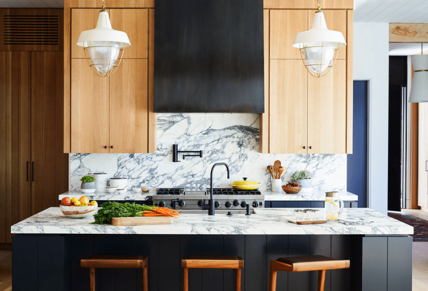
Kitchen Design with Marble Countertops
We all know the ever-popular tile backsplash, but what if it were marble? This modern kitchen uses the same thick marble slab for countertops, contrasting greatly with the black base of the kitchen island.
This interior design includes some tall wood upper cabinetry for even more contrast. A lot is happening here, but not so much that it’s overwhelming. This kitchen proves that simplicity does not have to equal minimalism.
57. Mixing and Matching
Mixing and Matching Textures
This kitchen is a masterclass of mixing and matching textures, design styles, and colors. A deep blue kitchen island stands as the focal point of this room.
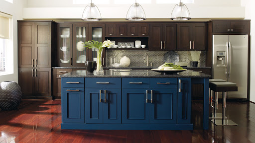
Cherry wood floors add another bold color to the room, but the red-tinted finish isn’t selected for the cabinets. Instead, dark wood cabinetry lines the back wall, featuring a reflective tile backsplash. People always say less is more, but what if more is more?
58. Keep it Simple
Simple Kitchen Design Featuring Natural Elements
If “simple” and “elegant” are your priorities when designing kitchen spaces, this example is for you. This interior designer picked a wood stain finish and stuck it across cabinetry, shelving, and the kitchen island.
Marble countertops accent both the back counter and kitchen island. A decorative hanging light fixture is this room's most complicated design piece.
59. Glossy White
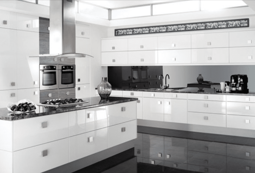
Glossy White Modern Kitchen
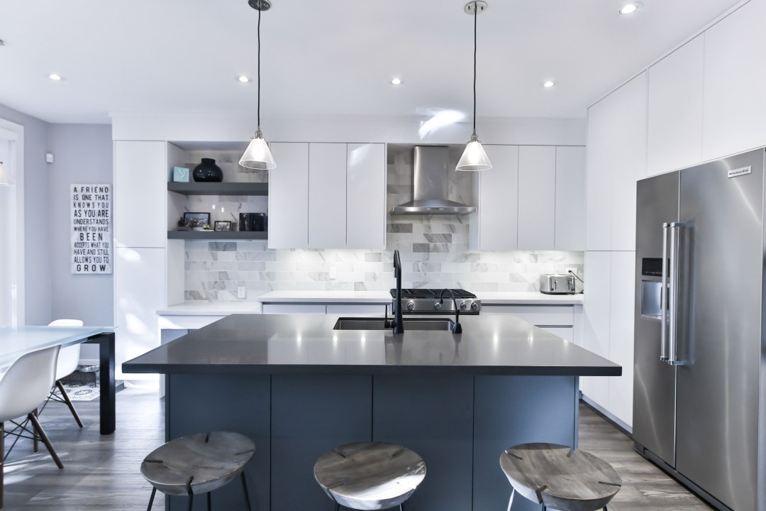
Glossy white cabinets adorn the walls of this modern-inspired kitchen. Simple pendant lights hang above the kitchen island, but the dominant light source for this gorgeous kitchen is a massive window. If you’re blessed with natural lighting, a super simple color palette like this will highlight your light source.
60. Semi-Industrial Kitchen Look
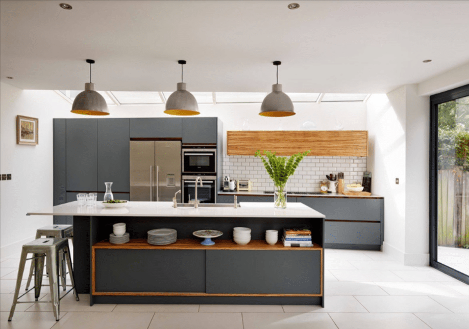
Semi-Industrial Kitchen Look
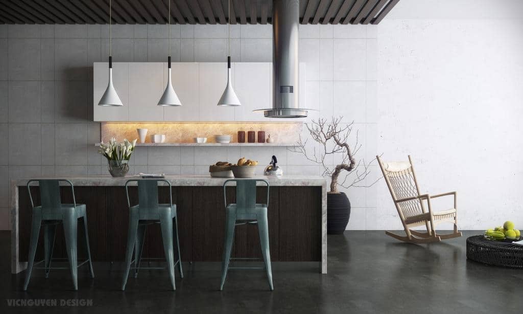
The clean lines of this kitchen emphasize cool design choices such as white subway tile and industrial bar stools. Grey cabinetry provides ample storage space, and three statement-piece pendant lights hang above a modular kitchen island.
This kitchen clearly draws inspiration from the past while maintaining a contemporary edge. Don’t forget the details—choosing a light fixture like these industrial lamps adds a lot of impact.
61. Tiny Details with Big Impact
Minimalist Kitchen
Modern kitchens use simple furniture and colors, so tiny details can pack a bigger punch than ornate design styles. An interesting pendant light or colorful barstool will stand out against more minimalist choices.
62. Wood Paneling, But Make it Fashion
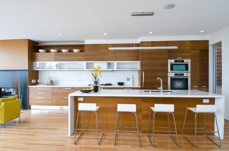
Fashionable Wood Paneling Design
Wood paneling isn’t just for the sides of old vans anymore. This sleek, wood-paneled kitchen island interior clearly proves that wood paneling can be modernized for chic kitchen designs. The open-concept floor plan in this home allows wood features to carry from one room to another.
If your home layout is like this, you might want to consider how to transition design elements into various rooms.
63. A Basket Full of Flowers
Basket of Sunflowers
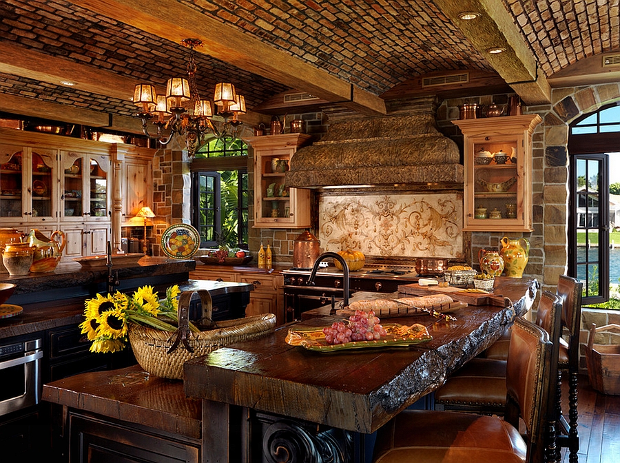
This basket of sunflowers resting on the kitchen counter seems to say, “Oh, nothing to see here. Just cut these fresh stems from my own beautiful, rolling hills.”
Everything about this Mediterranean-style kitchen is a humble brag, from the arched brick ceilings to thick wood slab countertops to the arched windows opened to a view of the private pond in the backyard.
Wood cabinets with glass panels display a set of collected wares. This kitchen embraces dark features and copper accents. A plethora of dark, earthy tones like this brings southern Europe to your home kitchen in Ohio.
64. Spanish Revival Style
Spanish Style
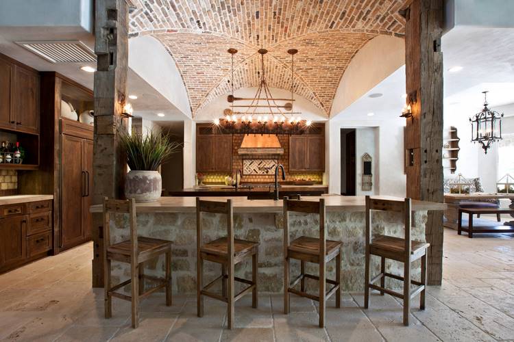
High ceilings and wooden beams set this kitchen up for a successful Spanish-style design. Old meets new in this elevated Mediterranean home. A high-topped kitchen island uses ashy wood with hand-carved details for an old-world look.
A wrought iron hanging light fixture feels almost Medieval. This open-concept kitchen blends into the dining room, which is decorated similarly to tie everything together.
65. Dark Neutrals
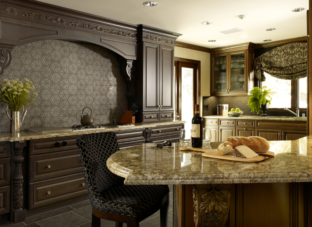
Dark Pieces
The juxtaposition of this kitchen with the last example proves just how broad the spectrum is for modern Mediterranean kitchen design. Ornate, dark-stained wood pieces frame this kitchen stove with granite countertops.
Large wood cabinets allow for plenty of storage space in this Mediterranean kitchen. A padded chair at the kitchen island adds to this Mediterranean kitchen design's cozy but elegant vibe.
66. Tiles Two Ways
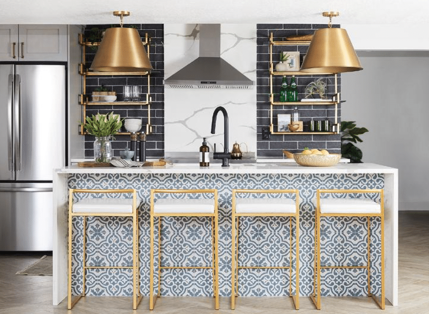
Tiles are popular in several modern design styles, so why not incorporate them in multiple ways? This kitchen uses black subway tiles as a wall backsplash and more ornate blue and white Mediterranean-inspired tiles on the interior of the kitchen island.
And while we’re at it, let’s talk about this kitchen island. This quartz-topped island with a waterfall edge looks absolutely stunning with the accent of gold bar stools. It is the epitome of Mediterranean design modernized for 2024.
67. Mediterranean Coastal Kitchen
Medi Coastal Design
This kitchen definitely feels like it sits on the coast of Greece. Open wood shelving highlights collected items.
In this case, the kitchen owner proudly displays ceramic goods and bottles of wine. You can’t get more Mediterranean than that. This interior design incorporates several hues of blue.
This room looks bright and exciting by displaying paintings across from a good natural light source.
68. Going Green
Go Green
While various colors and textures can be used when describing the Mediterranean style, green is unlikely to be at the top of my mind. However, this kitchen design proves that an unexpected color choice can be incorporated successfully in a Mediterranean home.
This dark wood kitchen island has less storage space than your average centerpiece, but that’s exactly what makes it stand out as a focal point of this room. A wrought iron hanging light fixture uses candles instead of lightbulbs—a heavy nod to the historical style of this room. Somehow, ornate vintage pieces pair well with stainless steel appliances.
69. Pour One Out for Dionysus
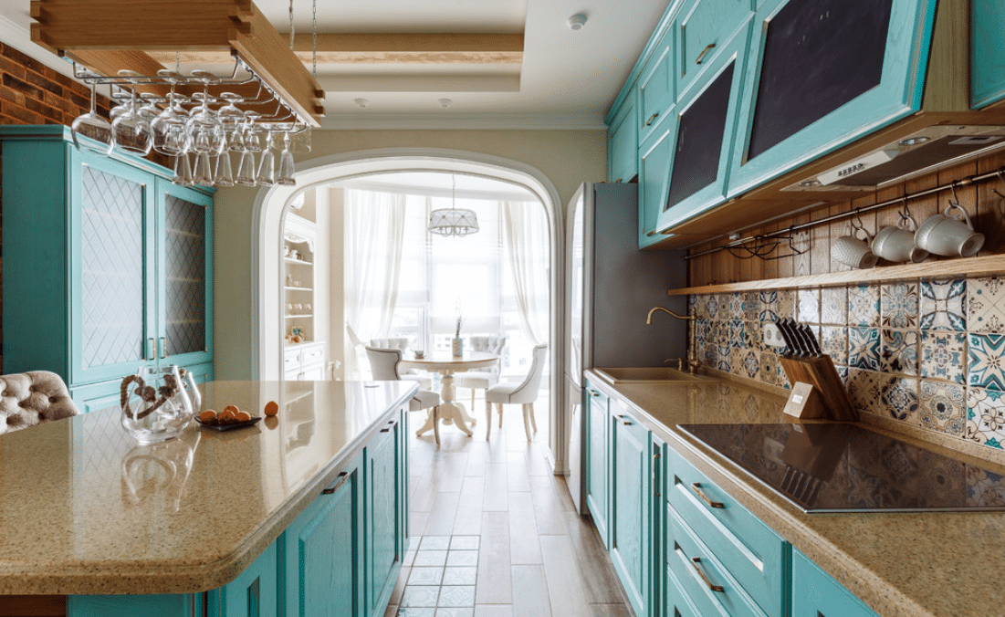
Hanging Wine Glass Holder
The Greek god of wine, Dionysus, would probably appreciate this hanging grate-turned-wine glass holder. But easy-access wine glasses aren’t the only thing that makes this kitchen distinctly Mediterranean.
This kitchen incorporates mismatched Spanish tiles to create an eccentric backsplash. Bright teal kitchen cabinets feel inspired by the North African side of the Mediterranean Sea. Aside from the bright accents of the kitchen cabinets, this kitchen utilizes a very Tuscan earth-tone color palette.
70. Textures Galore
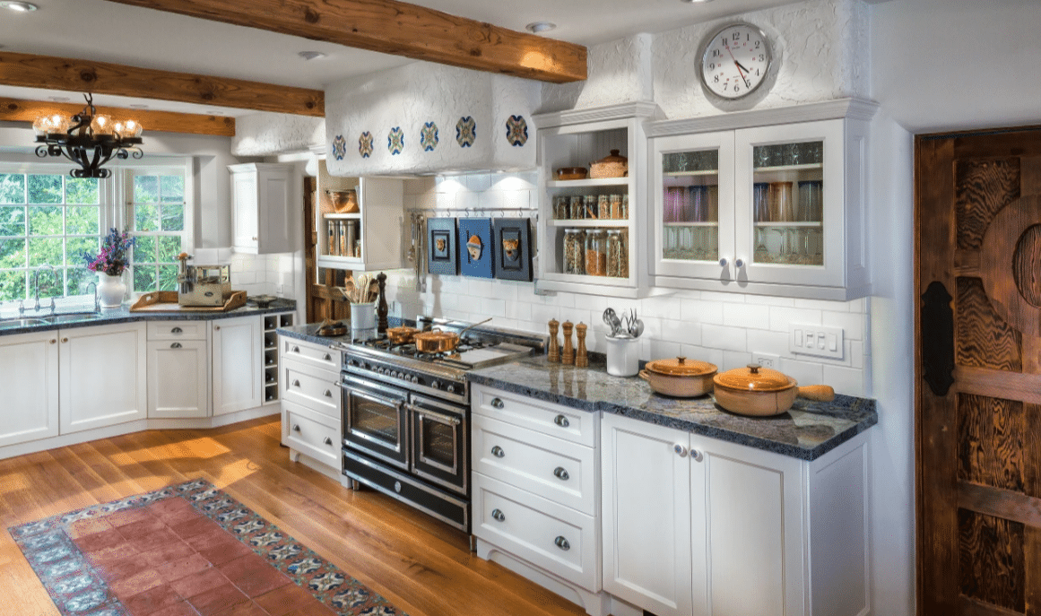
Mediterranean Textures
This Mediterranean-style kitchen (and likely the rest of this home) features every possible texture, including some. White cabinets with glass panels sit below stucco walls and ceilings, and white subway tile adorns the wall above the granite countertops.
These floors have hardwood and colorful tiles. It's one of those “I don’t know how it works, but it does” moments. Look no further if you’re looking for a Mediterranean kitchen with an eclectic flair.
71. Modern Kitchens Spanish Style
Modern Spanish Style
This kitchen feels modern at first glance, but its Mediterranean-style influences are apparent upon further inspection. White cabinets sit atop a thick wood countertop.
Patterned, decorative tile sits below an arch over the stove. Wrought iron details hold up open wood shelving. This is one of those kitchen designs that feels young and fresh while still maintaining an appreciation for history.
Did these Mediterranean kitchen ideas give you ideas for your next home design project? Let us know in the comments which Mediterranean kitchen image inspired you the most. We’d love to help you achieve the home of your dreams.
72. Textured Tile
Textured Tile
This gorgeous kitchen utilizes blue more subtly than several beach-themed kitchen designs. The simple patterned blue tiles along the back wall are a unique take on the ever-popular kitchen tile backsplash. Deliberately worn-down cabinets mimic the texture of driftwood washed ashore.
Glass windows in the cabinets on the left side of this kitchen show decorative coral pieces. Simple decorative items like these can add a beach theme to your kitchen without shouting it through a megaphone. Another standout feature of this kitchen is a large exposed wood kitchen island with plenty of room for those tall, beachy wicker barstools.
73. There’s a Mermaid in the House!
Aesthetic Art Piece
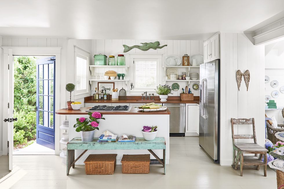
Do you see her? She’s floating above the kitchen sink! Paired with decorative ceramic plates and angel wings, this interior decorator seems to appreciate the value of a mounted art piece.
Mounting souvenirs from your beach vacations can be a great way to bring the ocean directly to your home. This kitchen also features white-painted wood walls, open white shelving, and contrasting dark wood countertops.
74. A Luxury Beach Resort at Home
Luxury Beach Resort at Home
Are you ever on vacation at a nice hotel, sipping coffee in the morning and thinking, “Wow, I wish I could make my home feel like this”? This kitchen example proves you can bring the best of the beach back home.
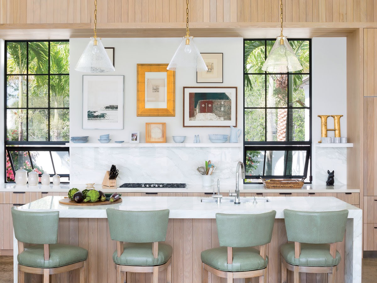
Of course, not all of us have the luxury of real palm fronds out our kitchen window. But this kitchen provides a coastal feel in various other ways, too. Natural wood paneling climbs the kitchen island.
A marble countertop and backsplash, as well as leather-upholstered bar stools, give this kitchen a real luxury resort feel. This kitchen also provides quite a few decorating ideas. High-quality ceramic goods displayed on floating shelves, a gallery wall, and cone-shaped light fixtures don’t necessarily scream “beach,” but they pair well with the luxury coastal aesthetic.
75. Marine Blue
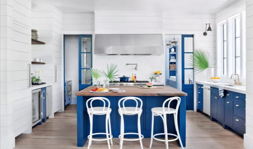
Marine Blue
This kitchen’s blue hue is reminiscent of the Finnish flag. The whole design has a Scandinavian flair. Marine blue cabinets and drawers contrast against a white kitchen backdrop.
A wood countertop accents this large kitchen island. Stainless steel appliances add yet another texture to this bold design concept. Starkly contrasted color palettes and textures can greatly impact your kitchen design.
76. Low Ceilings, High Hopes
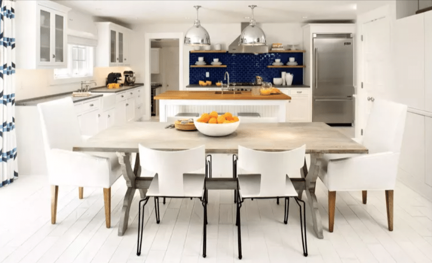
Low Ceilings, High Hopes
When looking online for coastal kitchen inspiration, it’s easy to spot homes with high ceilings and lots of square footage.
But not everyone is blessed with that kind of real estate. Never fear—making a gorgeous beach-inspired kitchen with lower ceilings is still possible.
This kitchen uses white cabinetry to brighten a room with limited natural lighting. A deep blue subway tile backsplash highlights wooden shelving. Pops of orange cookware (and a bowl of oranges) add some warm contrast.
77. Bagels by the Beach
Bagels by the Beach
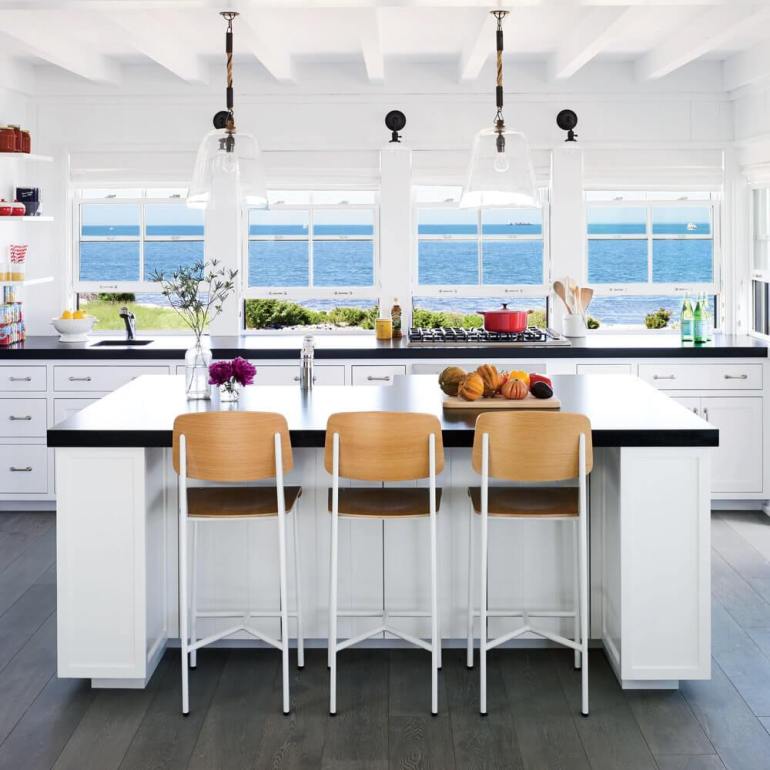
Maybe you have an ocean view like this in your kitchen, and I humbly ask, would you like a fun houseguest? I’m a decent cook. I’d love to make your bagels by the beach.
Even if this ocean view isn’t a part of your kitchen concept, a coastal feel can still be achieved using some of the design choices in this example. White cabinetry, white walls, and white ceilings all contribute to an overall lightness in this kitchen. Tall bar stools use a natural wood back, mimicking the color of sand.
If you don’t have access to the sea out your window, using colors like blue and green in some of your decorative pieces can help bring that missing view inside.
78. Vintage Vacay
Vintage Vacay
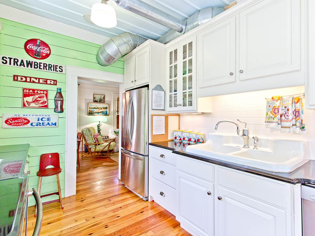
Vintage signs are the clear focal point of this beach-style kitchen. An old metal diner sign gives this kitchen a real seaside snack shack vibe. Contrasting colors allow these handpicked decorations to really stand out.
But this kitchen isn’t all vintage. New wood floors and a stainless steel fridge bring it into the 21st century. White cabinets look sleek against white subway tiles.
79. Luxury Lakehouse
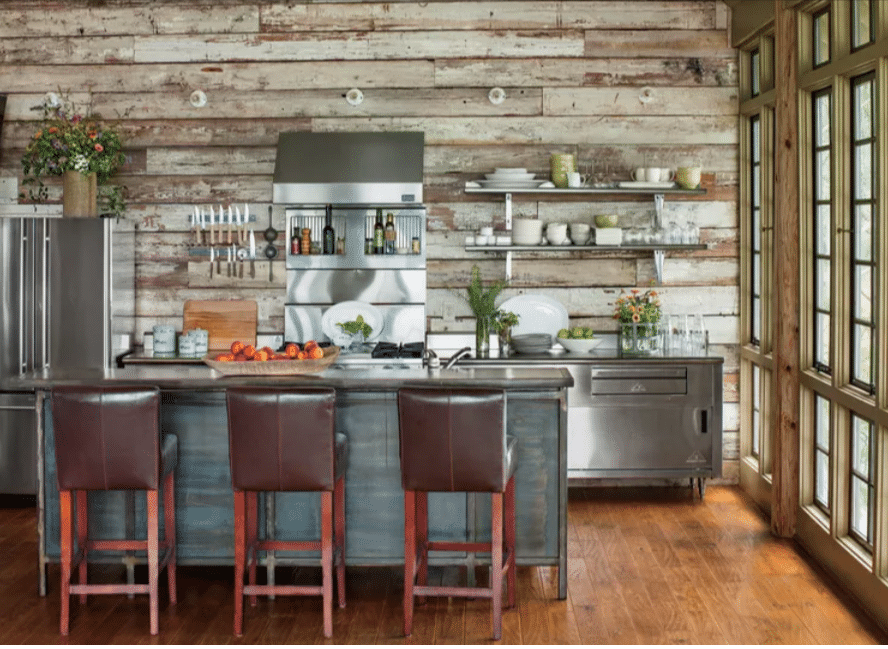
Luxury Lakehouse
This beach cottage kitchen reads a bit like a lakehouse. Whatever the body of water this kitchen borders, this design gives us many ideas. Stainless steel appliances contrast against the warm finish of hardwood floors.
An aged wood accent wall provides a rustic feel to a modern beach-style kitchen. Warm tones make this home feel cozy and lived-in. It’s easy to picture a family running inside to enjoy a glass of lemonade after a long afternoon swim.
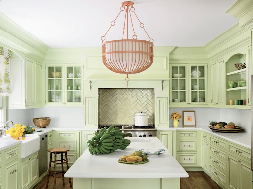
80. Light Green Dreams
Light Green Dreams
If you want your beach-style kitchen to stand out from the standard blue and white kitchen color palette, look no further than this tropical light green. This beach house kitchen definitely stands out from other ideas we’ve shared, and it’s certainly not for everyone.
But if you love to be the life of the party and your taste is a little bit quirky, embracing bold colors is a great way to bring personality to your beach house.
As evidenced by these beach house kitchen images, there are a million different ways to modernize your beach house in 2025. Whether you’re drawn more to a luxury beach house aesthetic or a rustic beach home look, we hope some of these kitchens inspire your next renovation project.
Updating your coastal kitchen with a bright blue kitchen island, stainless steel appliances, or tropical tiles could help bring the vacation to your doorstep. Which of these coastal kitchens inspired you the most? Let us know in the comments. We’d love to help make your beach-style kitchen dreams a reality.
81. Step into the bright white light
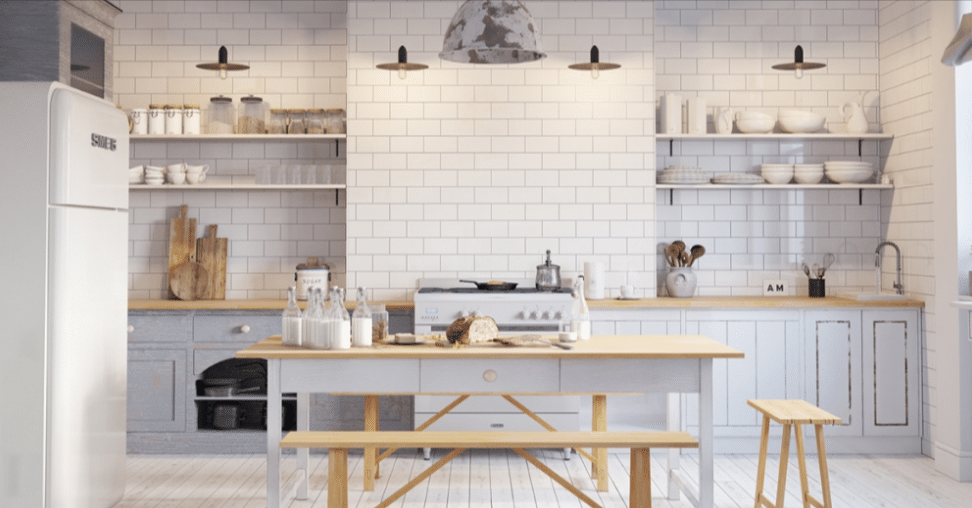
This kitchen screams Scandinavian—nay, it yodels. It is so Scandinavian that the designer chose to stage it with literal glass jars of milk. White features accentuate every corner of this Scandinavian kitchen design. A subway tile backsplash accentuates open shelving and light wood countertops.
82. One for the texture lover
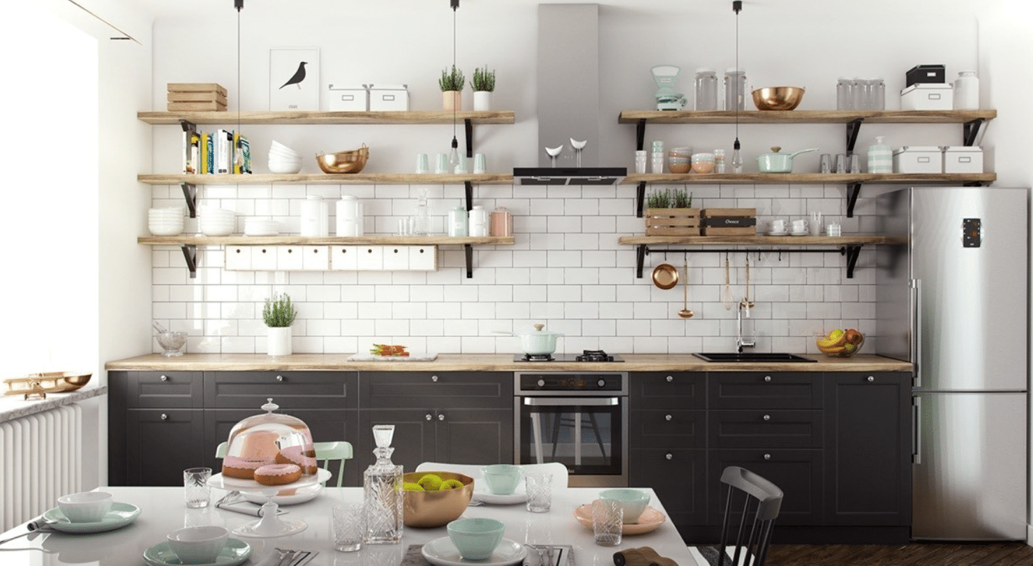
Scandinavian Balanced Kitchen Design
While this Scandinavian kitchen incorporates plenty of white, other colors and a variety of textures balance out the overall design. A stainless steel fridge contrasts with dark cabinets, white subway tiles, and open wood shelving. Scant mint green cookware feels accentuated in this otherwise neutral palette.
83. Back to Black White
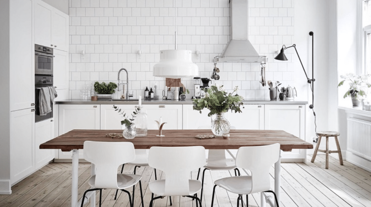
White and Neutral Scandinavian Kitchen
I told you there’d be many whites in these Scandinavian-style inspiration images. For a good reason, this majority-white color palette absolutely illuminates the room. A light wood flooring also brightens the room, while a darker wood kitchen table top provides some contrast. Large white kitchen cabinets provide a ton of storage space.
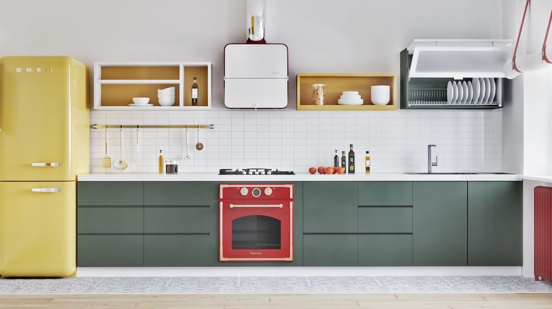
84. Yellow, Red, and Green
This Scandinavian kitchen incorporates a lot more color than previous examples, but it still maintains the simplicity of Scandinavian design. These green kitchen cabinets lack handles, which are uniquely Scandinavian.
Yellow and green “floating” cabinets sit atop that sweet white subway tile every kitchen designer seems to be loving these days. A vintage red oven is the focal point of this Scandinavian-style kitchen design.
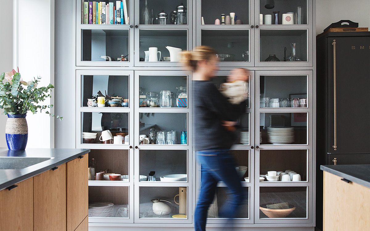
85. Everything on display
Full Wall Cabinet Feature
Usually, we pull interior design images that give you a view of the full kitchen, but the real superstar of this kitchen design is this full-wall cabinet. Do you ever find yourself in a hip cafe with a wall of mugs and plants and think, “Wow, imagine what I could do with all that storage?”
Well, take note of the Scandinavians and make it a reality. These floor-to-ceiling grey kitchen cabinets give you more storage space than you could dream of. The cabinets’ glass windows feature cookware as part of the design — not something to hide.
86. Stark contrast
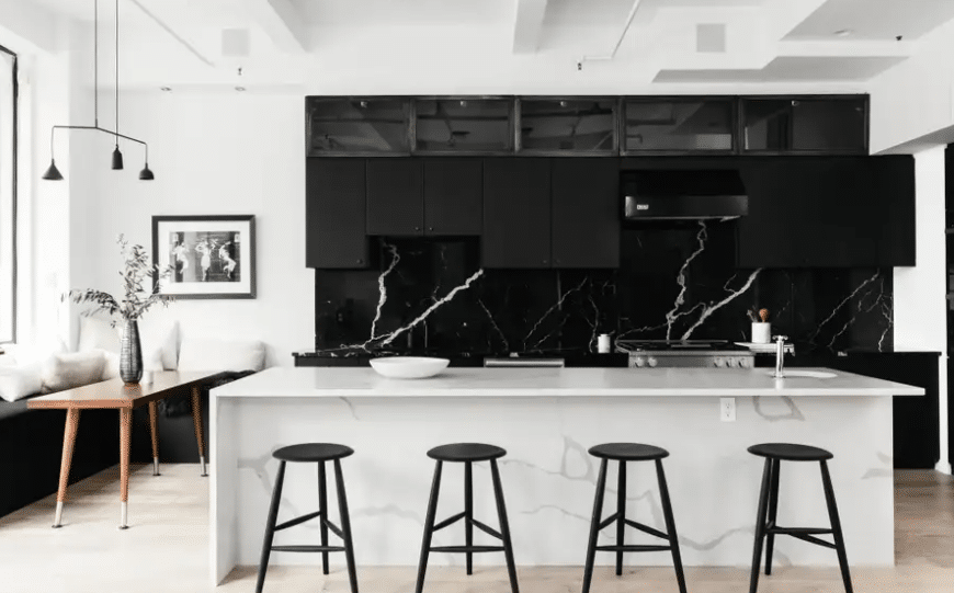
Are you also drooling over the comfy little breakfast nook tucked underneath that huge window in this image? Imagine sitting there for your morning coffee. The dream!
But that cozy corner isn’t the only thing this Scandinavian-style kitchen does well. The stark contrast of black and white gives this kitchen a real edge. A textured white kitchen island provides internal storage for black barstools when they’re not in use.
A similar texture in the reverse color scheme is used as a backsplash. If you’re hoping to design a kitchen with lots of impact, remember some Scandinavian-inspired kitchens like this one, which have bold color and texture choices.
87. Knock on Wood
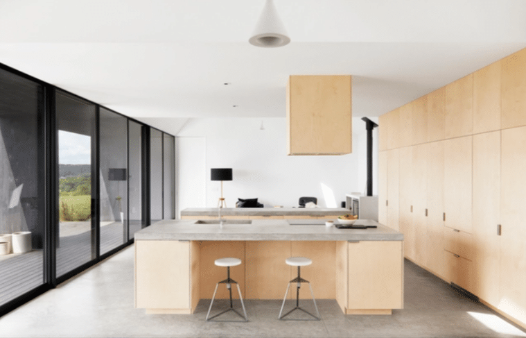
Simple Scandinavian Style Kitchen
Knock on wood, but don’t knock it until you try it. This prominent plywood Scandinavian-style design maximizes simplicity. This highly minimal approach isn’t for everyone.
But if function is your priority, you can’t get much more utilitarian than this. I would believe it if you told me this kitchen belonged to a successful tech startup CEO. It’s all about simplicity and functionality.
88. For the Eclectic Scandi
Deep Blue Scandinavian Kitchen Design
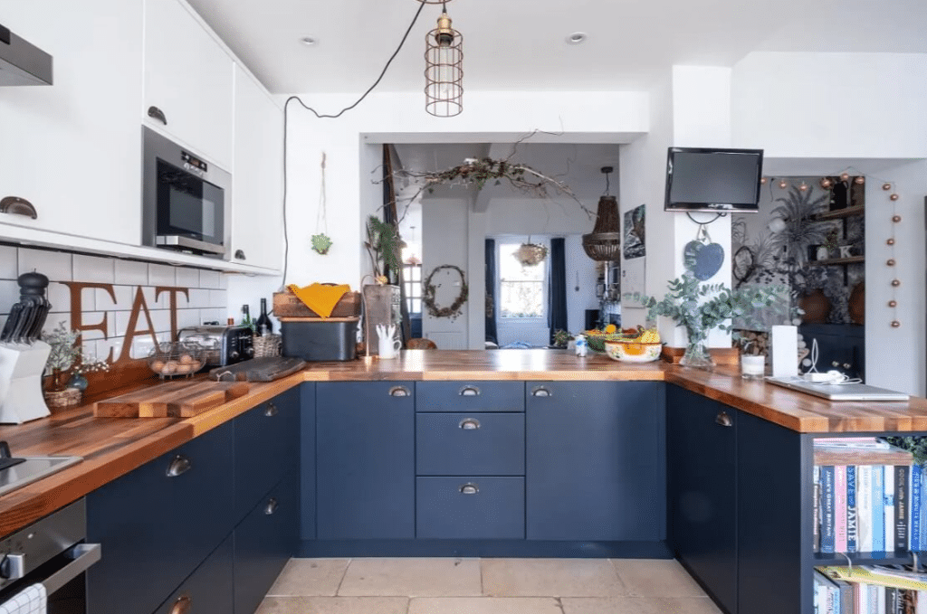
Many Scandinavian-inspired kitchens avoid color and decor like the plague, but not this one. A predominantly deep blue and white color palette tips its hat to simplicity while embracing a more lived-in feel. Thick wood countertops add a bit of warmth to the room, as do the several potted plants sprinkled throughout the foreground and background of this image.
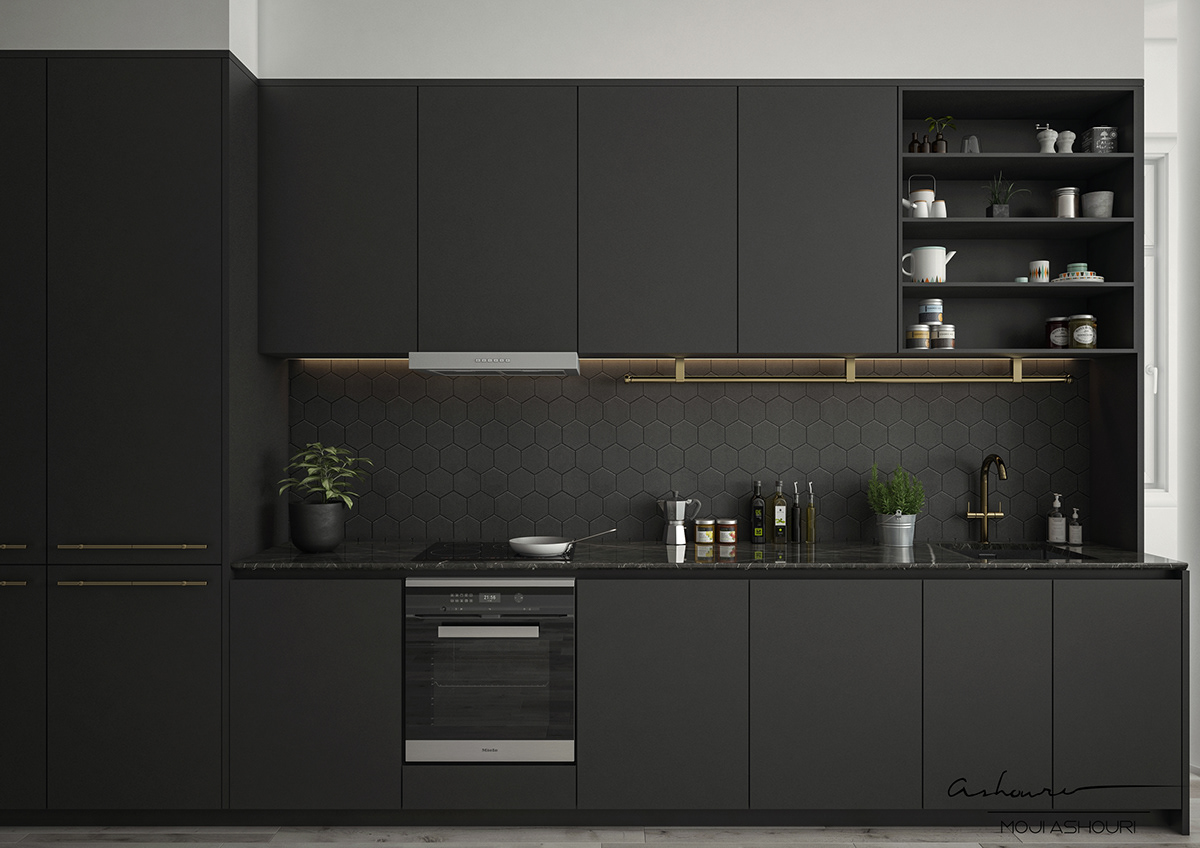
89. Black on Black on Black
If your goth friend from high school turned out to be a minimalist interior designer, this might be their kitchen. Solid black upper and lower cabinets blend into open black shelves and a geometric black tile backsplash in this Scandinavian-style kitchen.
You probably wouldn’t think twice if this kitchen were all white instead of all black, so why did this one stop you in your tracks? Well, using an unexpected color palette like this in any part of your home delivers a lot of impact. Can you imagine an all-black living room?
90. A more delicate approach
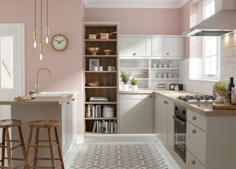
If that all-black kitchen design didn’t tickle your fancy, here’s something on the opposite end of the goth spectrum. Soft pink accent walls give this kitchen a delicate, warm feel.
The Scandinavian style is still present here, with a tall, exposed wood bookshelf turned kitchen appliance shelf. Industrial pendant lights hang above a simple kitchen island, and patterned tile floors add charm to this design.
91. For the Swedish Chef
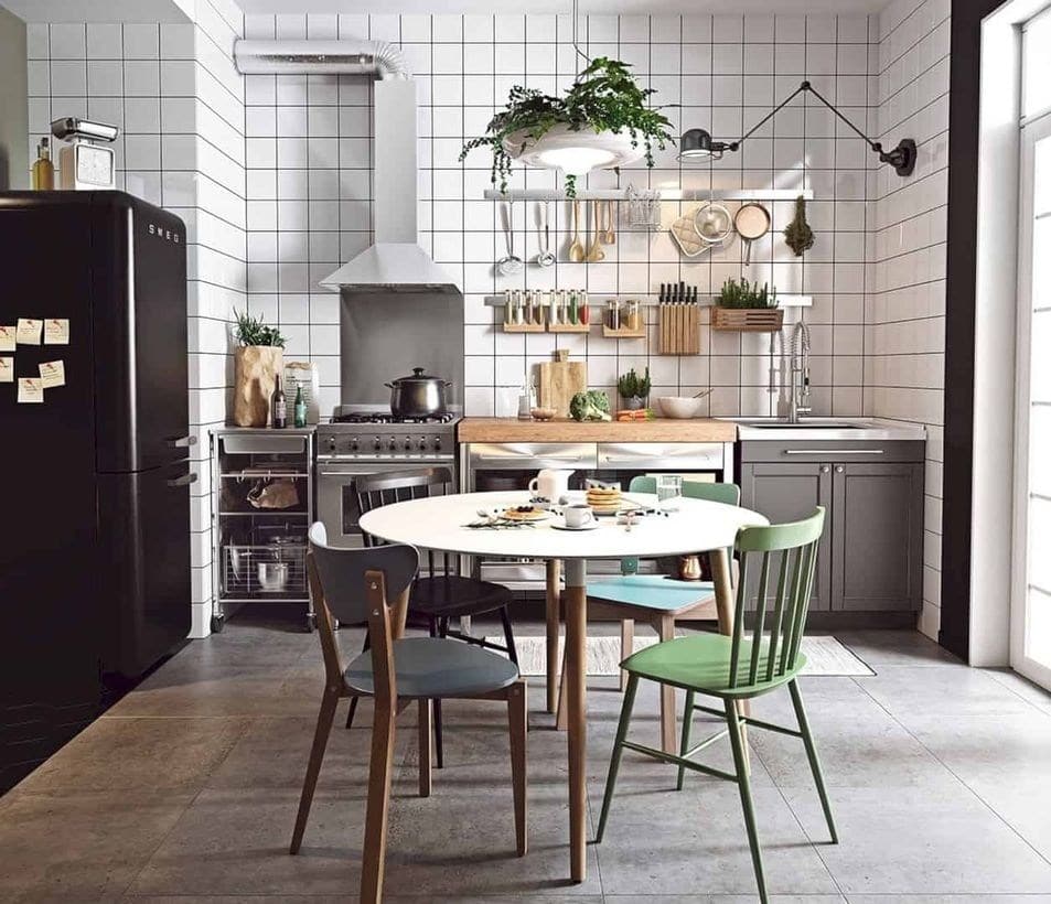
This final example incorporates a real hodgepodge of design elements from other styles to emphasize the simplicity of Scandinavian kitchens. Industrial appliances highlight the clean lines of floor-to-ceiling white tile.
An eclectic mix of farmhouse and midcentury chairs in various colors sit around a simple white table. This example proves that not all Scandinavian kitchens must be all white and minimalist. Instead, incorporating other inspiration sources can deliver a well-rounded design.
92. All White (and a tiny bit of green)
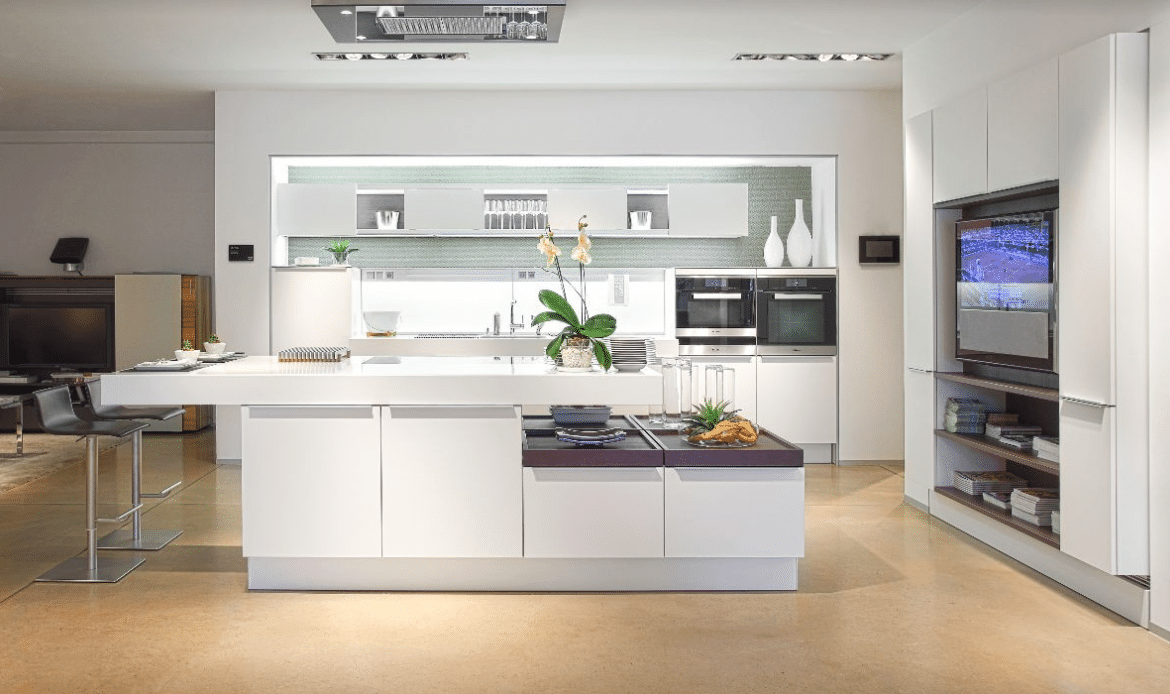
An all-white color palette harkens back to the Scandinavian design style. If you love this color scheme, you might want to consider a Scandinavian kitchen design. Go down the Google rabbit hole next.
These contemporary kitchen cabinets also borrow from the Scandinavian design aesthetic — a lack of knobs allows for a sleek, simple look. A light green tile backsplash brings a faint pop of color into this monochromatic kitchen.
And if you’re looking for a way to incorporate a flatscreen TV into your kitchen more elegantly than your average sports bar, this kitchen does it well.
93. Contemporary Condo Kitchen
Contemporary Condo Kitchen
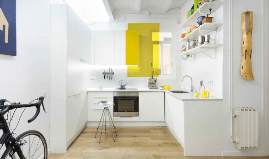
Some city dwellers have smaller spaces, and this contemporary kitchen design proves plenty of ways to make a small space look sharp and modern. White cabinetry wraps around this apartment kitchen, brightening up the room.
With limited space, white definitely helps your home look bigger. Open white shelving above the kitchen sink adds more storage space. Adding more storage vertically helps avoid adding clutter to your workspace.
94. Cool Tones
Cool Tones
When considering a neutral color palette, you likely think of warm beige hues. However, this kitchen proves that neutrals can also be done with cool tones. A blue, white, and grey color scheme unifies this modern kitchen design.
Pendant lights hang above a large blue kitchen island at the center of the room. It looks like this home uses an open-concept design plan, with the kitchen bleeding into the dining area. You can use darker tones more freely without fear of shrinkage when you have a large, open-concept space like this.
95. Eclectic Minimalism
Eclectic Minimalism
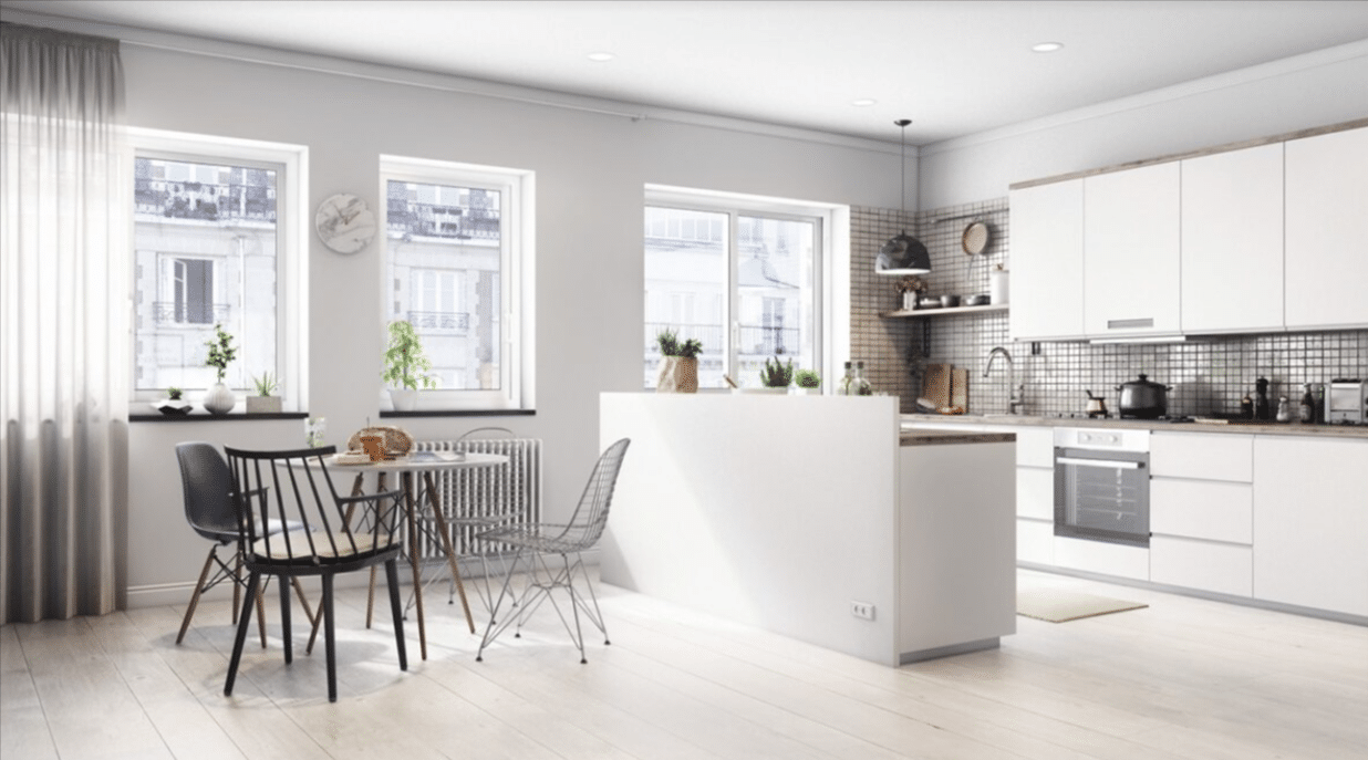
Modern kitchens often feel minimalist with solid-colored cabinets and walls. This kitchen design certainly incorporates some contemporary minimalist elements, but the homeowner also seems to have some eclectic taste.
The mismatched dining room furniture is a bit quirkier than expected from the average pared-down modernized kitchen. This kitchen’s tile backsplash also adds a bit of artistic flare, a reflective material instead of a solid white.
96. Everything in its Place
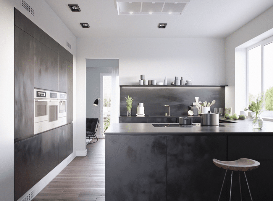
Everything in its Place
One trend we’ve noticed in contemporary kitchen designs is the tucking away of appliances. After all, the sleekest way to display an appliance is to display it at barely. Here, an industrial stainless steel oven seems to be a part of the side wall.
By the way, this is also a wall of cabinets. This storage illusion is an interesting way to create more space in your contemporary interior design. Also notable in this kitchen design is the textured grey used to add personality to an otherwise very modern kitchen.
97. Warm Tones
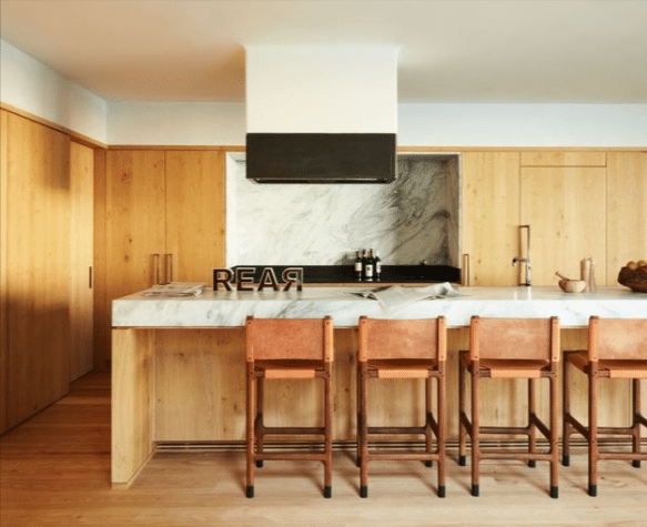
Warm Tones
Many modern kitchens we’ve seen use a cooler color scheme, so let’s look at how contemporary design can be achieved using warmer tones.
Massive wood cabinetry likely hides the kitchen appliances. Who needs a fridge, anyway?
Tall barstools with orange leather seats complement the warm yellow hue of the cabinetry and hardwood flooring. Marble countertops and a marble backsplash add an interesting textural change to the room.
And listen, I don’t know why letters spell the word “REAR” on the countertop, but I doubt that’s what will inspire you when designing your modern kitchens.
98. Customized Royal Blue Lower Cabinets
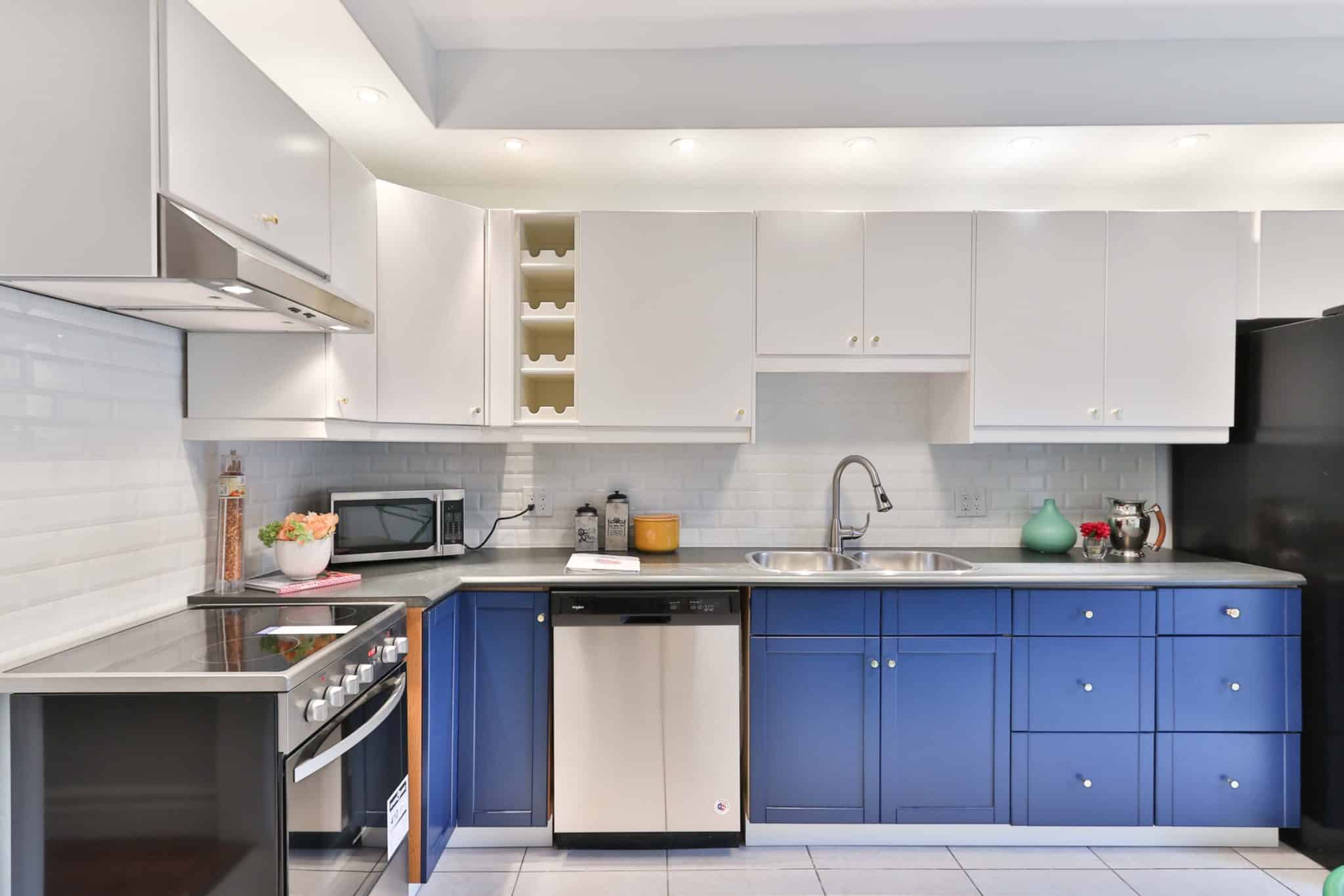
Customized Royal Blue Lower Cabinets
This contemporary kitchen design embraces the sleek simplicity of other modern kitchens but adds some bold flair. Royal blue lower cabinets and drawers stand out in a sea of greyscale and neutral-toned contemporary kitchens.
Using a bold color like this in your kitchen or dining room furniture will make your interior design stand out among minimalist concepts. White tiles and white upper cabinets also brighten up the space.
99. Clustered Light Fixture
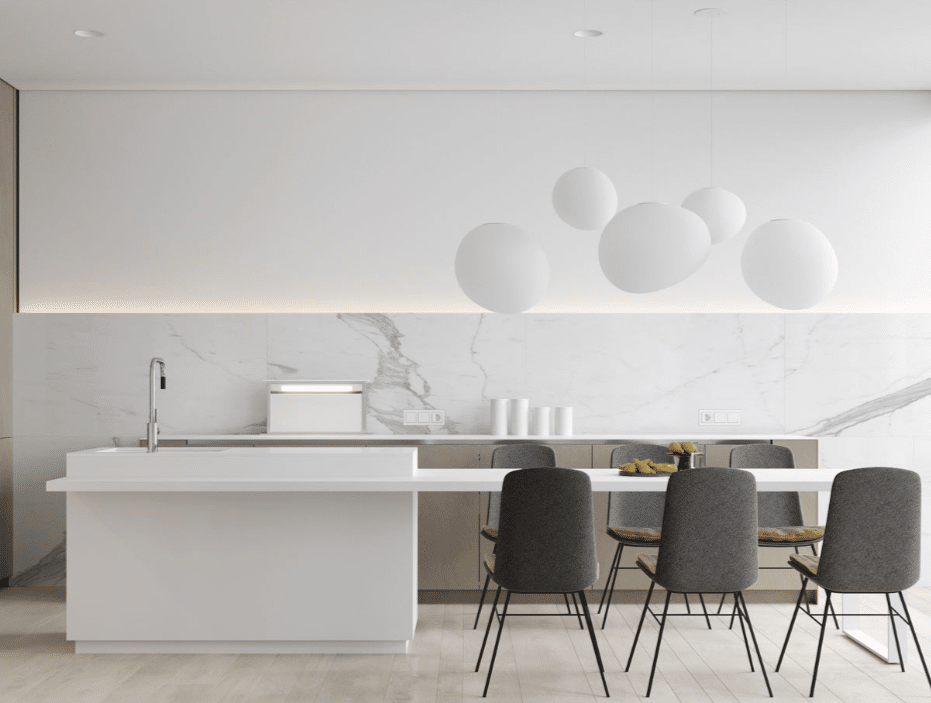
Clustered Light Fixture
The standout feature of this interior design is the clustered light fixture hanging above the kitchen island/kitchen table. The organic shape of these lights contrasts with the sharp lines of the walls and countertops.
A marble backsplash with grey accents pairs well with grey-backed chairs. This kitchen is minimalist but far from boring.
Which of these contemporary kitchen designs inspired you the most? Did you love the space grey cabinets, or are you a fan of the royal blue? Let us know in the comments. We’d love to help you turn your contemporary kitchen design dreams into a reality.
100. Champagne and Chandeliers
Champagne and Chandeliers
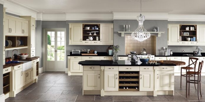
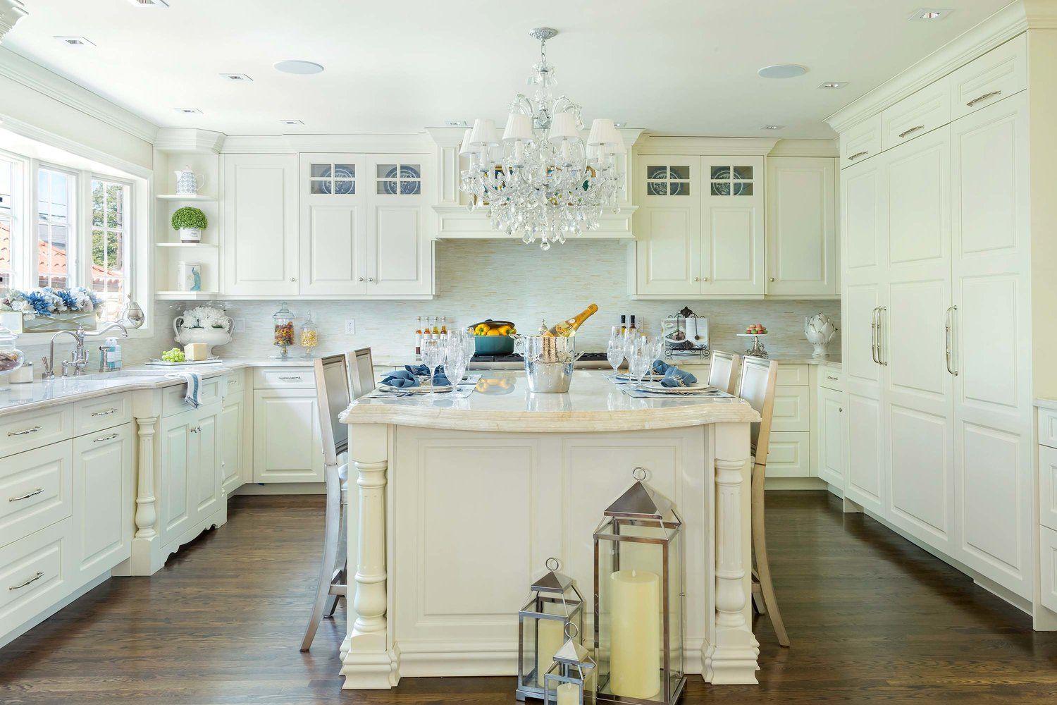
Nothing says fancy quite like a bottle of champagne chilling underneath an ornate chandelier. But this traditional-inspired kitchen isn’t unapproachably fancy.
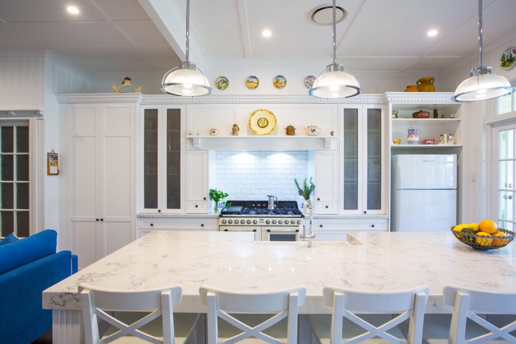
Cabinets in a warm creme color wrap around the entire kitchen, matching the kitchen island. Kitchen decoration can add personality to the traditional style, which is achieved in this image with the trio of lanterns sitting on hardwood floors.
101. Traditional Meets Farmhouse
Traditional Meets Farmhouse
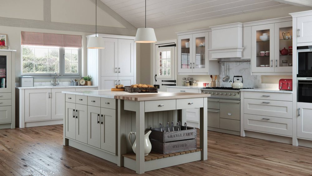
This example prominently displays traditional kitchen design elements. Kitchen cabinets, crown moldings, and a neutral color palette adorn the cabinets. Many of the countertops look to be marble, another staple of this design style.
However, this design offers farmhouse design elements in equal measure. Rustic wood floors and ceilings, a striped awning above the kitchen sink, and an upcycled farm crate add some country charm to this kitchen. If you’re a little bit country and fancy, this kitchen design is the way to go.
Built-In Wine Rack
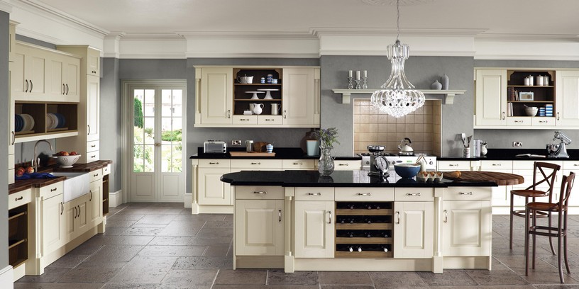
A wine rack built into the kitchen island? I’ll take two, please! Here is another example of a neutral palette used to achieve a traditional kitchen look.
Warm cream cabinets are accented with little decorative columns. Upper cabinets infuse some modernity with open shelving cubbies.
The tile backsplash above the stove is at once traditional and modern — modern in its placement but traditional in its color and texture. This design strikes a balance between new and old.
103. Black is the New Black
Black is the New Black
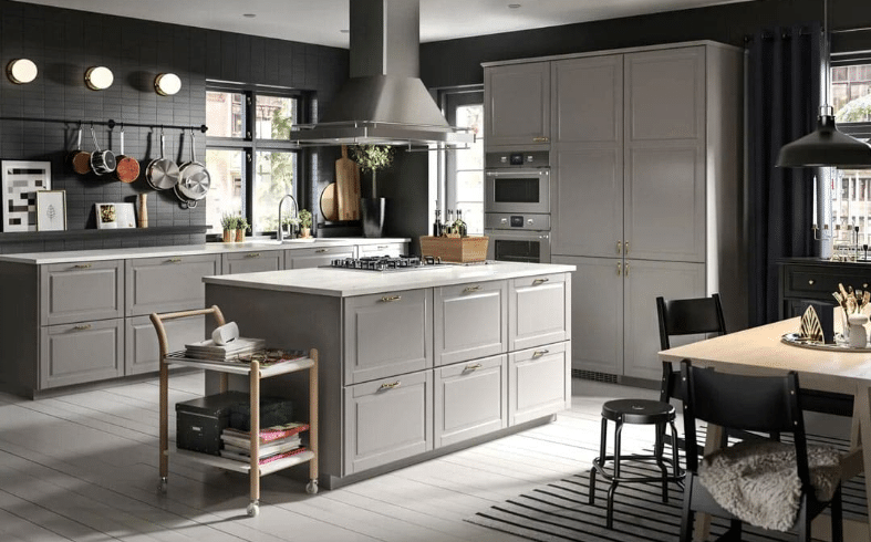
Here’s an example of modern dominating tradition. Black walls and stainless steel appliances don’t often find their way into traditional kitchens. However, traditional elements warm up this kitchen.
Decorated fronts and gold handles add aesthetic value to these warm grey cabinets. Though it’s unclear whether these countertops are marble or just solid white, a traditional marble white countertop in a design like this would add some personality.
104. Pink Walls & Pink Hydrangeas
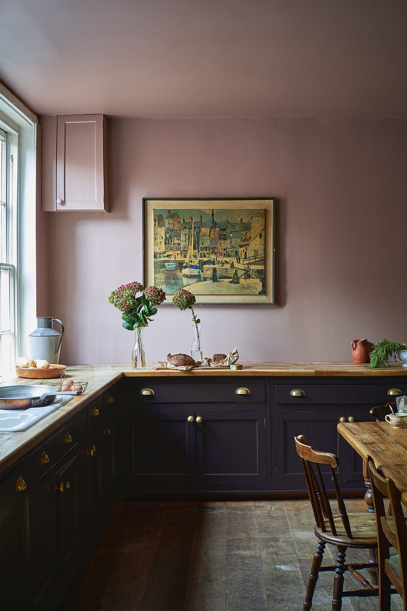
While traditional kitchen designs rarely stray from neutrals, a bolder color palette can definitely modernize the overall look. Here, pink walls and ceilings contrast with a deep blue set of lower cabinets.
Wooden countertops add a rustic element to this kitchen. Ornate accents, painted ceramics, and a vintage painting allude to the rich history from which the traditional kitchen style draws inspiration.
105. Classic Simplicity
Classic Simplicity
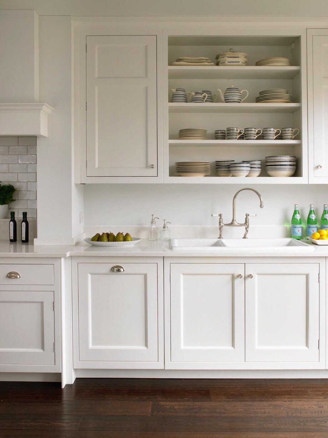
If you felt lost in the last two kitchen designs, no worries—we’re back to more traditional, neutral kitchen ideas (for now). This closeup shows how a warm cream color can be applied to the cabinets and walls for a unified look.
Here, we have another example of using a more modern open shelving unit to display cookware. This open shelving allows you to add some color without overwhelming your design.
106. Where’s the Fridge?
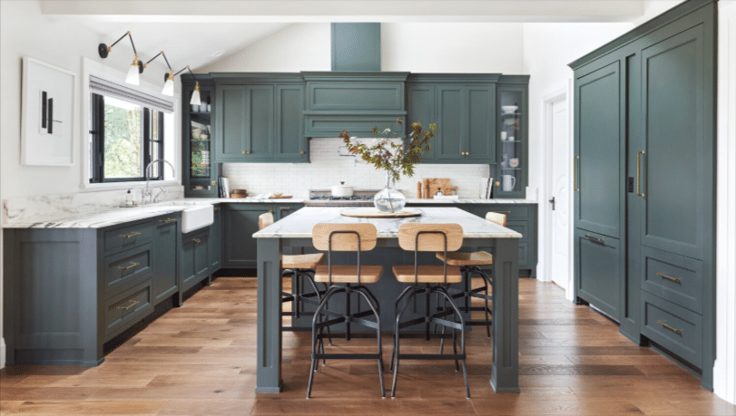
Hidden Fridge
No, but really. Where’s the fridge? It’s hiding behind this clever cabinetry designed to hide more modern-looking appliances. That’s one way to avoid incorporating other styles into your kitchen design—just hide the things that don’t match!
This kitchen uses gorgeous, large, traditional-style cabinets with crown molding and marble countertops. The deep green color deviates from the standard neutral tones of most traditional kitchen designs.
107. The “I Studied Abroad in Greece One Semester” Kitchen
Traditionally Inspired Kitchen Design
Have you ever wondered how to incorporate an interesting anecdote about your past into your interior design? Well, this kitchen somehow does just that. This traditionally inspired kitchen design screams, “I studied abroad in a Mediterranean country, and I have the ceramics to prove it.”
And you know what, kitchen? I’m not mad about it. The overall white color palette with ornamental embellishments and pops of bright blue feels like an oil painting of a small Greek village overlooking the sea.
108. Modern Versailles
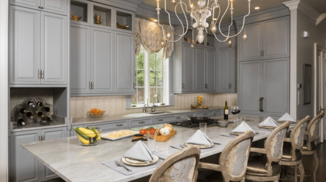
Modern Versailles
If Marie Antoinette opened a home in the Hamptons in 2024, this would be her kitchen. Tall blue-grey cabinets feature this kitchen's high ceilings, and a long, marble-topped island pairs well with its French aesthetic. These upholstered kitchen barstools are a great example of incorporating vintage elements into a modern kitchen design.
109. A King-Sized Kitchen Island
King Size Marble Kitchen Island
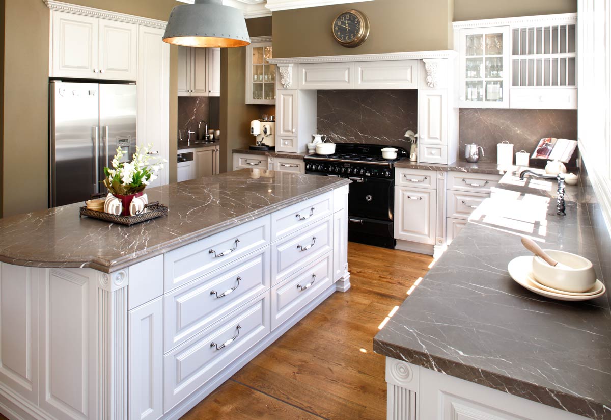
Just think of all the pots, pans, and cutting boards you could fit in this king-sized kitchen island. This marble-topped kitchen island is filled to the brim with drawers. But its beauty isn’t compromised by its functionality.
Ornamental elements adorn the edges of the island, the upper and lower cabinets, and the ventilation area above the stove. Some darker neutrals contrast nicely with the brighter white paint used on the cabinets in this kitchen. This kitchen proves you don’t need to choose extremes to create interest and impact.
110. Hanging Lanterns
Hanging Lanterns
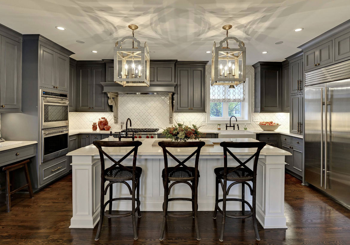
These aren’t your average kitchen pendant lights. These hanging lanterns are not an accent but a focal point. This traditional-inspired kitchen island provides room for tall wooden bar stools to be tucked away when not in use.
Grey cabinets decorated with crown moldings contrast with a large stainless steel fridge. This kitchen truly encompasses a mixture of modern and traditional features.
Which of these traditional design kitchen ideas inspired you the most? Let us know in the comments. We’d love to help you turn your ideas into reality.

