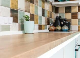
The kitchen remains one of the most sacred places in a home. It is where food is prepared and where family and friends gather to catch up and interact while sharing.
Many homeowners have paid close attention to their kitchen design. Yes, a few things will forever remain standard: comfort, good looks, and an efficient kitchen design.
However, you’d also want to be trend-led so that your kitchen design remains relevant to the current times. This means employing technology, being environmentally cautious, and focusing on sustainability. So which design encompasses all these?
Best Kitchen Designs and Remodeling Ideas For Every Home
Unlike cooking, there isn’t one recipe for a great kitchen design. In addition to the basics, your culinary workspace’s final look, feel, and technology entirely depend on what you want. This means you have total control over key areas such as the layout, tiling, cabinets, appliances, etc.
But where should you be paying the most attention to?
Looking at 2025 trends, for instance, most kitchen designs have focused greatly on storage space and sustainability.
Storage space has been a key focus area for homeowners with small kitchens. The idea is to move towards more concealed storage spaces that maximize the kitchen’s actual working space and make it more convenient to work in.
On the other hand, sustainability is more focused on using environmentally friendly, quality furniture and products in the kitchen.
So, how can you combine all these and many more with a personal touch to create an amazing kitchen design? Read on to find out.
1. Middle Compartment
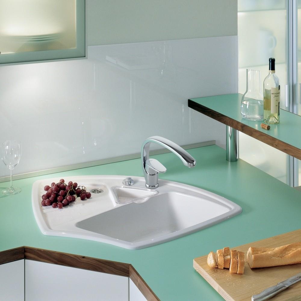
Speaking of storage, this sink offers space to store something between your washing basin and drainage basin. The entire sink is made of stainless steel, with two basins on the side and a compartment in the middle.
For instance, this compartment is big enough to store food as you wash it on either basin. This makes working in the kitchen much easier.
This sink design also blends well in a transitional-style kitchen, where the countertop is made of dark-tone marble and the cabinets are dark brown with stainless steel handles.
Conveniently, the middle compartment also features a drainage plug, which means that you can easily convert it from storage into a usable sink basin when you have a few more dishes to wash.
2. Open Shelving
Despite looking good on the magazines, open shelving is not the go-to for many homeowners. The main reason for this is that open shelving requires a matching set of appliances and kitchenware to fully blend in with the rest of the kitchen.
But is that entirely the case?
Having the right kind of shelves and good organization is what makes this cabinet design tick.
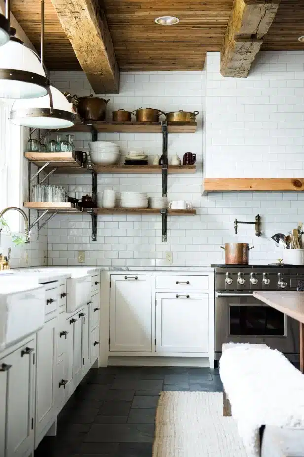
For instance, open shelving is great for smaller kitchens where an airy, roomy feeling is paramount. They introduce light and add an airy feel to the kitchen, which creates the illusion of space.
More importantly, open shelving is efficient. There are no doors to obstruct you while moving around in the kitchen, which increases your working space. Moreover, everything on the shelves is easily accessible.
Yes, you still have to be thoughtful about what you put on the shelves. Mismatched appliances can damage the overall aesthetics, making the entire design a disaster.
The use of oak wood for cabinetry is slowly creeping back into the bathroom and kitchen. In most cases, this design incorporates either driftwood or cerused finish.
But where did this design originally come from?
The use of oak wood for cabinetry dates back to the ‘70s and early ‘90s. These cabinets were common in a honey spice stain and were a mainstay in many kitchens. However, the 2000s saw other materials, such as cherry and maple, become more popular than oak wood.
And even now, options such as painted MDF and wood veneer are the most popular.
So why use oak wood?
Given their vintage heritage, oak wood cabinets add a nice vintage touch to your cabinetry. This makes them the perfect choice for a retro-style kitchen. These cabinets add dimension, color, and texture to your kitchen, with a final touch of soft luxury that makes the kitchen look splendid.
4. Transitional Styling
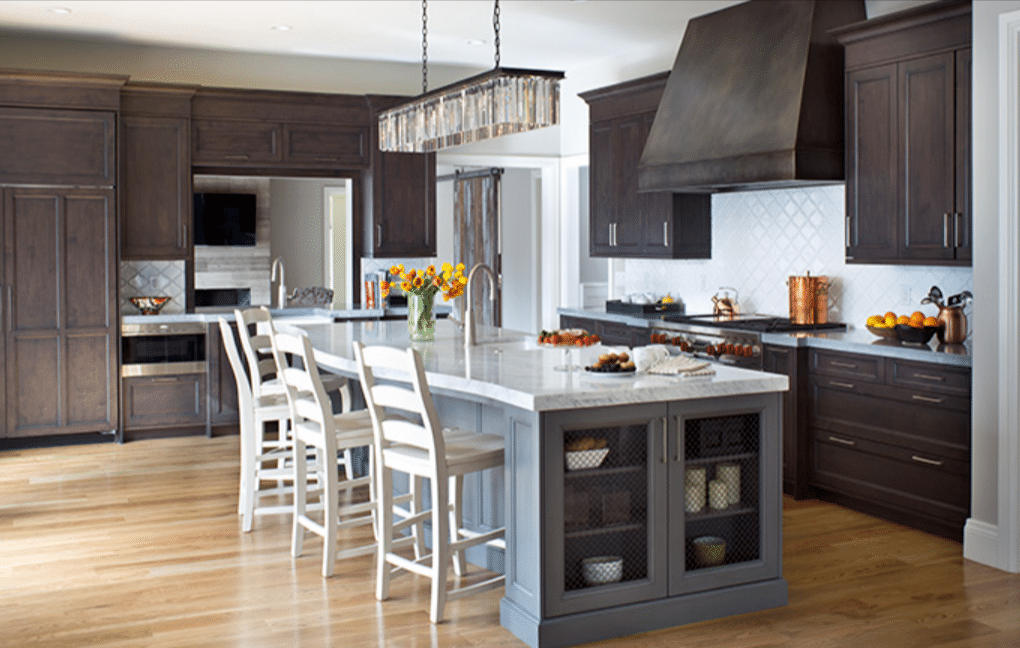
Transitional styling involves adding contemporary design elements to a traditional design without losing its traditional authenticity. This design suits anyone who loves modern minimalism but still craves the nostalgia of traditional design.
For instance, you can combine natural stones or stone-like tiles with white walls or matchwood wainscoting with modern glass or leather furniture.
So, how far can I take this?
Well, that depends on the degree of blend you desire. Transitional styling can either be subtle or dramatic. For example, you can incorporate European-style cabinetry with ornate architectural detailing on the ceiling and walls of a pre-war building for a more dramatic style.
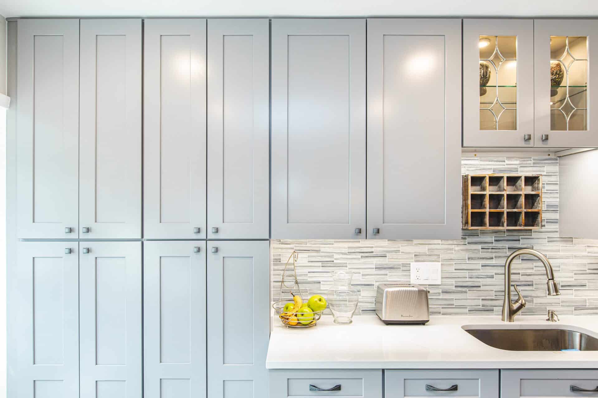
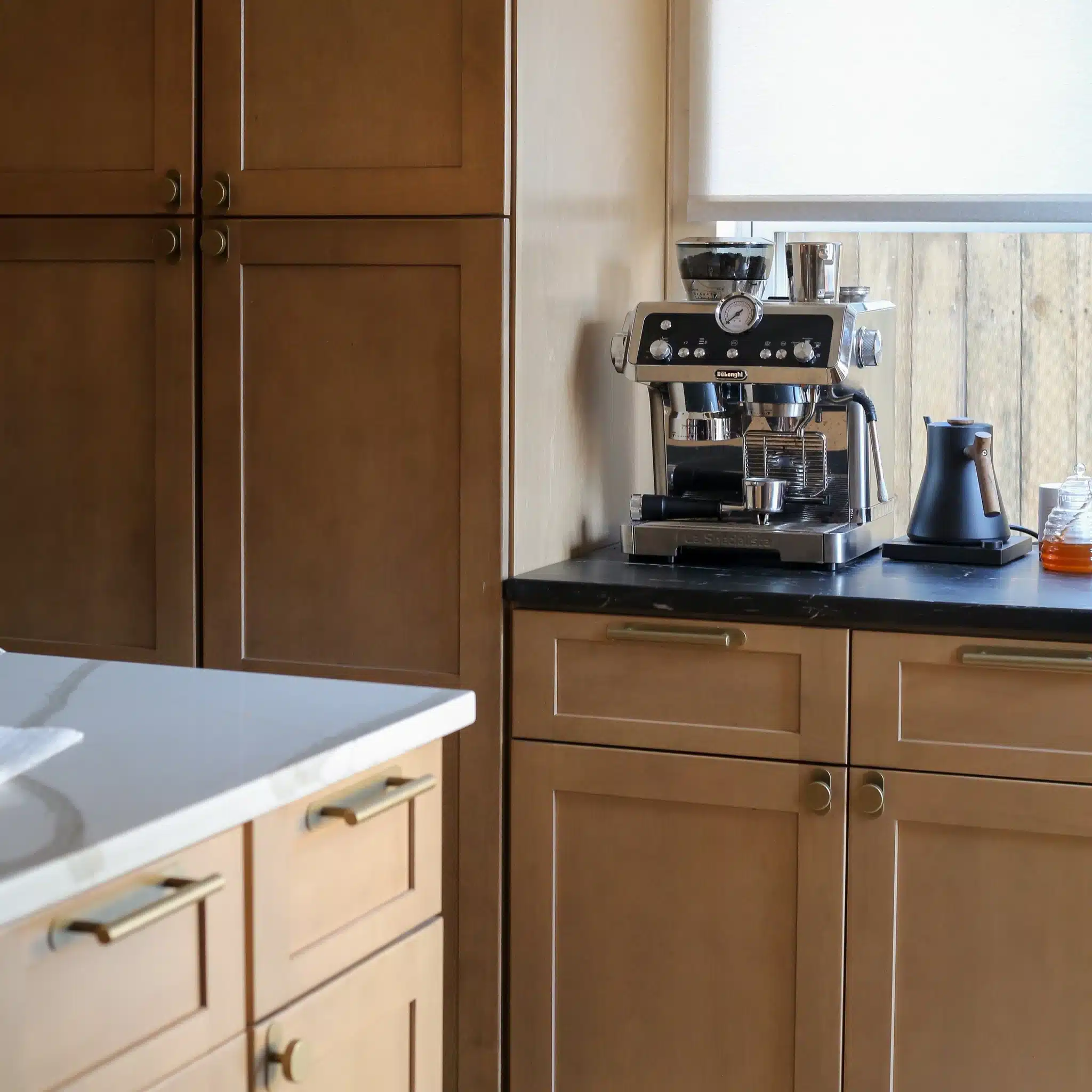
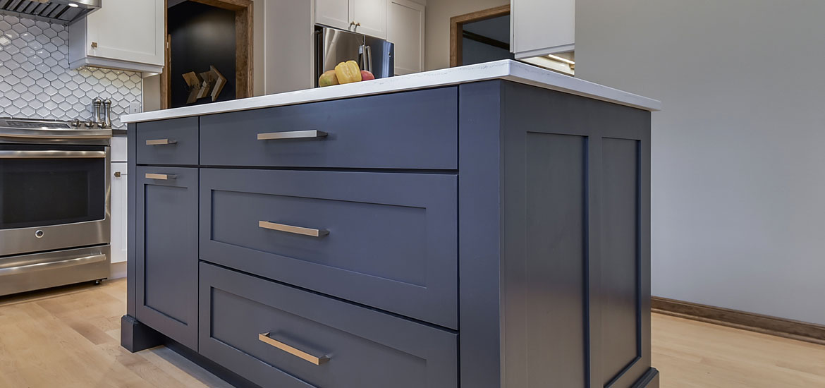
Shaker-style cabinets are one of the most interesting kitchen cabinets, still lingering around traditional design.
The shaker cabinet door style usually features a five-piece door with a recessed center panel. However, the design details vary depending on the specific design you’re going for.
Slab drawer doors are the most common choice for modern designs. On the other hand, five-piece drawer fronts are usually the best choice if you’re going for a transitional kitchen design.
6. Reclaimed Wood Cabinetry
This kitchen cabinetry style is born out of the need to be sustainable and eco-friendly, something that not only companies but consumers are driving towards.
Reclaimed wood kitchen cabinetry uses wood reclaimed from bamboo to non-biodegradable material such as recycled plastic bottles. The aim is to provide sustainable solutions for kitchen cabinetry design and improve material use and reuse.
Most reclaimed wood cabinetry features a rough-hewn, natural feel. Thanks to better environmental awareness, more companies are making these prefab materials, making them one of the most popular kitchen cabinet design options at the moment.
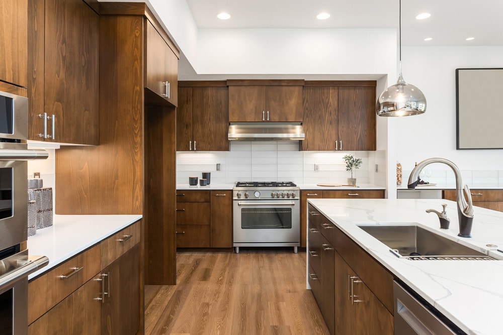
If you hate awkward center stiles and thick frames, the European-style cabinet should be your go-to choice. This cabinet design eliminates frames and center stiles, replacing them with thick boxes with full overlay doors attached to them.
The result is a frameless, full-access kitchen cabinet design. Moreover, it is one of the most modern kitchen designs available.
Euro-style cabinets are thus best suited for a contemporary design, where the emphasis is more on elegance and sophistication. Specifically, European-style kitchen cabinets come in natural, euro, or bolder versions. The natural version uses Roma, paint, Modello, and wood to provide a natural finish. On the other hand, Euro is more leaned towards high-gloss, textured, and matte finishes.
8. Color Customization
Color expresses personality in design, which is exactly what homeowners are going for when customizing their kitchen colors. This trend is so big that some manufacturers even allow customers to customize their color choices on the cabinetry they buy.
So, which colors are the most popular?
Despite each homeowner’s unique choice, most choose neutral colors such as soft greens, greys, and yellow. However, darker colors are still popular, with navy, black, and emerald green among the most popular.
Light colors, or neutral colors, are more popular in contemporary design. They offer a soft, clean, and simple look that blends well with the minimalist theme common with today’s modern kitchens.
On the other hand, darker shades are used to create drama and an extreme sense of luxury. However, they are not the most popular shades.
9. Clean Aesthetics
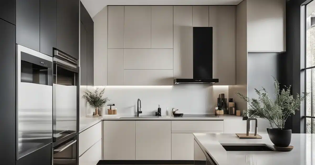
Speaking of minimalist design, this has been one of the biggest and most influential kitchen design trends of the year. So much so that kitchen cabinetry has significantly evolved under this wave. Currently, homeowners are opting for clean aesthetics when constructing their kitchen cabinetry.
This is preferred over the ornate design seen prevalently in traditional kitchen cabinetry.
So, what is considered clean aesthetics?
The modern kitchen cabinet features simple, clean lines and panel doors featuring smooth-edge profiles. This low-profile theme extends even to the cabinet handles, which come in low-profile styles that don’t demand too much attention.
In a modern kitchen setup, where this cabinet design shines best, the clean aesthetics complement other key kitchen components such as the countertop and the backsplash.
10. Double Bowl Fireclay Farmhouse Kitchen Sink
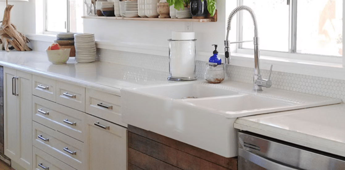
The farmhouse kitchen sink has been praised as one of the most functional and easy-to-use sinks on the market. Its apron, specifically, makes working on the sink more comfortable compared to other sink designs.
Regarding size, getting a double bowl fireclay kitchen sink is a sure bet at maximizing working space in the sink. This design looks splendid in a transitional kitchen. The sink is made of white ceramic, adding sophistication and elegance to the entire design.
The sink also blends nicely with a Torquay countertop, reclaimed wood, and shaker cabinetry. Silver or stainless steel faucets look great with this kitchen sink design.
11. Modern Farmhouse Kitchen Sink
If you’re looking for something more contemporary but still in the spirit of the farmhouse kitchen sink design, the modern kitchen sink should be your go-to choice.
This particular modern farmhouse kitchen sink doesn’t include two bowls. Rather, the two bowls have been combined into one large bowl, with a large faucet being made available to make washing on either side easy.
Instead of clay or ceramic, the modern farmhouse kitchen sink is made of stainless steel in a nice gray. This adds a modern touch while still preserving the traditional look and functionality associated with this type of kitchen sink.
Instead of a chiseled apron, the modern version has a smooth one that blends well with not only a modern kitchen but also a classic one, in case you want to blend contemporary with the old.
Black Granite With Wood Countertop
If you want something purely modern, this black granite sink with a wooden countertop might be what you’re looking for. This design specifically resonates with the modern kitchen trend of minimalism and contrasting colors.
And yes, it’s not all looks. This sink is highly functional.
Specifically, it features two washing basins. One is for doing the main washing, while the other helps you separate washed items from the rest and let them drain.
The matte black granite greatly contrasts with the light wood tone of the countertop. For a purely modern look, you can also color the cabinets matte black.
Kitchen Island Sink with Hidden Compartments
If you want pure storage space, this kitchen sink design might be what you’re looking for. Instead of using one of the basins as a temporary storage area while you’re working on the kitchen, this specific design uses compartments at the back of the sink and the faucet as storage space.
This space is handy when managing clutter and small items in your kitchen. Even better, you can fit this sink on the kitchen island, meaning the items you’d store behind it would also be the non-essentials you don’t use daily.
Alternatively, if you use this as your main sink, the hidden compartment serves as storage space for the not-so-pretty things in your kitchen, such as detergents and dishwashing scrubs.
14. Square, White Tile Kitchen Sink
Square, White Tile Kitchen Sink
Can your kitchen backsplash and sink be blended? Yes, and this design shows exactly that. Square white tiles are used to make the kitchen’s backsplash and sink, creating a unique design for a modern kitchen.
The backsplash and sink are not the only connected elements. The countertops and breakfast nooks are made from the same porcelain white tile. This creates a nice flow from the backsplash to the rest of the kitchen surfaces, resulting in a unified look.
With this kind of sink, the faucets lie horizontally against the backsplash instead of vertically standing faucets. The rest of the kitchen can be white, with European-style cabinets for a nice two-tone feel.
15. Glass Kitchen Sink
The glass kitchen sink should be your go-to choice if you’re looking for a purely fun design. Yes, the idea of having a glass for a sink doesn’t sound smart. However, glass is a viable option in most kitchen sink designs because of the modern touch it adds to kitchens.
But how safe and functional are they?
Well, glass kitchen sinks are shatterproof, heat, scratch, and stain-resistant. This makes them just as good as the commonly used materials such as stainless steel or hardened clay in a more traditional kitchen.
However, they’re not fully resistant to chipping. This makes glass sinks not ideal for a chef who runs his/her kitchen to its full capacity.
16. Make Use of Stools
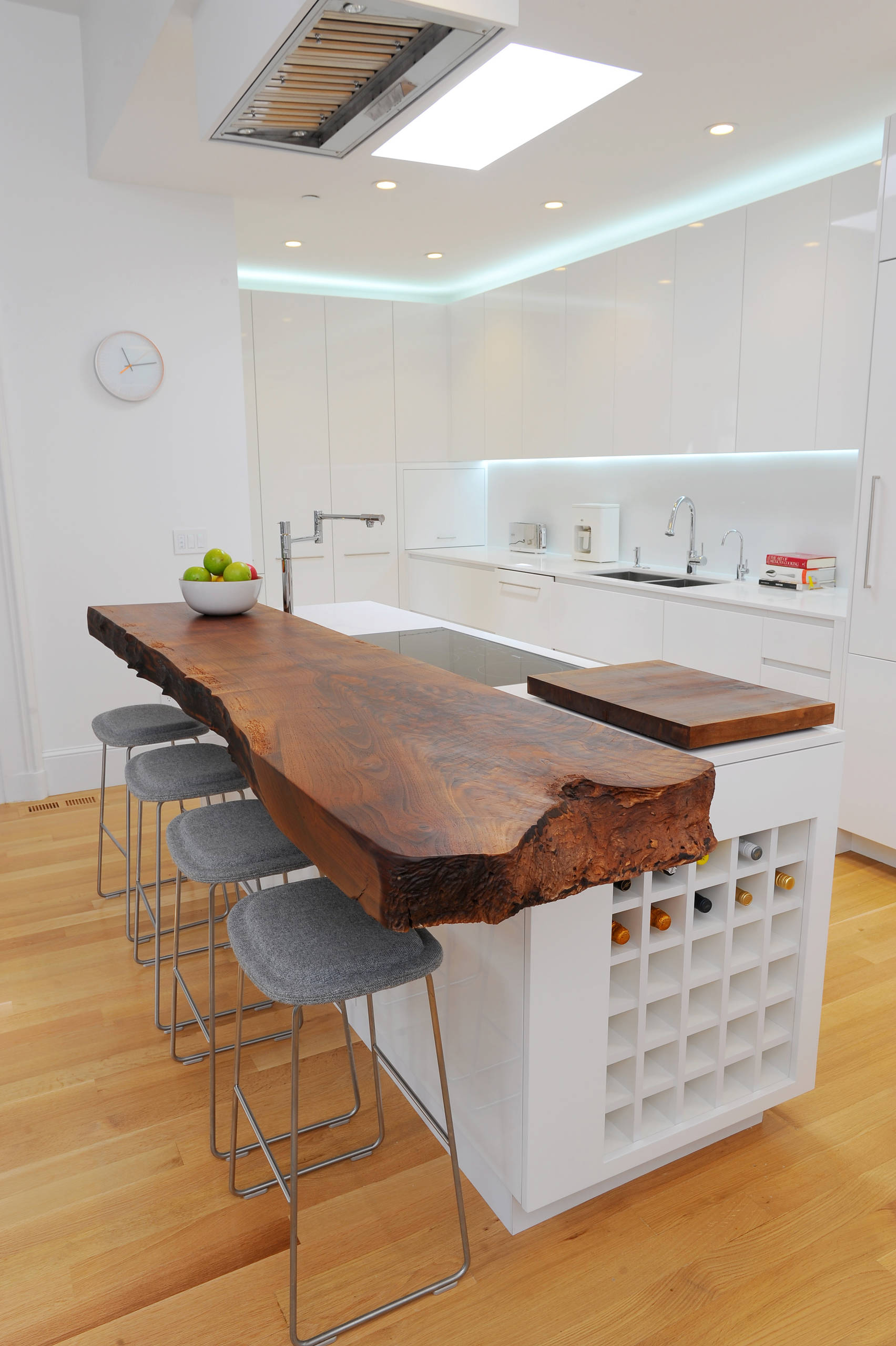
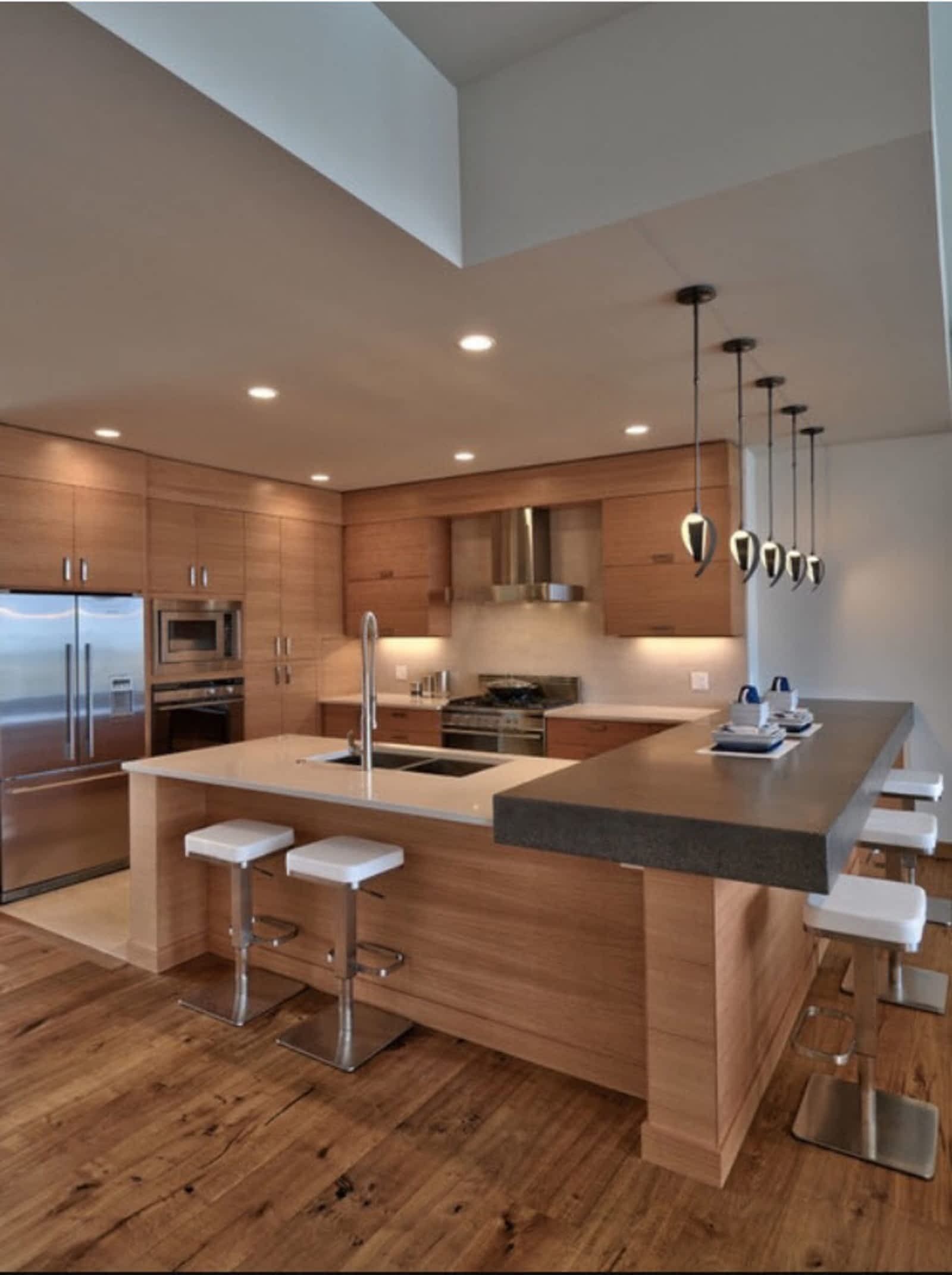
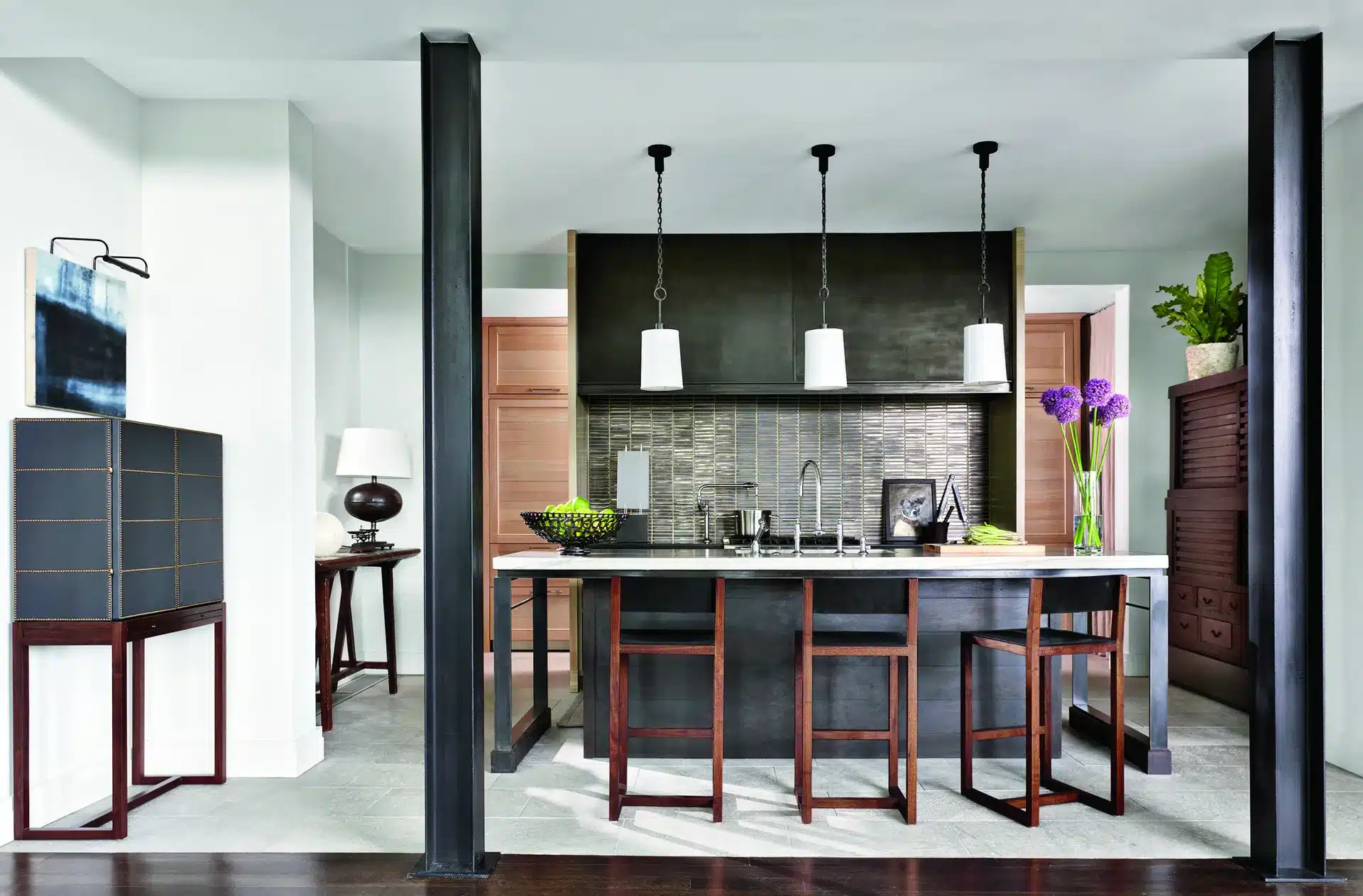
Your kitchen island should be comfortable. This means that instead of standing next to it, you should invest in stools that make working over it much easier.
“But I’m comfortable working while standing.”
Well, the use of stools extends beyond just sitting while preparing the groceries.
Adding stools to the kitchen island allows you to conveniently convert it into a dining area if you want to dine in the kitchen. Also, with a good island, you can use that space to do extra work, like writing the shopping list and planning your kitchen budget.
You can add pendant lighting at the top to ensure you get enough light while working on the surface.
17. Revamp Old Pieces
A new kitchen island can be pretty expensive. However, if you intend to spend significantly less on installation, looking into old pieces might save you money.
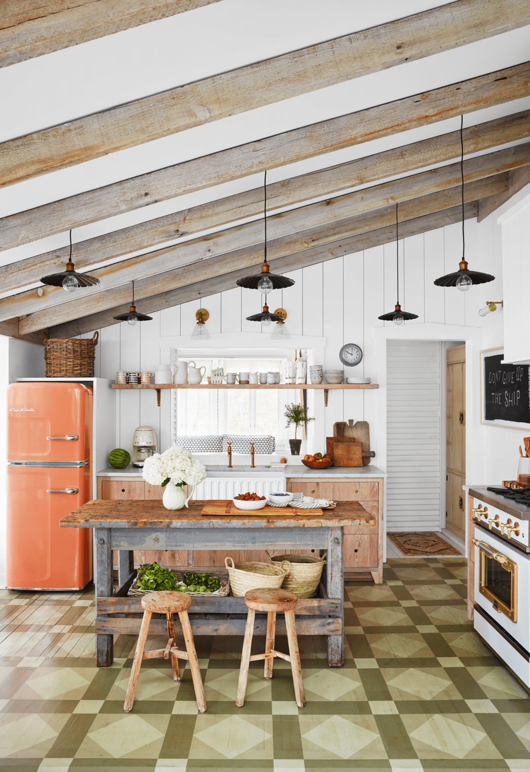
Instead of a new, expensive installation, you can shop thrift for a used centerpiece without a heavy kitchen beating. All you have to do next is add a bit of paint and finishing to get your centerpiece done.
But there’s another option.
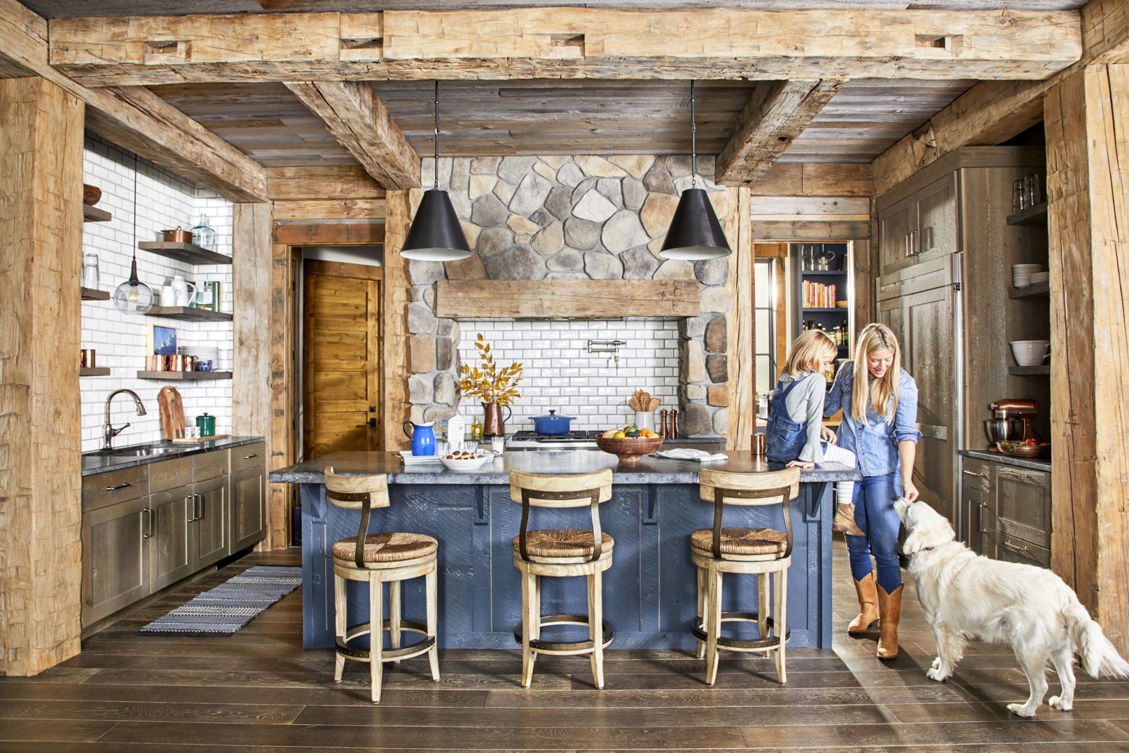
If you are going for a rustic kitchen, revamping an old kitchen island might not be necessary. You can brush it up a little and have the white walls, lighting, exposed tableware on floating shelves, and new hardware make the island stand out and look brand new.
18. Go for a Bistro Table
Bistro Table for Your Kitchen Island Design
If thrift shopping doesn’t sound ideal, this is another way to get a practical kitchen island at a price that is suitable for your budget. All you need to buy is a bistro table.
A bistro table serves as a nice addition to your kitchen. It’s also a functional one.
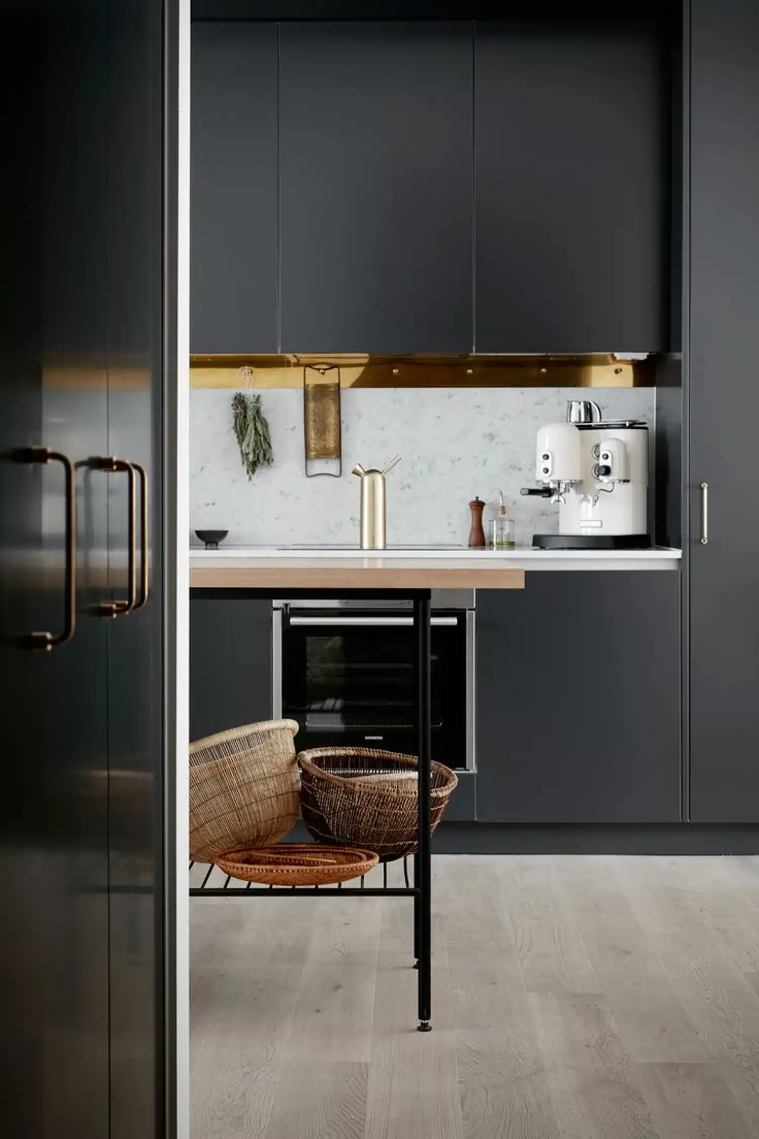
Ideally, the bistro or work table should have a slim rectangular silhouette that ensures it consumes as little space as possible. It should also have a shelf at the bottom serving as the kitchen island and storage space.
But is this a practical design only if you’re working on a budget?
No. If you’re a renter and installing a permanent, custom kitchen island makes no sense, this is an alternative you can consider.
19. Explore Counter Space Options
Counter space is another key design area when choosing your kitchen island design. Depending on your needs, you might be better suited to a long counter space Vis a Vis a shorter one.
So, how do you know?
If you have space, choose a kitchen island with the maximum workspace available. Besides, you should also try to use the kitchen island to maximize your cooktop range.
Any appliance that takes up a lot of counter space should be placed on the kitchen island. This might be the sink, dishwasher, or cooking stove.
Conversely, your choice of counter space size can also be determined by how social you want your kitchen to be.
For instance, if you love inviting people for dinner and dislike ignoring your guests while preparing the meals, a long counter space with stools and a stove might be your best design option.
20. Family-Friendly Kitchen Island
Family-Friendly Kitchen Island Design
Speaking of social kitchens, another practical kitchen island design is the family-friendly kitchen island.
What does this mean?
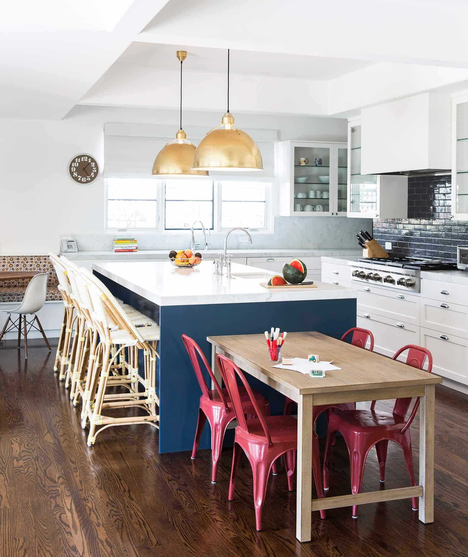
A family-friendly kitchen island allows you and your family to spend time together while preparing a meal. Ideally, this design features seats for the family, with an adjacent, smaller island accommodating seating for kids.
This setup is great for casual and entertaining meals or when you want to help your kids out with homework while preparing dinner for them.
A semi-permanent option should be your best bet for the kid's kitchen island. This means you can use a simple table with chairs for their island, which they’ll outgrow once they can handle the longer stools on the main island.
21. Multipurpose Kitchen Island
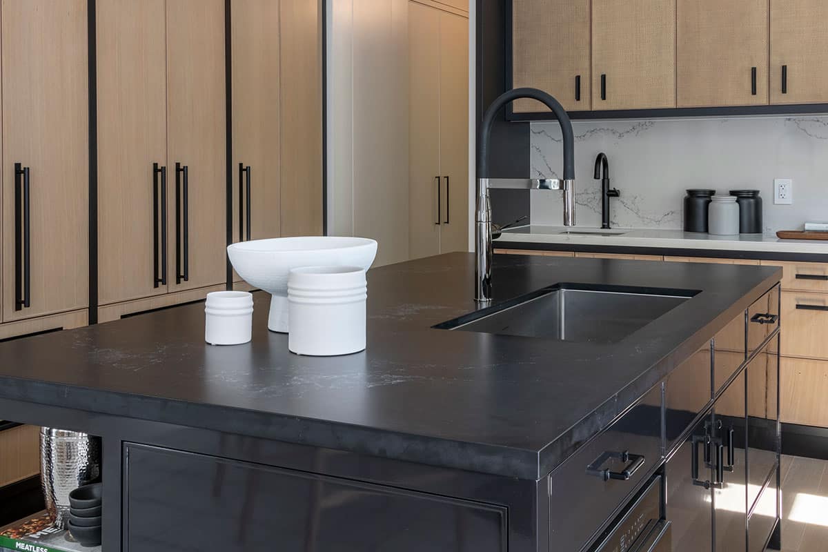
Grey Kitchen Island Caesarstone Quartz Countertop
The multipurpose kitchen island is one of the most robust designs available. This design uses the island not only as an area for serving and prepping food but also as the center for almost anything else that requires a hard surface.
This includes doing bills, homework, and permission slips, among others.
But isn’t that possible with the other designs?
Well, not entirely. Stretching the functionality of your normal kitchen island to these extremes can quickly degrade its surface. Thus, some designers use hardened materials like Caesarstone quartz to make the countertop for this particular design.
But that’s not the only feature.
This design also incorporates junk drawers on the side for other things, like your budgeting file or books for your kid’s homework, apart from kitchen supplies. There’s also hidden storage for items that you don’t use frequently.
22. Maximize for Storage
Kitchen Island With Open Shelving Design
Regarding drawers and hidden storage, if you’re not into multipurpose kitchen islands and working with limited space, getting a kitchen island design that adds extra storage space should be the top priority.
These designs add extra shelving to store extra items in your kitchen, such as cookbooks, jars of dried produce, bottles of wine, or any other item you want to store in your kitchen.
For a small kitchen, open shelving instead of drawers will facilitate movement and accessibility.
You can even get smarter and add suspended storage above the island. For this, you can use a rack to hang pans and pots.
23. Subway Tiles
Nothing can beat tiles as the number one selection for backsplashes. This is because tiles are durable, affordable, and various. And as far as those qualities are concerned, the subway tiles shine best.
Subway tiles feature a staggered layout and clean lines, which add a touch of uniqueness to your backsplash design. They also average $7-$13 per square foot, making them very affordable.
But not all things are rosy with subway tiles.
Despite being easy to clean and durable, the grout lines that are exposed between the tiles are prone to getting mold. Thus, you need to keep the backsplash dry at all times.
24. Laser-Cut Tiles
If you desire more sophistication, laser-cut tiles are the way to go. However, be prepared to break your bank while installing them for your backsplash.
Laser-cut tiles are famous for their intricate, clean patterns that can’t be drawn or etched on normal tiles. However, this added sophistication comes at an extra price of about $30-$40 per square foot, and installation is also equally expensive.
So, is it worth it?
Yes. Laser-cut tiles allow you to explore a wide range of different patterns for your backsplash tiling. They also show and expose a lot of detail in your kitchen that a normal backsplash wouldn’t.
25. Diagonal Tiles
If you are looking for great visual effects for your kitchen, then you should try diagonal tiles for your kitchen backsplash design. These are simply square tiles that have been installed diagonally to create a diagonal tile effect.
But this comes at a cost.
Since more precision is needed to install and cut the diagonal tiles, and a bit of wastage is incurred while doing so, this design tends to cost 10-20% more compared to straight tiles.
However, this has the great benefit of adding not only interest but also dimension to your overall kitchen design, making the kitchen look larger and more spacious.
26. Dark Shade Tiles
If you’ve chosen a dark-themed kitchen with dark flooring and/or cabinetry, exploring dark-shade tiles for your backsplash might be a great design decision.
A predominantly black, charcoal gray, or deep blue kitchen with a deep hue of teal for the backsplash would create a nice contrast between the kitchen’s background and the rest of the design elements, making them pop out.
The key here is contrast. You must ensure the backsplash creates depth and detail within the kitchen design.
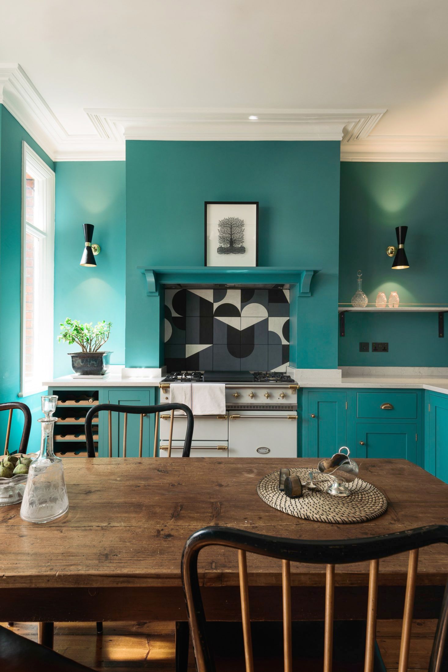
27. Patterned Tiles
Humans are attracted to patterns. Thus, if you want to grab guests' attention in your kitchen to the backsplash, then settling for a patterned tiles design is your best bet.
For a striking design, you can use tiles with geometric designs, such as chevron patterns etched into the tiling.
Pulling off this backsplash design also needs great attention to detail. You need to ensure that the grout lines match. This is important if you want the sharp edges to be softened, thus drawing more attention to the pattern in the tiling.
28. Moroccan Tile
Moroccan tile is one of the many backsplash designs inspired by a global heritage or community. Morocco inspired this specific design, which is evident by the unique color choice used on the tiling, which features green accents similar to those found in the Moroccan flag.
But that doesn’t mean this design is specific to the Moroccan community.
If you’ve chosen a green-themed kitchen, this backsplash design will greatly complement the overall theme. The dark green patterns on the tiling add detail and depth to the kitchen.
29. Mosaic Tile
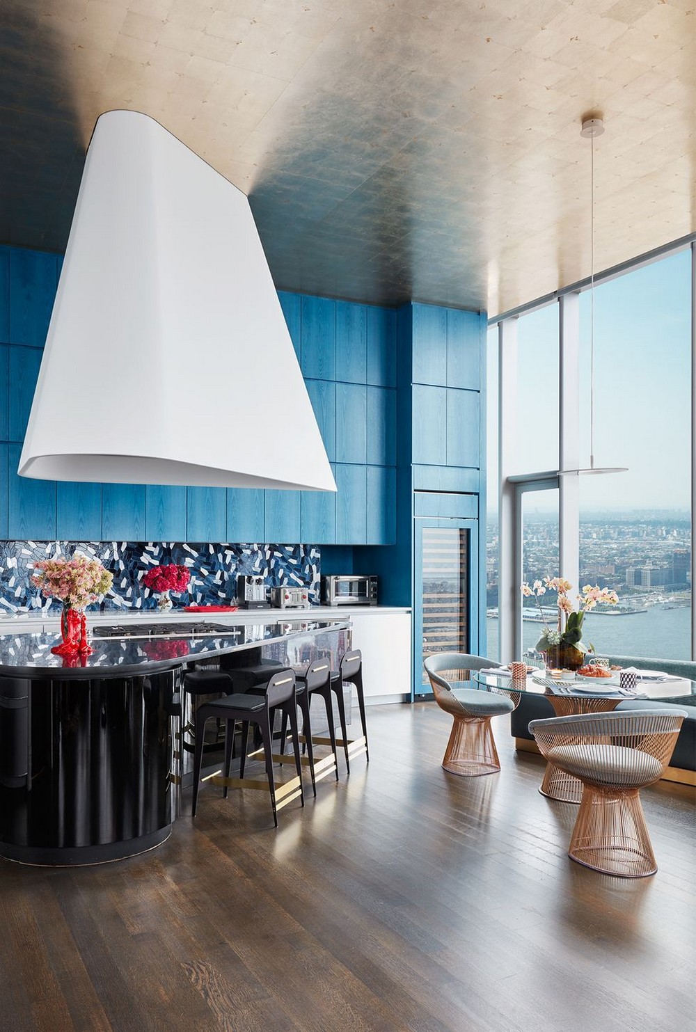
If you’ve chosen a blue kitchen and are wondering which backsplash design will do it justice, your eyes should be set on mosaic tile. This beautiful design features intricate patterns that blend beautifully with a blue-themed kitchen.
Specifically, the patterns on the mosaic tile break the blue monotony, adding detail to your overall kitchen design.
But not for a cheap price. Mosaic tiles are expensive, with most contractors charging about $20 per square foot for installation. This is along with the cost of materials. However, this is cheaper compared to the more expensive laser-cut tiles.
30. Neutral Pattern
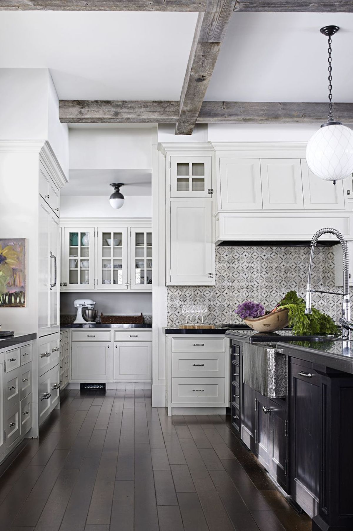
The neutral pattern is for the neutral kitchen. This is predominantly a black-and-white kitchen that doesn’t feature striking colors meant to draw attention.
So, what draws attention to the design?
The neutral pattern backsplash. This backsplash features sophisticated, neat, yet subtle patterns that add interest to the kitchen design. The rest of the kitchen can thus feature dark grey cabinetry, dark silver faucets, and a gray kitchen island.
If you want to add more color to the design, you can settle for colorful artwork to support the backsplash.
31. Tile Medallions
A backsplash should run the entire length of the countertop, not just behind the sink. However, the tile medallions backsplash design employs a great deal of creativity.
Instead of the regular backsplash, the tile medallion design features cream tiles offset by a medallion or tile centerpiece. This backsplash design aims to achieve a rich Tuscan look with the backsplash.
The medallion or centerpiece is not bought separately. Rather, it is built from scratch by the tile setters during the installation of the tiles. The tiles surrounding the medallion are also installed diagonally to draw focus. The outer frame finally makes it pop from the rest of the backsplash.
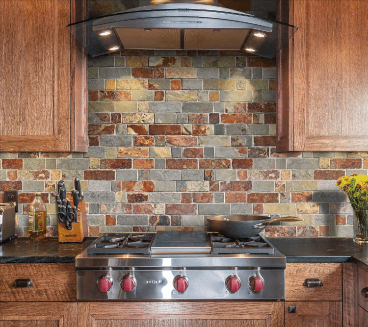
32. Rusty Slate Tile Backsplash
Why not use real stone instead of regular tiles? That’s the idea behind the rusty slate tiles, perfect for a rustic kitchen theme or a more traditional kitchen design vis something modern.
The slate mosaic tile adds a rough, natural, distinct look to a kitchen backsplash. It can come in 4×4 inch to 16×16 inch sizes.
Even better, copper slate tiles can be installed as a DIY project. This makes them ideal if you’re looking for something unique and experimental.
Flatware Cabinet Hardware For a Country-Themed Kitchen Design
For the DIY fan who also loves country kitchens, flatware pulls are gorgeous hardware that can be added to your cabinet design.
Flatware pulls use repurposed flatware to create funky pulls that bring out the country in your kitchen and add a kitschy touch that’s usually associated with this style. This repurposed flatware can be anything from spoons, folks, to breadknives.
As far as colors go, you can explore two great options: pure silverware for a pure white kitchen or brass for a darker-tone kitchen.
These pulls are also readily available in the market, with online stores such as Etsy having a dedicated category for this design. Even better, they don’t cost that much, so they should be a budget-friendly hardware addition to your kitchen.
34. White Porcelain Knobs
White Knobs for Kitchen Cabinets
If you’re not a fan of flatware pulls but you’re looking for something country and contemporary at the same time, then white porcelain knobs should be your go-to kitchen cabinet hardware.
These knobs blend nicely with a transitional kitchen that’s traditionally inspired by the country kitchen. The cabinetry, in this case, carries a more contemporary design.
For the white porcelain knobs to look great, your kitchen has to be splashed with lively colors. For instance, you can have a patterned tile backsplash, a small white range hood and cooking stove, plus colorful, retro-inspired kitchen appliances.
The cabinets can be colored peppy-yellow, which will nicely contrast with the white porcelain knobs.
35. Recessed Pulls for Your Cabinet
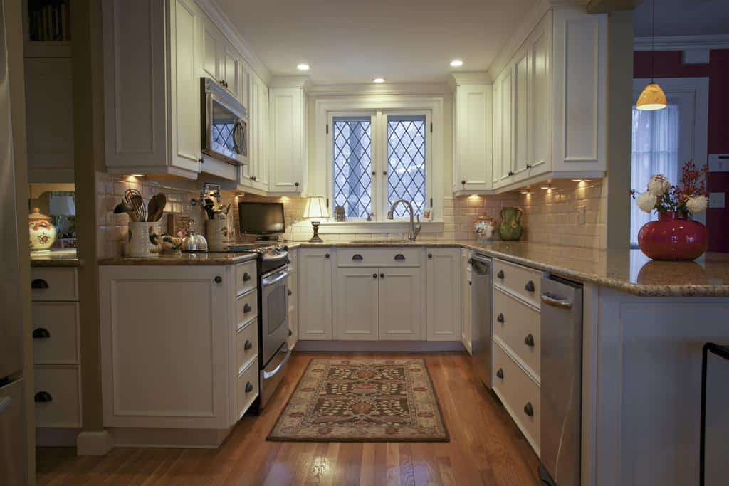
Traditional and Dreamy Cup Pulls
Cup pulls are not new in kitchen cabinet hardware design. They are one of the most common designs, popular in many traditional and transitional kitchens.
So, why consider them in the first place?
Because they are not only gorgeous but also highly functional.
Cup pulls are among the easiest to use. Also, they blend nicely with the rest of the kitchen cabinet design, thus making the detail and color in the cabinet stand out more over the actual pulls. This is because they take very little space.
In a predominantly white-tone kitchen, for instance, oil-rubbed bronze cup pulls look stunning. You can mix them with simple knobs in the same oil-rubbed bronze finish to add variety to your hardware.
On the flip side, using cup pulls and simple knobs in distressed black can also work nicely in a pure white kitchen. The cup pulls can be used for drawers, with simple knobs being fixed on the long cabinets underneath the drawers.
36. Luxurious Brass and Gold Pulls
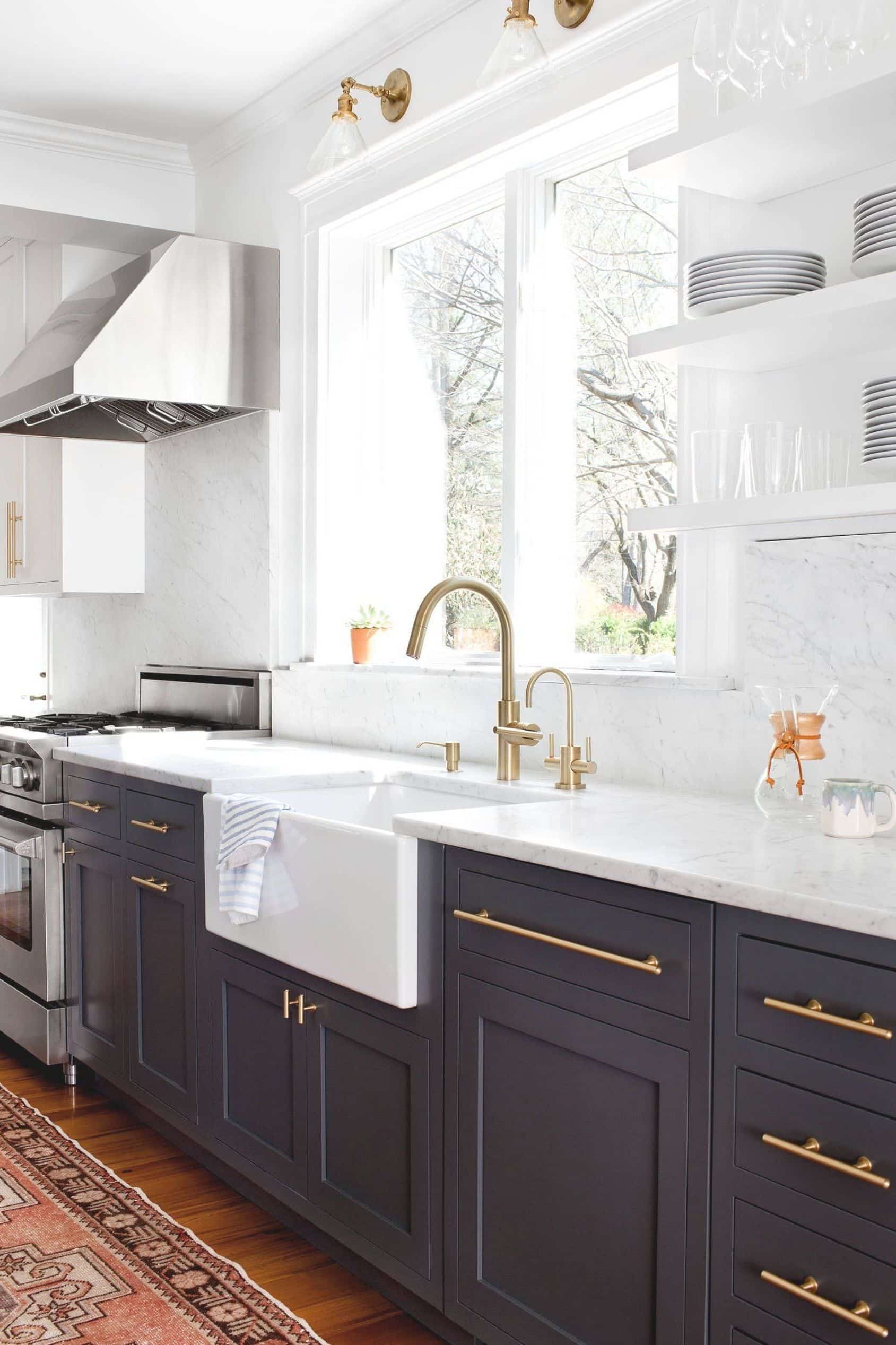
Kitchen Design by Elizabeth Lawson Featuring Brass and Gold Cabinet Pulls
Most of these kitchen hardware options look great. But which one fits a more luxurious design?
These brass and gold pulls.
What’s interesting about these pulls is that unlike most options available for a traditional or transitional kitchen, these feature a more contemporary design.
Instead of a cup, recessed, or flatware design, these pulls use the more contemporary t-bar pulls, albeit with a brass and gold finish. The brass and gold finish stands out in a dark-tone kitchen, say with navy cabinets, adding a luxurious touch to the cabinetry.
What makes these pulls even more desirable is that they can easily adapt to different color palettes and styles, making it easier to update the cabinet designs later.
37. Black and White Combo
Nothing beats the classic black-and-white combo. It’s the fastest and easiest way to get stunning kitchen cabinet hardware that also stands the test of time and is functional.
The black-and-white combo can be used in both a traditional and a contemporary kitchen, with a nice mix of matte black and white. But as far as the traditional kitchen is concerned, the black-and-white combo adds a retro feel and authenticity to the entire kitchen design.
You can alternatively add industrial lighting paired with lean, black bars that complement the black arch cabinet pulls on the pure white cabinets. This creates an authentic traditional kitchen, albeit with a modern touch.
38. T-bar Style Pulls
If you’re looking for something suitable for a colonial-style kitchen cabinet door, then the T-bar-style pulls are what you’re looking for. These pulls feature decorative ends associated with the colonial-era kitchen cabinet door pulls.
If you’re going for darker tones, a bronze finish on the T-bar is bound to look stunning. Specifically, you can incorporate these pulls in a large farmhouse kitchen with huge cabinet doors that fit the long bars nicely.
You can also experiment with simple knobs in the same brass finish for the drawers on top of the cabinetry. This will add variety to your hardware design, making the kitchen cabinets look even more gorgeous.
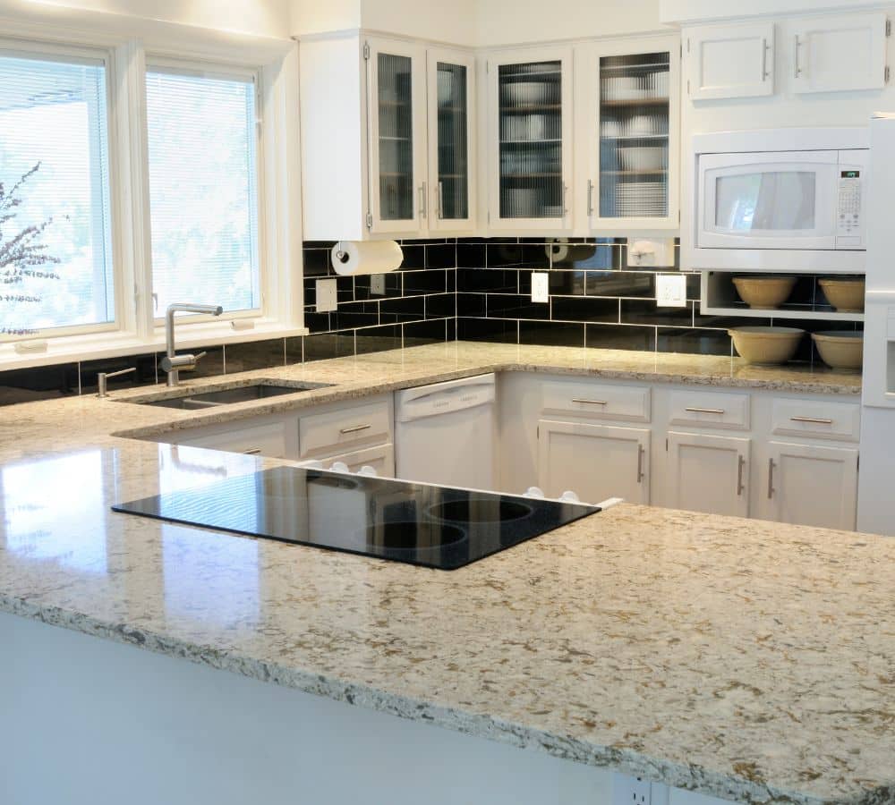
Yes, many homeowners and kitchen design experts hate laminate. But hear us out. High-definition laminate can be a great design option for kitchen countertops.
Used mostly in place of real granite, laminate countertops provide the aesthetic of marble and granite for the price of cheap plastic. With high-definition laminate, nothing about the final design will look tacky.
High-definition laminate does a great job mimicking real granite's visual chaos and patterns. Thus, it better replicates natural granite than other laminate options you’d get in the market, which use repetition patterns.
But there’s a downside.
In terms of uniqueness, high-definition laminate doesn’t score that well. Yes, it’s an improvement over the mostly lackluster laminate countertops, but most homebuyers and homeowners still have a prejudice against this material.
Thus, if you’re planning on selling your house after remodeling the kitchen, this countertop might affect the resale value.
40. Stainless Steel Countertops
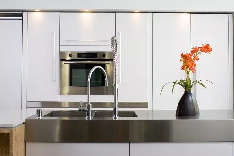
If you have the money to spend on something unique and long-lasting, stainless steel countertops might be your best choice. They have steadily risen over the last 10 years and are now found in most contemporary kitchens.
Restaurants inspire stainless steel countertops. They intend to mimic the kitchen quality of most high-end restaurants and the durability of these countertops compared to other popular options in the market.
And that durability comes at a hefty price.
Stainless steel countertops are some of the most expensive in the market. This material is also very hard to fabricate, skyrocketing the price even further the more experimental you get with your design.
41. Concrete Countertops
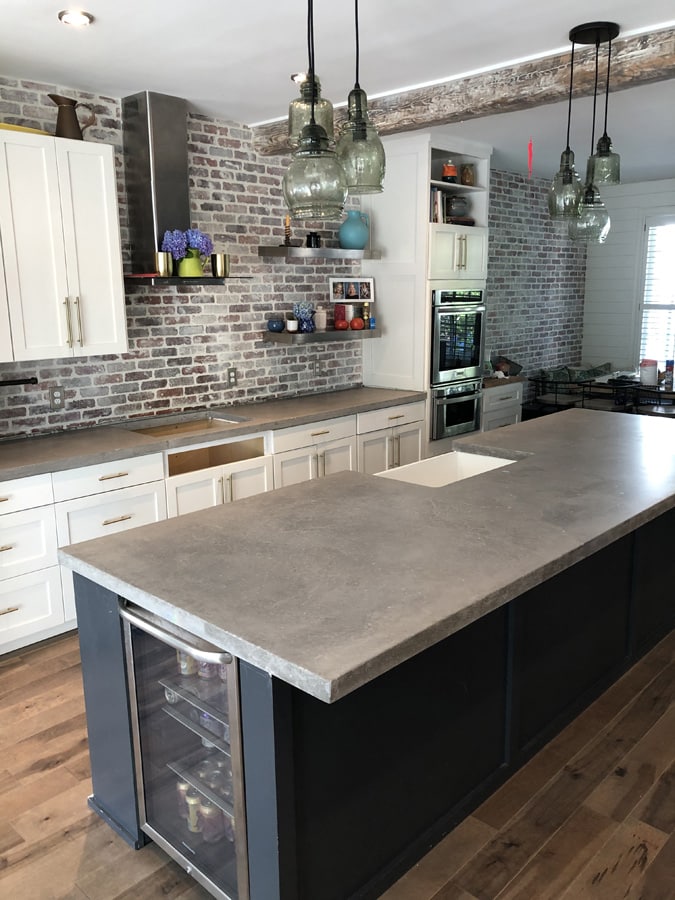
Instead of metal, you can opt for a more earthy concrete material. Concrete countertops are also very popular in contemporary but also traditional and transitional kitchens.
These countertops are made by pouring thick, non-porous concrete on the kitchen surface. Final finishing is done on the surface to make it smooth, shiny, and usable in the kitchen.
This design adds great detail to the kitchen. You can see it in the subtle patterns made on the surface of the concrete, which blend well with a dark-toned kitchen with dark floor tiling.
But that’s not the best part.
Concrete countertops allow you to be fully experimental, meaning that they adapt to your kitchen rather than your kitchen adapting to them. Thus, you can explore an infinite range of design options, from size and thickness to even color.
42. Contrasting Countertops
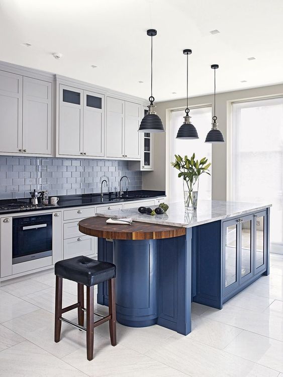
Speaking of color, contrasting color countertops are a fast-growing theme in modern kitchen design circles. These countertops use lively colors to bring life and boldness to modern kitchens.
In most cases, lime green, yellow, and orange are commonly used colors. If you use bright orange for the cabinetry, for instance, you can use white for the countertops to create a contrast that makes both colors stand out.
You can even go for bolder colors, such as black, to get as much contrast as you desire between the colors.
The trick here is to focus on the cabinetry. This is the closest design element to the countertops, so it's where you’ll get the most contrast.
43. Patterned Countertops
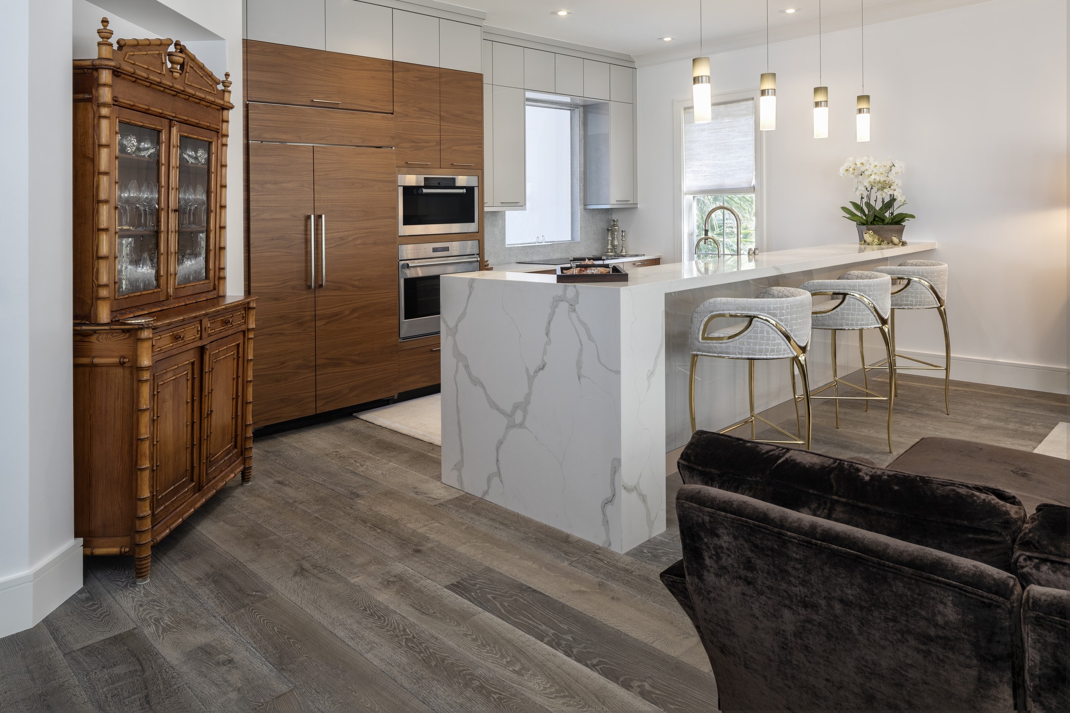
Patterned countertops have also been a trending design topic in both modern and traditional kitchens with a contemporary touch.
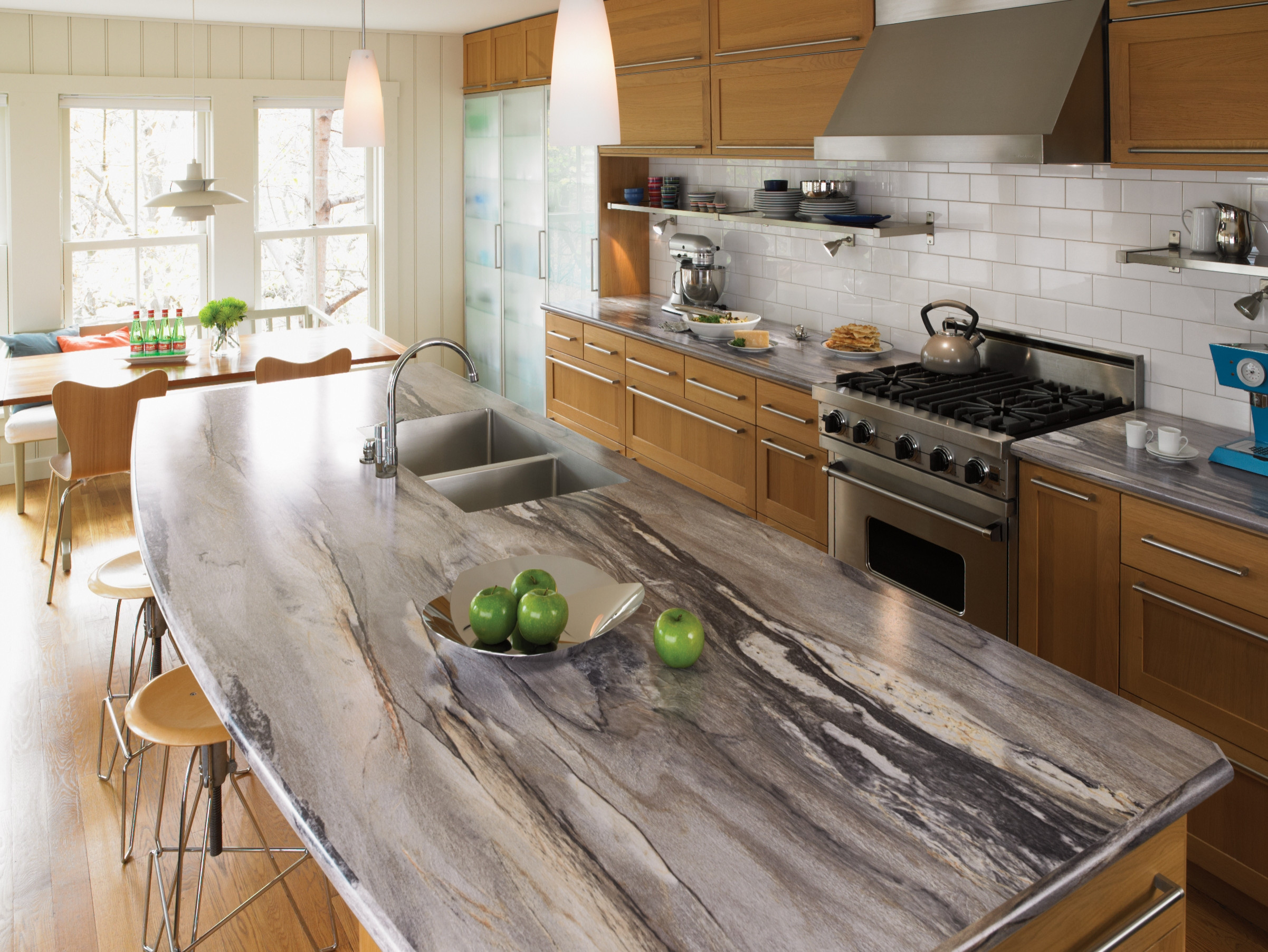
Patterned countertops are great, especially for a modern kitchen, because they add interest. They blend nicely with the minimalist cabinetry and overall kitchen layout, giving the design a final waterfall effect.
Patterned countertops are especially gorgeous on the kitchen island. Since the island serves as the architectural focal point, the waterfall effect is even more pronounced with the striped stone and textures.
Trying a two-tone color scheme can make this design stand out even more. For instance, you can have the cabinetry in dark wood, contrasting with the ash-gray countertop and gray backsplash, with dark gray or black patterns.
44. Thick Slab Countertops
The thick slab countertops might tickle your fancy if the concrete countertops don’t look interesting. Instead of the normal 2” thickness common for many countertops, thick slab countertops can go as thick as 5”.
These countertops also feature nice patterns that suit a contemporary kitchen. The added thickness creates a stately, anchored look that draws attention to the countertops and cabinetry.
With this design, however, you must adjust the cabinet heights to compensate for the increased height caused by the thicker countertops.
Regarding colors, most thick slab countertops look great in patterned white, with the cabinetry featuring dark-toned wood with silver pulls.
45. Wooden Countertops
Wooden Countertops
If you are going for a rustic kitchen, wooden countertops are most likely your best choice. These countertops blend in perfectly with a rustic-themed kitchen while still providing a flurry of design options to explore.
Wood adds texture, boldness, and warmth to your kitchen design. This design fits a rustic kitchen as well as a traditional, minimalist, contemporary, or modern kitchen.
How?
Wooden countertops can be styled into various designs. You can choose a butcher block countertop, a wooden tile option, or a chevron-clad countertop. Plus, you can choose the stain on the wood, thus adding the degree of detail you want on the countertops.
But there’s a downside to this countertop design. Wood is prone to rot. Thus, you must seal it properly to ensure it serves you long enough.
46. Stone Countertops
If you hate the idea of having to seal wood to make it long-lasting but are in search of a natural design option for your countertops, stone countertops might be your next best choice.
These durable countertops also allow you to highlight the design with inner lights and dashing patterns. Plus, stone countertops come in a variety of designs, so you’ll not have trouble finding the right type for your kitchen.
For instance, you can get stone countertops that match or contrast colors in your kitchen. Plus, you can choose a different stone for the countertops Vis a Vis the kitchen island.
47. MDF
Yes, most of the options provided so far are not cheap. However, save for the high-definition laminate, which other countertop design option can you explore that won’t break the bank?
MDF.
MDF is a very affordable type of fiberboard commonly used in kitchen cabinets. It can also make stunning kitchen countertops.
But why use it in the first place?
You can still explore a flurry of design options with MDF for your kitchen countertops. MDF is also water-resistant, meaning it’s less prone to rot than natural wood, which will need some treatment.
Plus, you can easily color the MDF to match or contrast any color for your countertops. For example, you can have the cabinetry and countertop in cobalt blue for a unified kitchen design.
48. Long and Wide Chimney
This style is not so popular among many homeowners, except those with large stoves. Thus, there is a greater need for ventilation in the kitchen.
A long and wide chimney is designed to remove as much heat and steam from the kitchen as possible. Thus, the design would incorporate a low-slung chimney, typically lower than you’d find in a normal kitchen.
But won’t that squeeze the kitchen? In a way, yes. And that’s where open shelving comes in.
Open shelving around such a range hood frees up space visually and physically. If you wish to keep a few things tucked away under lock and key, you can opt for closed-door shelves at the bottom of the stove and the lower cabinetry.
49. Custom Stainless Steel Range Hood
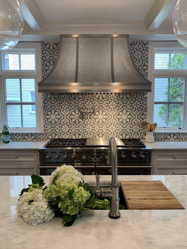
If you wish to go fully custom and find a creative way to incorporate your kitchen hood with the rest of the kitchen, you should explore this design option.
This custom design uses a multipart backsplash to creatively blend in the kitchen hood with the rest of the kitchen. Right behind the range hood is a backsplash section with multi-colored, nicely patterned tiles that add a great aesthetic to the overall design. The kitchen hood itself is made of steel, and its dark gray tone effortlessly blends in with the gray walls.
You can also use open shelving to create more space with this design while sticking to the patterned, two-tone color scheme prevalent in the entire design.
50. Traditional White Kitchen
Traditional White Kitchen Range Hood
If you don’t wish to be too experimental, you can return to the basics and stick to a traditional white kitchen featuring white shaker-style cabinets and a kitchen hood sandwiched between them.
The closed cabinets suggest a more traditional kitchen than the open shelving, which tends to be more contemporary. More importantly, this closed shelving creates a visual block that visually hides the range hood from the rest of the kitchen.
Yes, that steel installation is still visible. However, it is less conspicuous, thus giving the kitchen a unified look.
Other design elements in the kitchen, such as the cabinet hardware, can be matched to the color tone of the kitchen hood.
For instance, dark silver or gray cabinet pulls, and a dark silver or gray fridge would help further visually hide the glaring range hood in this design while still staying true to the authenticity of the traditional white kitchen.
51. Under-Cabinet Range Hoods
Under-Cabinet Kitchen Hood Design
If you wish to hide your range hood from plain sight, this design is your best option. The under-cabinet range hood cleverly hides the glaring range hood from the rest of the kitchen, thus drawing immediate visual attention away from it.
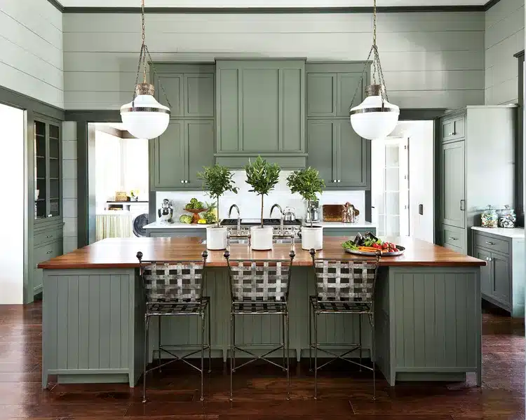
This design would look great with a sage green kitchen color scheme with shaker cabinets at the top. However, instead of the traditional design where the range hood is fully exposed, one of the cabinets can hide this installation, thus totally removing it from the glaring view.
A great thing about under-cabinet kitchen hoods is that they are compact. This helps hide them away while still incorporating an elegant design that will blend seamlessly with the rest of the kitchen.
Another great thing about this design is that you don’t necessarily have to remove your current cabinet installation to fit this kitchen hood. You can optionally buy one that blends in well with your cabinet design and have it fixed right above the cooktop.
Its small size and camouflaging design will go a long way in keeping it out of sight.
52. Marble-like Range Hood
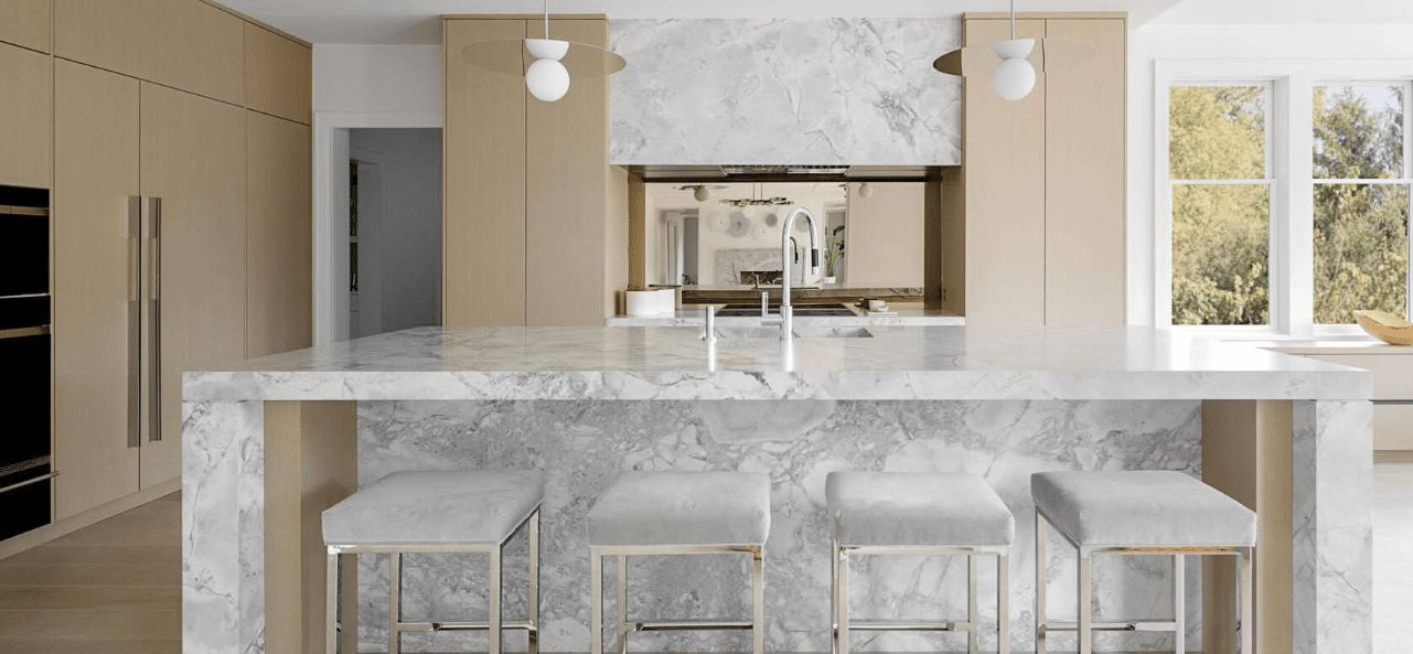
If you’re less worried about visibility and more about aesthetics, a marble-like range hood might be a great design option. This range hood is perfect for a contemporary kitchen with marble countertops, a minimalist design, and a striking two-tone color scheme.
The countertops and kitchen hood must be made from the same marble to make this work. This design aims to create a waterfall effect that trickles down from the range hood to the countertops and, finally, the kitchen island.
This unifies the entire design and creates a stunning effect that the kitchen hood greatly supports.
To fully complement this kitchen design, you should also consider using flat-panel kitchen cabinets, a white backsplash, and black appliances.
53. A Mix of Modern and Rustic
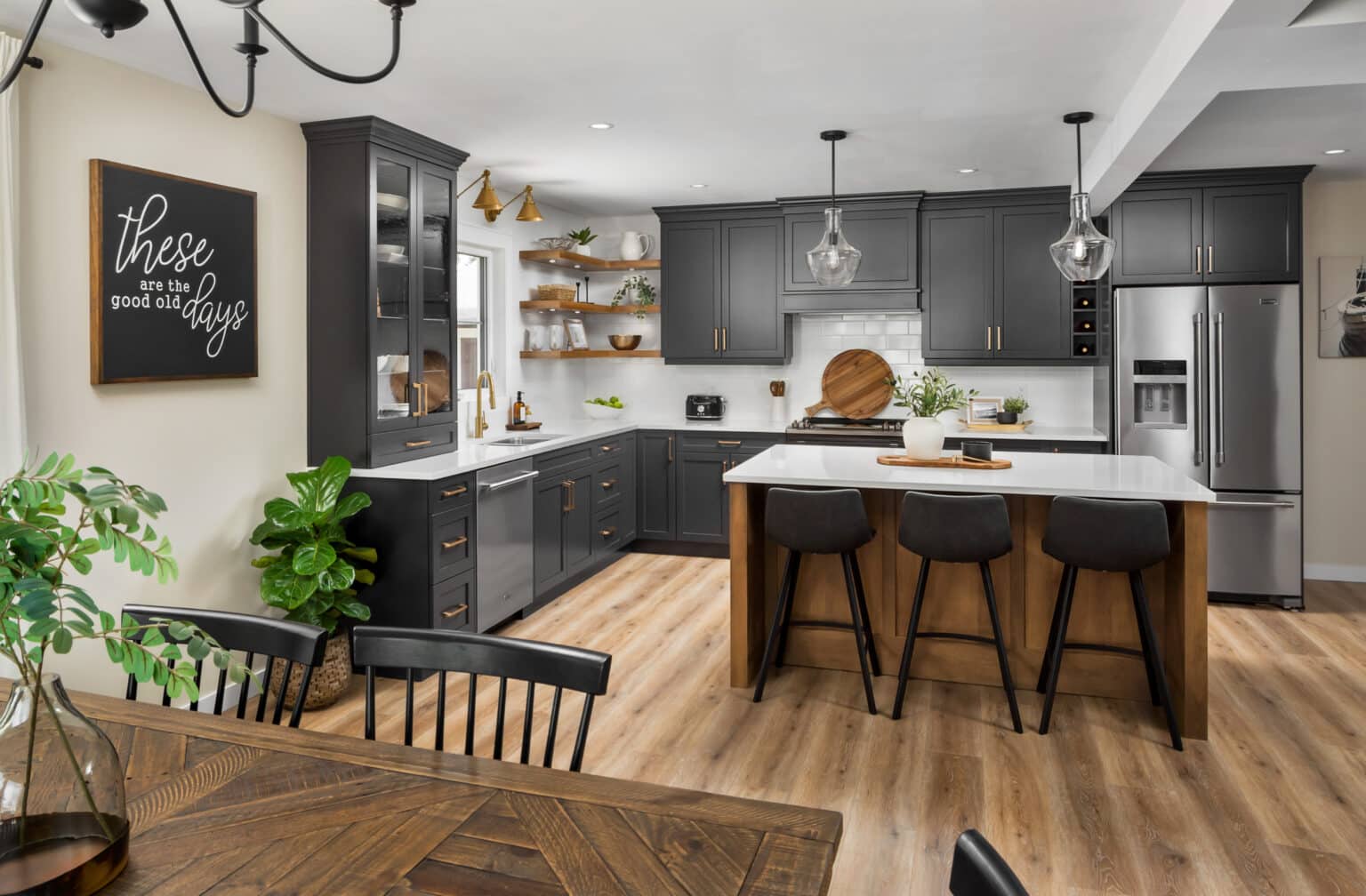
What if your kitchen hood design could incorporate both modern and rustic elements? This design option allows you to do just that.
The idea is to have a modern range hood blended with rustic cabinetry contrasting white walls and countertops. This is one of the most creative kitchen hood designs you can explore.
The kitchen hood is neatly covered in a modern dark gray pattern contrasting with the backsplash. This design creatively incorporates the range hood into the kitchen.
For this cabinetry design, you can opt for flush cabinet pulls, which add a contemporary touch. Since the white backsplash and walls create an airy and spacious feeling, you can further support this theme by opting for open shelving at the top.
54. Minimalist Shelves
Minimalism has been a trending kitchen design topic, especially for the modern kitchen. As far as open shelves are concerned, minimalist open shelves are one design you should try.
Minimalist open shelves are based on using little clutter to create a unique open shelves design. Instead of numerous plates, cups, silverware, or anything else that looks busy and squeezed, the minimalist open shelves design uses neatly arranged cups, spoons, and cutlery to create a chic layout for the kitchen.
The rest of the kitchenware can be stored in closed shelving at the bottom. For those shelves, you can experiment with recessed pulls that amplify the minimalism effect you seek in the kitchen.
55. Rustic Shelves
If you’re going for a country-style kitchen or want to tone down the bold colors you’ve predominantly used in your kitchen design, you should choose rustic open shelves.
These shelves add a rustic touch to a modern or traditional country kitchen.
For instance, if you’re working with a striking contrast of gold, black, and navy, you can install a patterned backsplash with rustic open shelves at the top.
The great thing about this design is that despite toning down the bold contrasts, it still doesn’t distract the view from the original design. Rather, it makes it more unified.
56. Half Shelves
If space is limited, try half shelves as a neat, open-shelving design option. Half shelves work well in a small kitchen with limited space. You can have the shelves installed next to the stove or kitchen hood to store supplies you use while cooking daily.
Does that mean this is a no-no for larger kitchens?
Not really. Half shelves are also meant for homeowners not yet ready to commit to an open shelf design. Thus, you can choose one wall section to install a few rows of half units before fully committing to everything in the open.
57. Glass and Gold Open Shelves
If you want something unique that blends in with the rest of the kitchen hardware simultaneously, you should try out glass and gold open shelves.
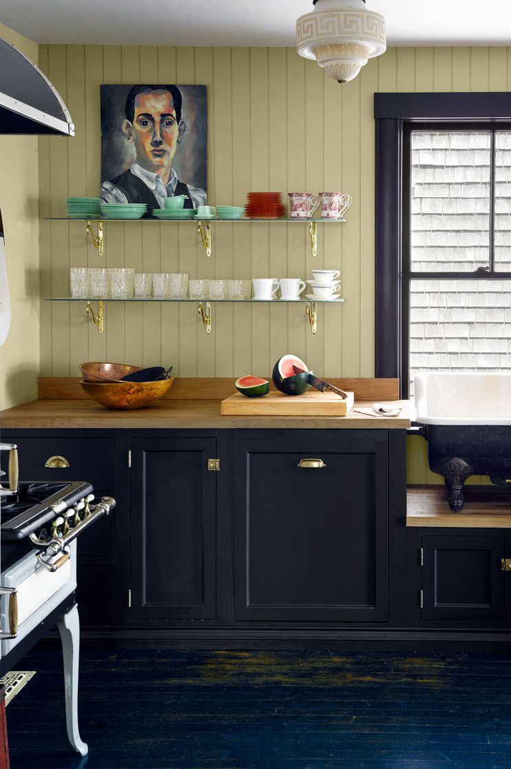
Glass and gold open shelves feature glass shelving supported by gold brackets. However, these shelves don’t stand alone. For most of the kitchen, the hardware should carry the same gold tone used in the shelf brackets. This can be the cabinet pulls, hinges, or stove handles.
Overall, this design shines best in a traditional kitchen with subtle contemporary touches. For instance, the stove can be antique, and the glassware and cutlery on the shelves can also be antique.
Pops of color or contrasting colors can add a unique contemporary touch to the kitchen, blending well with the glass shelves.
58. Wood Cubbies
The basic design for most open shelves is a flat board at the bottom supported by wooden or metallic brackets. But why not try something different?
That’s where wood cubbies come in. Wood cubbies are simply cubed shelves with no doors attached. Thus, they inherently have the basic box design of closed shelves, albeit without doors.
These cubbies look amazing in an all-white kitchen with modern, flush cabinetry at the top and bottom.
Wait, you can use closed shelves at the top, too? Yes. Wood cubbies usually serve as extra storage, which you can put on top of your current top shelving.
59. Wood Shelves with Rails
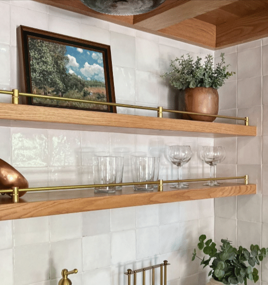
If cubbies don’t look that unique, open shelves with rails might do the trick. These open shelves carry the basic design of common open shelves, albeit with added metallic or wooden rails.
Plus, instead of glaring brackets, most wood shelves with rails feature a floating design, which makes them look chic. They’re also characterized by clean lines and extreme minimalism, making them perfect for a minimalist, modern kitchen.
This design of open shelves is usually used to store glassware and cups. Thus, they’ll commonly be installed next to kitchen sinks, with a matching color tone for the backsplash and the kitchen walls.
60. Light Wooden Panels
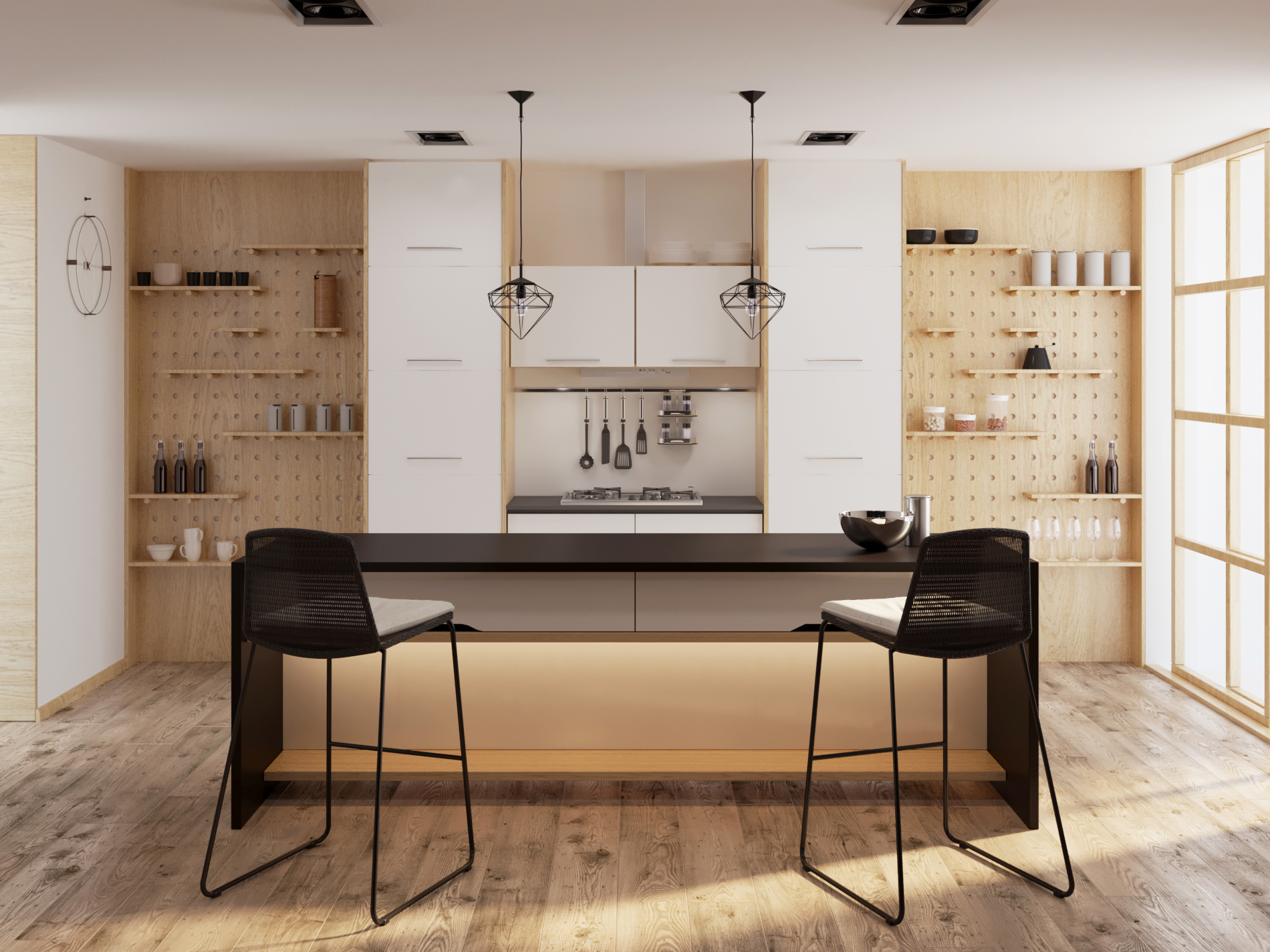
If you’re working with limited space in a one-wall small kitchen layout, you should try light wooden panels as an open shelves design option. Unlike regular open shelves, light wooden panels use the wall on both sides of the kitchen to create space for open shelves.
The shelves are creatively installed in an alternating pattern that adds a chic look to the entire setup. The floating shelves are also installed in various lengths to provide visual cues of what you can store on each panel of the shelves.
You can support this design by including a column of closed shelves on both sides of the open shelf panels. This cabinetry can have flush pulls to fully complement the minimalist design the light wooden panels promote.
61. Farmhouse Charm
This open shelving design should be your go-to choice if you’re going for the full farmhouse kitchen experience. The farmhouse charm lets you add a chic charm to your farmhouse kitchen and display the best vintage kitchenware and appliances you have.
These open shelves combine function and flair to create a stunning look. By being open, they create extra room for storage and display, enhancing the décor.
For instance, you can have a striking white and wood-tone kitchen design, with pure white open shelves supported by white wooden brackets. The open space allows you to fit the best of your kitchenware and appliances alongside artwork that will add a bit of décor to the entire layout.
62. Live-Edge Shelves
Most homeowners opt for reclaimed or stained wood to add a rustic touch to most open-shelf designs. But what if you could take this a notch higher and get an even more authentic rustic feel for your kitchen?
That’s where live-edge shelves come in.
Instead of stained or reclaimed wood, live-edge shelves use slabs with visible bark. This creates a rustic feel that can blend nicely with an authentic farmhouse kitchen.
The only downside to this design is that live-edge shelves tend to cost more than reclaimed or stained wood. However, the investment is worth the final look and authenticity these open shelves add to your kitchen.
63. Monochrome Layout
If you’re not a fan of pops of color or deeply contrasting tones, then a monochrome layout should be a viable design option for your galley kitchen.
A monochrome layout, especially in white, helps create a feeling of space and airiness in your galley kitchen design. You can experiment with glass wall units or a wall of windows that bring in some light.
Alternatively, instead of a pure white color scheme, you can add subtle shades of black on a few kitchen appliances, such as the stove, to break the color monotony. Doing this helps further reduce the hallway feeling and thus makes the kitchen feel more spacious.
64. Terracotta Design
If white is too bright for you, experimenting with darker colors is still a viable design option.
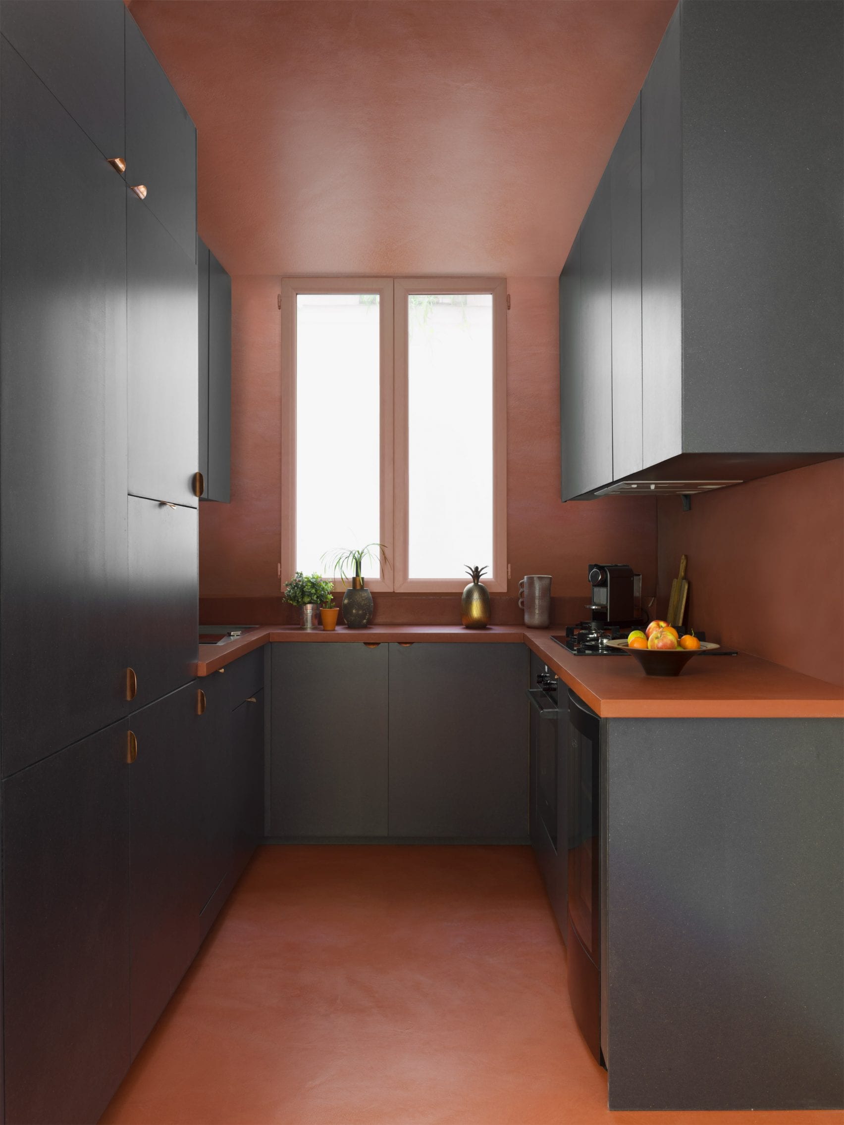
Yes, dark colors are known to make a room feel squeezed and constricted. Thus, going for a shade like terracotta for your galley kitchen design makes no sense.
Well, that’s not true. Interestingly, a terracotta galley kitchen is a very viable option.
When dark cabinetry is painted in darker tones, like dark gray, terracotta ceilings, and walls, it breaks the dull color monotony without adding too much contrast.
With such a design, you must focus on minimalism to give the kitchen an even more airy feel. Thus, the countertops should be clutter-free, and all appliances should be stored inside the cabinetry.
You can even experiment with a nice shade of orange on the countertop to create a stunning three-tone design.
65. Contrasting Colors
White and dull colors are not that contemporary. In most kitchens today, designers are exploring bold shades of color with great contrast to add interest to the kitchen design. So why not try that with the galley kitchen?
One way to do this is to have the ceiling, walls, backsplash, and piping all be different but contrasting color shades.
For example:
You can have a painted ceiling and floor with pale pink varnished piping. The kitchen hardware, such as cabinet knobs, can be in jewel tones that, put together, add a vibrant feel to the entire kitchen design. You can use the same theme in the rooms adjacent to the kitchen to give these areas a unified look.
66. Open Concept Galley Kitchen
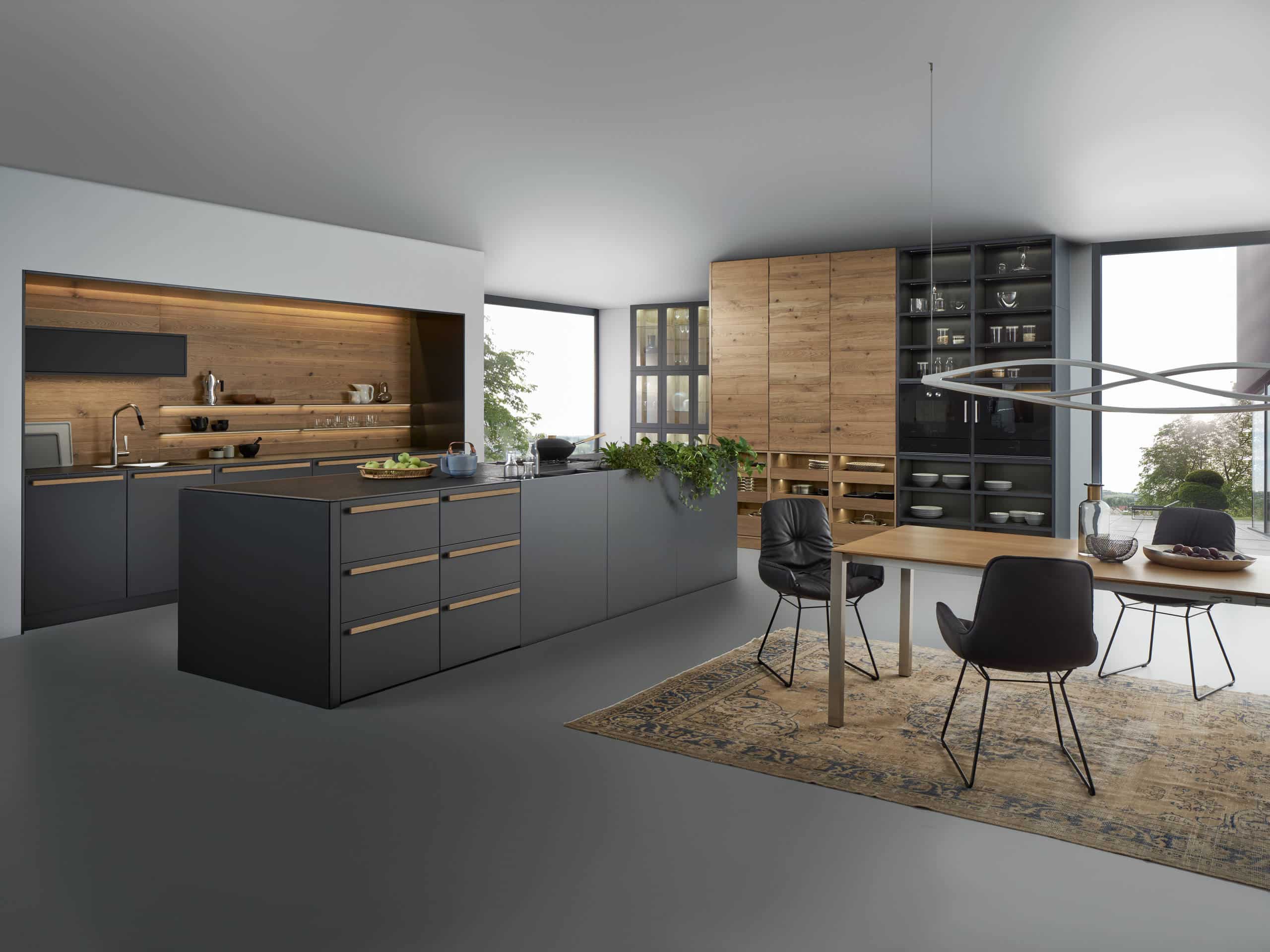
Open Concept Galley Kitchen Design
Who said the galley kitchen has to be a closed hallway? With a modern design, an open-plan concept can be used with the galley kitchen design.
Functionally, this design helps reduce smoke and heat in the kitchen by adding ventilation in the small hallway.
As far as aesthetics go, an open-concept galley kitchen connects the kitchen to the dining and living areas, making the entire house feel like one. More importantly, it makes the kitchen feel more spacious.
You should also go for a minimalist design to fully explore the open concept. This means using flat-panel kitchen cabinets, open shelving at the top, and open wood cubbies between the top and bottom drawers for the bottom cabinetry.
You should also try contrasting darker tones with lighter colors to make the kitchen airy and spacious.
67. Separated Wet and Dry Areas
Separate Wet and Dry Kitchen Areas
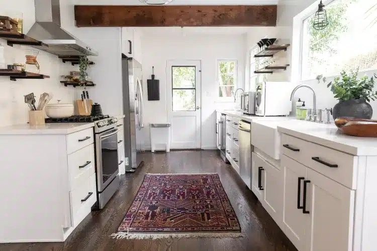
This is one galley kitchen design that fully explores the functionality of this kitchen layout. Instead of mixing the wet and dry areas, this design separates the two.
The wet area thus holds the sink, dishwasher, and laminated modular cabinets that mostly hold utensils and other appliances that are cleaned regularly.
On the other side are the stove, fridge, range hood, and laminated modular cabinets that hold items used mostly for cooking.
This design neatly organizes your kitchen, making it easier to work in. Laminated modular cabinets and stainless steel fixtures give this kitchen a contemporary look.
68. Modern Galley with Windows
Modern Galley Kitchen Layout with Windows
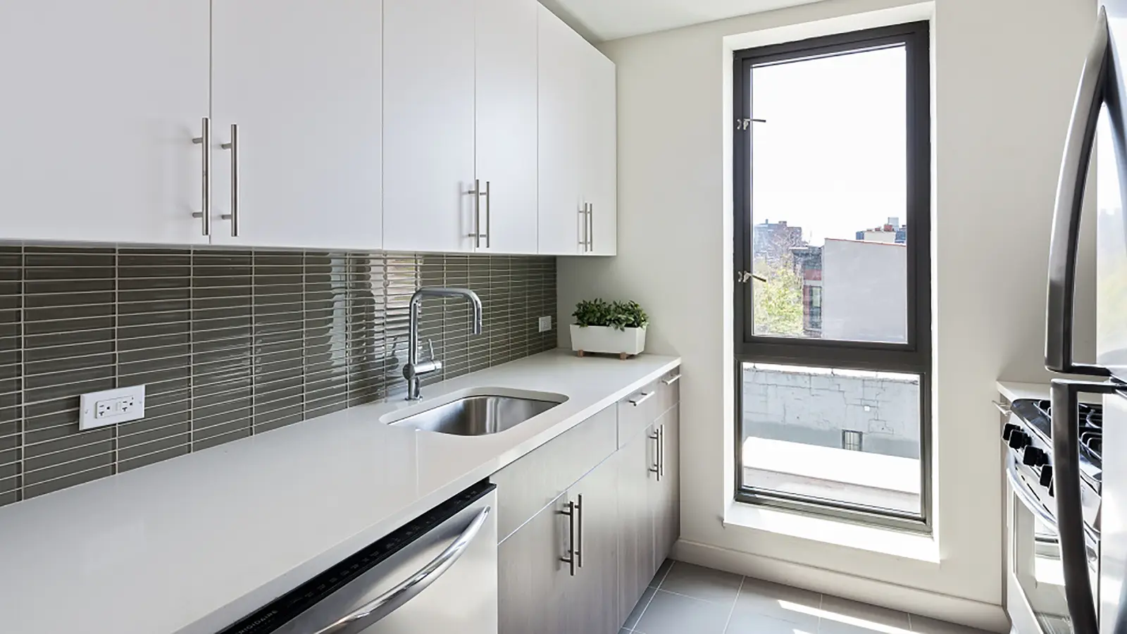
Nothing beats natural lighting when it comes to visually expanding a room. If you want to make your galley kitchen look big, you should try this design option.
Fixing a window on the yard-facing side of the kitchen helps add much-needed natural light. It also adds ventilation, making it easier to cool the kitchen off when the cooking intensifies.
You can use bright colors, such as white, on the kitchen cabinetry and backsplash to bounce off the natural light. The countertops can be made from white quartz. The goal is to ensure you bounce back as much natural light as possible around the kitchen.
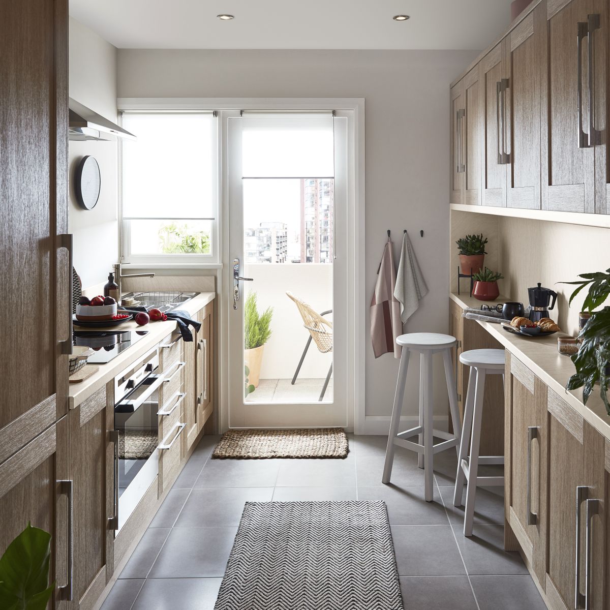
69. Wall Units and Mini Breakfast Bars
Visually expanding your kitchen might not be enough. In most galley kitchen designs, you also want to add physical space around the kitchen. That’s where wall units and mini breakfast bars come in.
You can install full-size wall units on one side of the kitchen, adding extra storage space. This will help reduce clutter on the surface and add physical and visual space.
You can also fix the half-width wall and base units on the other side of the kitchen to fully utilize the available space. And on this same side, you can use the extra space left to fit a mini breakfast bar. Instead of chairs, you can use stools to add extra room in the galley hallway.
As much as the focus is on the physical space, don’t forget to add some visual space. Invest in light colors to expand the kitchen and make it look spacious.
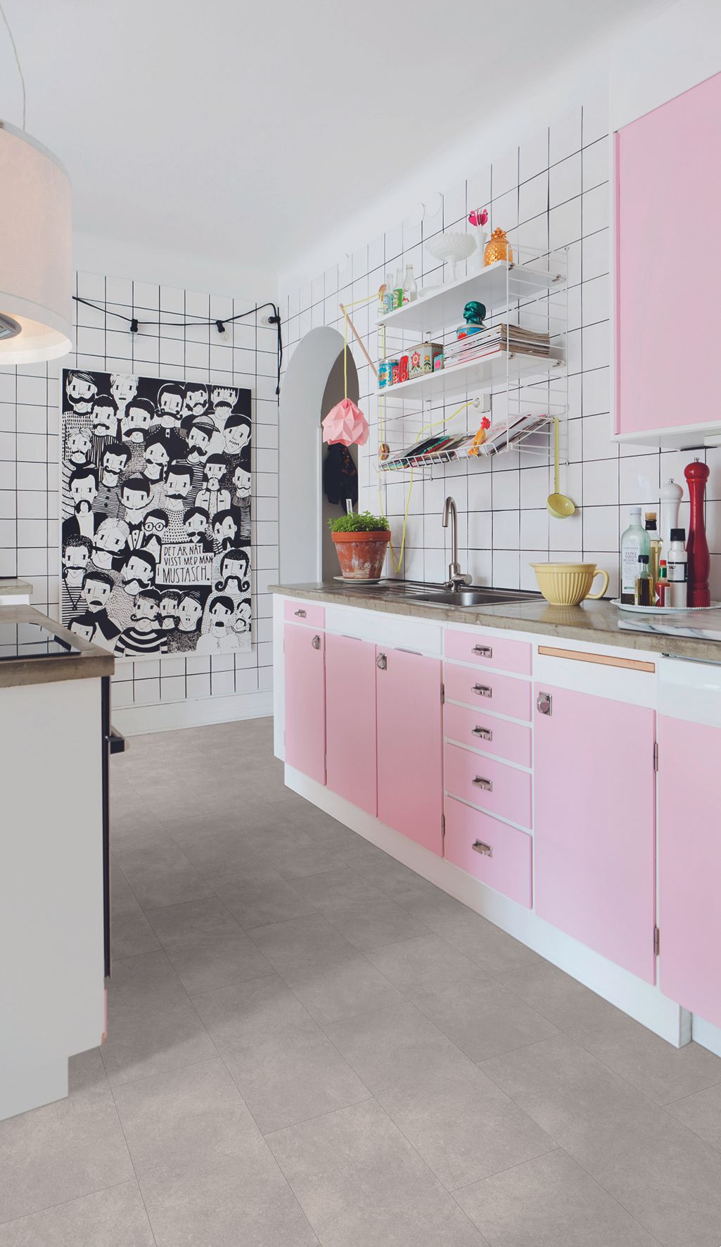
70. DIY Paint and Artwork
Galley kitchen designs are mainly focused on increasing not just physical space but the sense of it. However, this design is more inclined towards personalization than space and utility.
With this design, your DIY skills are left open to the wild. Thus, any crazy idea goes, from the paint job to the artwork displayed in the kitchen.
For instance, you can use happiness-inducing bright shades on the cabinetry and walls of the kitchen. Then, on either side of the wall, you can place a monochromatic artwork that blends with the paint and conveys a personal message.
This design is most popular among millennials who are not shy about expressing themselves. It only needs a lick of paint, not an entire architectural alteration, so you can do it in your rented house, too.







:max_bytes(150000):strip_icc()/003_mccadden_los_angeles_ADU_spanish_style_guest_house_small_kitchen_villa_lagoon_tile_backsplash_saltillo_tile_flooring_IKEA_cabinets-8e7ba7b12a3e495cb393fff0624c18fb.jpg)
