Go bold or go home! You probably already have this mentality if you’re interested in red-and-white kitchens. Home to you is fun and loud; you’re not afraid to show it. Still, with such a big idea, it’s hard to know where to start.
Let me assure you, though, by starting here, you’re on the right track.
White and red kitchens can give several distinct vibes: antique, retro/vintage, and modern. If your style is more sophisticated and elegant, red is good for the ballroom but not the kitchen.
However, if you want some fun for your new apartment or want to spruce up your rustic kitchen, give red a shot. Unlike purple and orange, red is more likely to create a long-lasting look that won’t go out of style while stepping outside the neutral box.
Red and White Kitchen Design Ideas To Inspire Your Next Remodel
There are so many ways to design a red-and-white kitchen that it is best to walk through some examples and explain what makes them great. I hope that you can find some inspiration for your red kitchen dreams!
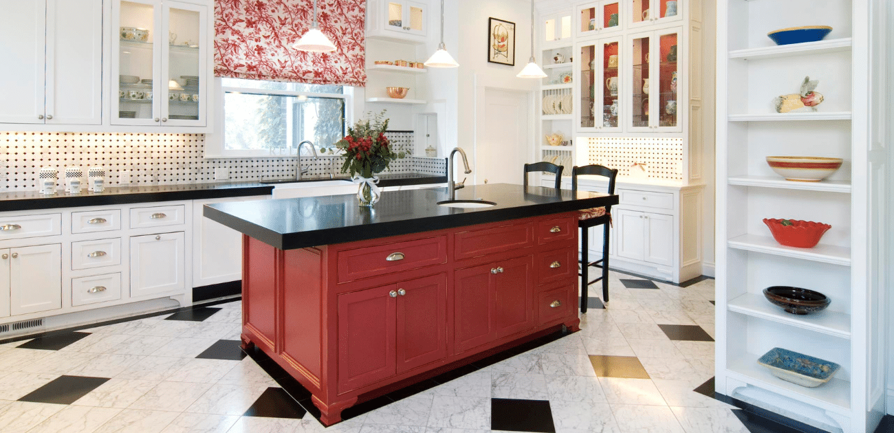
For many people, incorporating red into the kitchen might be a little too much. This design shows a great way to incorporate some color into an otherwise simple room. Just adding some red to the island cabinets and using red and white for the window shade will liven up a space without feeling like it is dominated by a bold red.
2. Just the Decor
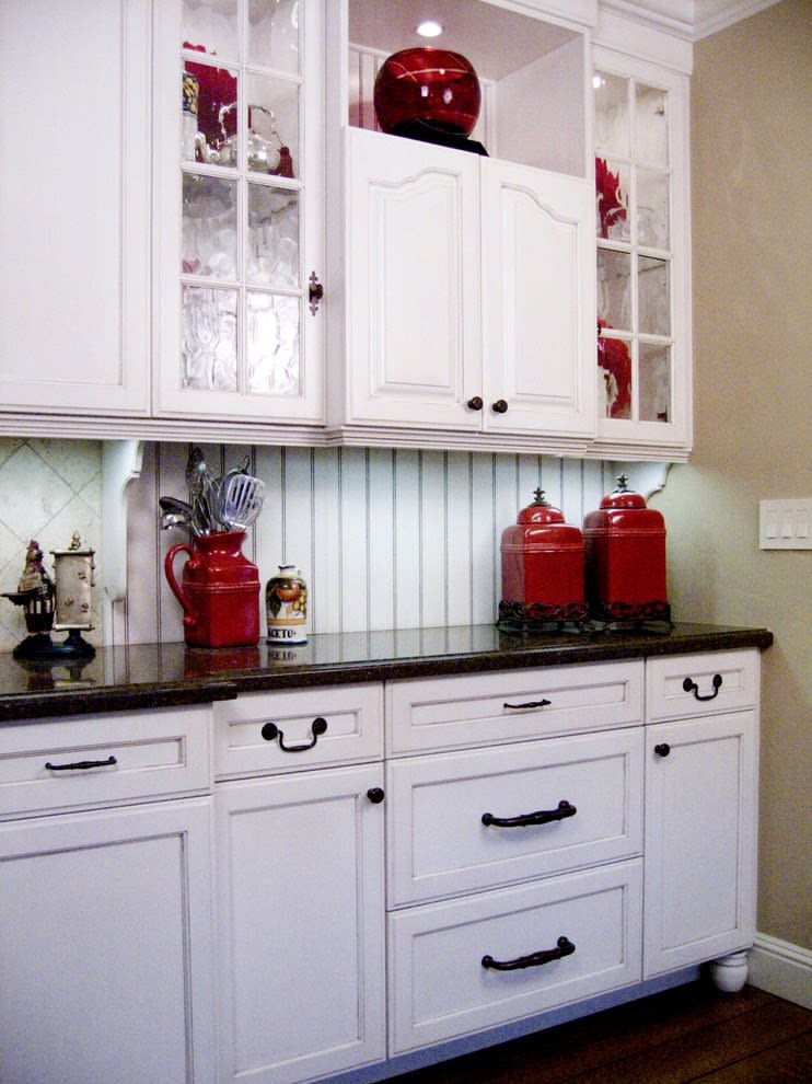
This is a mostly white kitchen, but the decor adds pops of red to give the room some life. It has an antique style that will make anyone who enters feel right at home. This is a narrow view of the room, but the kitchen is on the small side. For this reason, it’s best to keep the foundation light — use white cabinets and white walls. The decor is vintage and gives the kitchen the red pop, making it a beautiful white and red kitchen.
3. Glossy Red Cabinets
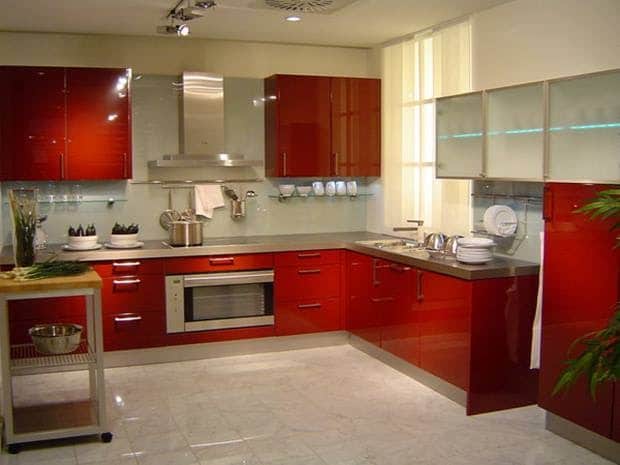
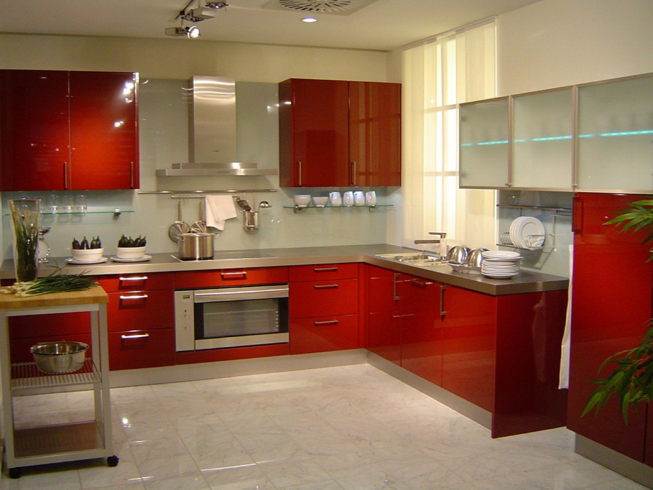
It’s probably best to say that glossy red cabinets are not for everyone. If you are going to be chic and sophisticated, it’s best not to go for a bold cabinet. However, if you want a modern kitchen or a 50s vintage vibe, the glossy red could be for you. Like with most bold designs, if you go bold with one thing, it’s best to keep the rest simple.
Otherwise, the room will become busy and lose its desired retro or modern flair. In this case, there is just a solid countertop and no backsplash. It would be a mistake to try to make anything more of red cabinets.
4. Bright Walls
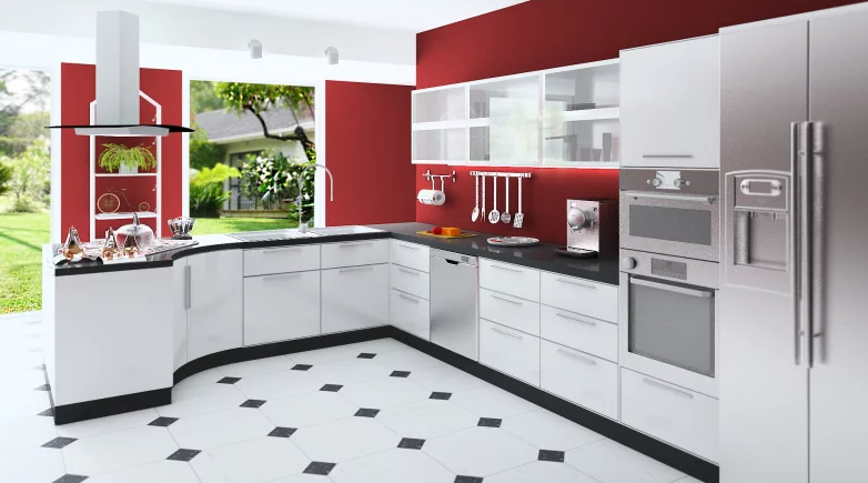
This modern and sleek design can be paired with any color. Simply adding red paint to the walls brings this room to life. If you're bold, you can replace the red with blue, green, and/or purple.
This is an easy and adaptable design that will go with any house. Add a fresh coat of paint, and this kitchen will feel brand new.
5. Best Backsplash
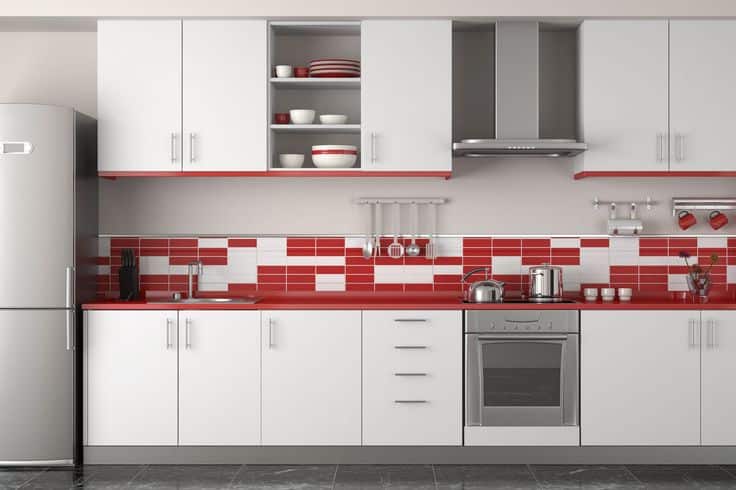
White and Red Backsplash Combo
Besides adding some paint, the easiest way to incorporate red into the soul of a kitchen is the backsplash. Using tile to make a great backsplash can be expensive, but it doesn’t have to be. A simple design is a great and cheap way to add life to a space. This kitchen also uses a red countertop to complement the backsplash, plates, and decor and contrast with the white cabinets.
6. Red, White, and Blue
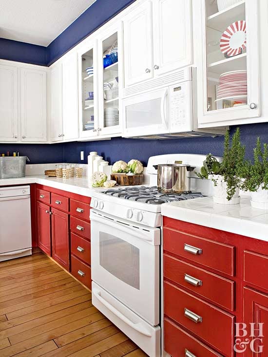
The kitchen isn’t the most common place to flaunt your patriotism, but with this design, it works. You get the red through the cabinets, the white through the counters and appliances, and the blue on the walls. The key to adding a third color to a white and red kitchen is to match the shade of the red and the third color.
That is done well here—that is, if the walls were electric blue or the cabinets bright red, that room would look gimmicky and poorly designed. So, if you want a tri-color theme, do it! Just be sure to do it right.

