You have many options for European kitchen designs. But why would you settle on Scandinavian?
Scandinavian kitchen design is described as oh-so-stylish and eclectic. It focuses on accents of warm wood, pale paint color hues, and minimalism.
Scandinavian European Kitchen Design Ideas For Your Inspiration
So, how do you make a Scandinavian kitchen? Unlike American kitchens, Scandinavian kitchens are focused on less is more. They also emphasize efficiency and a sense of cheerful elegance, which the Scandinavians developed during the long winters that inspired this design.
Clean lines and functionality are at the core of the Scandi kitchen design elements. That’s why, traditionally, Scandinavian European kitchens have a limited color palette, and the design emphasizes texture instead of bells and whistles to add interest to the design.
The style, therefore, traditionally revolves around lined tiling, white walls, and wooden floors.
So, does that mean there isn’t room to experiment?
No. Scandinavian kitchens offer many customization options. For instance, despite working with a limited palette, this almost monochromatic/two-tone approach can still be achieved with a bit of color experimentation while providing stunning results.
Plus, thanks to its focus on minimalism and clean lines, the Scandinavian kitchen design is perfect for the modern kitchen. And if that’s what you’re going for, then you should read the rest of this piece. These designs will surely inspire your next great kitchen build.
1. Hints of Color
Going all white might be boring to most people. Assuming you’re one of them, the Scandi kitchen allows for a little bit of colorful experimenting, albeit in a regulated manner.
For instance, a mix of chic kitchenware with floral patterns, pops of bright yellow or green, and pastel hues that provide a breezy summer charm, coupled with a neutral backdrop, provides a nicely toned kitchen that is not too colorful for a Scandinavian European kitchen design.
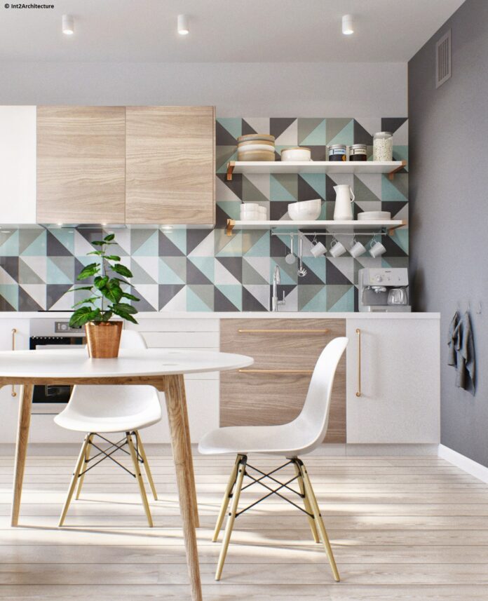
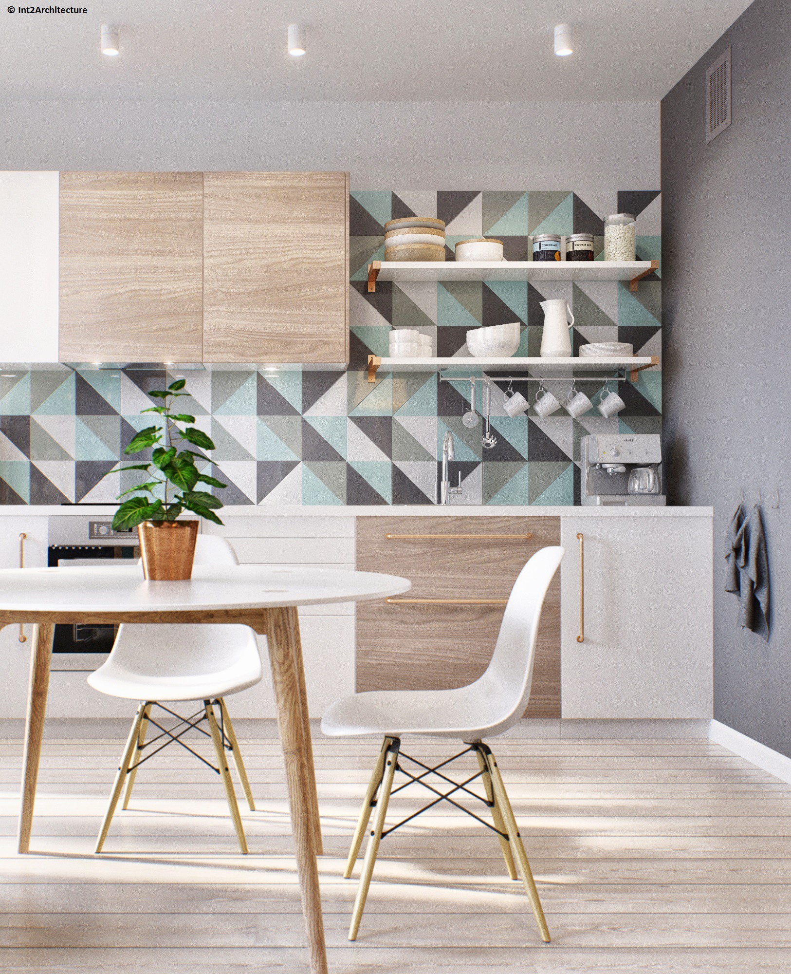
If your backsplash is monochrome, you can also experiment with wallpaper or colorful geometric tiles to break the monotony.
Do all colors work with this design? Not exactly. In most cases, summer colors provide the best balance. Stronger hues might work, but a bit more constraint is necessary so that you don’t overdo things, as far as Scandinavian kitchen designs are concerned.
2. Industrial Scandinavian
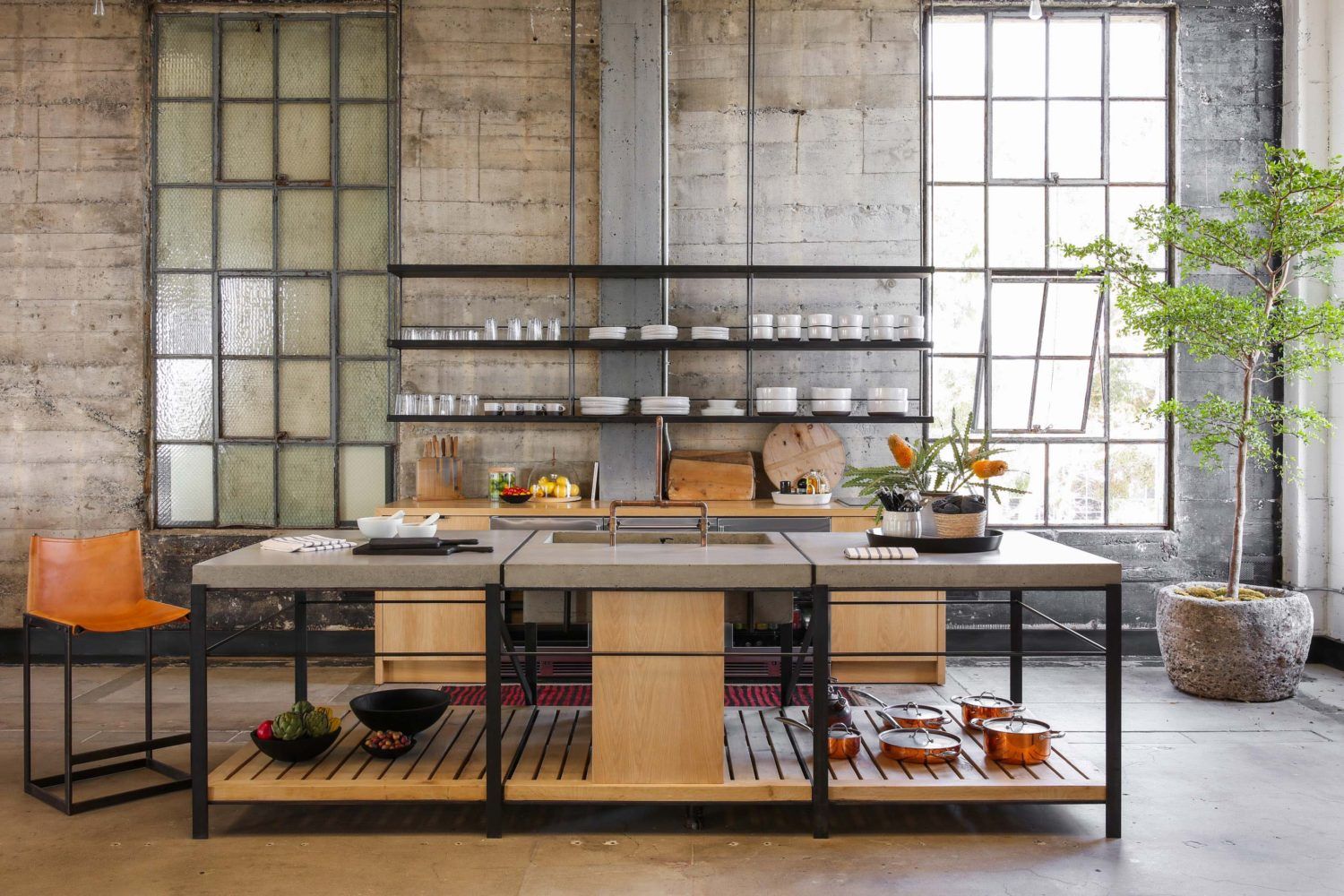
This design focuses on another core element of Scandinavian kitchen design—texture. The industrial Scandinavian kitchen design combines leather, poured concrete, and wood to create a Nordic, industrial, and chic kitchen.
This kitchen visually exposes the bones and structure of the rustic brick building upon which it is built by exposing these textures. To nail that industrial look, you can use open shelving for the upper layers, with the bottom cabinets featuring a highly minimalistic design.
The open shelving exposes the old stone wall, framing it as a unique kitchen feature and further amplifying the design's texture.
The final design includes a bit of metal, with the center island/table featuring a concrete top, wood base, and metallic legs painted in black.
3. Take Full Advantage of Minimalism for Small Kitchens
Most people have small kitchens. While the one-wall or galley layout seems to be the best option for limited space, the specific design is always a question of debate.
Well, the Scandinavian European kitchen design should be your go-to.
Why? Thanks to its emphasis on minimalism, organization, and frugality, this kitchen design serves both lavish catalog creations and ultra-small utility kitchens. How exactly?
In small kitchens, you can incorporate floating shelves, wall-mounted cabinets, and ergonomic worktops that prioritize efficiency over form to fully utilize the limited space.
You can experiment with inherently light colors to create an airy, roomy feel in the kitchen.
4. Light and White Hues
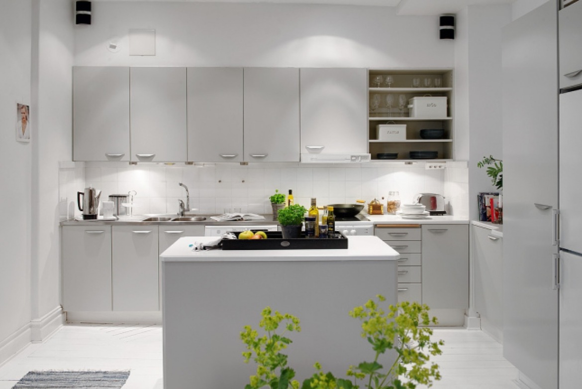
The Scandinavians predominantly used white in their kitchens. But why so?
Well, back in the day, when the winters were long and gloomy, Scandinavians preferred painting their kitchens white to create a cheerful and airy feeling away from the winter gloom outside.
White improved the natural lighting in the kitchen and kept the visual fragmentation at a bare minimum.
So, what’s stopping you from using it? Nothing. Given that this is part of the original Scandi kitchen design, you can never go wrong with it. This design works even better in a small kitchen’s one-wall layout since it visually makes the space look larger and the kitchen looks lovelier.
But that doesn’t mean any kitchen in white is inherently Scandinavian. To stay true to the design, you need to add a few touches of soft wooden tones, clean, straight lines, and little to no clutter.
5. Try Two Tone Cabinets
Two Tone Cabinets Scandi Kitchen Design
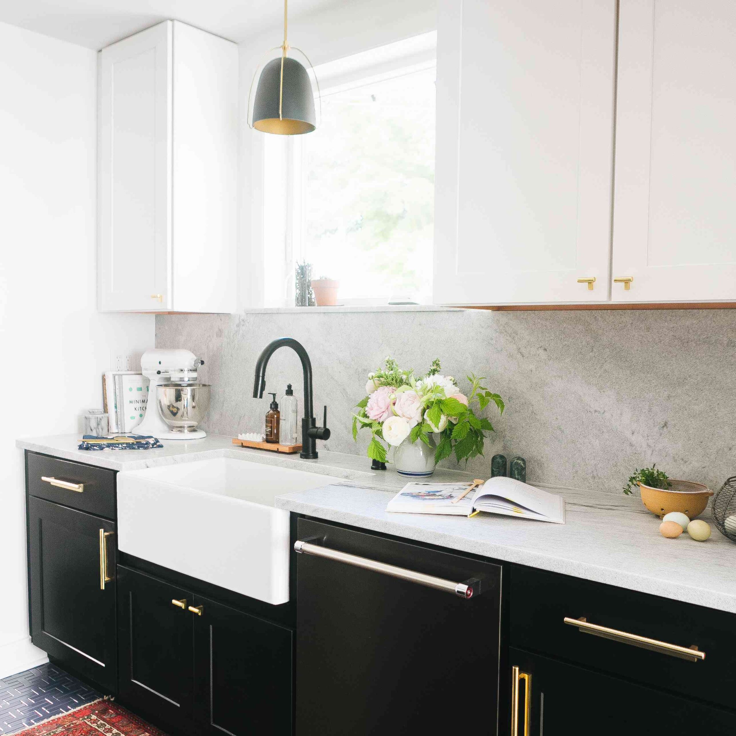
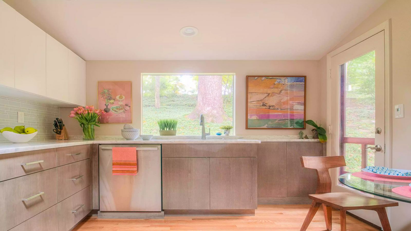
If mixing colors with restraint in the kitchen is challenging, try two-tone cabinets instead. This approach adds visual interest to a neutral kitchen while adhering to the Scandinavian minimalistic design principle.
With two-toned cabinets, you can have white on top and a lightly stained light wooden hue at the bottom/cabinet doors.
A complementary backsplash amplifies this design even further. You can choose a soft yet impactful color with a lighter hue than the color tone on the cabinets.
Can you add a bit more color? Yes. You can break the strict two-tone nature of this design by incorporating some wall art. The wall art should subtly add vibrant colors without being visually distracting from the rest of the kitchen.
6. Try Coastal Kitchen Vibes
Yes, the Scandinavians inherently didn’t have a beach during winter, but that doesn’t mean you can’t add your coastal vibe to this design if you live in a beach house. The first step is working with an open-concept kitchen.
The idea is to make the open-concept kitchen feel sunny and light. To top off that coastal vibe, you can strategically use pops of color around the kitchen.
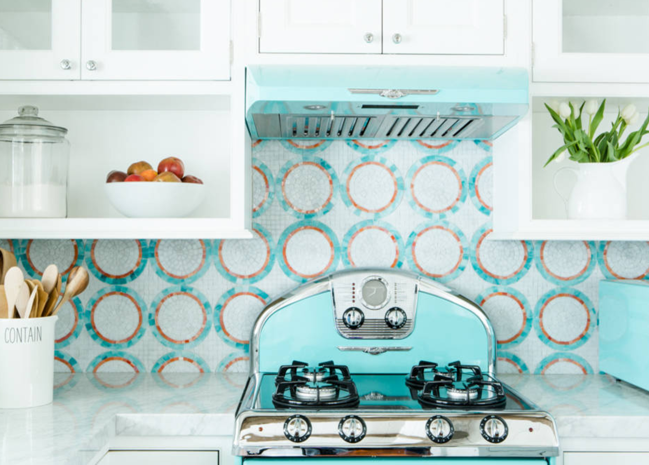
For instance, you can have white glass fronts for the cabinetry, with some open shelving. The countertops can be quartz, and retro-inspired kitchen appliances can occupy most of the space.
So, how do you mix the colors? Let’s start with the kitchen appliances. Robin's Egg Blue would be perfect since you’re going for a coastal vibe. This color will provide a refreshing and welcoming feel to the kitchen.
For the backsplash, you can use mosaic tiles in a circular pattern. This complements the color scheme while not taking too much attention away from the rest of the kitchen.
You can take this design up a notch by incorporating elements such as plants and simple containers. However, remember to keep them as minimalistic as possible.
7. Clean Contrasts
This is one of the most subtle ways to incorporate slightly stronger hues into your Scandinavian European kitchen design. The idea is to have clear contrasts between the different colors, with the colors naturally blending in together to form a homogenous look.
So, how should I split the colors? I could simply color the island differently from the rest of the kitchen.
Otherwise known as the contrasting island, this trendy color-contrasting approach works well with a natural wood kitchen. The stark contrast between the center island and the rest of the kitchen adds sophistication and sleekness to the design, making it stand out.
The striking island adds warmth to the space and is a focal point for the kitchen visuals.

