A mid-century modern kitchen is one for homeowners looking for a classic yet on-trend kitchen. The style is flexible and can be mixed and matched with other design preferences, such as classic, traditional, and modern.
In addition, mid-century modern kitchen design colors and materials can easily be mixed with newer materials and more contemporary styles.
Creating a mid-century modern kitchen is a fun way to add life and a little quirkiness to the space, even if the goal is just to add a few mid-century modern touches.
What is a Mid-century Modern Kitchen
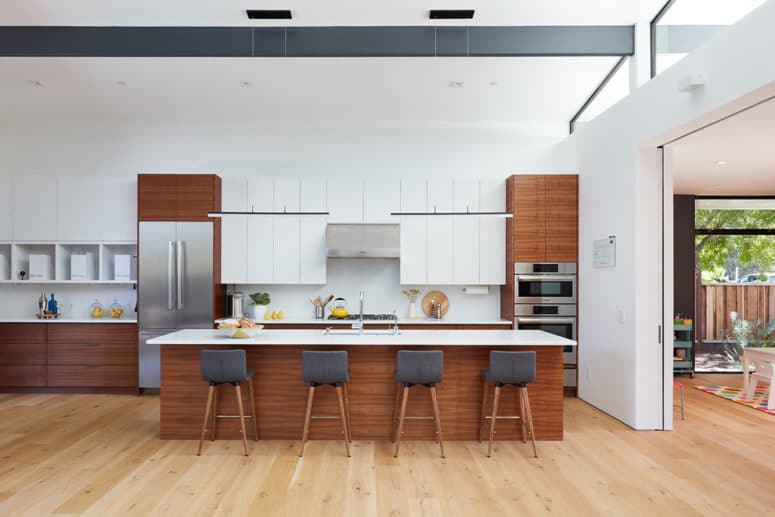
Mid-century modern design became popular during the 1940s, following the Second World War, and has been considered a timeless style since. With so many young families building and buying their first homes after the war, the design reflects the booming economy and optimistic outlook.
It was appealing to many because it allowed for more freedom than other design styles, such as traditional. Additionally, homeowners wanted more efficient and functional designs and coveted new materials and textures resulting from technological advances.
During this time, floor plans in the new house were designed with a purpose. In addition, multipurpose furniture helped conserve space, and pieces could be stacked or nested to conserve space further. This style of interior design focuses on the functionality of the space.
Like Scandinavian design, which rose in popularity around the same time, mid-century modern design is free of clutter and ornamentation.
Instead, the décor is streamlined—practical and durable but also incorporating vintage styling. It highlights the materials used, focusing on their function.
Mid-century modern design was a catalyst for open floor plan concepts, but the kitchens of that era were nowhere near the size of kitchens today. True mid-century kitchens are galley style with one long space of counter running down each side. That is why this style of kitchen works in any size.
Characteristics of Mid-century Modern Kitchen Design
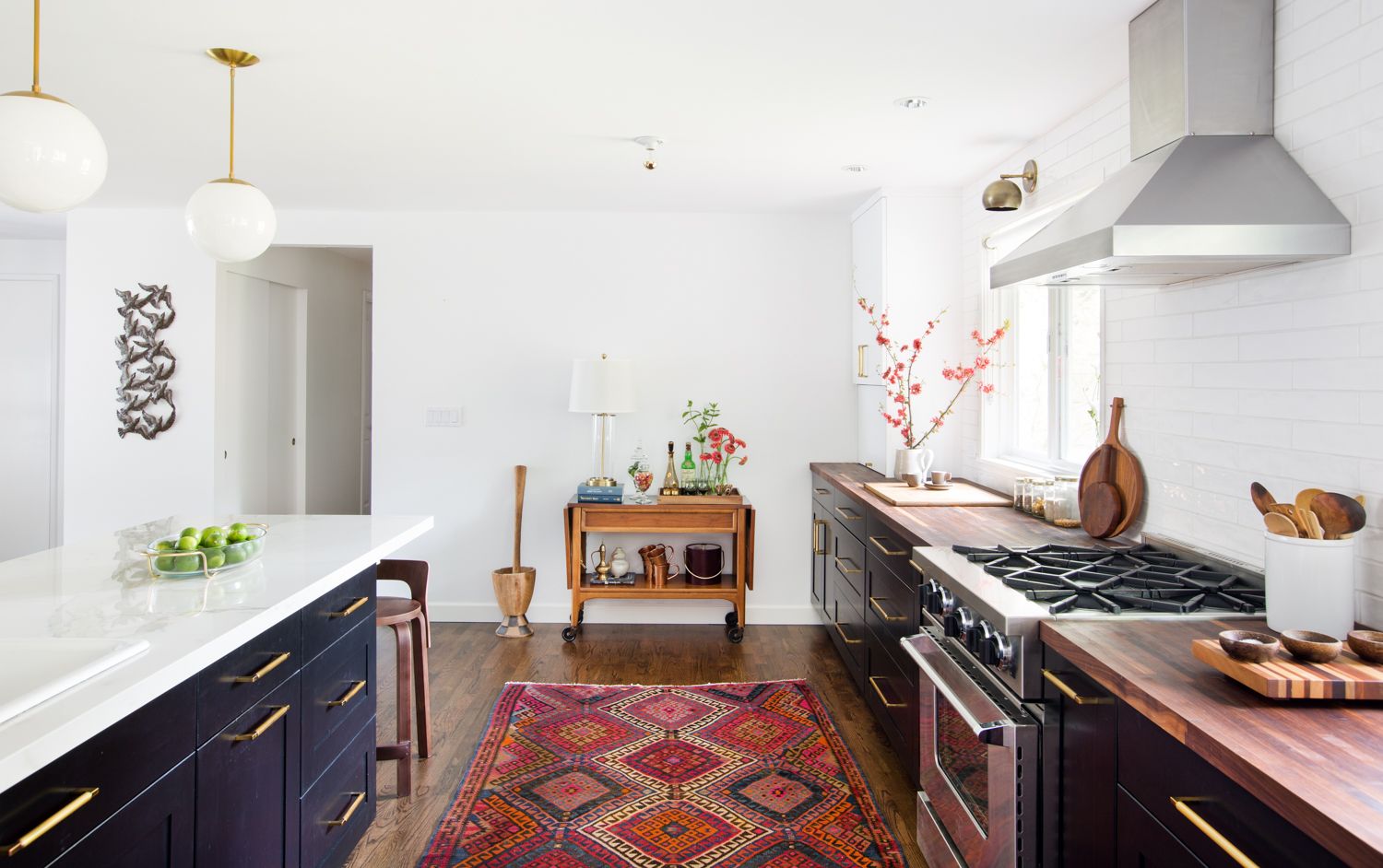
Mid-century design is easy to identify because it has features not found in any other design style. The mid-century design commonly features some of the following:
- Use of different colors, some of which are bold
- Graphic patterns
- Understated design
- Use of wood
- Organic and geometric shapes
- Minimal or simple décor
- Opposing materials and textures
- Natural elements such as plants
- Large continuous countertop
After the inception of this style, new manufacturing methods were producing new materials, such as plastic, Plexiglass, and Lucite, which are also used within the design.
Mid-century Modern Kitchen Color Palette
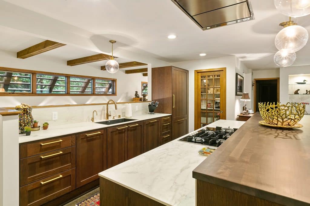
The color palette of a mid-century kitchen is very flexible and can cater to the homeowner’s preferences. The neutrals used in the mid-century modern design are always in style.
However, this style also uses bright hues or warm colors in addition to a neutral base. For example, neutral tones for the cabinets and countertop should be used, with a bold color on the backsplash or the island stools.
Want colors to pop in the kitchen? Bright colors like apple green, bright red, and turquoise contradict the heaviness of wood grains. Many colors were used in the former mid-century design, such as in a bright orange countertop.
However, in today’s design, one colorful statement piece is balanced with muted colors. Pale yellows and greens on the walls help balance the use of wood and can help add light.
With colored cabinets, it is best to use white or off-white walls so the space does not become overwhelming.
Mid-century Modern Kitchen Cabinets
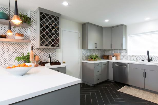
Cabinets in a mid-century kitchen are generally modern with simple, clean lines. No ornamentation is important. Flat front panels are ideal for this style due to their sleek look. They can be paired with simple satin nickel pulls that do not detract from the rest of the design.
Walnut Grain was a popular choice for cabinets in true mid-century design and can be made to look modern again with the correct use of other materials in the kitchen. The overall look is clean and modern, no matter what color cabinets.
Homeowners who want to recreate a true, vintage feel can consider the metal cabinets used in this design when it first came out. Wood cabinets eventually replaced the metal in the 1960s.
Mid-century Modern Kitchen Countertops
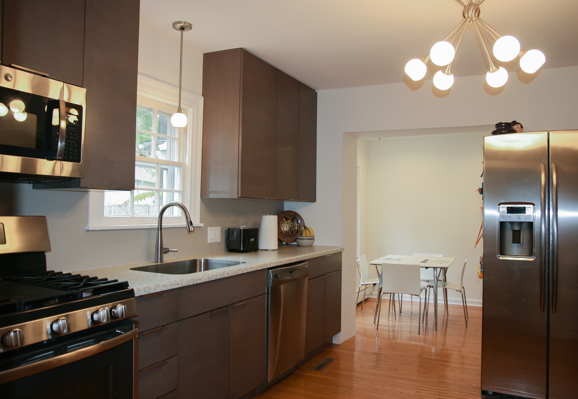
Who said laminate countertops were out of style? Laminate countertops were trendy in the 1940s, the 1950s, 1960s, and beyond, but innovations in the material have improved them, so they have come a long way since then.
A big bonus: laminate is an affordable and durable material for homeowners on a budget. The wide range of colors and patterns available in laminate can be a good fit for a mid-century modern kitchen.
Another option is a ceramic tile, a popular choice for countertops in original mid-century homes. Different colors and patterns can be used to add texture to the room, but bold tile choices should be paired with neutral cabinets.
Quartz can also be used in this kind of kitchen because it pairs well with any chosen color scheme and goes well with bold colors. Since it is non-porous, it will not stain and is durable.
Mid-century Modern Kitchen Backsplash
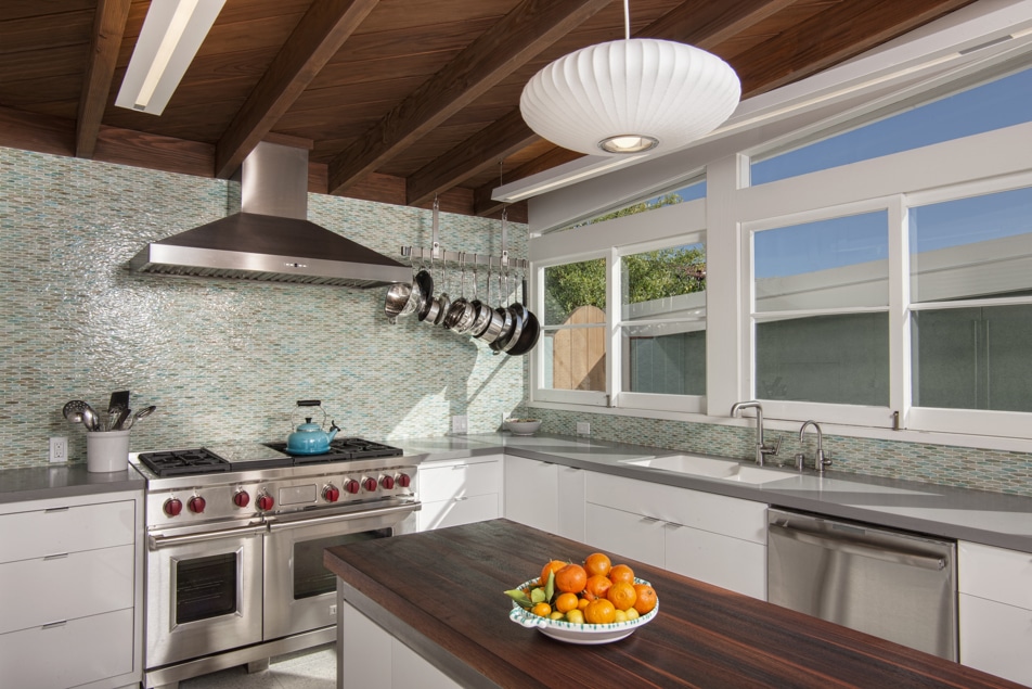
Mid-century modern homes often use ceramic tile for the backsplash as well, and bold color is often used as an accent. Today, the design and style choices are endless.
A black tile border around the colorful tile modernizes it. Squares and rectangles are more classic choices, but mid-century modern kitchens have hexagons, circles, and other geometric shapes in the backsplash.
Even classic shapes like squares become unique when incorporating a retro graphic design. For example, a half-circle tile design in pastel colors fits the mid-century modern aesthetic.
Mid-century Modern Kitchen Furniture
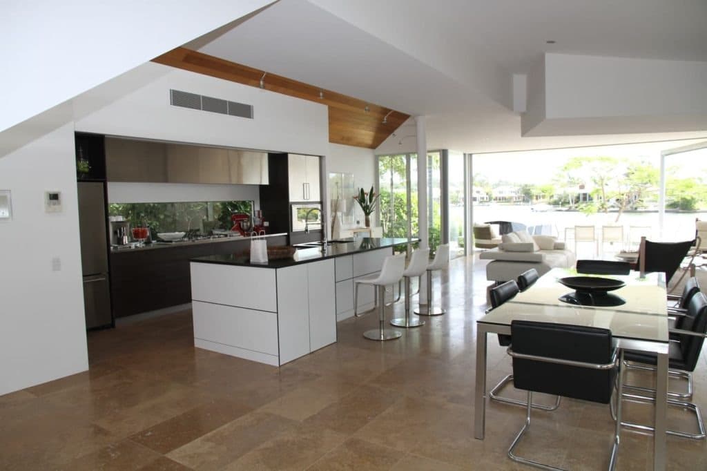
Mid-century furniture is very easy to define, with a mix of organic and geometric shapes. This type of kitchen features hairpin legs, low, streamlined seating, and plastic shell chairs. Kitchen tables and island chairs are simple, purely functional, and minimally elaborative.
Wood and wood veneer are elements of this style but are mixed with other synthetic and organic materials in furniture. Furniture with geometric, curving lines and multiple uses provides continuity in style throughout the space.
Mid-century Modern Kitchen Flooring
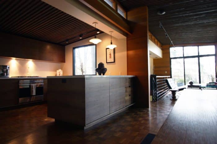
Traditional mid-century modern kitchens had natural stone floors such as slate, travertine, or bluestone. Many new tiles are more affordable but offer the same look.
Other flooring options include wood and cork. There are many choices for wood flooring, from hardwood to vinyl planks that look like wood. The type of wood is not as important as the color, which should be a rich, warm brown with grain to be true mid-century modern.
Mid-century Modern Kitchen Texture
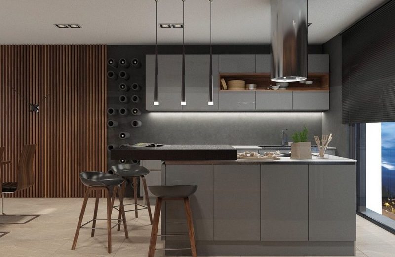
Part of the appeal of this type of kitchen is the mixture of different textures and materials. Wood became popular in the 1950s, and wood textures have a natural feeling when used on the ceiling and walls.
Now, wood is mixed with other materials and is less abundant than in years past. Different textures and materials, like greenery, help offset the wood texture. Other natural materials like leather and metal are commonly found in mid-century modern kitchens.
Bold patterns in abstract or repeated geometric shapes are paired with the furniture’s clean lines to create an uncomplicated statement piece.
Materials like Plexiglass and fiberglass are sometimes used in furniture, usually molded and bent to fit the piece’s curve. Furniture might also have textiles in colors, such as an avocado-green kitchen nook upholstered bench.
Open shelving is either a major feature of the kitchen or just an accent. Open shelves can be placed over the sink or in another area of the room. This is a great place to add bold color.
Even in a kitchen with a lot of wood, open shelving can help lighten the weight of its use.
Mid-century Modern Kitchen Breakfast Nook
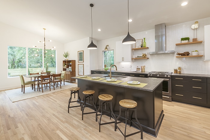
When mid-century modern kitchens first came into play, the breakfast nook served as an efficient place to serve meals. Even as kitchens became more significant over time, homeowners still wanted a defined meal area.
The breakfast nook is often used in the mid-century kitchen as a specific space for eating. Built-in seats with a patterned material can add texture to the room.
Mid-century Modern Kitchen Lighting
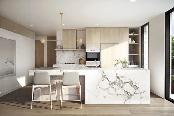
European and Scandinavian designs inspire lighting in the mid-century modern kitchen. Newer trends are silhouettes that mirror space technology. Designers experimented with new materials like plastics and traditional ones like wood, brass, and steel.
One of this design’s most well-known lighting fixtures is the starburst, which features metal round bulbs in spiky designs. These were inspired by the launch of spacecraft in the 1950s and 1960s.
Since there is an emphasis on natural features, large windows that let a large amount of natural light in are favorable. In terms of window treatments, sheer drapes or blinds can be retracted to allow as much natural light as possible.
Mid-century Modern Kitchen Appliances
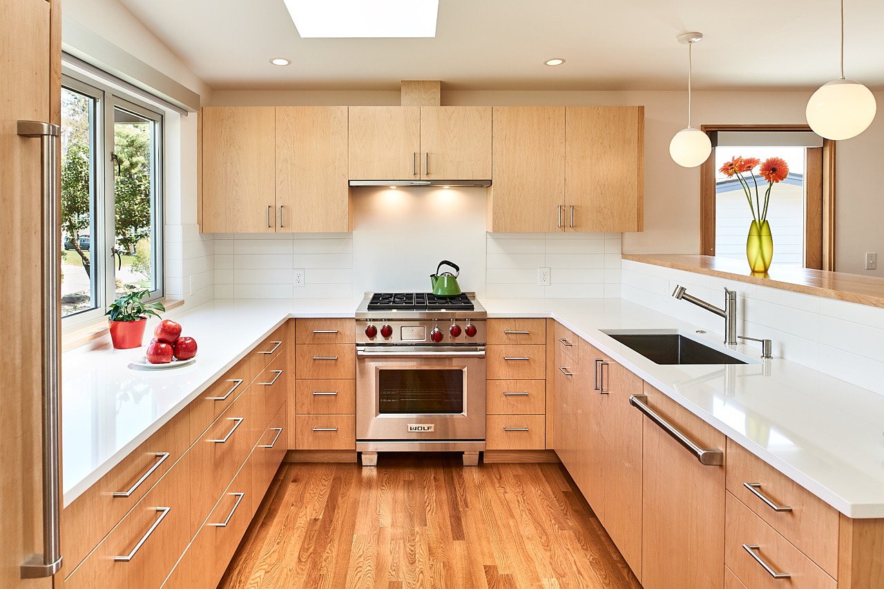
The appliances in a mid-century modern kitchen do not need to be stainless steel. Instead, some appliance designers make them in bright or pastel colors, giving the space a retro look. For example, a cherry red refrigerator can be a statement piece in the room.
Mid-century Modern Kitchen Sink
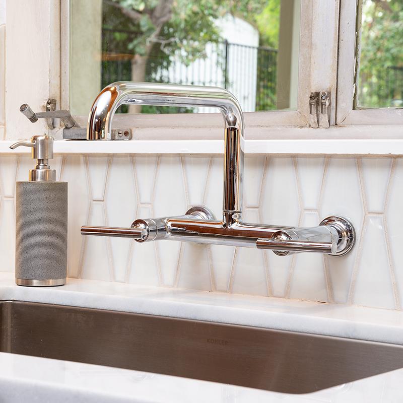
The sink is not a focal point in this type of kitchen. Instead, one can use either a stainless steel or apron-style sink. Keeping it stainless steel will not detract from the rest of the kitchen design.
Mid-century modern remains popular because of its versatility. As more people live in small urban environments like apartments and condos, this style has been highly sought after. Its simple, mixed-material design makes it easy to recreate, and simple, sleek cabinets play a large part in creating this style.

