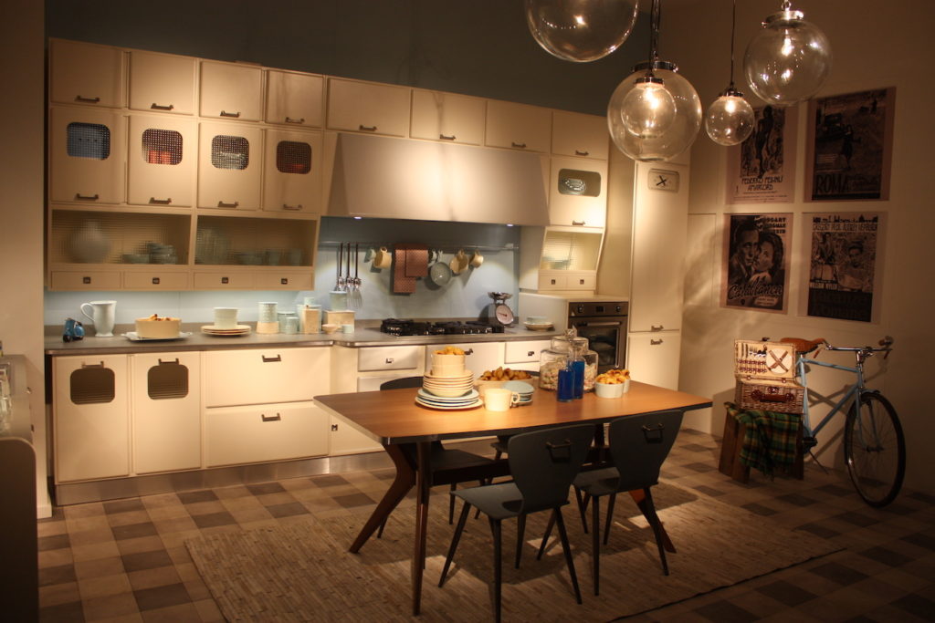
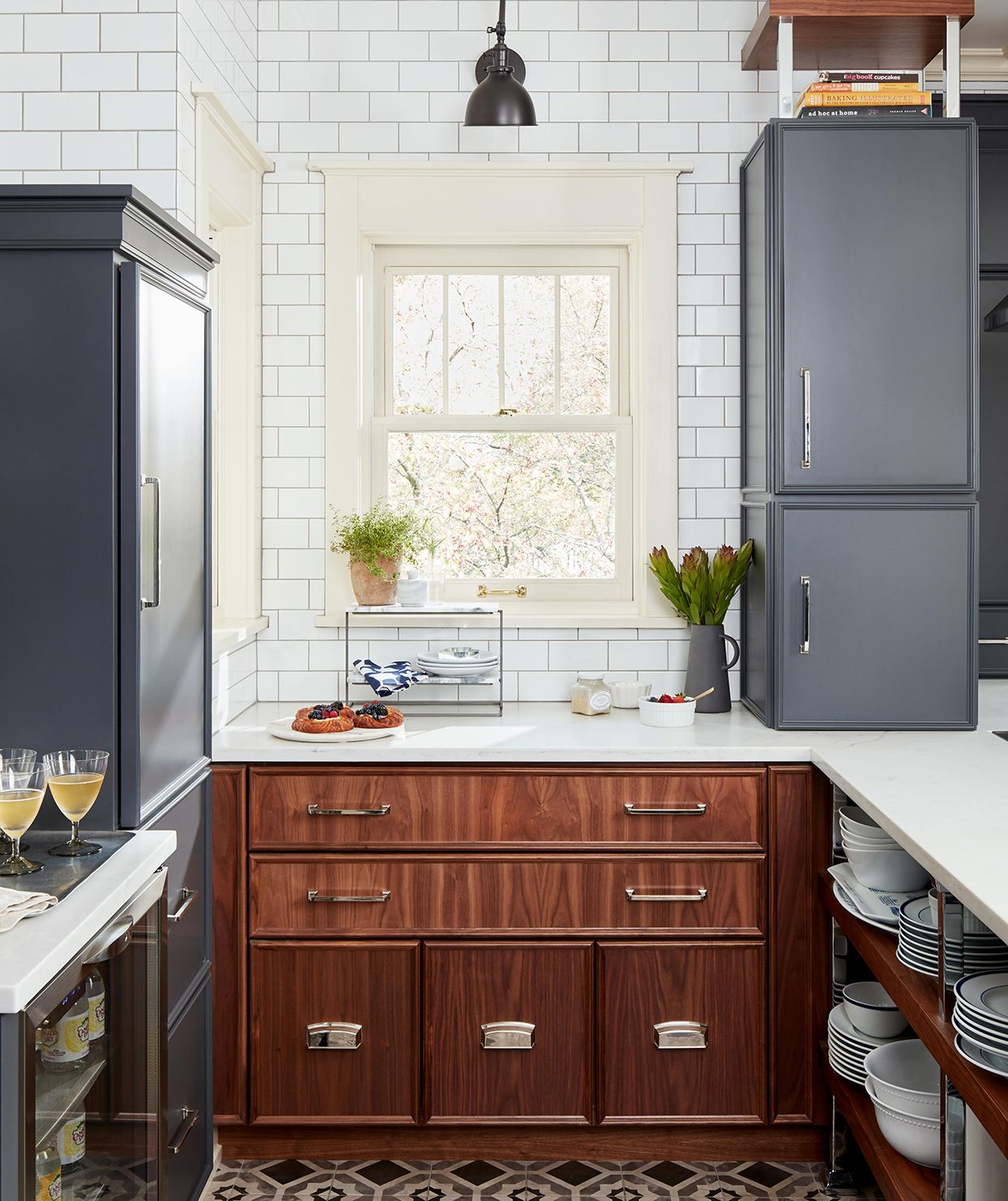
Deciding whether to go for an American-style or a European-style kitchen is difficult, but the tough decision-making does not end there.
Once you’ve settled on your preferred style, you must choose a design that will work best for your kitchen. So, which one should it be?
European Kitchen Design Ideas For Your Inspiration + Tips and Trends
As far as European kitchen designs go, there are a lot of options you can explore. If you’ve asked around (why haven’t you already), you must have heard a few professionals and remodelers naming brands such as Snaidero, Valcucine, and Rossana. Dig deeper into these brands, and you’ll notice a flurry of options.
Yes, it can get overwhelming. That’s why this piece is for you.
But before you call these brands’ offices and ask for brochures and quotations, let’s start with the basics. The direction you’ll take with your European kitchen design will be either modern or traditional. As far as these two go, contemporary European kitchen design has consistently leaned towards mid-century modern design, which was prevalent in Nordic countries.
This is why most European kitchen designs have been labeled more traditional and geared towards efficiency over comfort, compared to the larger and sometimes more lush American kitchen designs.
But that doesn’t imply you’re at a loss if you want something modern. As you’ll learn in this piece, European kitchen designs cater to various needs. Look at this extensive list of European kitchen designs with images for inspiration.
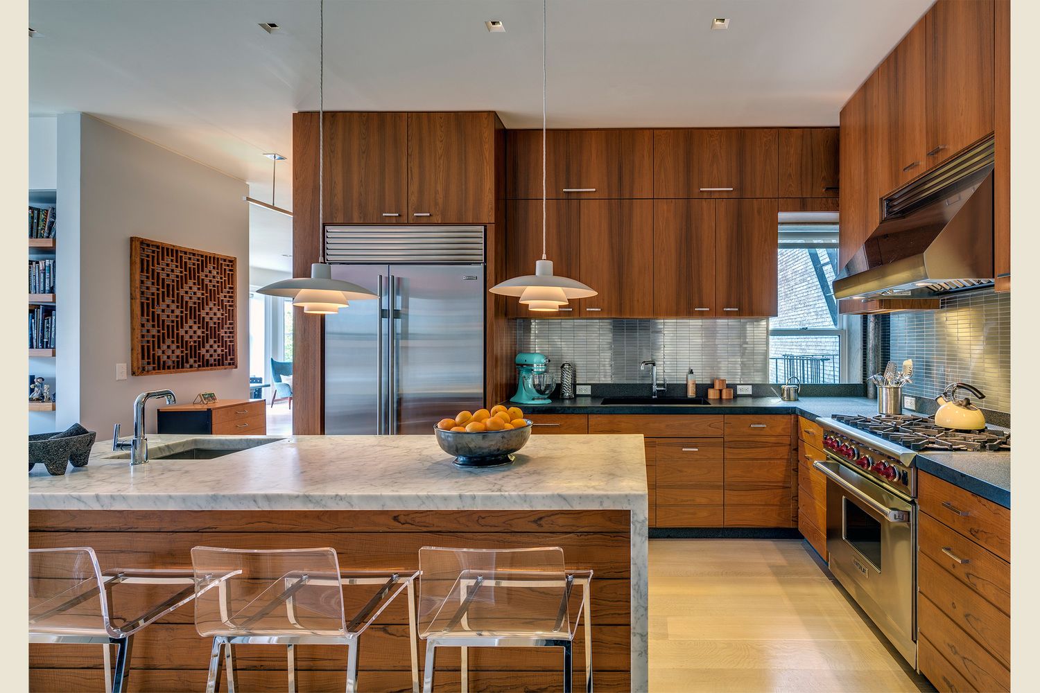
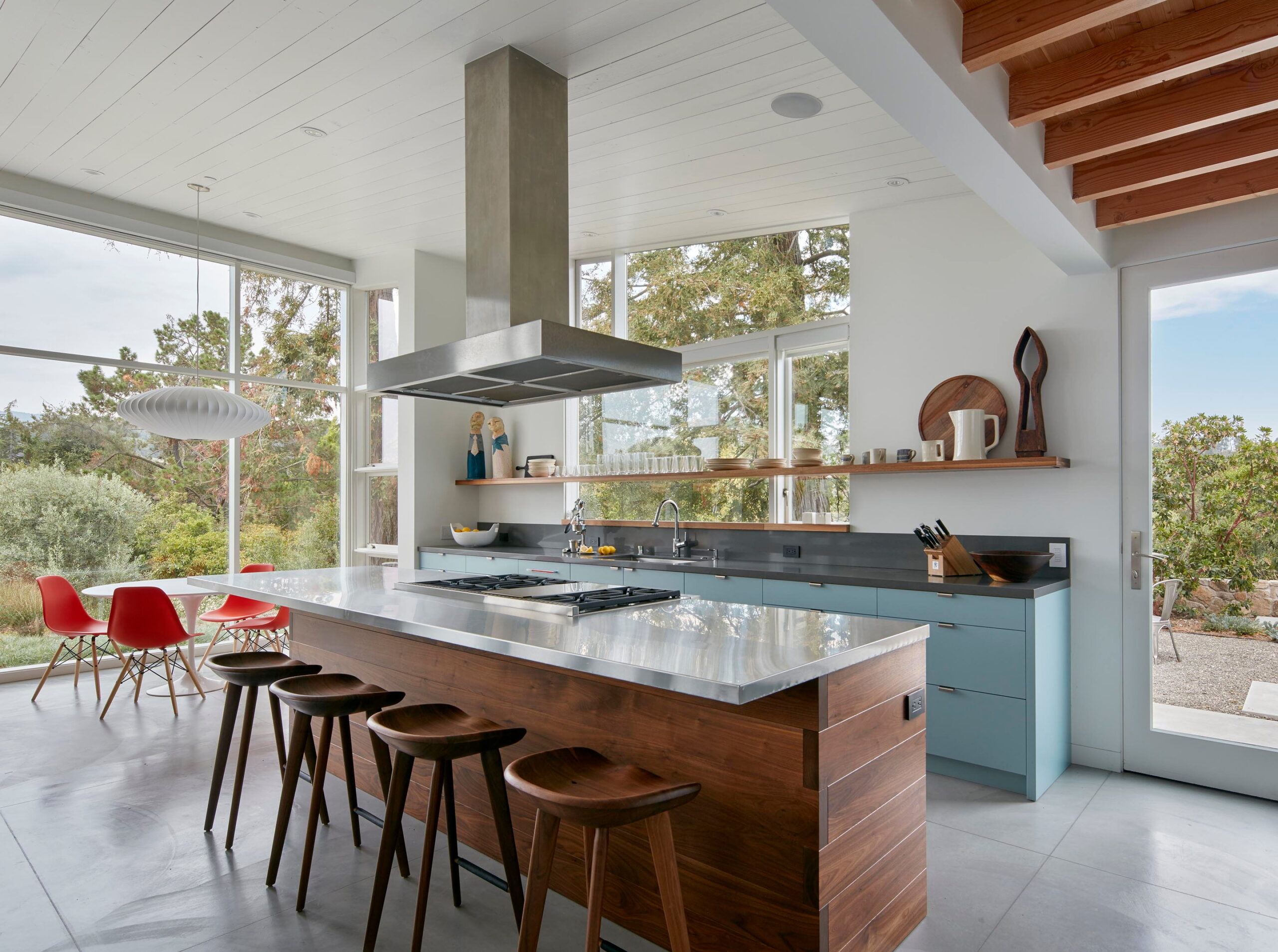
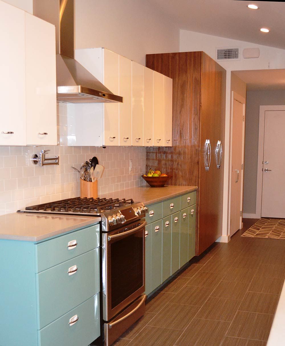
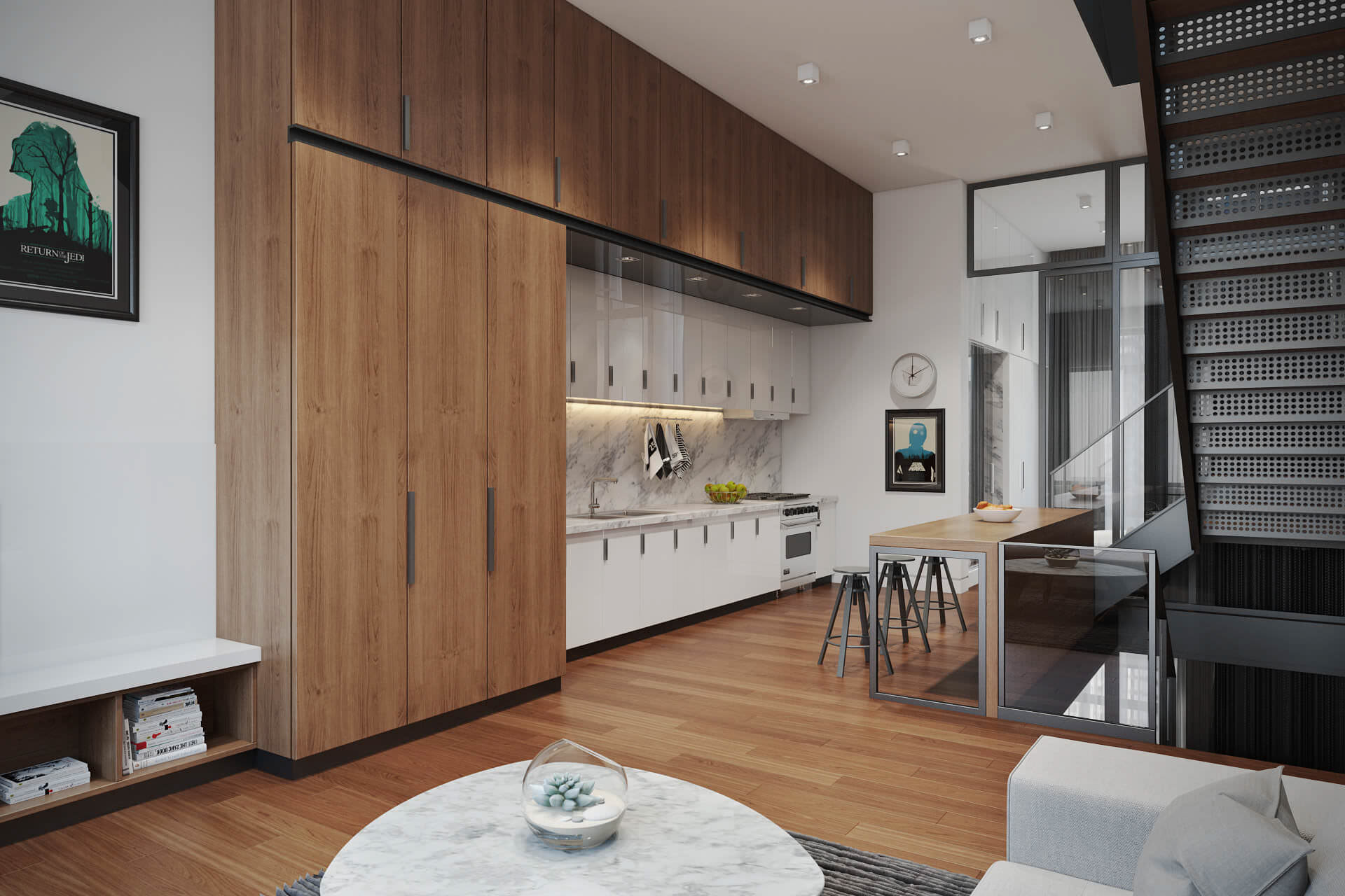
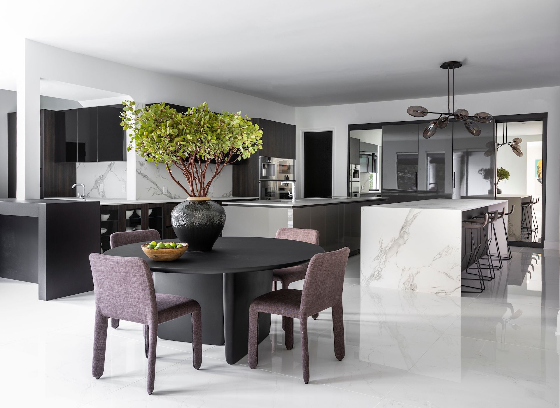
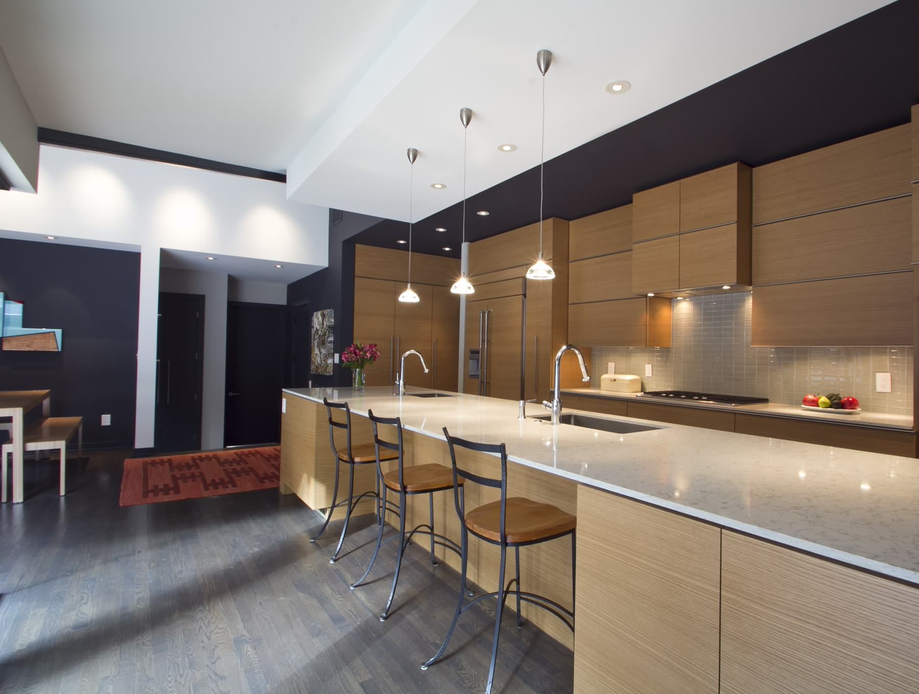
The authentic use of natural materials is at the heart of midcentury modern kitchen designs. If you want an edgy-looking kitchen, a mix of wood and marble is the way to go.
For instance, you can use a Walnut veneer with a lacquer gloss finish on the kitchen cabinets, drawers, and other storage areas. The Walnut gives the space a natural feel, while the gloss adds a modern touch to the entire design.
On the other hand, you can have the countertops made out of marble. Carrara marble can be great for the island.
Then, assuming you have an L-shaped orientation, the perimeter can have Absolute Black Granite for the countertops. Make sure the marbles are also honed to blend aesthetically with the glossy Walnut veneer.
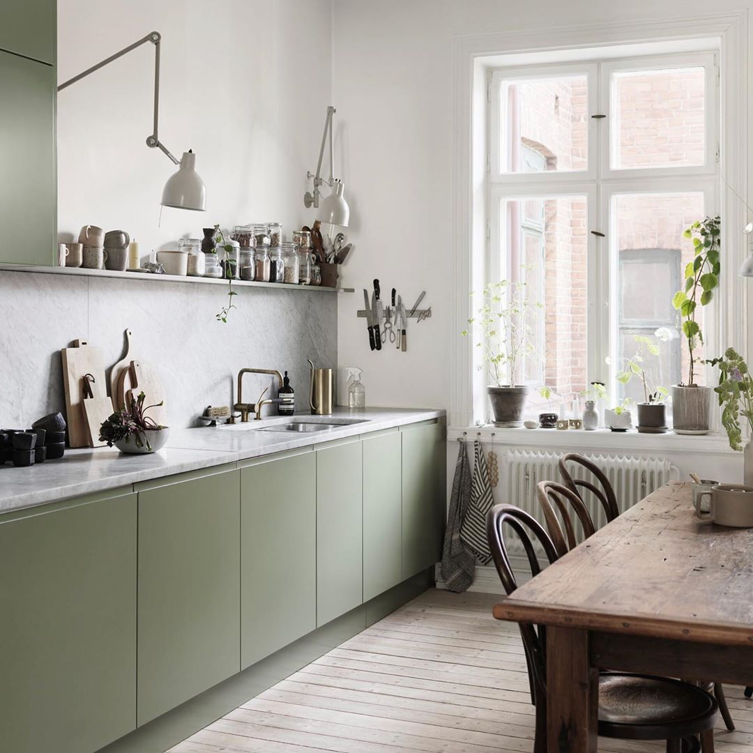
2. Try the Galley
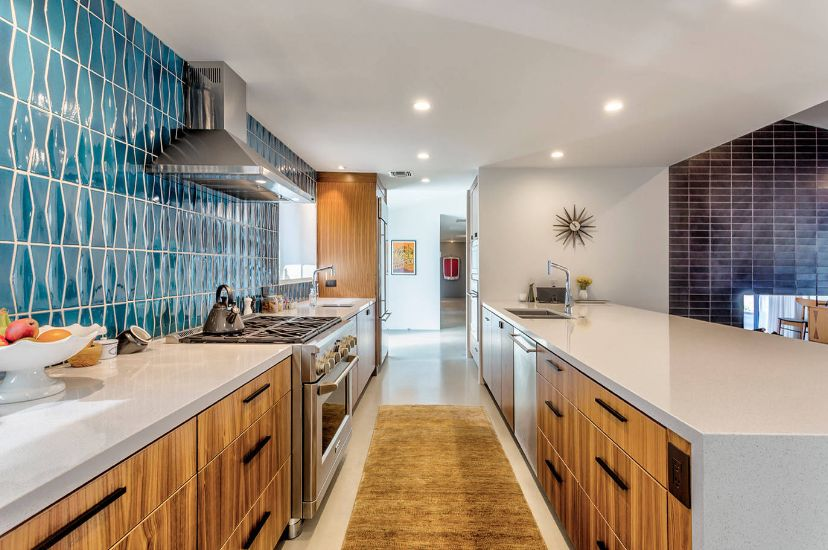
Some historians argue that the galley was among the first midcentury modern European kitchen designs. These kitchens were not truly open-plan, but the construction was done so that the galleys provided a sense of connection between the kitchen and the rest of the interior space.
The galley style is also considered one of the most efficient kitchen designs. The long space and counters along each side provide ample space and a nice flow from the kitchen to other spaces.
Despite not being the current trend, the galley can still look spectacular. You can experiment with open-floor-plan kitchen options such as wood and marble or neat patterns on the backsplash tiles.
Aren’t laminates tacky and ugly?
Well, that was the perception. With improvements in manufacturing processes, laminates are back bigger, better, and more stylish. Plus, they’re the material you should be going for in case you have little love for stones or you find granite and marble too expensive.
Laminates come in various colors that blend nicely with a midcentury modern European kitchen design. These include current, trendy kitchen colors such as sea green, black, and mixed wood tones. Plus, thanks to better manufacturing processes today, laminates are more durable than they initially were.
The design variations have also improved, with some companies offering laminates that mimic certain natural materials or stones for a more authentic look. And for the ones that don’t, the colors are still perfect enough to blend nicely with wood and tiles.
4. Try Flooring with Natural Stones
Try Flooring with Natural Stones
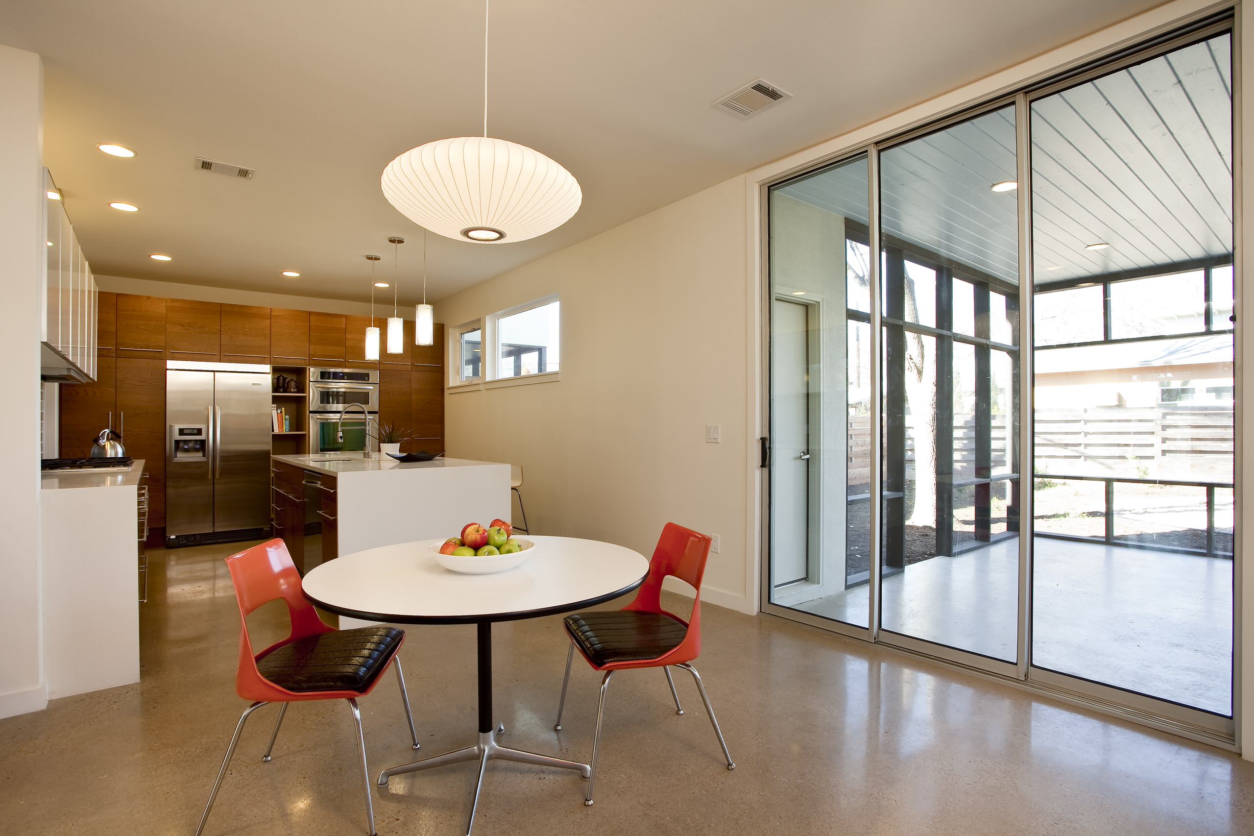
In its purest form, the midcentury modern European kitchen design featured natural stones for the flooring. This set the tone for the entire kitchen space and thus the midcentury modern design architecture of minimalism and authentic use of natural materials.
Ideally, your flooring choice should be slate, terrazzo, bluestone, or travertine. These are among the original stones used for flooring these kitchens. And yes, they can be quite expensive.
So, what other options can you explore? Cork and wood. These are still considered natural materials that can provide an authentic, midcentury, modern look to your kitchen. Plus, they’re more affordable compared to their stone counterparts.
If you decide to use cork or wood, the key thing to note is that the grain should be subtle, and the tone should be medium.
5. Extend the Curves to the Furniture
Extend the Curves to the Furniture
One of the key features of midcentury modern kitchen designs is smooth flowing lines and curves. These are prevalent in cabinets, colors, and even accessories used in the kitchen.
What about the furniture? If you want to nail this design, you should extend these curves to the furniture, too. You can shop for new furniture or order new ones made to follow a line or curve pattern in your kitchen. This will allow the furniture to blend in with the rest of the place, creating a homogenous design feel.
So, where should you put these lines or curves? For instance, the arms, legs, and back of chairs are perfect areas. However, you should be careful not to overdo things. Minimalism is a key aspect of this design.
6. Try Glass Tiles for the Backsplash
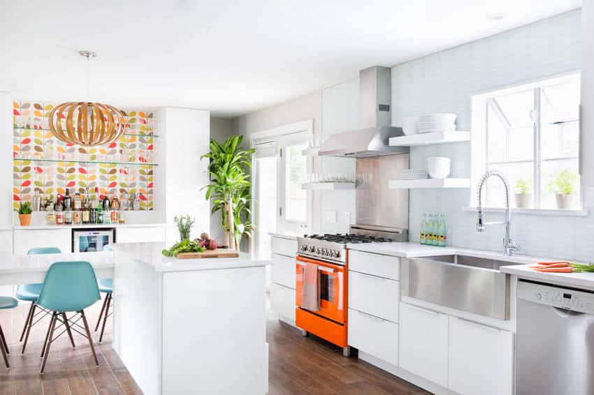
The kitchen backsplash also plays a huge role in creating the overall tone of the kitchen. And for a midcentury modern European kitchen design, glass tiles can be the perfect choice for a natural stone-themed kitchen.
Glass tiles can be used for the backsplash, and white quartz countertops can be used. A wood-plank ceramic tile can be incorporated into the floor to break the white monotony. This floor is highly recommended if you have a pet.
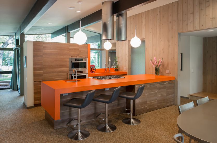
Given how white the kitchen can get with this design, you need a slight dash of color on the kitchen equipment to tone things down a bit. For instance, you can have an orange stove and simple wallpaper in the bar area to add color to the glass tile backsplash.
Plus, since the midcentury modern design is based on the idea of bringing nature into your kitchen space, you can add a green potted plant right next to the kitchen island as a final touch.
7. Get Back to Flat Front Cabinets
Get Back to Flat Front Cabinets
Before the midcentury modern European kitchen design lost popularity a few years back, flat-front cabinets were the in-thing. Then, most interior designers swung away in favor of decorated cabinets with trim panels as the design lost its fame.
But now, the flock is coming back. Flat front cabinets are, according to midcentury modern kitchen design purists, the only style of cabinets that can work well with a midcentury modern kitchen design.
Otherwise known as slab-door cabinets, flat-front cabinets look sleeker, are cheaper to produce, and blend perfectly with the design theme of the mid-century modern kitchen—natural, simplistic, and minimalistic.
You can even try some trending kitchen cabinet colors, including white, gray, blue, two-toned cabinets, and wood-stained cabinets, which are the more natural-looking options.
8. Go with Metal Cabinets
Metal cabinets were the first cabinets to be used in the midcentury modern design kitchen. This happened thanks to the steel demand surge after World War II. Demand for these cabinets faded towards the 60s when wood cabinets finally made a powerful entry into the market.
However, some manufacturers still produce authentic, retro versions of metal cabinets for mid-century modern design purists. Alternatively, you can hunt for vintage originals, which you can later recoat and repaint.
9. Wooden Cabinets for the Baking Area
Wooden Cabinets for the Baking Area
Speaking of traditional European kitchen design trends that are making a contemporary comeback, the wooden cabinet is a nice reincarnation of the past.
Great for not just the baking area but also all kitchen cabinets (if you’re in love with the dark tone), the wooden cabinets take you back to when wood stoves were used to bake bread in the morning.
However, modern cabinets employ a subtle lacquer finish instead of a dull finish. Typically, you’d have three rows of drawers. You can dedicate the lower row to storing pots and large pans. Add toe-kick drawers for cookie sheets and some space for your blender and mixer.
As is, wooden cabinets can be a little bit dull. However, you can spice things up with a quartz countertop, donning an ash-gray color. The gray is bright enough to neutralize the dark wood but not too bright to dim its aesthetics.
10. Matte Texture and Finishes
Look around, and you’ll notice a lot of matte is making its way into contemporary European kitchens. Yes, glossy finishes are great. They add glimmer and an attractive sheen to your kitchen surfaces. Matte colors, however, add sophistication.
This sophistication adds a modern and cool look to your kitchen. It can be applied to the countertops, backsplash, and kitchen equipment such as the stove, pots, and pans.
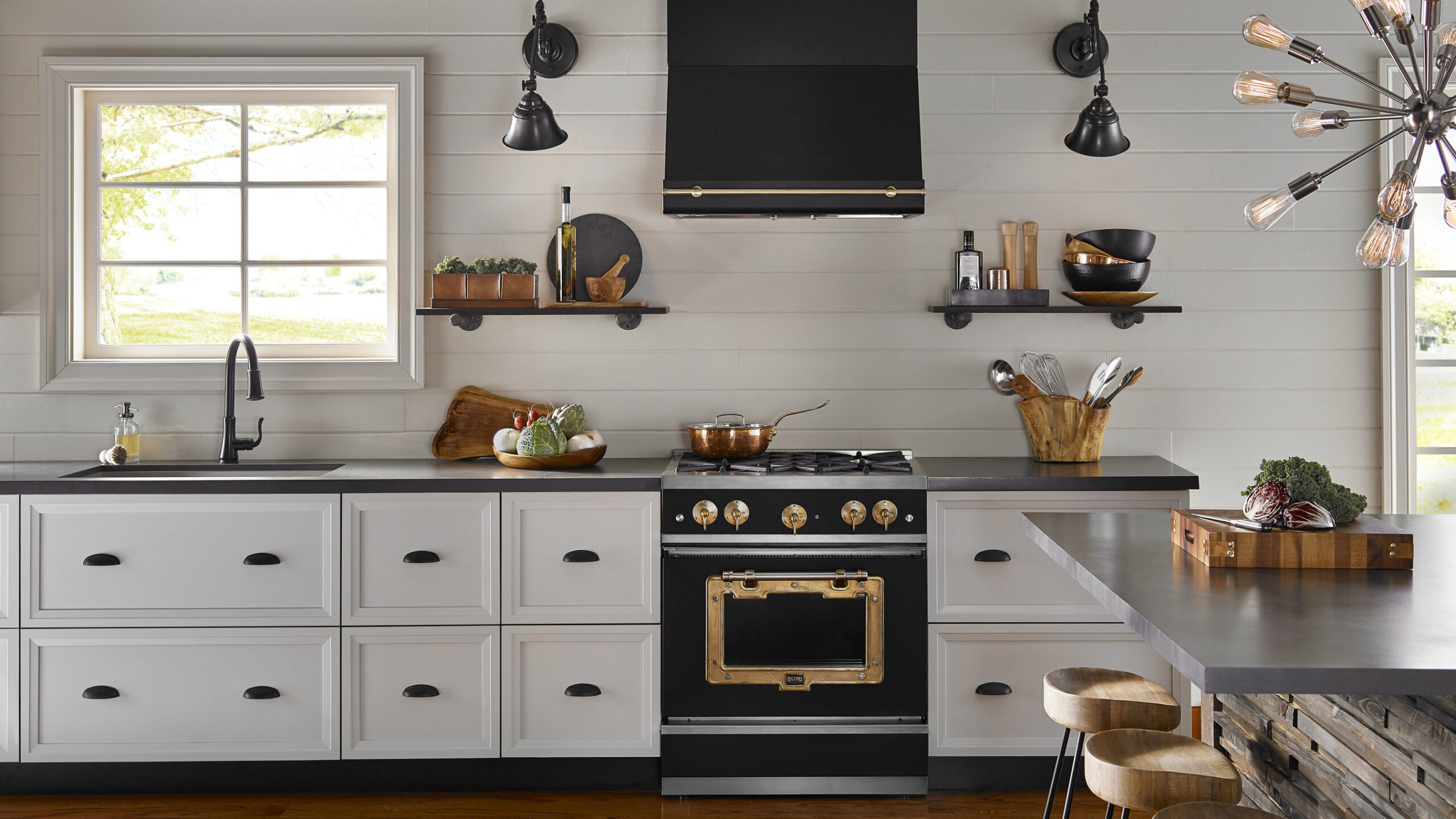
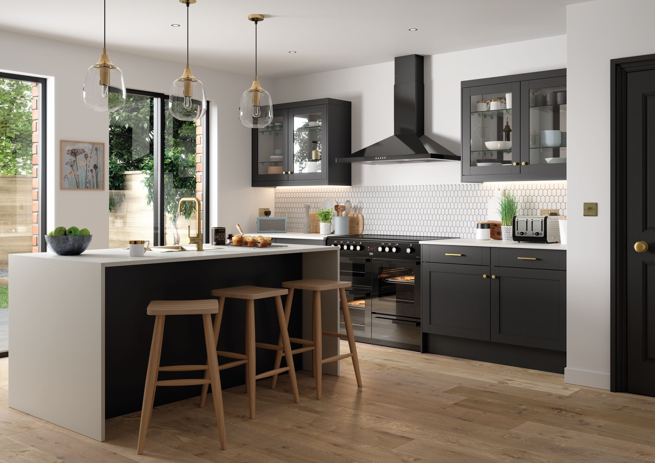
Currently, matte black is the trendiest matte color. Unlike glossy black, matte black is bold yet neutral. Also, matte black easily blends well with crisp, light surfaces. This creates an amazing contrast between the dark and light shades, resulting in a smooth and polished aesthetic.
11. Fully Nature Inspired
Nature-Inspired Aqua Blue European Kitchen Design
Traditional European kitchen designs embrace the use of natural materials to create stunning aesthetics. As a nature aficionado, you can express yourself more expressively with a modern design by taking a nature-inspired design route.
So, how does that work?
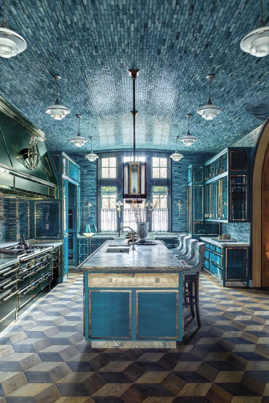
Sourcing inspiration from this mansion, you can see how the ceiling and walls are covered in aqua blue, handmade glass tiles. This creates an underwater immersion effect. The designer installed custom oak floors on the floor. These were put together in an almost Escher-like pattern.
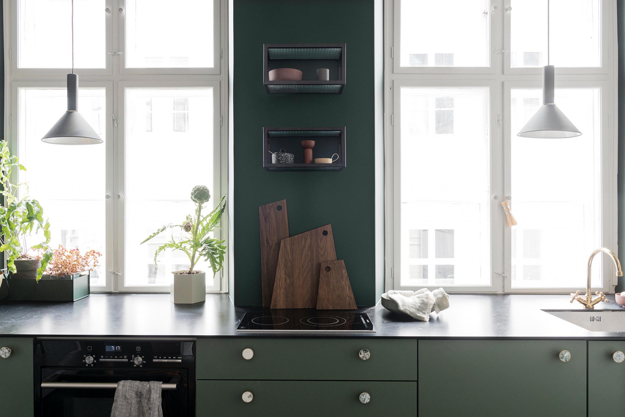
The nature theme extends to the exhaust hood, colored forest green.
The rest of the kitchen, for instance, has aqua-blue cabinets. The same goes for the kitchen island and the seats, creating a fully nature-inspired kitchen that is still compliant with European kitchen architecture.
12. Full Concrete Kitchen
Two materials traditionally make a European kitchen – wood and stones. However, with contemporary design, you can experiment solely with concrete.
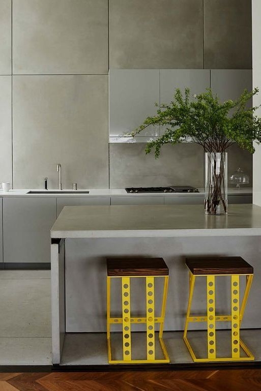
The great thing is that it produces stunning results. With this design idea, everything in the kitchen, from the flooring to the backsplash, should be made of concrete. The only exceptions, of course, are the upholstery and appliances.
With this design, you can go monochrome or mix contrasting colors to create bright results. If you choose to go with a dark color, such as ash gray, you can use your appliances to break the monotony. Shiny silver, in this case, would work magic.
Still, you can experiment with other brighter colors, such as sunny yellow, for the stools on the kitchen island.
13. Gold Themed Kitchen
Colors have been used expressively to convey taste and style in the modern world. As far as your modern European kitchen design ideas go, gold is a great, expressive color that you can use in your kitchen. A word of caution, however: This is not for every corner in the kitchen.
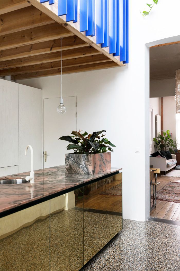
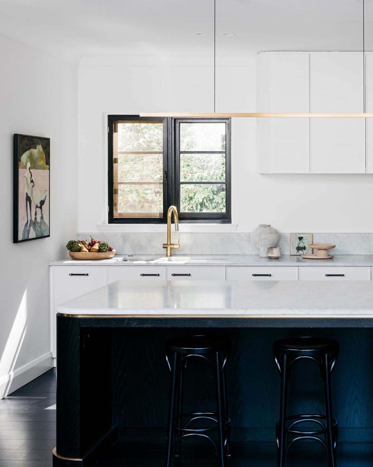
Gold works perfectly for kitchen islands, where a bit of extra shine adds great aesthetics. Instead of using it everywhere, you can use it on the sides of the island. The mirror finish adds glamor and draws attention to other small details in the kitchen, such as a pendant light.
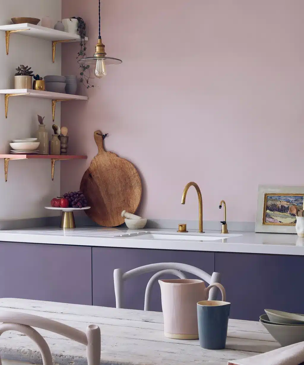
For this gold to work even better, you should consider a marble top with a predominant color like pink.
14. Just Focus on Light
There are countless design variations available regarding the details of the kitchen. However, natural lighting is one thing you shouldn’t get wrong. If you want your European kitchen to look contemporary, you should allow in as much light as possible.
How exactly? Using clean lines, a simple color scheme, and graphics fixtures. Couple that with huge windows, and plenty of natural light will fall into the kitchen.
15. Try Mirrored Backsplash
The backsplash is one of the most critical kitchen design areas. Together with the floor, it sets the entire tone for the kitchen.
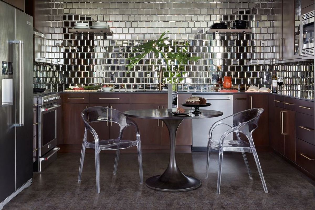
So, should you experiment with it? Absolutely. The most radical thing you can get is to incorporate a mirrored backsplash. The mirrored backsplash uses polished, reflective tiles to create a mirror effect. Now, this is where you need to pay attention. This design idea cannot be used with very bright colors.
Since you already have something very reflective, you need dark colors to complement the reflective tiles. So, instead of colors such as yellow or crimson, you should try cool gray for the floors. On the other hand, dark wood would be great for the cabinets.
Finally, you can get clear plastic or glass furniture and stainless steel appliances for the kitchen.
16. Go All Dark
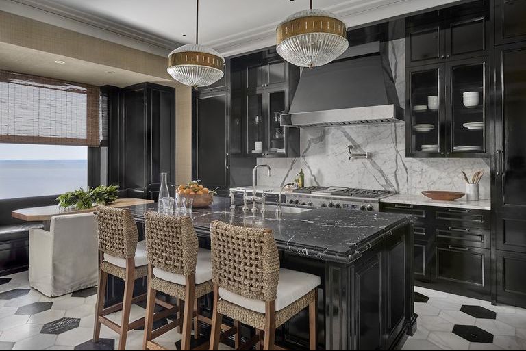
If you want a completely dark design, black lacquered walls and cabinets should be your go-to option. These are paired with a grasscloth backsplash that adds a bit of brightness to the kitchen.
This design works great with shiny metallic appliances, like the mirrored backsplash option. The only difference is that you can go all out with creative pops of color to add a bit of brightness to the overall design.
And how do you achieve detail with an all-dark contemporary European kitchen design? Through notches and patterned edges. For instance, if you have a kitchen island, you can notch the edges of the island’s countertop, thus showcasing intricate details in the design.
17. Consider Using Exposed Cabinetry
Open-Shelving For Small Kitchen
A one-wall or galley layout will save you a bit of width while adding much-needed storage space. However, having closed cabinets might not be the best idea. Every time you open one, you’ll be battling for working space.
That’s where exposed cabinets come in. Not only do they save you from endless battles for working space with the cabinet doors, but they also create an airy feel to the kitchen. This creates an impression of more space, which makes the small kitchen even more comfortable to work in.
You can extend this cabinetry style to the adjoining room to further drive this impression. Through the sense of unity, this small European kitchen design makes the compact space look even bigger than closed cabinets.
18. Try the Galley Layout
Yes, the one-wall layout is deemed to be the most space-efficient kitchen layout available. However, the galley layout is another layout that can save you a lot of space by creating more. The galley layout converts the kitchen into a narrow aisle. The cabinetry and appliances then go against separate walls.
The downside of the galley layout is that the second row of cabinets will need to be narrower. This is unlike the one-wall layout, which uses only a single wall.
The plus? You get an extra set of cabinets to store more items. Thus, if you are a big fan of storage, the galley layout might serve you better, albeit with limited working space, than the one-wall layout.
19. Use Light-Colored or White Paint
Use Light-Colored or White Paint
Dark colors create an illusion of constriction, making them undesirable in a small kitchen. Instead, you should choose light colors or white paint.
These colors create an airy, light feeling, which makes the small space feel even bigger. Combine the white paint and light colors with the open cabinets, and the small kitchen will feel larger.
Remember to use the sense of unity with the adjoining room to amplify this effect further. An important thing to note here is that the monochromatic colors must be uniform. This uniformity creates the impression of a big space in a rather confined environment.
20. Invest in Useful Kitchen Tools
Invest in Useful Kitchen Tools
Your drawers are always going to be full. So, to capitalize on the limited space, you should invest in useful kitchen tools. These will keep most appliances and utensils out of the drawer, freeing up more space for you to use.
From a functional perspective, you’d want the items you use daily closest to you as you work in the kitchen. Kitchen tools help you keep such items nearby so you can move them less in the kitchen.
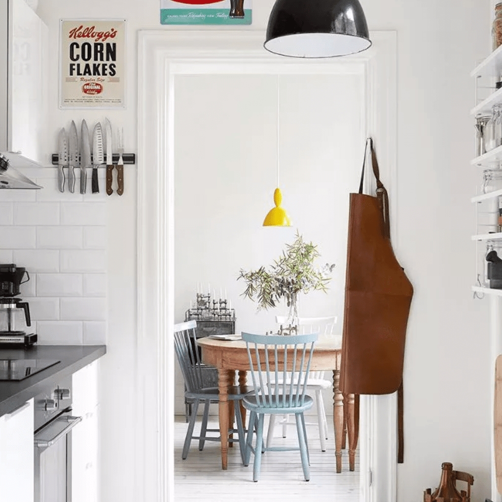
Which tools should you look for? You should shop for items such as magnetic wall knife holders, which keep the knives you use most often out of the organization trays. Instead, they’re kept in an accessible area next to the sink, where you’ll reach out to them most.
Ensure that the tool's design and color match the backsplash. Because of the confined space, any odd differences will be quickly noticeable.
21. Work with a Recessed Kitchen Nook
In a studio apartment, for instance, the one-wall kitchen layout is the most prevalent. So, how do you go about designing one while still working with the limited space for not only the kitchen but also the apartment itself?
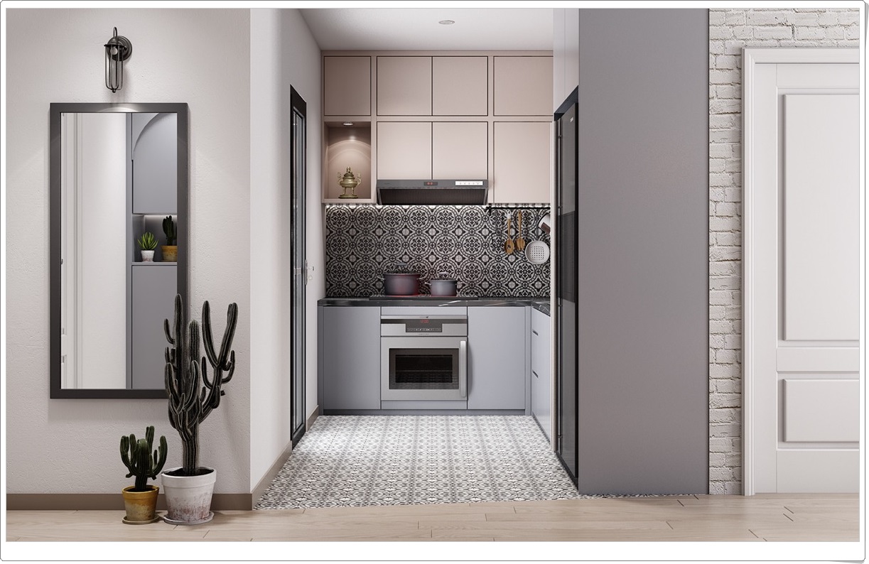
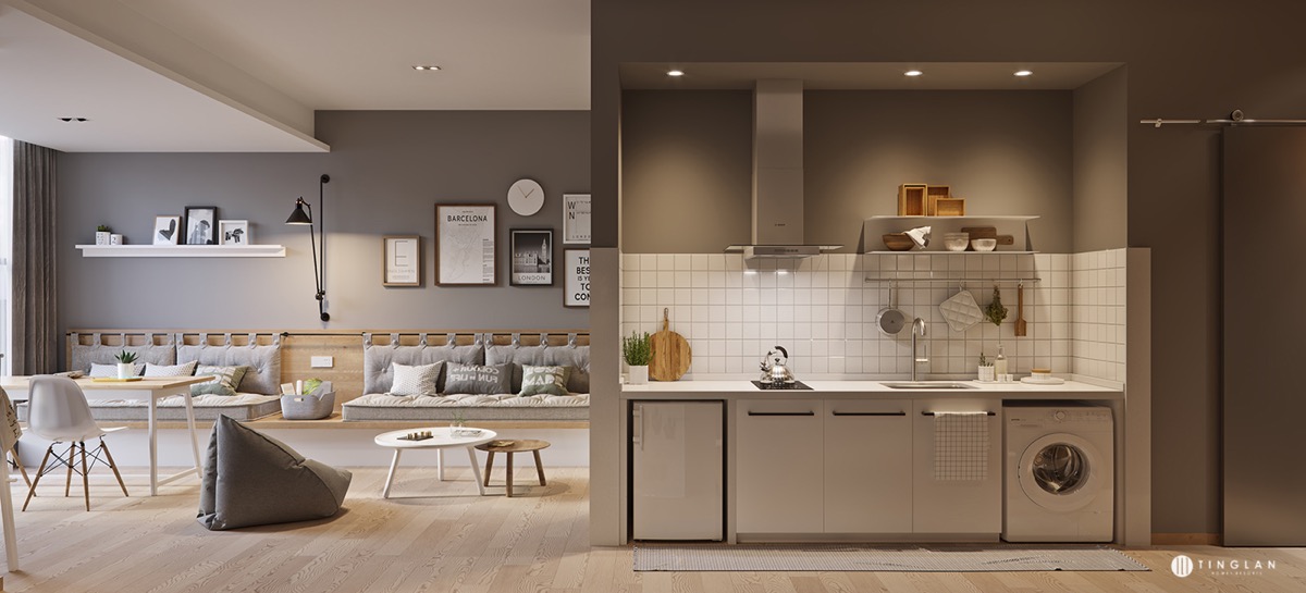
By using a recessed kitchen nook. A recessed kitchen nook hides the kitchen cabinets away from the rest of the space in the open-plan apartment. This creates an almost separate room that contains all the equipment you need for your small European kitchen.
You can set the dining area in the remaining space or any other strategic location that will optimize the available space. In some designs, the washing machine is tucked into the last cabinet, saving even more space in the apartment.
22. Use a Bit of Luxury
Saving space doesn’t mean saving every bit of dime you can get. A bit of luxury in your small European kitchen can go a long way in making your kitchen look splendid. And as far as finances go, since you’ll not be covering such a large area, not so much cash will be spent on adding a bit of glamor.
What exactly will you be spending on? Marble, for instance. Thanks to its light colors, marble adds not only aesthetic and sophistication to the kitchen but also a light, airy feel as a backsplash. If you have a bit more to spend, you can make the countertops out of marble, too.
Wood will work fine for the rest of the small kitchen design, such as the cabinets and storage cupboards. However, you can get creative with the colors by using dark colors on the storage cupboards to create the impression of a warm frame surrounding a cool scheme.
23. Add a Semi-Permanent Prep Area
Multi-Purpose Table Instead of Kitchen Island
Kitchen islands are a no-no in small kitchens since they occupy much space. However, their need cannot be eliminated since, in most cases, a one-wall layout won’t offer a large prepping area.
The solution? Getting a semi-permanent prep area. In its simplest form, this can be a table that doubles up as your dining area. So, when you’re busy creating in the kitchen, you can place your ingredients here and do all the necessary prep work before cleaning up and enjoying your meal.
You can also use a narrow console to set your tools while prepping, giving you more kitchen space while cooking. That way, you would have conserved a ton of space you desperately need.
24. French Style Range Hoods
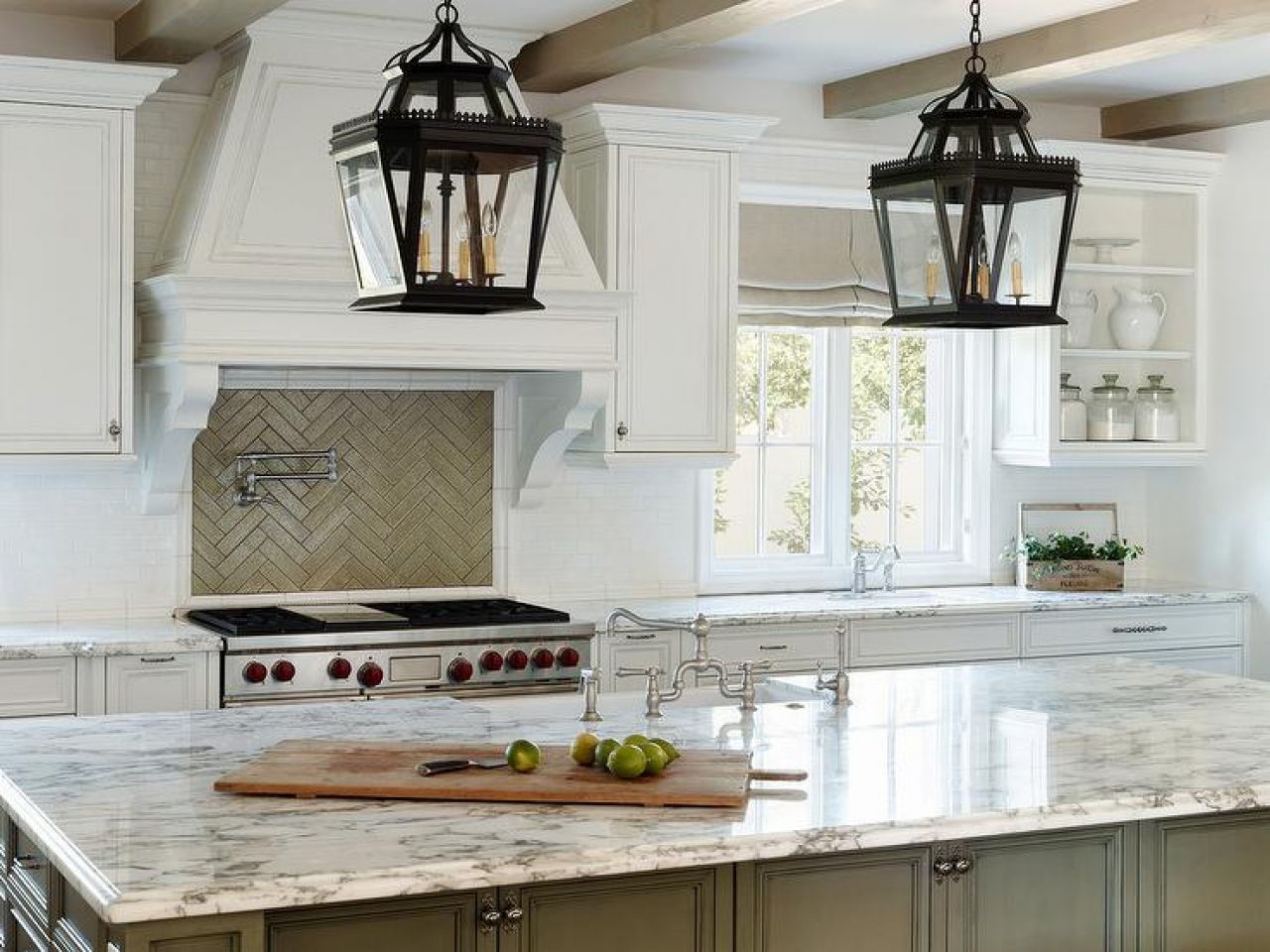
French-styled range hoods are a classic French country kitchen addition that makes a chic statement in any design. This architectural feature can add authenticity to your French country kitchen design.
But don’t make it the only feature. For instance, you can have a contrasting color scheme of a sage kitchen island coupled with crisp white cabinetry. You can contrast these colors even further using a light jungle green backsplash.
Since this design is more towards authenticity, you can go all out by adding two other features of French country kitchen design. These are the lantern-style lighting and a vintage wood box planter.
You can hang the lantern-style lighting over the sage kitchen island. You can get some herbs for the vintage wood box planter and place it at the window for that final touch of European flair.
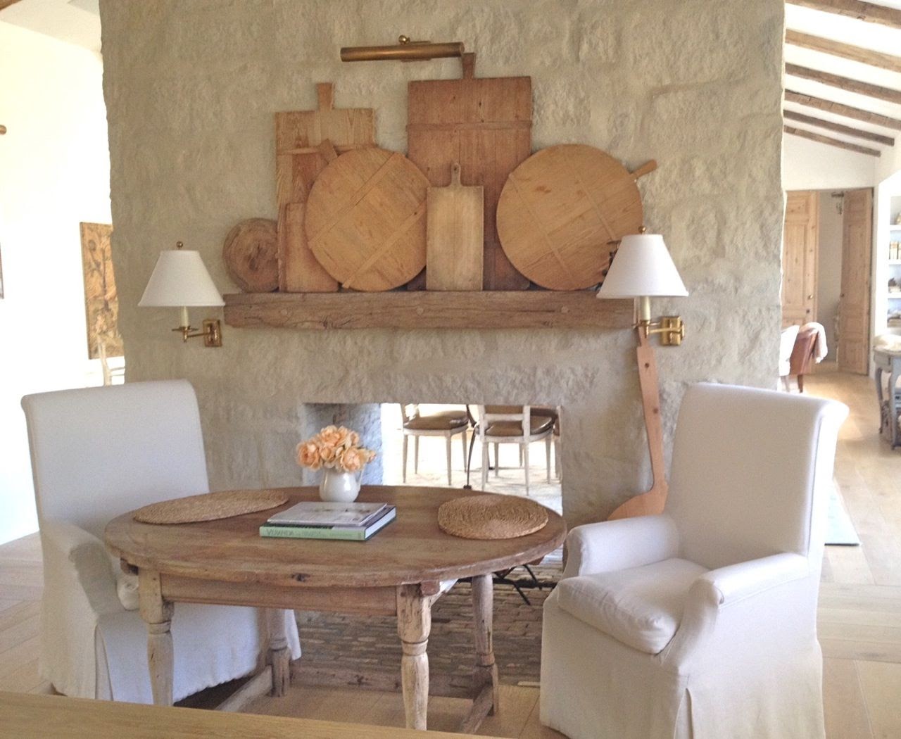
25. Experiment with Stone Walls and Authentic Dishware
Stone Walls and Authentic Dishware
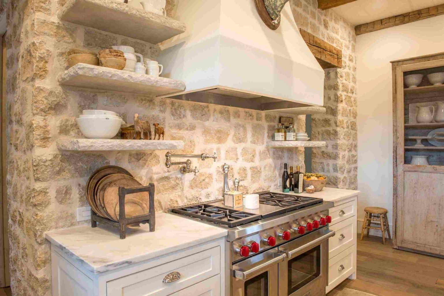
This is yet another kitchen design variation that strives to preserve most of the authenticity of French country European kitchen design.
The stone wall is the center stone in this design. It adds character to the kitchen while creating a rustic feel—something that was common in most French country kitchen designs in the past.
These stone walls need to be coupled with authentic French country kitchen cabinets. You can make a china cabinet out of distressed wood. This will add even more European charm to the design.
Since you’ve taken a design route focused on authenticity, the china cabinet should be fitted with dishware inspired by the French. White would be a perfect color choice for these dishes.
26. Pendant Lighting
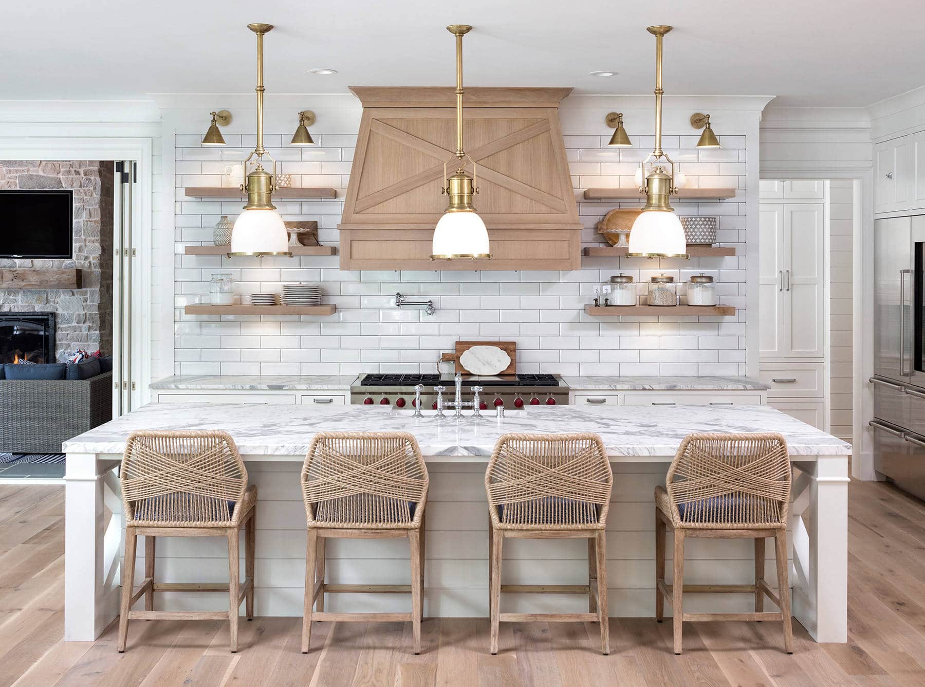
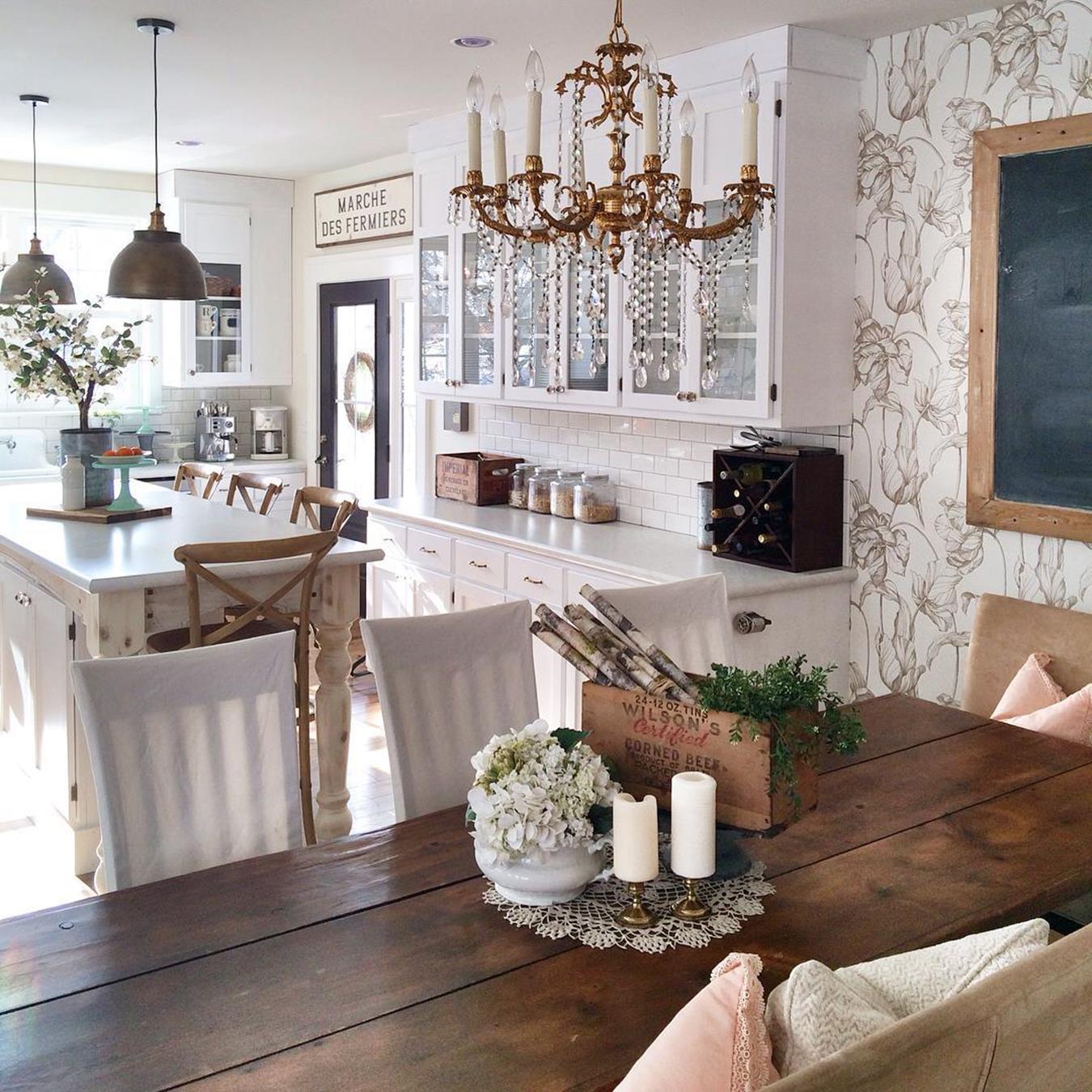
Pendant lighting is a predominant feature in most French country European kitchen designs. If you want to quickly and easily remodel your existing kitchen into a French country design, this is among the first things you should consider.
Which lamps should you choose? Ideally, industrial pendant lamps with classic French brass elements should be your go-to option. However, your exact pick will depend on your color choice. Brass-element industrial pendant lamps blend nicely with a neutral color palette and natural, finished wood textures.
The choice of furniture should also be country, with finishes almost the same as wood textures. For instance, wicker bar chairs might be a great addition to the kitchen island.
If the industrial pendants don’t tickle your fancy, chandeliers can also work great. They add great French authenticity to your design and more depth and lighting to the kitchen.
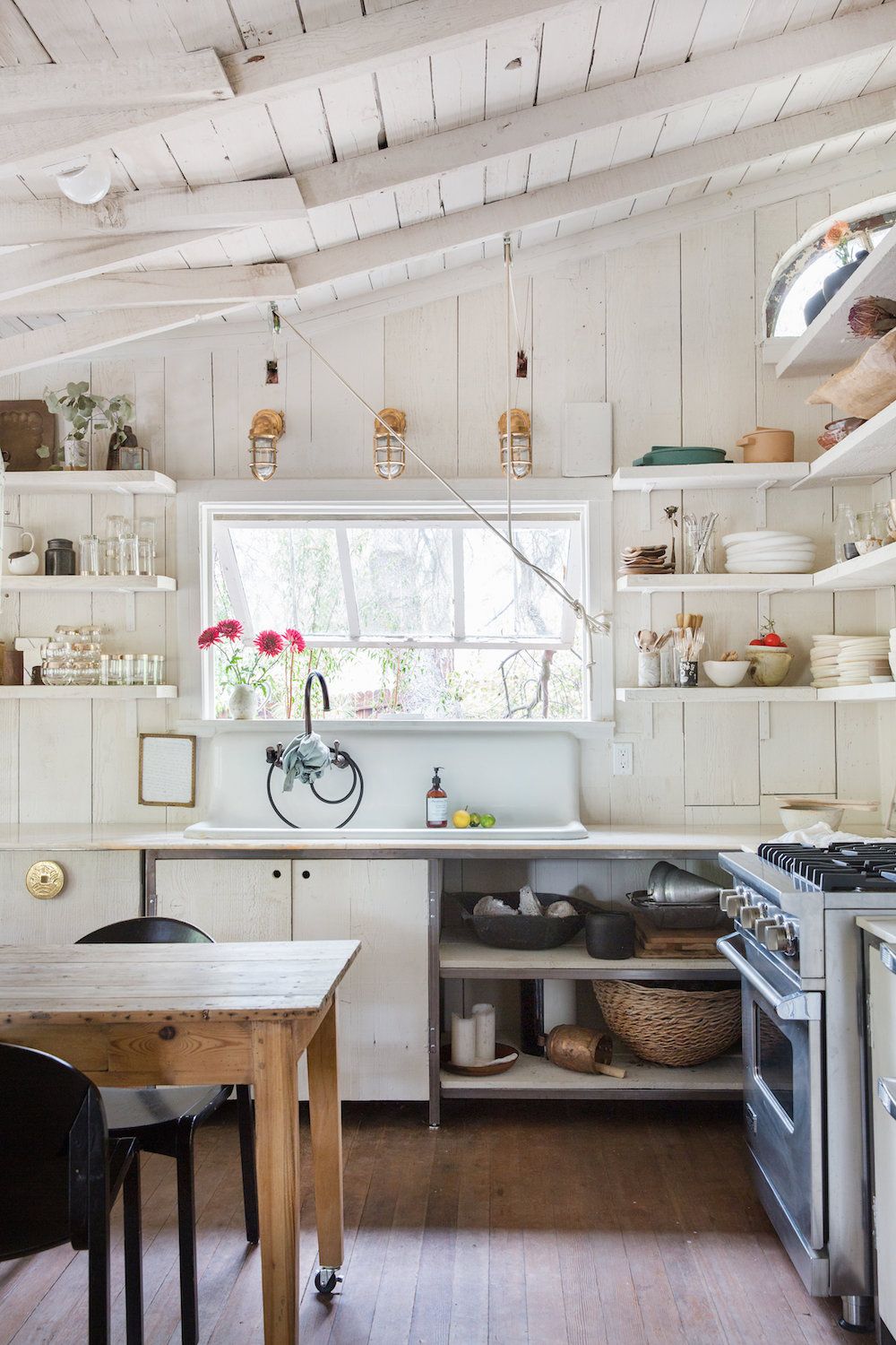
27. Get Rid of the Cabinet Doors
If you are remodeling your kitchen to a French-country European design, stripping everything off and putting it back together might not be necessary. Just getting rid of the cabinet doors might be all you need.
However, your China and Moscow mule glasses must have been bought already. The idea behind this design is to use the china and Moscow mule glasses as décor instead of having them tucked in the cabinets for purely functional use.
If you are not a fan of completely open cabinets, you can alternatively opt for glass doors. As long as China can be seen, the French Country's authenticity in the design will be well represented.
Can you start afresh completely? Yes. The third option is to remove your old cabinets completely and install floating wood shelves instead. These shelves add a rustic element to the design, making it even more French country authentic than simply ripping the cabinet doors off the hinges.
28. Go with Eclectic Seating
In design, chaos sometimes births masterpieces. And as far as this French country's European kitchen design is concerned, a mix-and-match of seats is the x-factor.
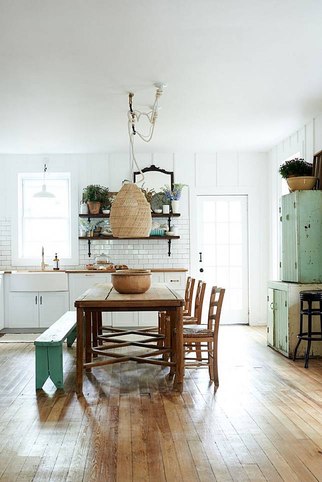
The mix-and-match, however, is not purely chaotic. For instance, one row of seats would consist of chairs, while the other row would be a bench for the center table that sits in place of a kitchen island. The wood should not have shiny lacquer since the goal here is to create a rustic French country feeling.
The seats themselves can have different colors. However, instead of a chaotic spatter of colors, you can have one row of seats in dark wood, which you’ll use in the antique tableware and cabinetry. For the bench, you can use a subtle lime green, which you would use in the cabinet doors.
Okay, the colors are getting quite dull. If you love a bright kitchen, white subway tiles for the backsplash will never disappoint you.
29. Use Appliances Inspired by French Retro
Appliances Inspired by French Retro
Shifting from a completely modern kitchen to a French country kitchen might be arduous, especially if you are strongly inclined towards modern flair.
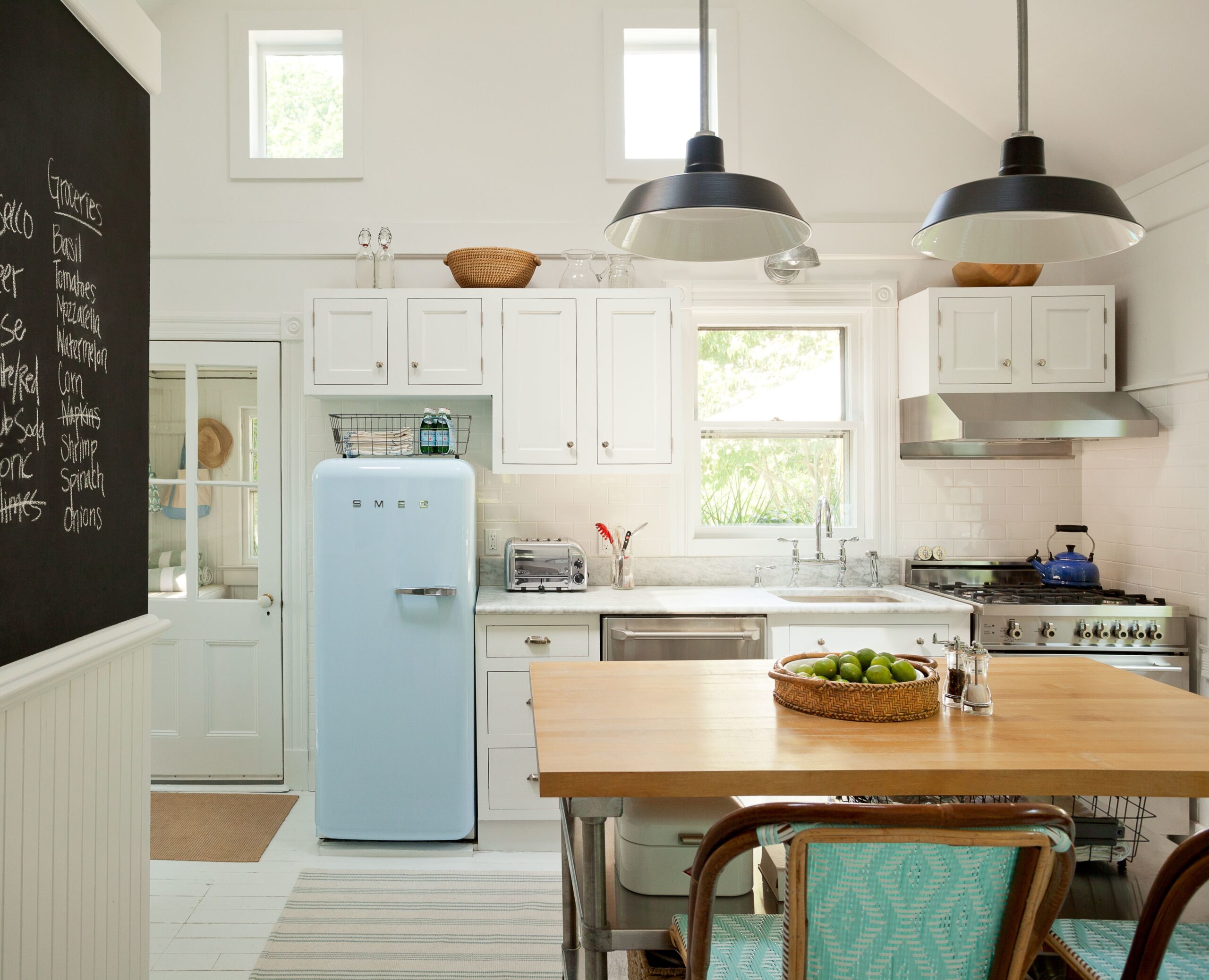
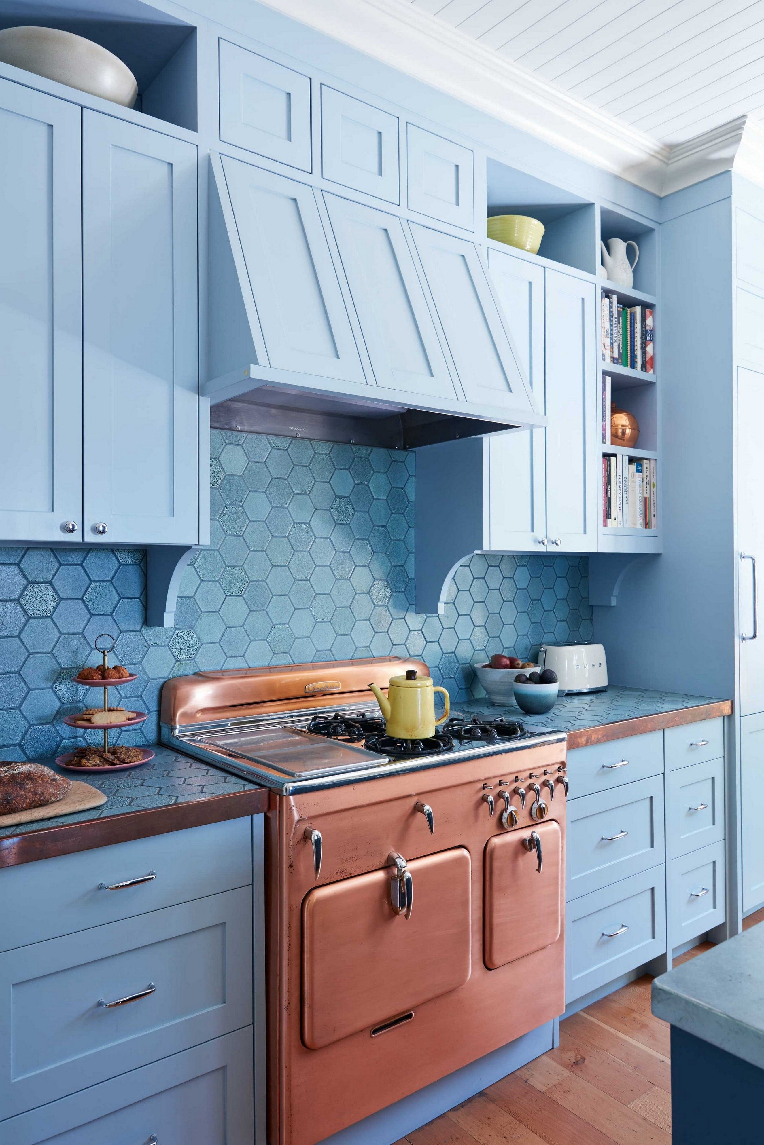
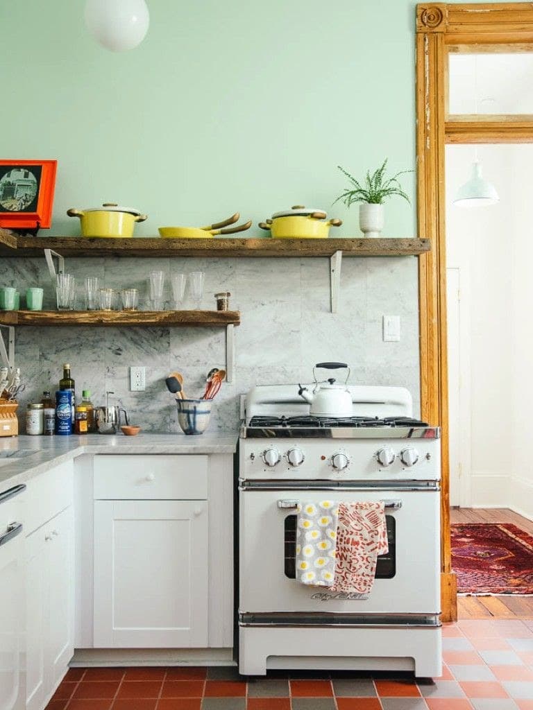
So, how do you balance the two? By going for French retro-inspired appliances. You can predominantly use a trendy but timeless color in the kitchen (sky blue, for instance). This can be combined with light touches of a more retro color, like dark wood, splashed more predominantly on your kitchen appliances, like the stove.
This provides a great way of balancing the modern with the retro while maintaining that French countryside feeling.
30. Go all White
If the last French-retro and modern mashup didn’t sound good to you, then this might be the easiest way to make your modern kitchen look all French country without losing much of its modern flair.
Paint all kitchen cabinet finishes white. This strategy results in a modern farmhouse look and a white monochromatic accent that rarely goes wrong.
A little bit of refurbishing might be needed before the kitchen cabinets are painted white. Plus, you can leave a bit of unfinished darker wood accents around and on the kitchen island. This will provide a modern French country rustic feeling to the entire design, ensuring you’re still as authentic as possible.
Are the counters all I need to take care of? Not really. If you have wooden elements on your window frame or floor, you can paint them white, too.
31. Focus on the Doorways, Windows, and Beams
The kitchen design is rustic at the heart of the European farmhouse. In many designs, most emphasis will be on the cabinetry, Kitchen Island, and kitchen appliances to create this rustic aura.
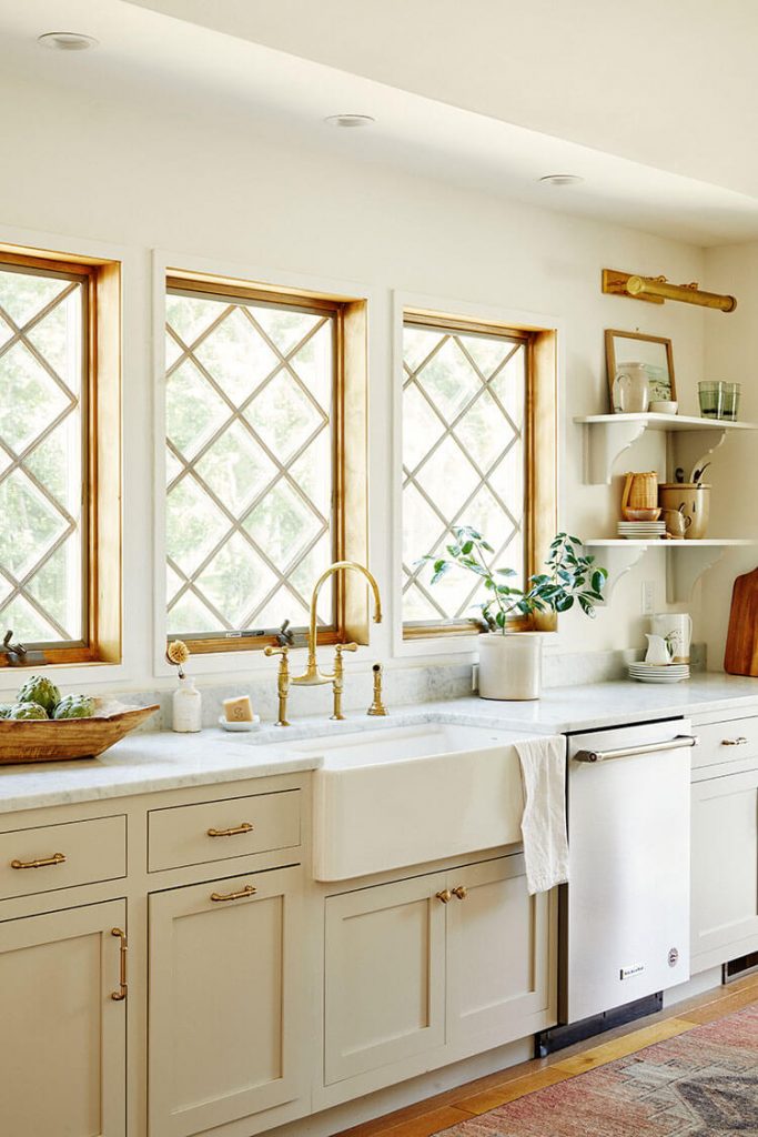
But those are not the only areas that add a touch of farmhouse elegance to your kitchen design. Arched doorways, exposed wood beams, and diamond grid windows perfectly add a touch of rustic elegance to your farmhouse kitchen design.
For instance, you can go for diamond-paned windows, mixing a predominant cream-white monochromatic scheme with touches of diamond on the appliances and other subtle kitchen areas. With the window panes in diamond, you can also have the water taps, cabinet handles, and window grilles painted in the same diamond color.
32. Work with Top Shelves and a Ladder
Work with Top Shelves and a Ladder
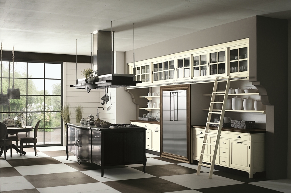
A predominant theme in most European farmhouse kitchen designs is functionality, albeit using the most simplistic tools available. You can capitalize on this theme by installing tall upper cabinets with a ladder for accessibility in your farmhouse kitchen design.
A ladder in the kitchen?
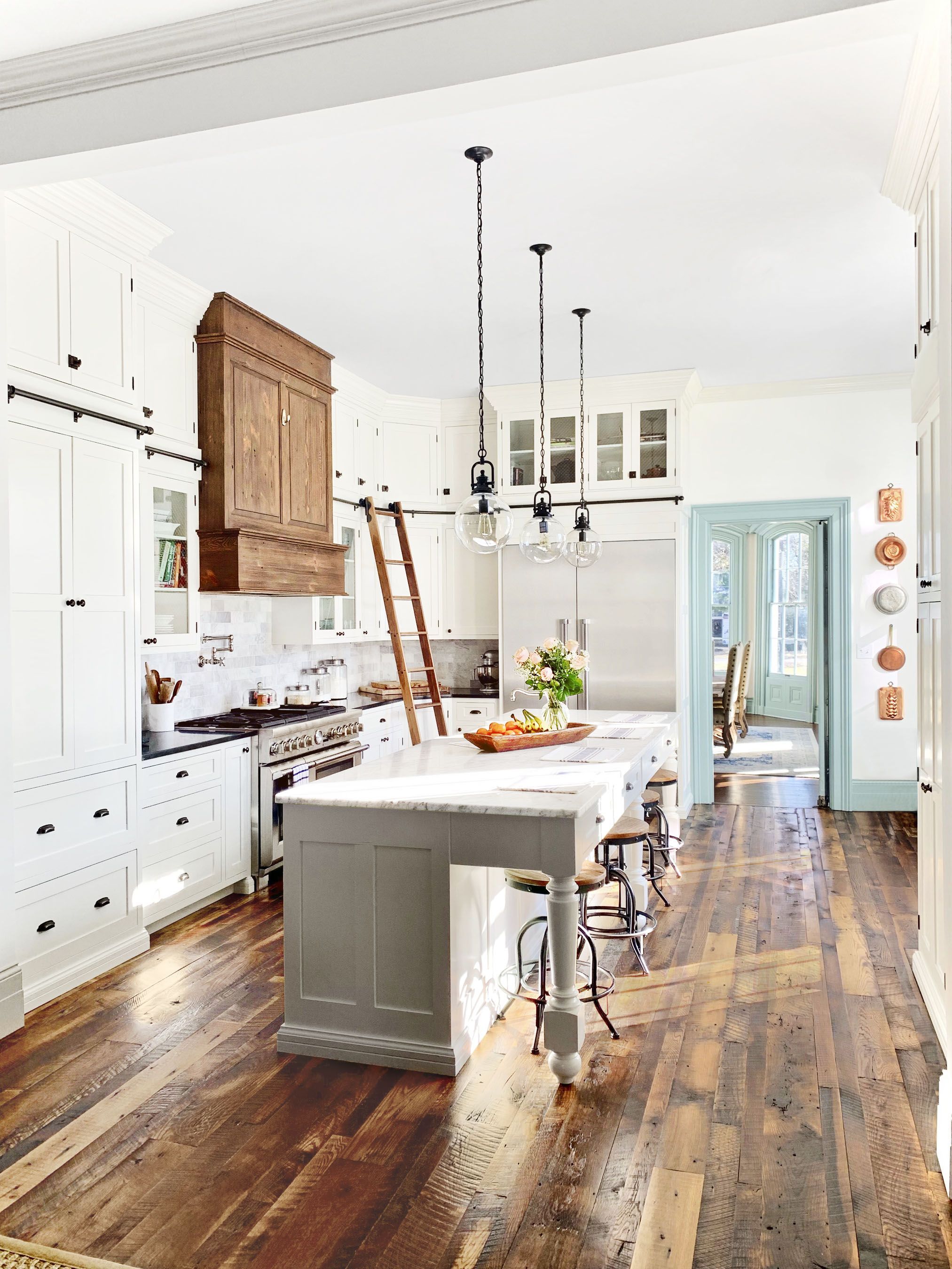
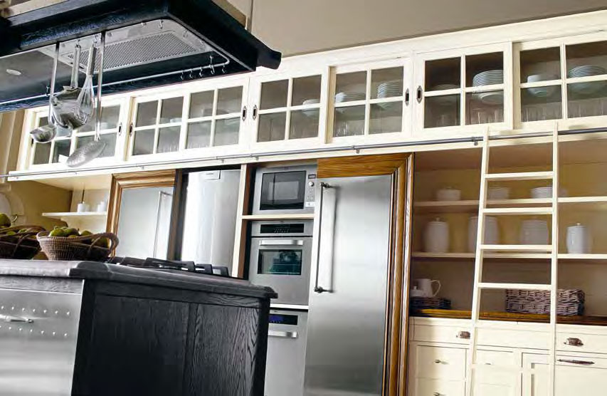
Yes. This library ladder allows you to capitalize on the space above the kitchen, adding more storage to your kitchen. Therefore, you can install very tall cabinets at the top, which can be easily accessed by the library ladder.
This ladder should have a rustic touch. Preferably, you should leave it in dark wood. You can use this same color on the range hood, with the rest of the kitchen getting a pure white paint job.
The result is two greatly contrasting colors, which help pop the rustic element of the ladder and range hood.
33. Try Matte Black
Matte colors have been hot in 2019. As 2025 approaches, matte is still considered one of your kitchen's most versatile, modern, and sophisticated colors.
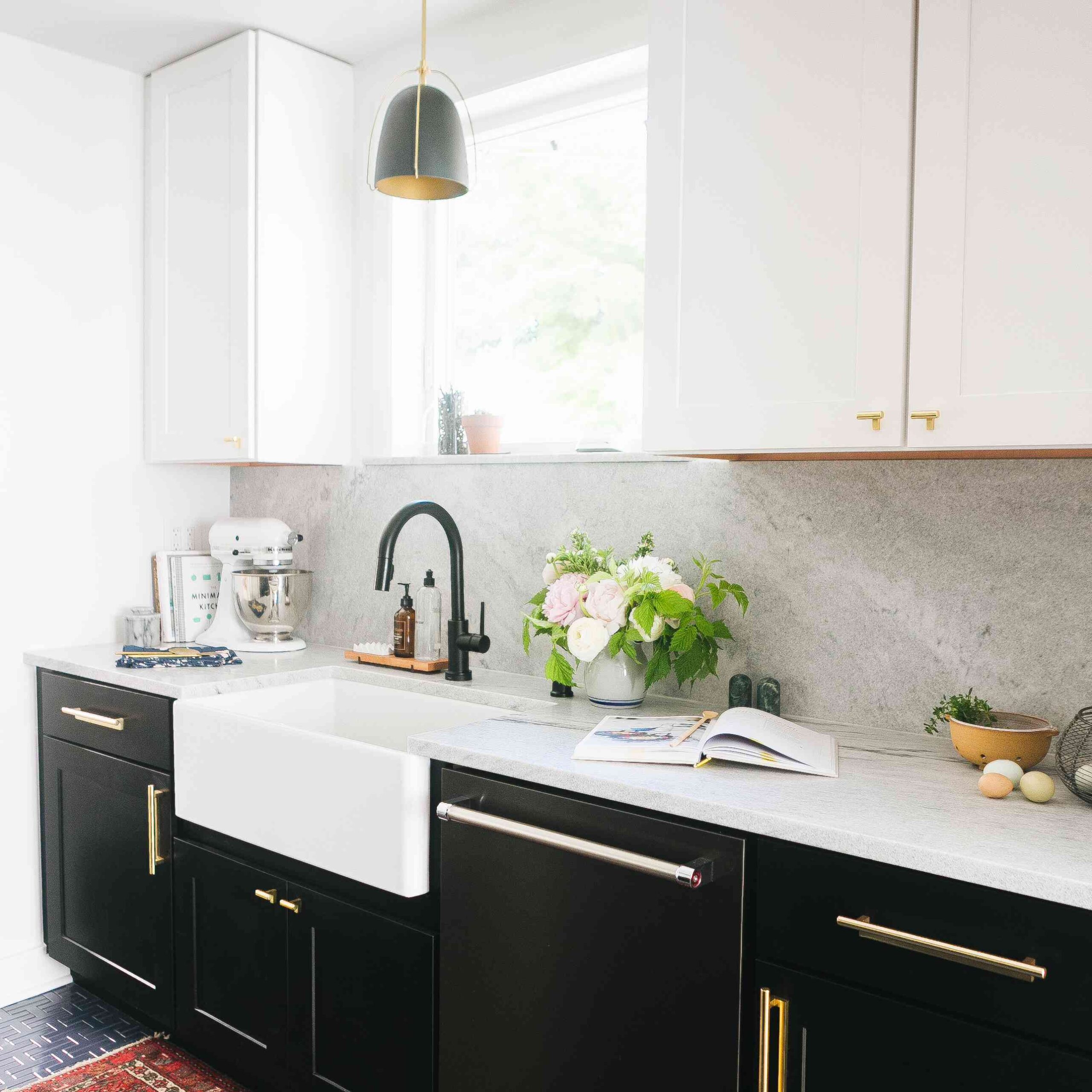
And as far as your European farmhouse kitchen is concerned, you’ll never go wrong with matte black. This color will work magic when mixed with white and a light gray backsplash. You can use matte black on the cabinetry and a touch of gold on the cabinet handles.
The kitchen island's base will also look great in matte black, with either white, light gray, or ash gray crowning the top. The same applies to the countertop.
But how do I add a rustic element? I use wooden kitchen island seats, pendant lighting hanging over the Island, and rustic wood kitchen appliances like the breadboard.
34. Focus on Charming Details
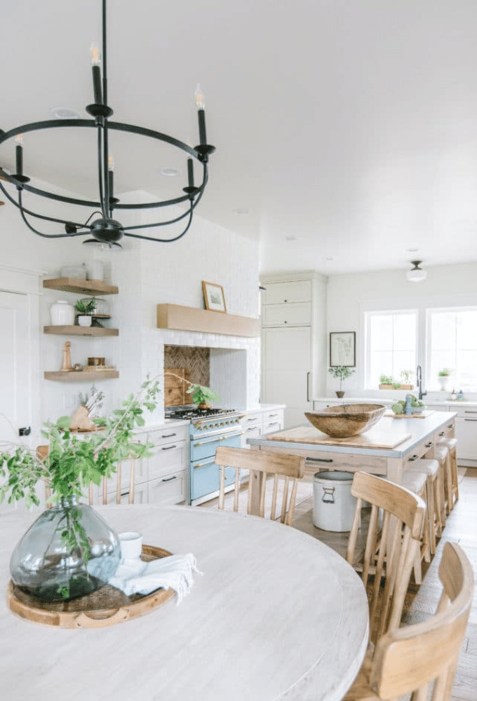
The European farmhouse kitchen was imagined based on the American farmhouse kitchen theme of coziness, warmth, and a homey feeling. You need to get this right in your European farmhouse kitchen design.
How? Focus on small details such as the cabinets, wood elements, and the fireplace. For instance, glass-door china cabinets make the kitchen feel large and cozy. Using wood elements with a warm tone makes the kitchen feel inviting, while a fireplace fixed in the dining nook adds warmth to the entire setup.
But those are not the only avenues you can explore. Going back in history, you’ll learn that traditional European kitchen design allowed different people to express their histories through the kitchen. That’s an avenue you can explore.
Therefore, you can use finishes and décor tied to your family history. This will make the space welcoming and sentimental to you and your family.
35. Use Open Shelves
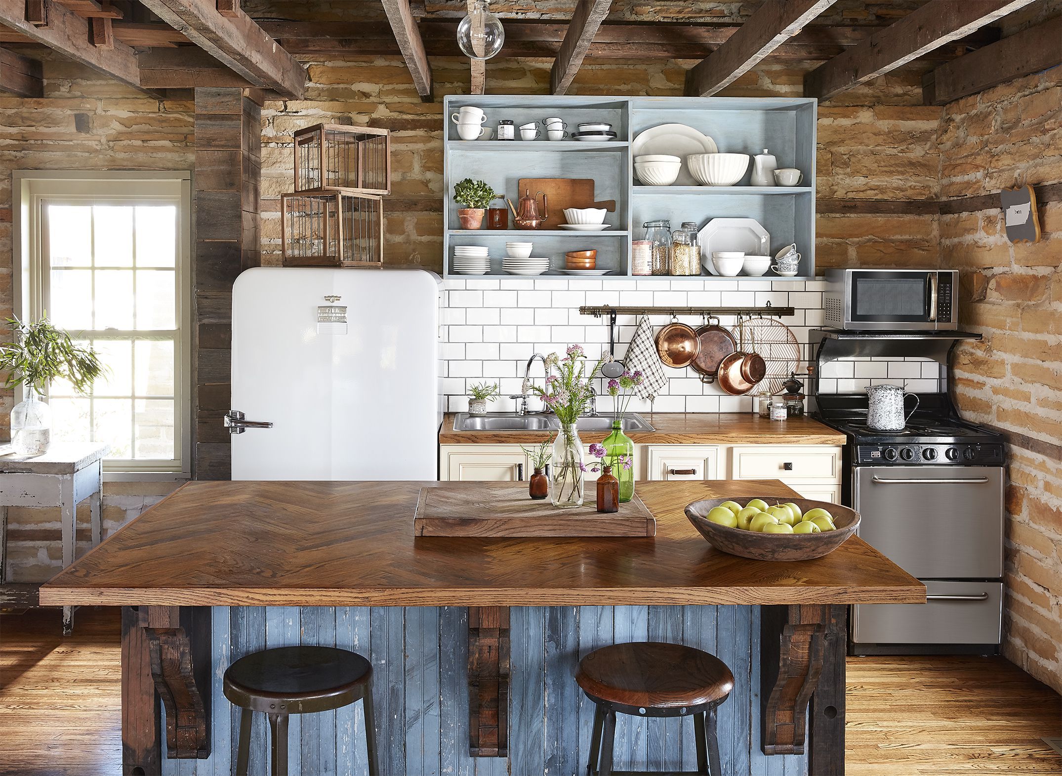
Depending on the size of your kitchen and layout, upper shelves may or may not be necessary. However, if you want a pure rustic touch to your European farmhouse kitchen, especially if you have enough floor space, you should consider using rustic open shelves.
These are usually used in place of upper kitchen cabinets. Instead of tall cabinets that go up to the roof, this design uses a simple plank as a platform to support small kitchen appliances, tools, and items such as cups, small china, spice containers, and cutlery.
You can go even further and use the original European flush kitchen cabinets design for the lower cabinets.
Does this design work if you need a lot of storage? No. You should use this design if kitchen cabinets are not heavily utilized and the kitchen appliances and tools you have support a rustic theme in the kitchen. This means that shiny metallic kitchenware will not do this design justice.
36. Embrace Wood Topped Worktables
Embrace Wood Topped Worktables
Wood is among the most dominant materials in any farmhouse kitchen design. In most cases, it is the root of the rustic theme associated with most farmhouse kitchens. If you want to nail this theme and have it stand out visibly in your design, embrace wood-topped worktables.
With this design, most of the kitchen can be made out of wood, from the range hood and cabinetry to lantern-shaped lights at the side of the wall. However, most of this wood should be colored in a monochromatic scheme. For instance, a dash of ocean blue would work.
To finally nail that rustic element, the kitchen island should have a wooden top. For this top, the color should be left in light wood color, with the grain clearly visible. Pendant lighting at the top should be the cherry on top of this wood-inspired European farmhouse kitchen design.
37. Try Wallpapers
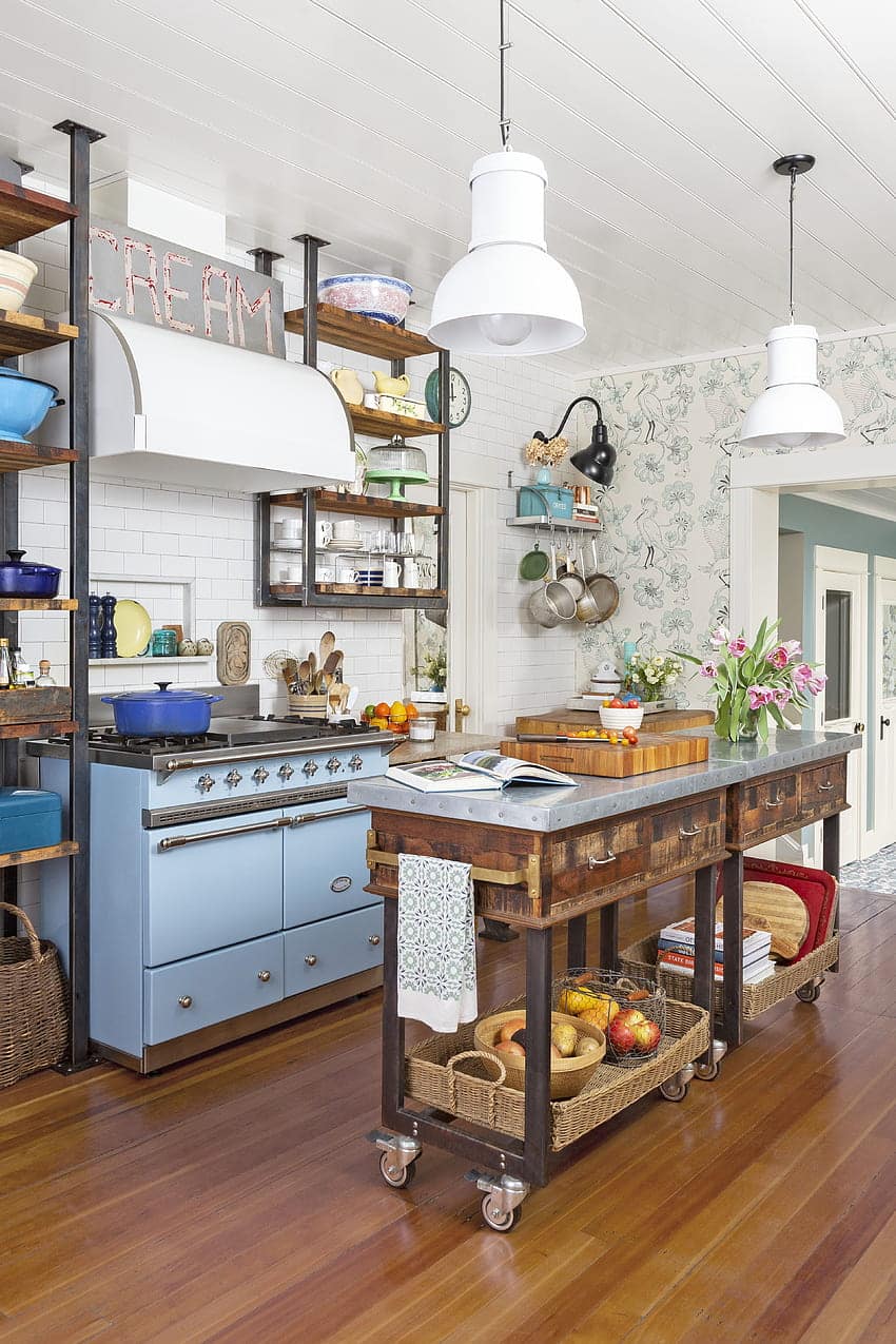
Wallpaper for a Modern Flair to a European Farmhouse Kitchen Design
Farmhouse kitchens are predominantly traditional. Therefore, very few designs will incorporate a purely modern feature, except this one. Wallpapers are a nice way to add a touch of modern flair to a European farmhouse kitchen design.
For instance, to work with this design, you can incorporate industrial carts, neutral colors, and floral patterns to get a charming result. The industrial carts can be used as the kitchen island, with light blue serving as the predominant color in the design.
With that setup, a floral wallpaper would provide a beautiful backsplash.
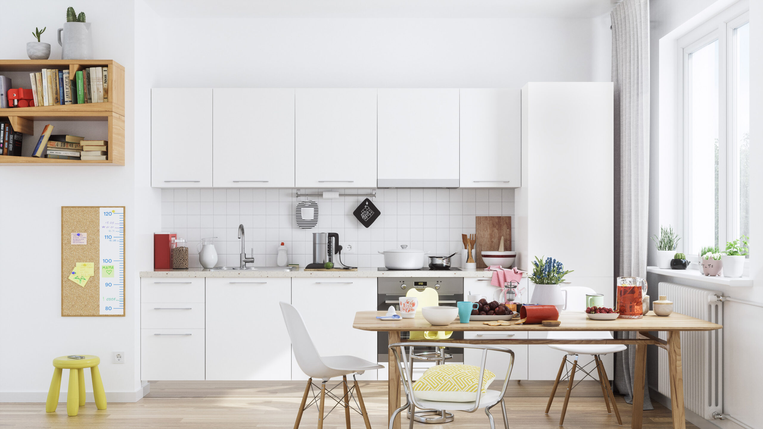
38. Light and White Hues
The Scandinavians predominantly used white in their kitchens. But why so?
Well, back in the day, when the winters were long and gloomy, Scandinavians preferred painting their kitchens white to create a cheerful and airy feeling away from the winter gloom outside.
White improved the natural lighting in the kitchen and kept the visual fragmentation at a bare minimum.
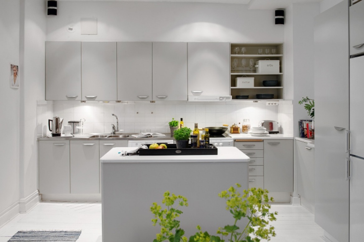
So, what’s stopping you from using it? Nothing. Given that this is part of the original Scandi kitchen design, you can never go wrong with it. This design works even better in a small kitchen’s one-wall layout since it visually makes the space look larger and the kitchen looks lovelier.
But that doesn’t mean any kitchen in white is inherently Scandinavian. To stay true to the design, you need to add a few touches of soft wooden tones, clean, straight lines, and little to no clutter.
39. Hints of Color
Going all white might be boring to most people. Assuming you’re one of them, the Scandi kitchen allows for a little bit of colorful experimenting, albeit in a regulated manner.
For instance, a mix of chic kitchenware with floral patterns, pops of bright yellow or green, and pastel hues that provide a breezy summer charm, coupled with a neutral backdrop, provides a nicely toned kitchen that is not too colorful for a Scandinavian European kitchen design.
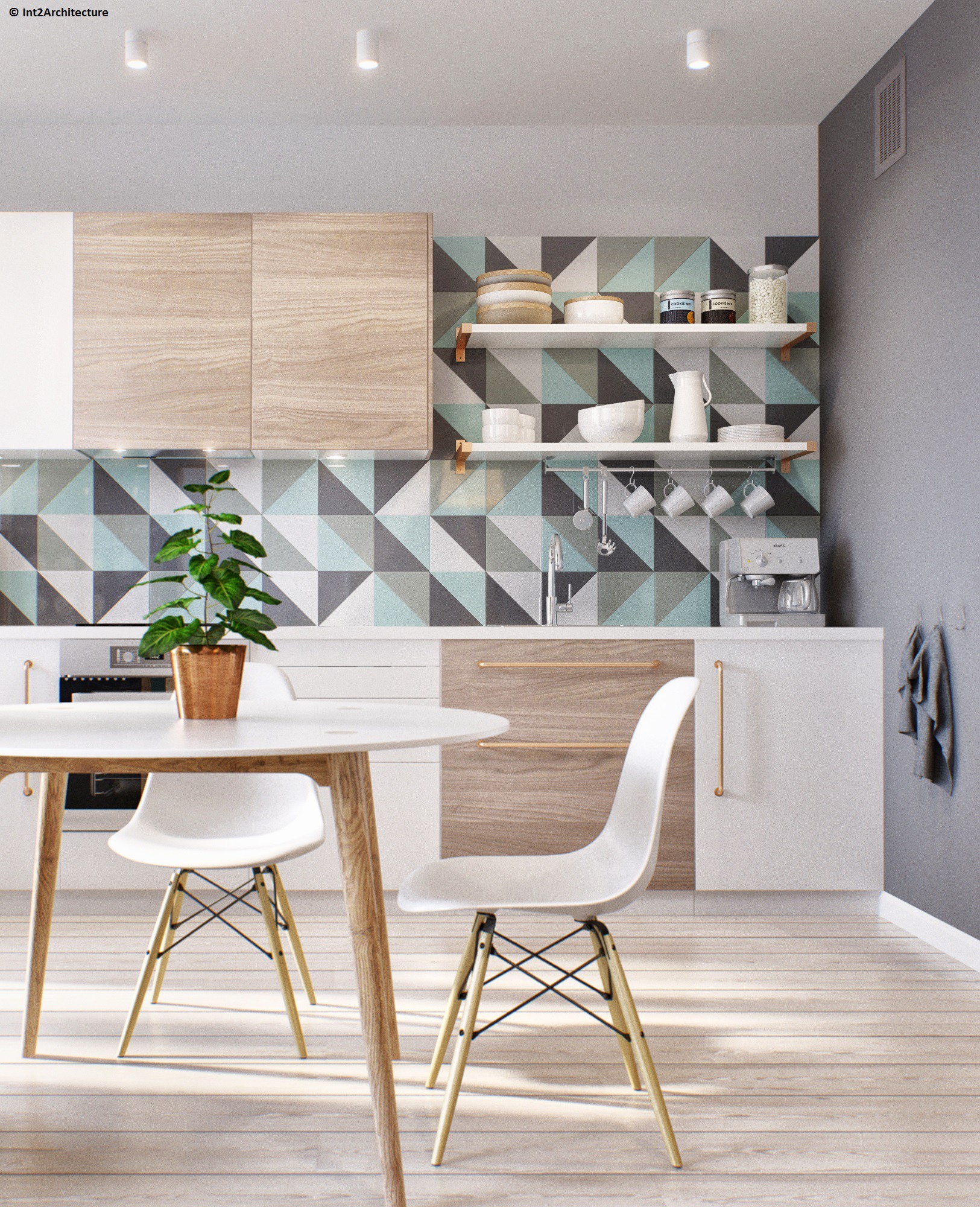
If your backsplash is monochrome, you can also experiment with wallpaper or colorful geometric tiles to break the monotony.
Do all colors work with this design? Not exactly. In most cases, summer colors provide the best balance. Stronger hues might work, but a bit more constraint is necessary so that you don’t overdo things, as far as Scandinavian kitchen designs are concerned.
40. Try Two Tone Cabinets
Two Tone Cabinets Scandi Kitchen Design
If mixing colors with restraint in the kitchen is challenging, try two-tone cabinets instead. This approach adds visual interest to a neutral kitchen while adhering to the Scandinavian minimalistic design principle.
With two-toned cabinets, you can have white on top and a lightly stained light wooden hue at the bottom/cabinet doors.
A complementary backsplash amplifies this design even further. You can choose a soft yet impactful color with a lighter hue than the color tone on the cabinets.
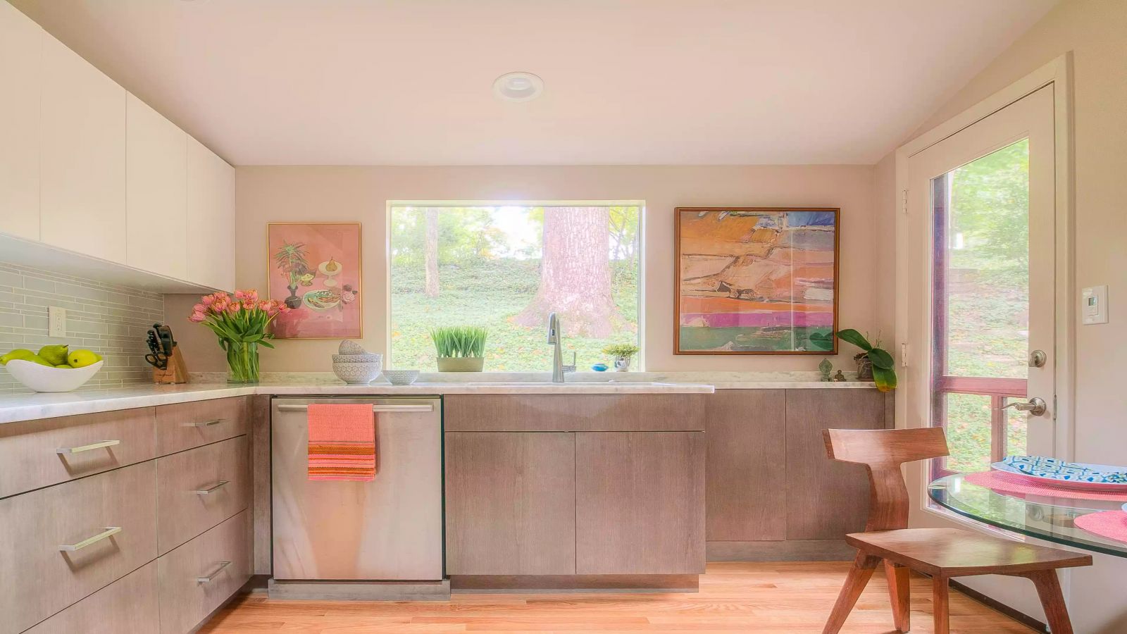
Can you add a bit more color? Yes. You can break the strict two-tone nature of this design by incorporating some wall art. The wall art should subtly add vibrant colors without being visually distracting from the rest of the kitchen.
41. Try Coastal Kitchen Vibes
Yes, the Scandinavians inherently didn’t have a beach during winter, but that doesn’t mean you can’t add your coastal vibe to this design if you live in a beach house. The first step is working with an open-concept kitchen.
The idea is to make the open-concept kitchen feel sunny and light. To top off that coastal vibe, you can strategically use pops of color around the kitchen.
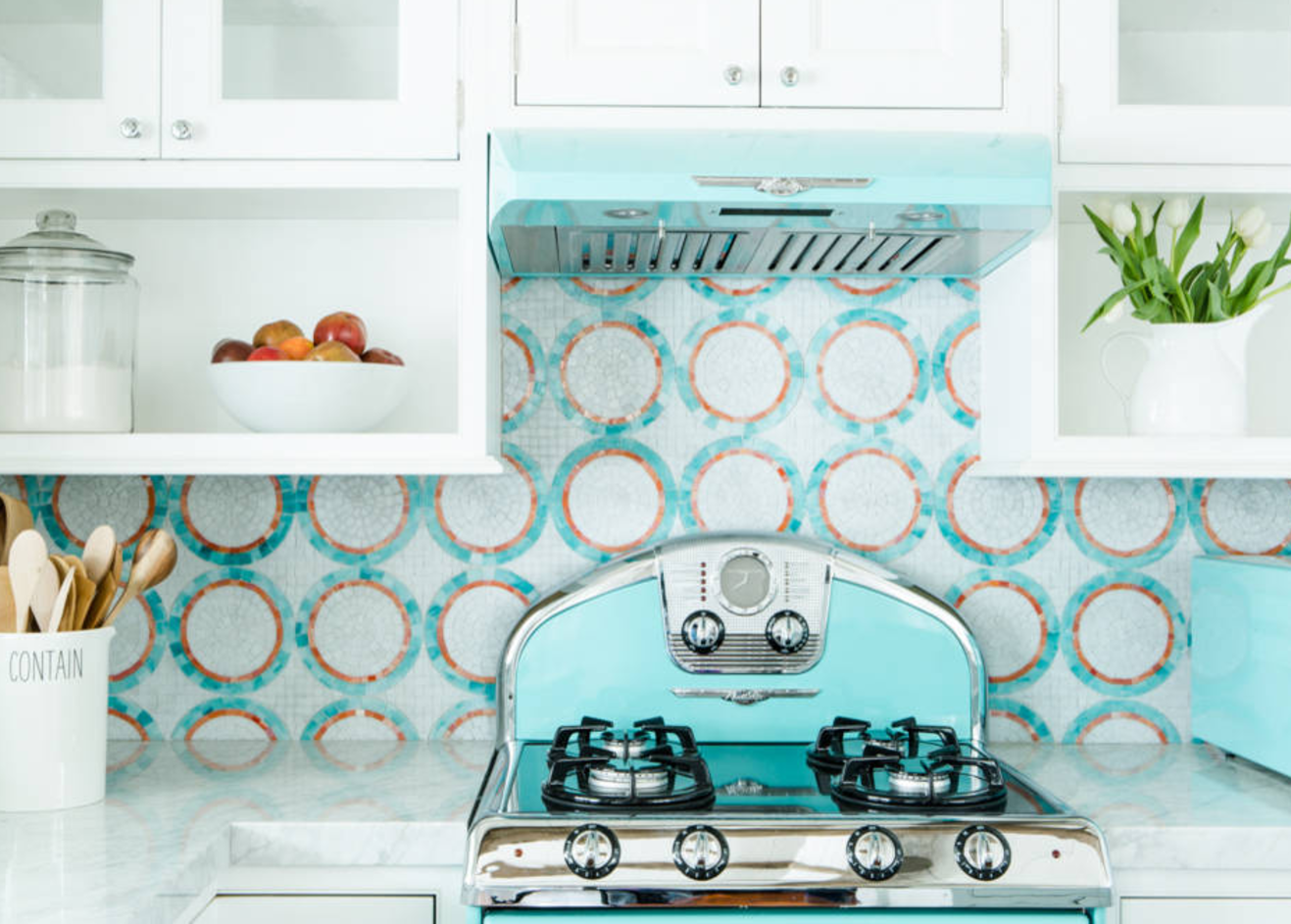
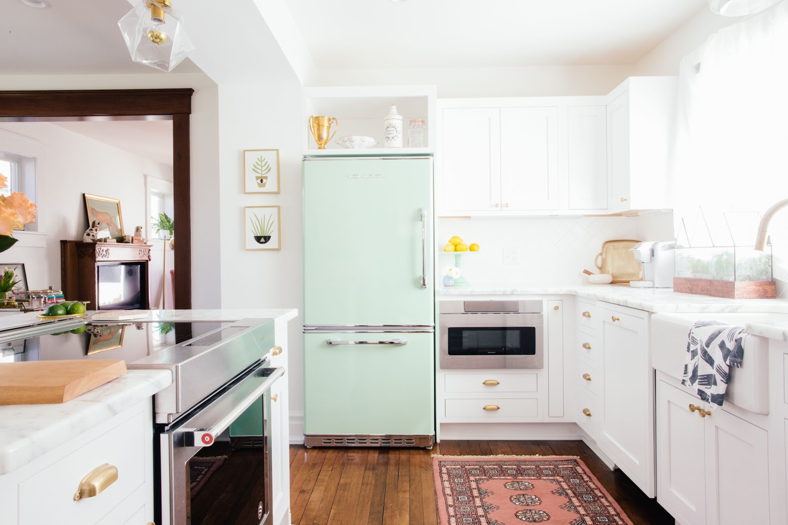
For instance, you can have white glass fronts for the cabinetry, with some open shelving. The countertops can be quartz, and retro-inspired kitchen appliances can occupy most of the space.
So, how do you mix the colors? Let’s start with the kitchen appliances. Robin's Egg Blue would be perfect since you’re going for a coastal vibe. This color will provide a refreshing and welcoming feel to the kitchen.
For the backsplash, you can use mosaic tiles in a circular pattern. This complements the color scheme while not taking too much attention away from the rest of the kitchen.
You can take this design up a notch by incorporating elements such as plants and simple containers. However, remember to keep them as minimalistic as possible.
42. Clean Contrasts
This is one of the most subtle ways to incorporate slightly stronger hues into your Scandinavian European kitchen design. The idea is to have clear contrasts between the different colors, with the colors naturally blending in together to form a homogenous look.
So, how should I split the colors? I could simply color the island differently from the rest of the kitchen.
Otherwise known as the contrasting island, this trendy color-contrasting approach works well with a natural wood kitchen. The stark contrast between the center island and the rest of the kitchen adds sophistication and sleekness to the design, making it stand out.
The striking island adds warmth to the space and is a focal point for the kitchen visuals.
43. Industrial Scandinavian
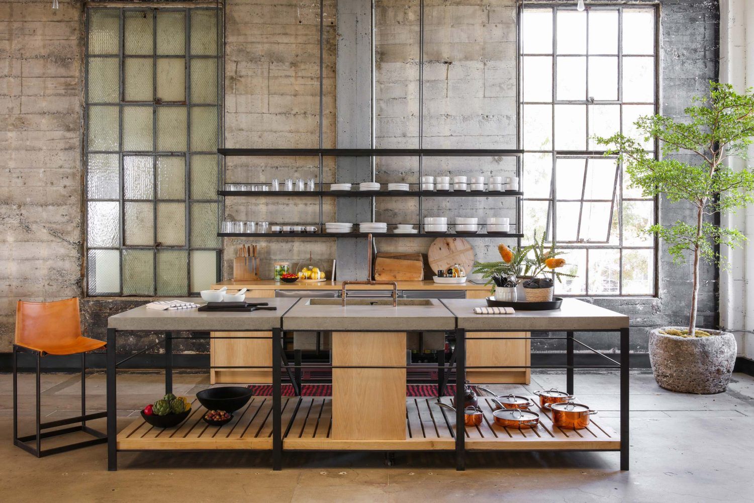
This design focuses on another core element of Scandinavian kitchen design—texture. The industrial Scandinavian kitchen design combines leather, poured concrete, and wood to create a Nordic, industrial, and chic kitchen.
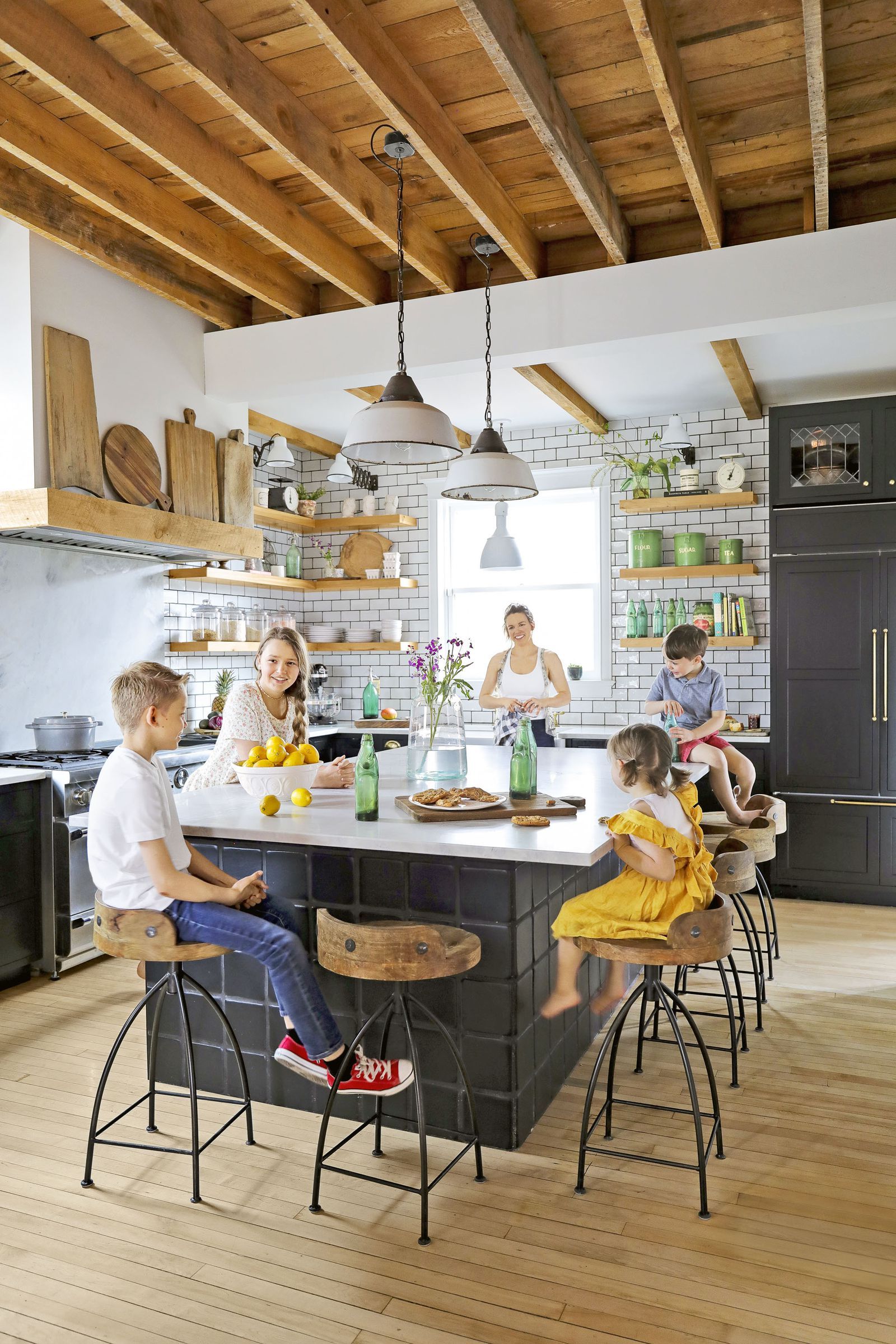
This kitchen visually exposes the bones and structure of the rustic brick building upon which it is built by exposing these textures. To nail that industrial look, you can use open shelving for the upper layers, with the bottom cabinets featuring a highly minimalistic design.
The open shelving exposes the old stone wall, framing it as a unique kitchen feature and further amplifying the design's texture.
The final design includes a bit of metal, with the center island/table featuring a concrete top, wood base, and metallic legs painted in black.
44. Take Full Advantage of Minimalism for Small Kitchens
Most people have small kitchens. While the one-wall or galley layout seems to be the best option for limited space, the specific design is always a question of debate.
Well, the Scandinavian European kitchen design should be your go-to.
Why? Thanks to its emphasis on minimalism, organization, and frugality, this kitchen design serves both lavish catalog creations and ultra-small utility kitchens. How exactly?
In small kitchens, you can incorporate floating shelves, wall-mounted cabinets, and ergonomic worktops that prioritize efficiency over form to fully utilize the limited space.
You can experiment with inherently light colors to create an airy, roomy feel in the kitchen.
45. Mix Old and New Design Details
You’re not restricted to one design pattern when experimenting with European kitchen designs. The great thing about European kitchens is that old and contemporary mix seamlessly.
How?
For instance, you can mix wood with marble, stainless steel, or glass. The kitchen appliances can be made from stainless steel, and the cabinetry can feature glass doors. Finally, you can seal this design with a wooden library ladder to reach the upper cabinets.
You can even combine two-door styles in one cabinet. For instance, you can fully overlay drawer heads and inset cabinet doors. The drawer heads can have a unique profile shape, such as a slight concave arc. The cabinet doors underneath can alternatively have inset heads.
This mix and match can create breathtaking and unique results.
46. Wood and Metal Kitchen Island
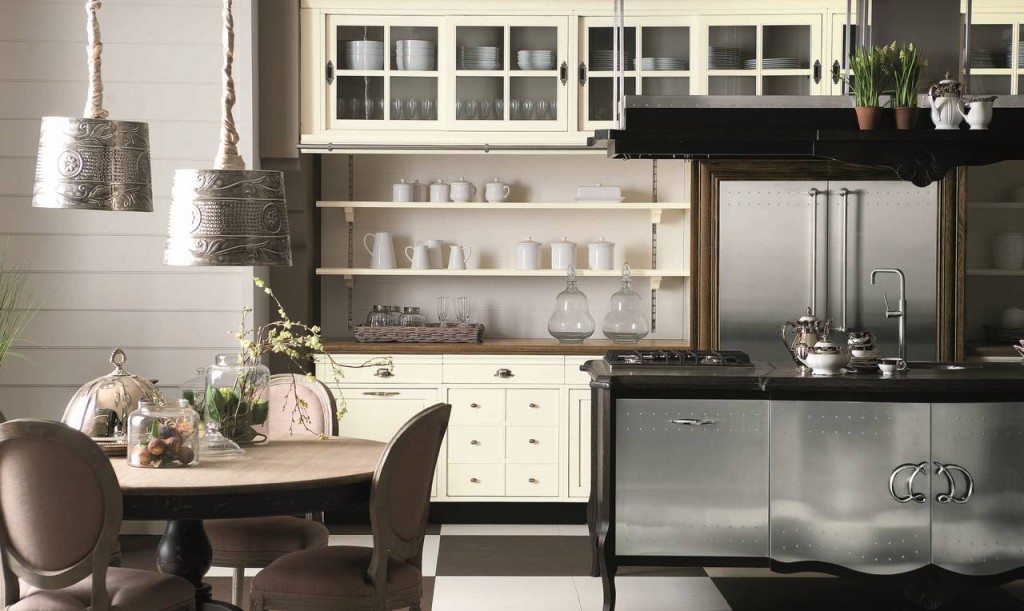
Kitchen islands are predominantly made of stone. However, this European kitchen design allows you to experiment with wood, rivets, and metal.
The idea is to have the kitchen island crafted out of wood. The island can be painted black, sculpted down, and set to stand on decorative legs, which have been sculpted from its dark wooden frame.
You can have an extra set of cabinets fitted with metal doors at the front. The cabinets can have a sculpted bottom, shiny silver decorative handles, and decorative rivets.
You can choose an even more unique design with the center cabinets bowed out. A final metallic silver finish would crown the kitchen island cabinet doors, making them the visual focal point in the kitchen.
47. Use Large Sliding Doors for the Hideaway Effect
Large Sliding Doors for the Hideaway Effect
If you’re not a fan of seeing your appliances displayed openly in the kitchen, then using large sliding doors in your London townhouse European kitchen is the best design idea you can get.
With this design, a large sliding door hides the microwave, fridge, and any other appliance you want to keep hidden. The door runs on a hidden track system that controls its opening and closing.
However, don’t be quick to install this feature. Make sure you first consult with your designer or interior décor team to ensure that local building codes allow the installation of such equipment in the kitchen.
Regarding aesthetics, you can have the front of the door made out of steel, with a wooden frame surrounding it. Besides, you can paint the frame contrasting to the kitchen’s backsplash so that the sliding door stands out.
48. Painted Kitchen Mixed with Authentic Materials
More and more people are falling in love with the painted kitchen. This design approach breathes a modern take on a traditional look and finish.
So, how do you mix a painted kitchen with authentic materials?
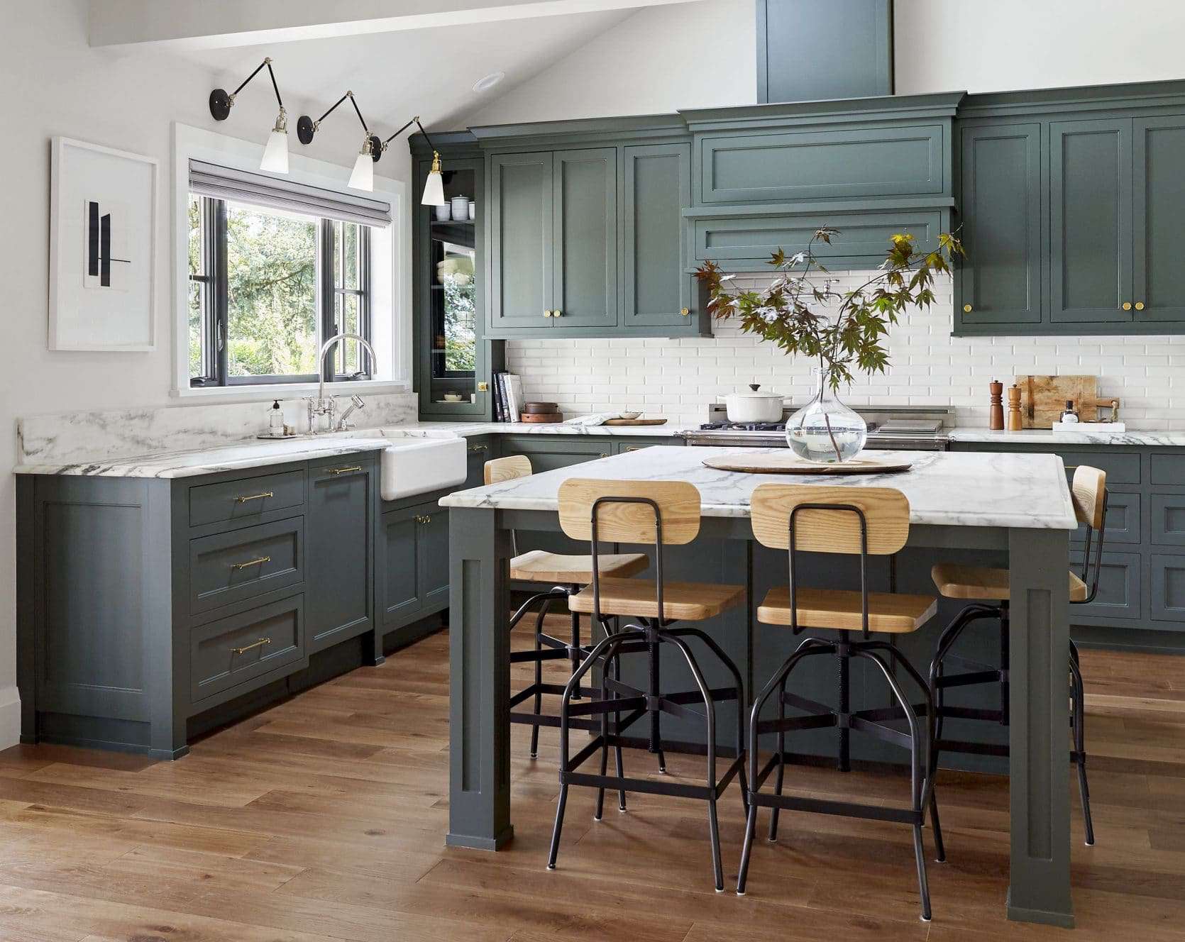
Midnight color, for instance, is commonly used on kitchen cabinets. For instance, charcoal, slate gray, light gray, and taupe neutralize the rest of the colors. The effect of this seamless blend of colors is great emphasis on the architectural detail and furniture of the design.
The painted kitchen is usually coupled with authentic raw materials such as concrete, wood, and marble. Wood or concrete may be used for the kitchen island, with marble crowning the countertops.
This creates a kitchen environment that is classic yet contemporary, thanks to the modern finishing.
49. Play Around with Kitchen Appliances
Play Around with Kitchen Appliances
Kitchen appliances play a major role in how your final European kitchen design turns out. For instance, if your colors are generally dull, and you want to light up the kitchen with some pops of color, you can do this with kitchen appliances.
For instance, you can get a bright yellow blender, red stove, or shiny silver pans to complement the kitchen's predominant dark tone.
Is there a specific formula for this?
Well, not really. The general rule is that if you’re going for a vintage design, vintage kitchen accessories should be your go-to option. On the flip side, if you want to experiment with something more contemporary, hyper-colorful accessories will best suit your design.
50. Go Panoramic
Among the key design elements of the European kitchen is bringing nature into the kitchen. For London townhouses, achieving this feat might be a tall order, especially if your kitchen is on a higher floor.
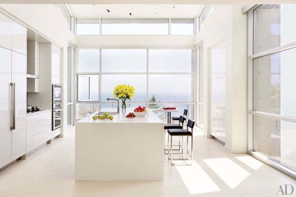
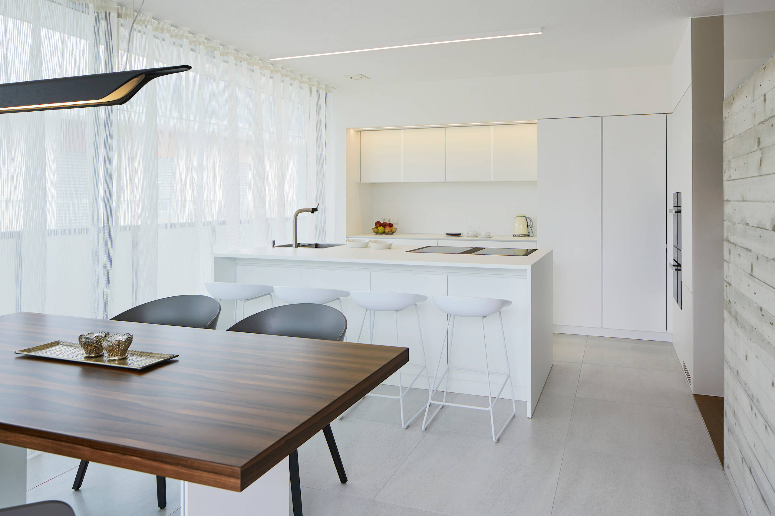
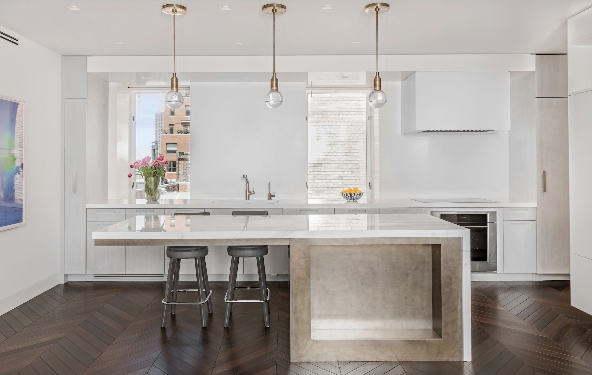
So, what’s the remedy? Panoramic windows. To bring nature in, you must let in much of its view and natural light. Coupling panoramic, floor-to-ceiling windows with an all-white monochromatic kitchen is a great way to brighten and light up everything.
You can tone things down a bit by using a cream-white floor and stainless steel kitchen appliances and accessories.
Since this design also exudes a luxurious feel, you can spend a bit more dime by going for marble countertops and Kitchen Island. You can then contrast this with black seats for the kitchen island, with stainless steel support.
A flower vase right at the edge of the Kitchen Island also helps break the whiteness while adding a nice detail to the entire layout.
51. White Will Never Go Wrong
If you’re looking for inspiring minimalist kitchen designs, you’ll be flooded with numerous designs donning a white monochrome palette.
Why? Because you can never go wrong with white when it comes to expressing minimalism. White is easily associated with clean and simple. Plus, it allows natural light to flood the kitchen, creating a light and airy feel.
To nail this color even better, you can extend it to the rest of the place. Since most minimalist designs are used in small kitchens, painting the adjoining room or space white creates unity, making the kitchen appear larger.
What if I want to go for a stronger contemporary feel? Mix the white with black. Two-tone minimalist kitchens featuring black and white are getting trendier by the day. The black helps break the monotony of the white, creating a contrast that adds sophistication and a modern feel to the kitchen design.
52. Mix Wood and Tile
Wood and tile mixed work magic in creating a minimalist European kitchen design. How?
For instance, you can have a pure white kitchen with a redwood dining table coupled with black or midnight-colored seats right at the front. The stark contrast between the white kitchen and the wood dining table creates airiness and space.
Alternatively, if you’ve installed a kitchen island with white seats, you can break off the monotony using a wooden floor. A bit of grain should be visible, with a lighter white or ash gray coloring the wooden floor.
You can then break the background using a white subway tile backsplash. It doesn’t entirely break the white tone in the room. Rather, it cools down the warm white, chilling the kitchen.
53. Play with Colors
Yes, the minimalist design is made prominent by the color white. But that doesn’t mean that white is the only color that can pull off this European kitchen design.
In the simplest case, you can mix bright colors in a predominantly white minimalist kitchen to add a nice pop of color. You can do this by subtly incorporating natural wood in the furniture and bright colors such as red and yellow in kitchen accessories such as the dishcloth and stool and patterns on the seat cushions or cups.
If you want to go all out, you can have a white tile backsplash and white countertop mixed with crimson green cabinetry, a red stove, and a bright yellow fridge.
At the top, you can open things up using open shelving while incorporating a creative splash of colors. For instance, you can have the shelves painted white at the frame, with the inside in the same bright yellow as the fridge.
54. Match the Countertops and the Backsplash
Matchy Countertops and Backsplash
Assuming you want to use a two-tone color palette, one of the best ways to exude a minimalist design is to match the countertops with the backsplash. In this case, you’ll need to use a light color to maintain the spacey, airy feeling.
You ask which one? Ideally, marble. First, using marble adds a touch of sophistication to your kitchen design.
Second, since the colors, patterns, texture, and graining match, the backsplash and countertops create a waterfall effect, resulting in a calm and simplistic aesthetic.
What about the rest of the kitchen? A dark matte color would do. Plus, you’re not strictly confined to one color choice.
For instance, you can have the dining table and cabinets in matte black. The seats can be dark brown, and dark brown pendant lighting can hang over the kitchen island.
55. Remove the Plugs
This can be termed minimalism at its extreme. And sure thing, it looks gorgeous.
Instead of reducing the clutter of kitchen accessories and settling on a monochromatic or two-tone palette, you can also remove the electric plugs completely from the backsplash and countertops, leaving you with a flush, sleek, and clean surface.
Where will the sockets go, then? If you take this route, you should invest in pop-up plugs instead. These plugs only appear on the surface when you need to use them. Otherwise, they’re tucked in flush with the backsplash or countertop surface.
You can even change the lighting, replacing the wide lighting with strip pendant lights that hang over the countertop.
With this design, since the aim is to achieve extreme minimalism, you should eliminate any kitchen accessory, tool, or appliance on the countertop. Preferably, only one item should remain on the surface.
56. Invest in Lighting
Adequate lighting makes a minimalist European kitchen design shine. There are two ways to achieve this: natural lighting (preferred) or a mix of natural and artificial lighting.
So, how do you ensure the space gets enough light? First, ensure the kitchen efficiently bounces light off its surfaces. If your kitchen is positioned so that natural lighting is limited, you should invest in fancy countertops, classic laminated drawers, and European kitchen cabinets.
You can add pendant and ceiling lighting above the kitchen island to add more light to the kitchen. This can still work well even if you don’t use a full white monochromatic color palette.
57. Keep Everything Low Profile
Minimalist kitchen design not only involves using the bare essentials but also structured design features. As far as the latter goes, you can keep the Kitchen Island and countertops low-profile for a great minimalist effect.
How does that work? The cooktops and countertops appear smooth and continuous at the same level. You can then declutter these surfaces for a greater sense of continuity.
You can extend this low-profile aesthetic to the pendant lighting as well. You can drop them a bit lower, making sure they all align horizontally. The seats at the kitchen island should also not be too tall.
58. Be Creative with Pops of Color
Be Creative with Pops of Color
Some people find plain European kitchen designs a bit boring. This is because, in their architecture, most European kitchens are built using dark wooden cabinets and vintage tiles. But that’s just the architecture.
Being creative with pops of color around the kitchen can add that missing pizazz to your final design.
To stay true to the Europeanisms of the kitchen, you have to use a lot of dark wooden cabinets and vintage tiles—but not everywhere. As far as the tiles go, you can get creative and use colorful backsplash tiles to bring the color you need back to the kitchen.
You can then go all creative with your appliances, using a red stove, a colorful microwave, or a blue refrigerator. The idea is to have these colors pop while mixing beautifully with the traditional colors of the architecture.
59. Go All Vintage with Grain Sack Upholstery
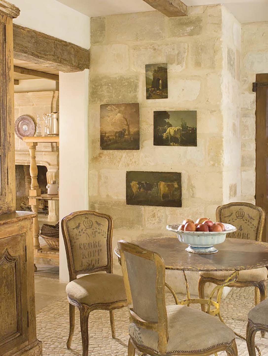
Adding pops of colors might sound a bit unauthentic to you. So, if you don’t mind the dark colors and are totally in love with the vintage theme, grain sack upholstery might be the way to go.
This kind of upholstery is mostly associated with traditional Gustavian, Tuscan, French Country, and Belgian European kitchens. The grain sack upholstery blends seamlessly with the dark wood used to make the cabinets and tops in these kitchens.
In some instances, you can extend this theme to the dining area. Instead of leather or normal cushions, you can use this upholstery on the dining seats. The main thing to note here is that if you take this route, everything else, including most appliances, must be mildly colorful to maintain the architecture’s pureness.
60. Try Adding Breadboards Too
Try Adding Breadboards
Breadboards were once used to transfer loaves of bread into and out of the oven. Today, these traditional appliances are still functional.
Moreover, they are an authentic addition to a country-style, traditional European kitchen. Thus, if the grain sack upholstery worked for you, this might also be a great addition.
Authentic breadboards are made from maple, pine, or oak. They’re about 2 inches in diameter. What makes them a great design idea is that apart from serving a traditional purpose, they’re nice, collectible, decorative artifacts for your kitchen.
Thus, they can be placed in the kitchen to add aesthetic value instead of just retrieving hot bread from the oven.
61. Eclectic Ideas Work
Indecision is common when figuring out the right kind of European kitchen design. But what most people don’t understand is that this indecisiveness plays right at the heart of European kitchen design.
Thanks to their architecture, eclectic European kitchen designs allow for a touch of personality. They feature a mix and match of materials and even color. In most cases, this kind of design approach is used when you want to remain as authentic as possible while still adding a bit of contemporaryness to your design.
For instance, if you love shiny metals, you can combine shiny metallics with the raw and earthy materials that inspire most European kitchen designs. The result will be a beautiful blend of modern design and a European rustic theme.
If you want to venture fully into your own creative space, you can combine this with creative pops of color.
62. Try Sticking To Raw Materials
Suppose you’re remodeling from a fully modern kitchen to a European-style kitchen. Does that mean everything you had before has to be thrown out?
Not really. Wood, iron, and concrete are among the key components to add a rustic touch to your kitchen. The great thing about these raw materials is that they blend seamlessly with a feminine or masculine traditional kitchen design.
If you dread remodeling your modern cabinets, you can try concrete countertops. These also work well with your modern artifacts to create a breathtaking European kitchen design.
Since your modern kitchen already has eye-popping colors, adding wooden beams, for instance, will complement the modern design perfectly. The main thing to note here is that the imperfections of the raw natural materials should be maintained for authenticity to the traditional looks.
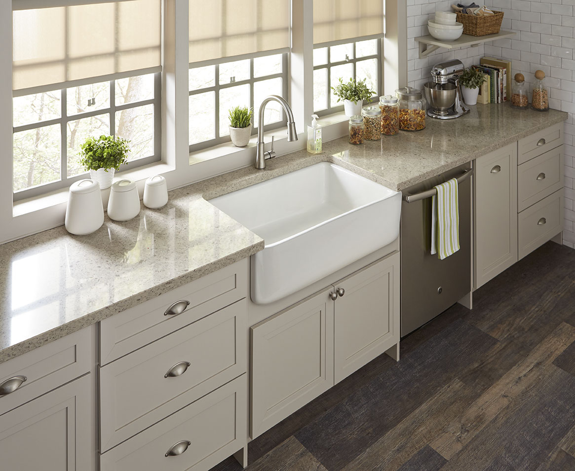
63. Give Fireclay Farmhouse Sinks a Try
Before dishwashers became common, folks spent long hours in the sink washing mountains of dishes every day. The fireclay farmhouse sink was born to deal with the strain associated with these long hours.
It is one of the most comfortable sinks you can use. Apart from being very authentic, this added comfort is another reason you should have one in your European kitchen design.
Fireclay sinks are not made from modern ceramic. Rather, they’re crafted from ultra-heated clay and hardened to withstand the torture a European country kitchen would subject it to.
“But I do have a dishwasher.” Yes, that’s an added advantage. However, if you are the kind that is always busy creating in the kitchen, this is the kind of sink you need.
It nicely accommodates pots and pans. Plus, it traditionally features an apron design that eliminates the need to lean over the countertop while working at the sink.
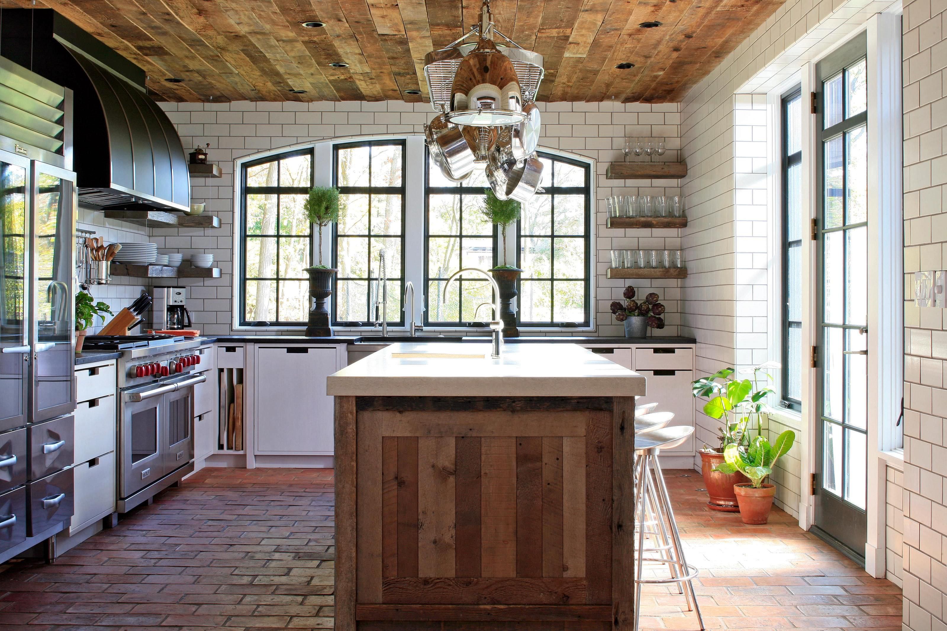
64. Go for Reclaimed Terracotta Tiles
Tiles are not as modern as most interior design newbies think. In the day, terracotta tiles were among the first used in European kitchens. The tiles were, and still are, gorgeous, authentic, filled with earthy colors, and full of history.
Back then, terracotta tiles were made from natural clay deposits in the earth. Everything was done by hand.
The clay was first dried in wood molds. Then, they were further dried in the sun before firing in wood-burning kilns.
One of the most attractive features of terracotta tiles is their unique color spectrum, which results from the different kiln temperatures used during firing.
65. Instead of a Center Island Counter, do a Worktable
Worktable Instead of a Center Island Counter
Center island counters are great. They add extra space to the kitchen while providing a common gathering center. However, if you have limited space or you’re renting, committing to a kitchen island is tricky.
So, what should you try? Worktables. Traditional to most European kitchen designs, worktables offer the convenience of center island counters without the full commitment required.
Plus, since they’re not fixed but instead have legs for support, they offer extra storage space at the bottom. Given that European kitchen designs tend to be smaller than American designs, this is something you might crave.
66. Try a Monochromatic or Black Kitchen
Minimalism has been a hot trend in kitchen design since 2019. Instead of flashy colors and blinding graphics, most homeowners and interior designers prefer two-tone or monochromatic schemes, with matte being the most preferred color.
So why not try this for your London townhouse kitchen, too?
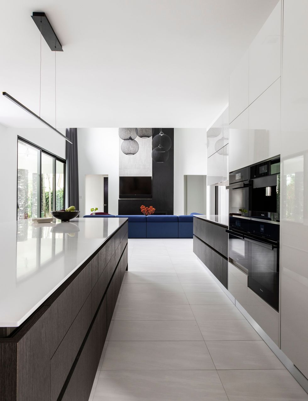
A mixture of black, charcoal, and white shades works magic in bringing out a contemporary feel in a European kitchen design. This design further complements the modern design of the townhouse, elegantly connecting the kitchen and other spaces.
You can work with black and charcoal, for instance, with hex-shaped charcoal tiles for the backsplash. The matte black would work perfectly with the cabinets, and the charcoal would be used for the countertops and the Kitchen Island.


