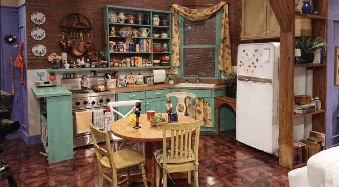
The iconic “Friends” kitchen, featured prominently in the beloved TV show, is a symbol of nostalgic, cozy design.
Known for its distinctive blend of vibrant colors, retro elements, and eclectic style, the kitchen in Monica Geller’s apartment has become an enduring representation of ’90s interiors. The space features a mix of warm wood tones, yellow walls, and quirky decor, with the focal point being the refrigerator and the famous purple walls.
This iconic set has inspired many home kitchens, blending practicality with charm, and continues to influence design trends today.
About the Iconic Friends Kitchen Design
Many people will know the famous American sitcom Friends, created by David Crane and Marta Kauffman. The show aired from September 22, 1994 to May 6, 2004.
The show ranked within the top ten of the final television season ratings and became one of the most popular television shows of all time. Today we look at the iconic kitchen of the show. The kitchen of Monica’s apartment, unit 20.
The kitchen is infamous for where the cast has gatherings and meals together. Along with one of the cast members being a chef, the kitchen is constantly being used theoretically.
As it is a film set, the kitchen most likely was not functionable compared to movie kitchens that are filmed in homes. Homes set up for filming are typically traditional houses, meaning they are common household kitchens and appliances. So is this kitchen functional? Let’s look at the components of the kitchen and see how viable it is.
Friends Kitchen Design
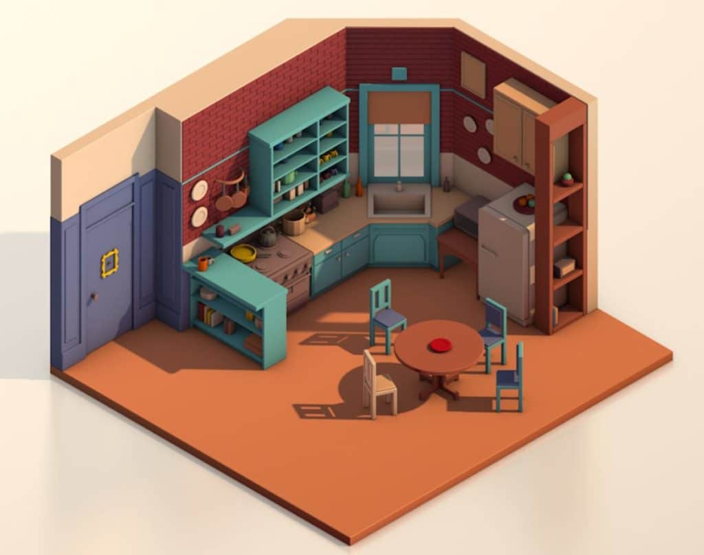
The Friends kitchen is designed as an L-shaped kitchen. The countertop slightly turns to form the L but barely enough space for small object placement. Typical L-shaped kitchens are meant to maximize countertop and storage without occupying walkway space in the room.
As the set takes place in an apartment, the kitchen is designed to be minimalistic. Many homes in this style had either a galley or one-sided kitchen.
The kitchen is a shabby-chic design kitchen with teal cabinets open storage, and a wooden surface countertop. The kitchen drawers have white bar handles while the cabinet doors feature white knobs on each door.
Friends Kitchen Layout
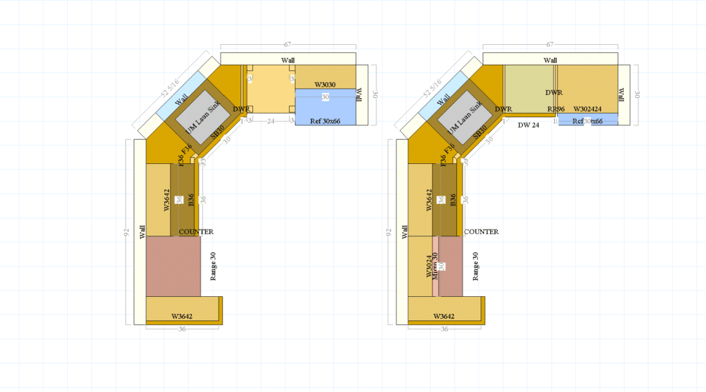
The Friends kitchen only features 5 cabinets. Two of which are open shelving. The focal point is the sink in front of the window located at a corner positioned at 45 degrees. These diagonal corners are not very common in homes, but occasionally pop up due to construction purposes.
These require a corner sink cabinet or need a cabinet to turn the corner. Right of the sink has a small turning section of countertop forming the leg of an L-shape kitchen, but cuts off after that. To the right of the sink area is the microwave which sits on a stand alone table and then a white single door refrigerator.
Turning left of the sink is the only base cabinet in the kitchen. It features two drawers and double doors meant for pots and pan storage. A 30” slide in range sits to the left of the double door cabinet.
Oddly enough, a 3 layer shelf sits perpendicular to the stove. This acts as potential work space as it has a wood layer sitting over the shelf like a breakfast bar overhang. The overhang faces the door walkway, so it acts as work space to put dishes or prep work area.
Over the double door base cabinet is an 8 section open shelving that has many spices and decorations inside. A shelf area extends from the open shelving over the stove that acts as more spice storage.
Above this singular shelf has small pots hanging from a pot rack. Wall storage like this is very common amongst minimalist kitchens.
The Kitchen Functionality
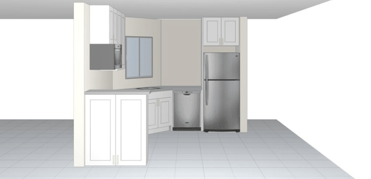
Despite the kitchen having a concise work triangle, the functionality of this kitchen would not work for a traditional homeowner. For people that have a lot of appliances, pots, and pans, this kitchen does not have the storage space for it.
The only realistic place of storage for them is the double door cabinet to the right. The only other cabinet found in the kitchen is a 12” deep double door cabinet located on top of the fridge.
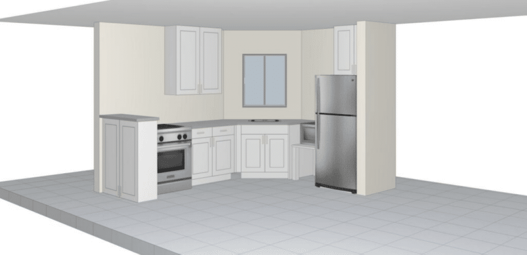
This kitchen would not be usable in today’s standards. The kitchen has not enough storage. We can see very small pots hung on the rack over the stove.
There aren’t large pots or pans to cook for large gatherings, despite many festive activities held in that apartment. Some people in minimalist kitchens can live with small storage, but need the appliances to accommodate it.
Kitchen Design Improvements

There are three improvements that can be made to the Friends kitchen. The first is storage in the kitchen. Adding more cabinet storage and countertop work area will significantly help out the kitchen’s functionality.
The table where the microwave is can be removed to add more countertops. Microwaves typically come in 24” or 30”. Filling in that area can be a dishwasher, which also doubles as potential plate storage. This addition allows for more workspace in terms of prep work.
To support the weight of the countertop, we will need a dishwasher panel on the end. It’s important to remember that the dishwasher itself does not support the weight of the countertop.
The unit slides in after the cabinets and countertops are installed. So the panel encloses the area dedicated for the appliance and holds the weight on the corner turn.
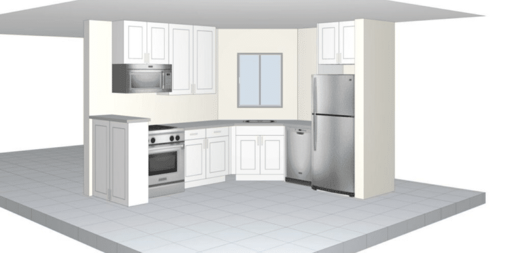
The second improvement is along the wall cabinets. Some people may love the idea of open shelving because of the ease of access to your cupboards. Others will not due to either dust or simply they want to conceal their stuff in the cabinets.
Something that works with the wall cabinets is the potential of a range hood to ventilate the smoke when one is cooking. If we look at the old design, the shelf sits right over the stove. That sounds like an immediate fire hazard.
How is one supposed to cook like that?
Back then, technology was outdated that microwaves did not have ventilation capabilities. Now we do. We can combine both aspects together to create a more functioning kitchen and more space without removing the appliance.
The last improvement is the cabinet over the refrigerator. That cabinet is a different color from the rest of the teal kitchen. This shows to either guests or people viewing the kitchen that it was added later on and doesn’t naturally belong there.
To make the cabinet more accessible and blend everything together, encase the refrigerator. Fridge panels are common that are ceiling height and can support a 24” depth cabinet to go over the fridge.
Overall thoughts of the Friends Kitchen

The Friends kitchen is so well known. The film set is so popular amongst fans that many people go and visit.
Recreating the exact layout in one’s home is difficult due to the position of the window and wall in front of the sink. This kitchen does show the popularity of open shelving present in kitchens that a lot of home remodelers are now leaning towards.
A trend like this may not have come directly from the Friends kitchen set, but nostalgia may have brought it in. With many people reminiscing on their interests and shows from childhood, this kitchen’s aesthetics may become sought after again.

