How does one determine the color of the year? We can look objectively at interior design magazines for inspiration or sales of furniture and colored cabinetry. People can look at the fashion world and see which colors are considered “the new black.”
Many companies say they choose their colors of the year based on the mood they forecast for the world. 2020 is a new decade, so this year’s kitchen cabinet color may be significant for years to come.
Certain kitchen cabinet colors, like white and grey shaker, will never fade away easily. Four paint manufacturers and a color technology company predicted the most trending color.
Let’s examine why they made that prediction, what that color means, and how to use it in your interiors.
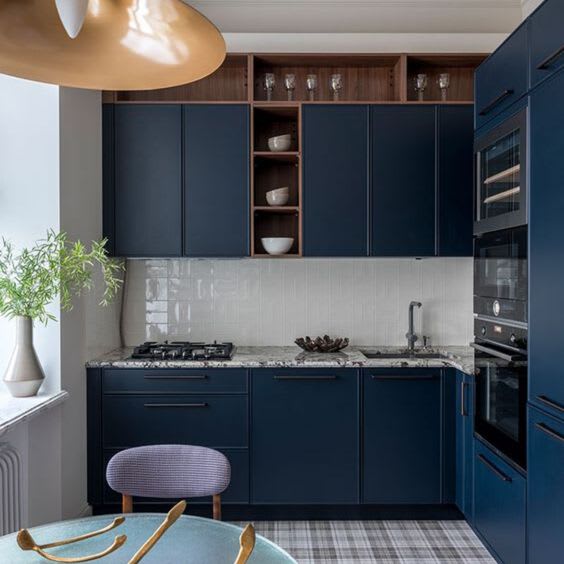
Pantone’s 2020 Kitchen Cabinet Color of the Year: Classic Blue
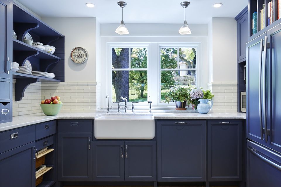
Pantone started in 1963 as a company that specialized in printing matching colors. Since then, it has developed technology for accurate color matches in several industries, from apparel to paint.
The company champions “Classic Blue” as the year’s color, citing that “it is elegant in its simplicity.” Pantone refers to the prime qualities of this darker blue as bringing “peace and tranquility to the human spirit.”
On a practical level, dark blue is embraced by several people as a solid choice in any interior.
It’s noteworthy that dark blues like navy have been popular in interior design in the past few years. These deep blues provide a dark contrast and are an alternative to black in some color design schemes.
The word “classic” is added to this blue, not because this color was particularly prominent in the past. However, it is a shade that feels timeless, so that color choice can last throughout the life of your home.
Sherman-William’s 2020 Color of the Year: Naval
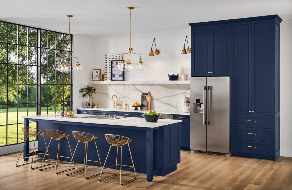
Sherman-Williams was founded in 1884 when Henry Sherwin bought a company that distributes painting supplies and oils. He partnered with Edward P. Williams and A.T. Osborn to patent the recloseable paint can after ready-mixed paint was developed.
Along with new chemical formulas for paint, paint can last longer, changing how we decorate buildings.
The company picked “Naval,” a blue similar to Panton’s Classic Blue but with more black mixed into it. It is an allusion to Navy Blue and with references to the evening sky and the ocean in its description. Sherman-Williams suggests pairing Naval with gold, offering two versions of it because the dark blue and gold highlight each other.
Naval’s blue is darker than Classic Blue, so it almost reads as black. Those who don’t want the sharpness of black can cut that with this color. Naval feels better as one of the main color choices in a room rather than an accent.
The trend for gold and brass hardware in 2020 complements black or dark blue and reinforces that pairing.
However, in 2019, Better Homes, House Beautiful, and Gardens, and HGTV reported that Sherman-Williams forecasted a different color. They reported that “Romance,” a version of pink, would be their 2020 color of the year.
However, it is interesting that “Coral” was Pantone’s Color of the Year in 2019, which looks similar to “Romance.” That fact may have influenced Sherman-William’s prognostication from “Romance” to “Naval.”
Benjamin Moore: First Light
Benjamin Moore started his paint company in 1883, offering ready-mixed paints in custom colors. In the 1930s, they introduced a character named Betty Moore on radio shows, who had given decorating advice for 40 years.
Over time, they have also developed their own color-matching system to better serve their clients’ needs.
The company selected “First Light” as its color for 2020, a pale pink that refers to dawn. Its website defines First Light as “a neutral that floats between warm and cool.”
InteriorDesign.net says this is the first time the company has chosen a pink hue for the Color of the Year.
Pinks have maintained popularity for some time since the advent of “Millennial Pink,” a hue that appears everywhere on Instagram. First Light is paler than millennial pink, and a warm and cool neutral is a rarity.
This pink reads as a calming color that can offset bold, saturated colors paired with it. The most unusual part about this hue is when people think “pink,” they think of a lighter variant of red. This First Light pink almost reads as gray, which makes this a fresh, neutral tone.
Behr: Back to Nature
Behr Paint Company was started by Otto Behr Jr., who sold linseed wood stains. Later, with the help of his chemist father, he developed a redwood stain, which grew his business. They expanded to house paints and primers, and the brand is exclusively sold at The Home Depot.
The company chose “Back to Nature,” a muted verdant color similar to sage green. Behr calls this a “fresh and invigorating” color reminiscent of nature. They use the adjectives “Calm, gracious, balanced.”
In 2020, we saw a major movement to embrace nature in the interiors, even using humble materials and biophilic design. Green is forecast to be a prominent color this year, and “Back to Nature” touches on this.
Like all greens, this pairs well with all wood textures and browns. While mint green has been popular in the past two years, “Back to Nature” is toned down in brightness. This feels more calm rather than attention-grabbing like its mint-flavored cousin.
Valspar: Multiple kitchen cabinet colors
Valspar began in 1806, making it the oldest of these color companies and the sixth-largest paint corporation worldwide. In addition to manufacturing paint, they created the first clear varnish, which distinguished them as a company. In 2017, Sherman-Williams acquired Valspar.
Valspar did not pick a single Color of the Year; they went with a color palette of 12 different colors. They are:
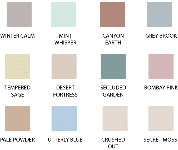
Winter Calm – Medium gray with tints of lavender. Picked for evoking serenity and comfort.
Mint Whisper – Mint Green that is slightly toned down in brightness but remains vibrant
Canyon Earth – Warm reddish-brown inspired by “sunbaked clay”
Grey Brook – Pale blue-grey inspired by “comforting denim”
Tempered Sage – Sage green or lime green with more yellow tint
Desert Fortress – Light yellow sand color that reads a neutral
Secluded Garden – A blue-green hue that pairs well with warm woods
Bombay Pink – A dusty rose color stated to be a “mature, colorful neutral”
Pale Powder – This is a light brown, warmer in tone than Desert Fortress
Utterly Blue – This is a medium cornflower blue or a periwinkle blue with less violet
Crushed Out – This color is a much paler version of rose gold, used as an off-white
Secret moss – Secret moss is a gray-green with nature and comfort vibes
When looking at the collective palette, these kitchen cabinet colors have some things in common. All of the colors are muted or close to neutral. There isn’t any bold or vivid color in this selection.
Many of these colors are part of the American Southwestern color palette, where the sun fades the intensity of the colors.
Looking at the different colors of the year, there is a common theme: Trying to instill calm in a space. This explains the several muted hues in Valspar and why many colors allude to nature since nature is supposed to promote tranquility.
The bold dark blues of Classic Blue and Naval are reminiscent of water or the evening sky and feel familiar. These Colors of 2020 reflect the concept that our homes are places of rest and relaxation. No matter how hectic our lives are, our homes are our sanctuaries more than our castles.

