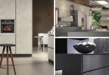
Retro is a nostalgic aesthetic, but when the term was invented in the 1960s, it referred to the 1940s and 1950s.
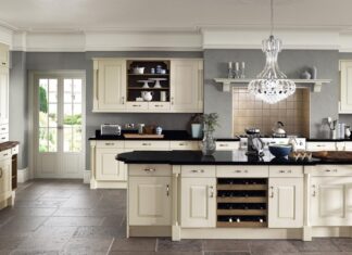
Over time, this vintage style incorporated more and different themes as we know them today. Retro is still considered the idyllic 1950s aesthetic but refers to the 1970s or 1990s look. Retro-chic kitchens combine traditional styles with modern nuances.
The other key about the retro-chic kitchen is that it is intrinsically personal. Some people like to mix and match eras, while others remain loyal to a specific time period in their ornamentation.
However, while retro feels almost freeform, a certain “vintage look” remains consistent and smart. Otherwise, you may end up with a look like a hodgepodge full of leftovers from a thrift store.
8 Tips To Bring Back Retro Chic Kitchen Design
Here are eight essential tips to keep this retro-looking tight and trendy rather than haphazard and messy.
1. Pastel Colors
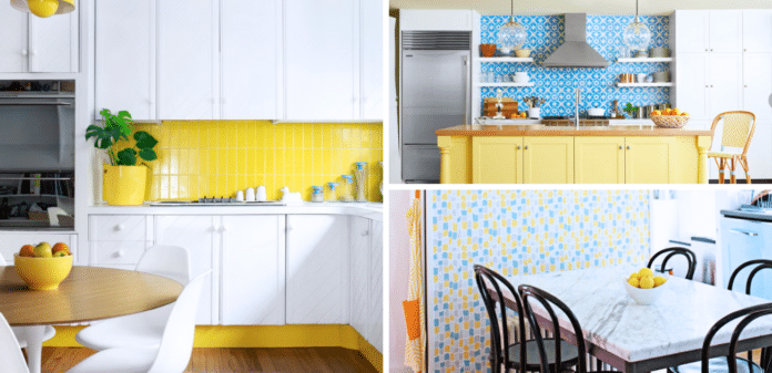
Pastel colors and neutrals like cream or black and white define the kitchen retro palette. These will feel muted yet bright in many kitchens, and the cream, with the slight yellowing of age, invokes nostalgia.
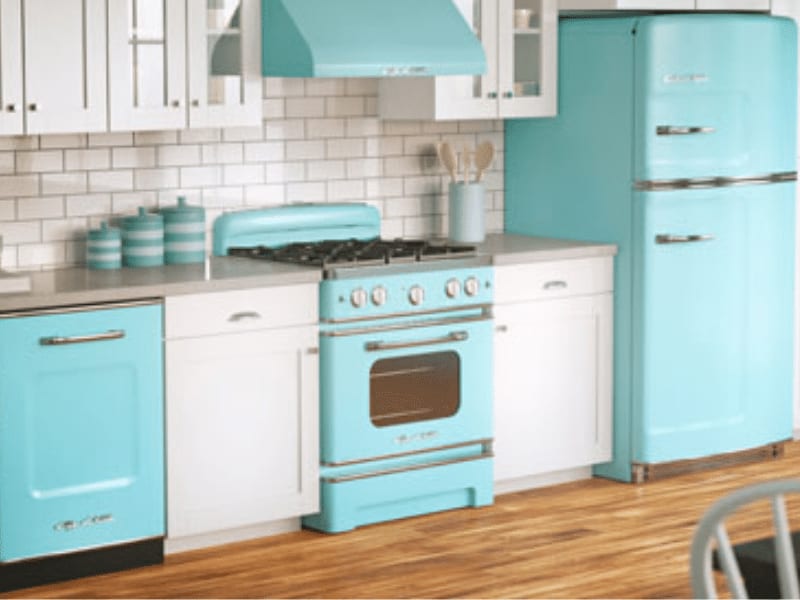
Popular pastel colors in retro kitchens include mint green, turquoise, pale yellow, and even baby pink.
However, when many people think retro kitchens, they think of cherry red with black and white checkerboard floors. That is more of a 50s diner aesthetic, yet the look is so iconic that the bold look is adapted to kitchens.
Pastels reflected real 1950s kitchens at the time because they matched so well with the next tip to come: Chrome.
2. Chrome Details and Appliances
The 1950s were fascinated with the World of Tomorrow, imagining the future in their kitchens and homes. The 1950s aspired to be futuristic, so this sense of retro-futurism feels utopian, almost like Disneyland’s Tomorrowland.
Chrome was the prevalent metal in kitchens, simulating the look of 1950s cars with that metal. The shape of appliances in the kitchen even mimics the popular car styles of that era.
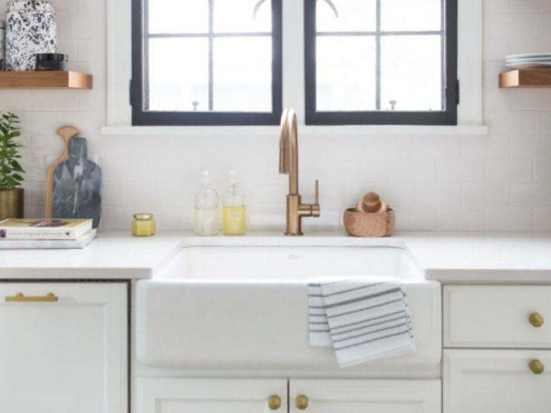
The shininess of chrome pairs well with the muted pastel color scheme. Chrome is usually found in details such as chrome-edged tables, countertops, and cabinet handles, almost acting like jewelry in the kitchen.
3. Square Wall Tile Patterns
Tiling was a large part of the retro kitchen, and its shape created a simple and easy-to-design room.
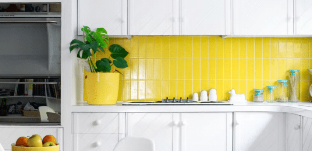
In the 1940s, wartime attitudes conveyed that tiles in kitchens and bathrooms were considered utilitarian and usually white. In the 1950s, colored tiles were an easy kitchen luxury, so they appeared in city and suburban households.
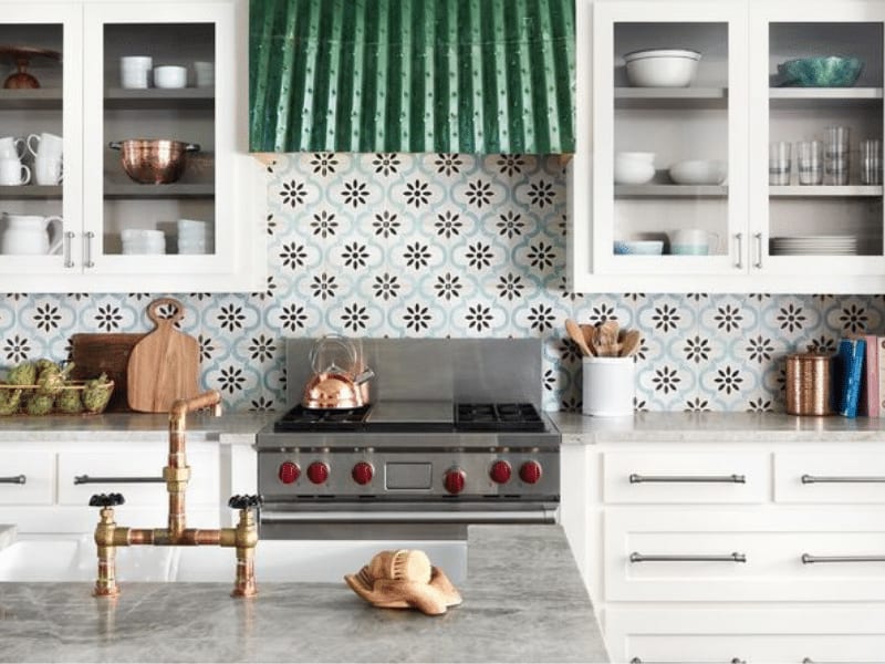
Creating patterns with colored tile makes it easy to express yourself with a unique kitchen while still looking clean.
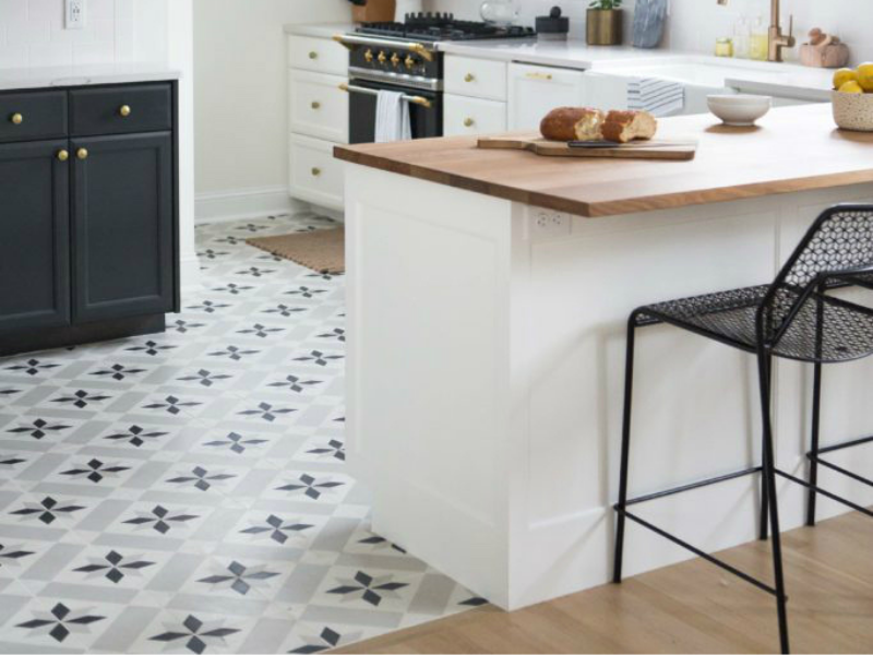
Many patterns were square and rectangular, like checkerboard and basketweave, but even in the 1950s, households used random colored tile placement.
Most importantly, the tiles were glazed for a glossy look since a shiny, bright kitchen is the retro ideal. The trend is mainly seen in backsplashes where they shine rather than countertops.
4. Terrazzo
From the 1920s to the 1940s, terrazzo tile was a popular floor choice for its decorative scattered look. This product is made of marble, glass, quartz, and epoxy, creating a unique, effortless texture.
Terrazzo is highly customizable with materials and bonding agents, so it was considered a luxury material for the home.
In 2020, it’s recently become popular for floors and countertops. With recent developments in bonding agents and materials, having this surface in your home is cheaper than before.
5. Statement Appliances Are Meant to Stand Out
Even though we talked about the popular colors, the stars in the kitchen were clearly the appliances. People were eager to discuss new refrigerators, ovens, dishwashers, and smaller appliances like toasters.
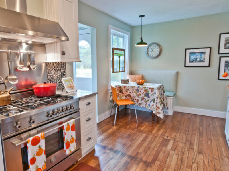
Retro appliances were stainless steel, chrome, or colored and glossy. They usually do not match the other colors because they are meant to get your attention. It’s in theme for a retro kitchen with mint green tiles and cabinets to have a bright refrigerator and stove.
6. Retro Art Prints And Pieces
One of the most distinctive looks from the 1950s is the art print, usually of vintage magazine ads.
Vintage art embraces all sorts of iconography, including products, animals, characters, cities, and abstract art for posters and paintings. It is easy to match your art to your décor or vice versa, where your art inspires your color palette.
If you want to go the extra retro mile, tin signs and panels add a nice touch of the past. This works nicely in the kitchen, which already has metal cookware.
Most tin panels have vintage art in mind, with prints of Coca-Cola ads and Wizard of Oz movie signs.
7. Collection Displays
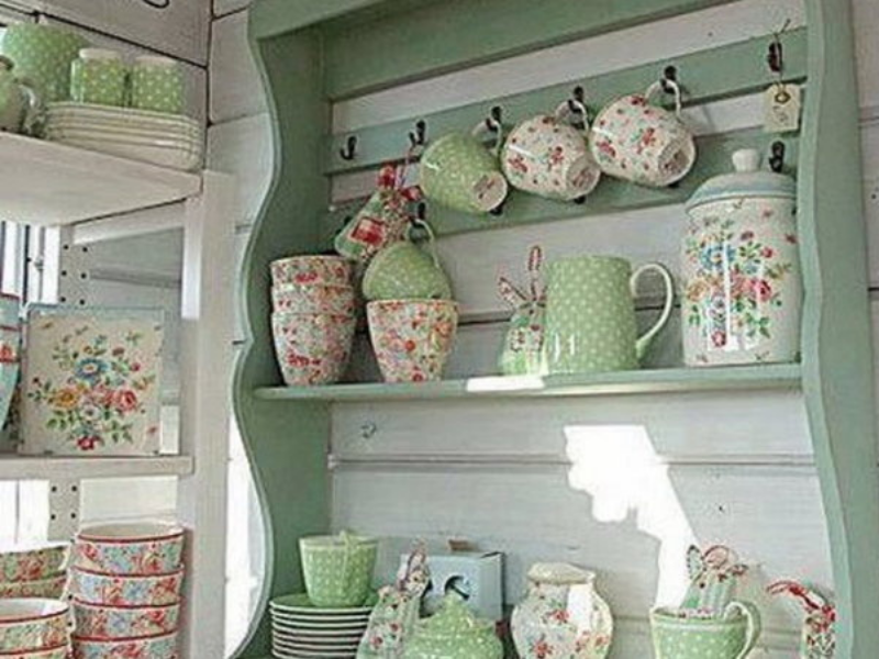
It’s not complete without displays of a favorite theme or hobby to complete the retro feel in your kitchen. These collections include anything from porcelain figurines to Mickey Mouse plates and shot glasses worldwide.
It’s important to house collections in certain areas so they don’t look like an overabundance of things without a home. Depending on the collection, you will want to invest in display cabinets or have wall space to mount your objects.
The great part about having a unified theme is that it can organically tie a room together. But it’s important not to overdo a theme; otherwise, it will look like the Bunny Museum, where it looks obsessive.
8. When in Doubt, Mimic Your Favorite Room Design
Imitation is the sincerest form of flattery and a source of inspiration. If you’re dealing with retro, you don’t always need an original design for your room, just a passionate one.
You can find examples of retro kitchens on interior design sites like Houzz, Spruce, or Harper’s Bazaar.
However, an app like Pinterest allows you to narrow your search by a specific color or theme. Pinterest has the added benefit of pictures with links to articles, making it an aggregate site of inspiration.

