What is a transitional kitchen? All definitions of transitional interior design say it is the space between traditional and contemporary design, mixing both worlds.
This sounds like a random hodgepodge, but when viewing transitional design pictures, I see a “look” for them. They do not look classic, yet something keeps us from calling those rooms modern.
I began to question whether interior designers created this look. But there’s a certain appeal to creating your own unique aesthetic that defies being locked in a box.
Design Elements of a Transitional Kitchen
After looking at several different pictures on Pinterest, these seem to be the elements of a transitional kitchen when deconstructed:
1. Neutral palettes and materials go with EVERYTHING

Most of the room’s colors appear neutral to create a transitional kitchen. Based on those hues, this usually means lots of whites, browns, and greys or tints.
Many browns and greys are wood and metal colors, so many are incorporated into these designs. You will see a lot of emphasis on the material more so than the color itself.
Almost every transitional kitchen example in interior design magazines has some white space. This is the equivalent of using white gesso on canvas as part of your design rather than painting things white.
It also explains the prevalence of white and grey shakers in these rooms, as these structures work in transitional kitchens.
Sometimes, this reads as transitional-designed rooms “lacking color.” To stand out, other areas must be muted for brick backgrounds or animal patterns.
2. Details in furniture become even more important
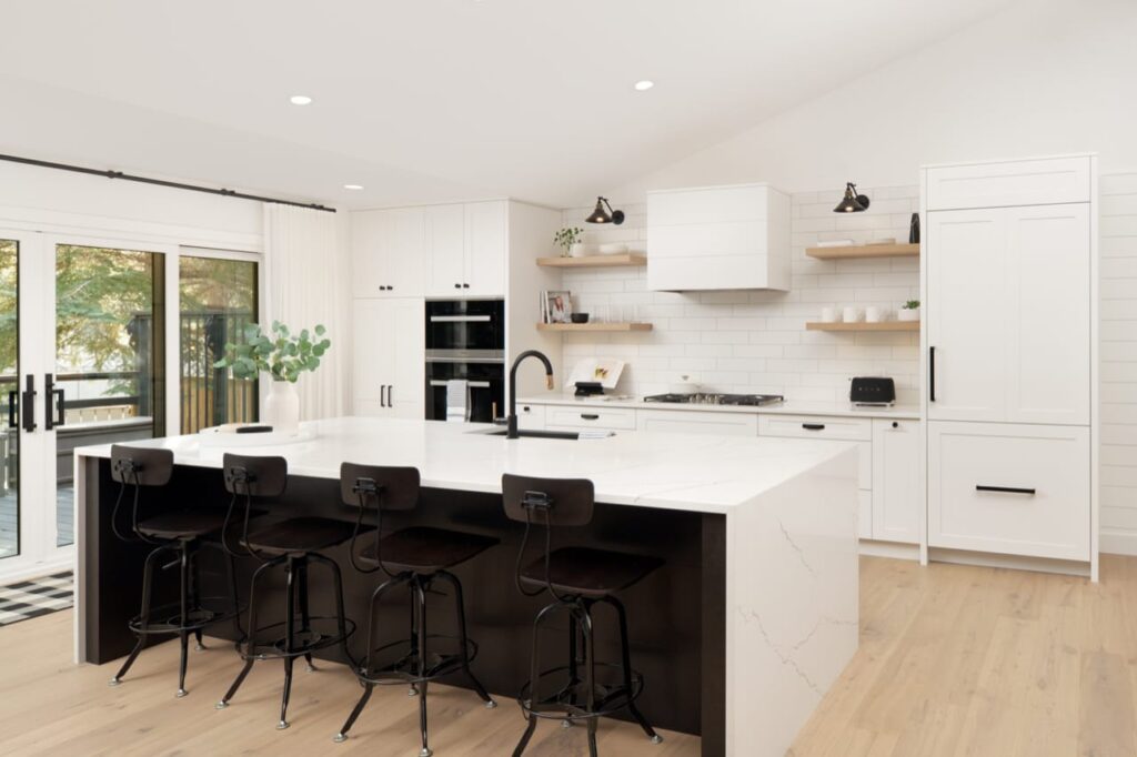
There is a saying in interior design that handles and knobs are the jewelry in a room. It’s a functional and decorative area, so whatever you pick can emphasize the transitional design.
The transitional look is not based on a single piece of furniture; it is a juxtaposition of styles.
For example, a white marble countertop on top of a rustic shaker base cabinet can look striking in its visual contrast.
The rustic brick wall with a sleek silver oven range and hood contrasts old and new. Contrast naturally draws the eye’s attention as the mind makes sense of your aesthetic positions and choices.
This also means you will not see many oversized patterns in this kind of design.
This is not because people don’t appreciate boldness, but focusing on the details means large things become part of the background.
3. Lighting is a key visual piece
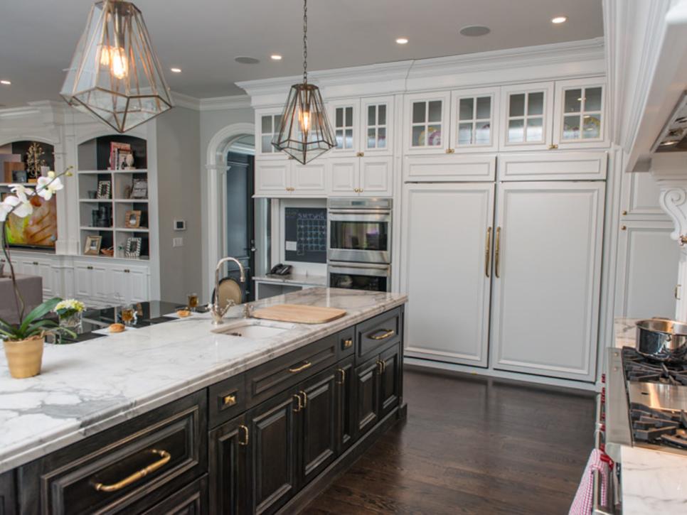
Lighting fixtures are more likely to stand out in a transitional design than in traditional or contemporary designs.
In traditional design, lights are used mostly for illumination, and more attention is drawn to the lamp or lampshade.
In contemporary kitchen design, the lighting showcases the room; sometimes, it is recessed out of the way.
However, in transitional design, lighting fixtures themselves can be statements, as either sculptural pieces or a style frozen in time.
Overhead pendant lights, rustic lanterns, and wire chandeliers will appear as floating figures drawing attention to themselves.
Lighting is essential for a kitchen. You need lots of light to handle food, especially when dealing with heat.
So, for lighting, this is not a choice of style over substance when considering this element’s artistry. You can (and should) have both.
4. Pick one or two strong statement pieces to inspire the design and color of your room

Using strong elements as the focus for the rest of the room design will naturally tie a room together. A tiled patterned backsplash or a unique lamp texture can spark your imagination.
For example, let’s say that you have a peacock-inspired backsplash behind the range.
You can use the feathers’ blues, greens, browns, and yellows to select chairs with cushions in those colors.
You can use the ridged feather motif for art that hangs on the wall. Pieces that echo off of each other will make the design look purposeful and whole.
However, for effect, you may want to try two inspirations with little in common from different worlds. If your peacock backsplash is one inspiration, your state-of-the-art silver range could be the other.
So, along with the blue chairs and feather art, you can have silver pendant lamps and silver arch cabinet handles.
The end result is a décor that addresses components of each theme but is unified in one transitional room.
5. Flooring can be a foundation for your transitional look

Rugs and carpets add splashes of texture and pattern to many examples of transitional décor, such as living rooms and bedrooms.
However, carpets are not standard in a kitchen with many potential spills, and rugs may not work in all kitchens.
The most popular textured flooring in transitional décor are tiles and parquet floors in geometric patterns. Patterns like herringbone, the wood strip pattern, and basket weaves are seen throughout the interior design for this look.
Also, repeating squares, hexagons, and subway rectangle patterns are popular stone and tile layouts. Each presents a clean, organized look without leaving your floor blank and uninspired.
What if you feel committing to flooring is too much for your kitchen?
A little rug next to the kitchen sink that grips your floor can add a splash of pattern and save the floor from an excess splash from your sink.
6. There’s not a “right” way to do transitional
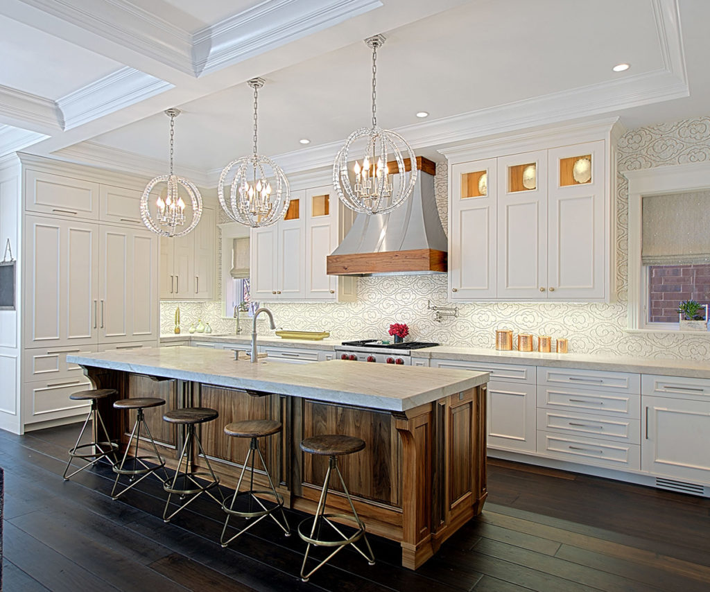
Even though we showed many elements found in interior design sites and Pinterest, transitional design ultimately means “personal style.”
Transitional kitchen design mixes and matches parts from different eras without worrying about what is proper or always done.
Traditional design prefers furniture pieces to come from the same collection. Contemporary can sometimes be so minimalist that you must hold back from expressing what you want to see.
Of all the kitchen design styles, transitional design is the most inherently unique. However, it takes time to be confident that certain accessories belong in an area without much outside validation.


