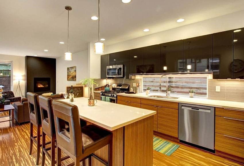
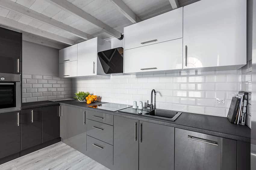
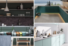
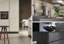
Two-tone cabinets have been popping up everywhere in kitchen design in the past year and continue to grow. This new look is modern and elegant, a break from the monochromatic appearance of last year’s kitchen.
However, the big complaint is that we assume there’s not much variety and think they all look the same.
Ways To Design Your Two-Tone Cabinets
Here are 12 ways to do two-tone cabinets to find one that fits your style!
1. Cream or White Wall Cabinets or Darker or Jewel-Toned Base Cabinets
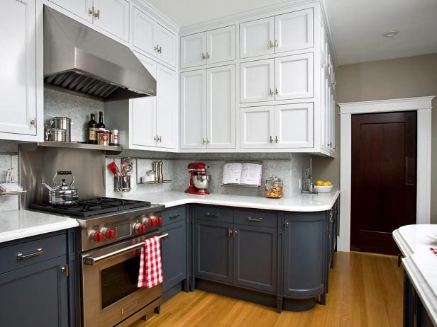
Of all the two-tone cabinet styles, this is the most prevalent in many kitchen design pictures and magazines. Often, the combination has been white wall cabinets with navy blue base cabinets since that color is trending this season. We have seen colors from jewel tones like maroon, black, slate grey, and espresso at the bottom.
On the top, the hues are closer to white, like cream and beige. However, popular lighter colors like these are usually named “antique white” and “arctic white” for cabinets.
2. White Cupboards for Dishware with Other Cabinets that are a Darker Color
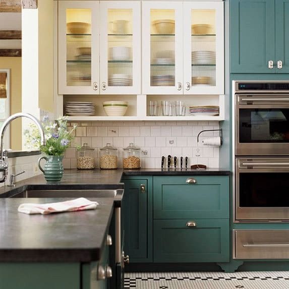
This variation in two-tone cabinets draws more attention to the cupboards and dishware in the kitchen. These cabinets show an alternative solution to those who want the display of open shelving but none of the hazards.
Having glass panels on your cabinet doors still shows your dishware without getting dust on it. This variation makes sense in this kitchen since, on the right-hand side, there is a column of dual ovens. Attempting to divide that column by top and bottom colors would look too forced.
3. Dark Cupboards, Natural Textured Wood Base Cabinets
This reverse trend of darker wall cabinets on the top and textured, lighter base cabinets works well here. Since the kitchen background is mostly white, the midnight blue wall cabinets serve as a nice contrast.
Using the white stove on the left-hand side may influence this design decision. If we went with white or light cabinets on top and darker cabinets below, the white stove would be jarring.
The use of natural wood, the only strong texture in the room, also highlights the stove. Other textures, like marble and subway brick lining the wall cabinets, add a subtle, clean aesthetic.
4. Wall Cabinets and Base Cabinets are the Same Color or Texture, Darker Base Cabinets
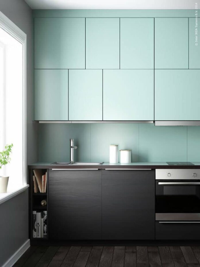
This kitchen design uses the backsplash to continue the wall cabinets’ theme playfully. The seafoam green European cabinets mimicked by squares of the same backsplash tile make the kitchen look cohesive.
The matching tiles in different places add an interesting depth to this contemporary look. The contrasting dark wood of the Euro-style base cabinets has a silver handle that mimics the handles of the oven.
5. Island Base Cabinets are a Different Color Completely from the Cabinets Against the Walls
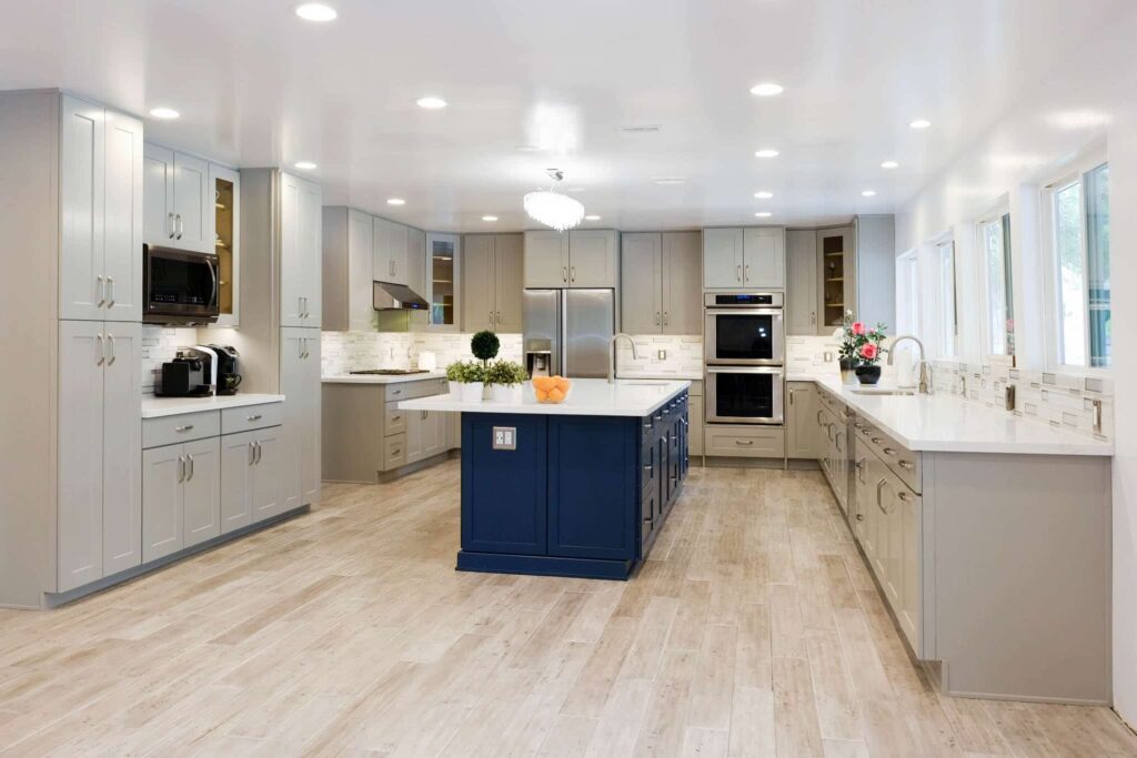
Island Countertops are naturally a focus in kitchens because they are usually the center of the room. A different color will change the look of an otherwise muted kitchen and add an interesting aspect.
Here, we have island base cabinets in navy blue in the same shaker style contrasting against the gray shaker cabinets. This island also looks like much-needed surface space in a large kitchen where countertops would be otherwise far apart.
6. Different Color Door and styles on Wall Cabinets, but Cabinet Boxes All the Same Color
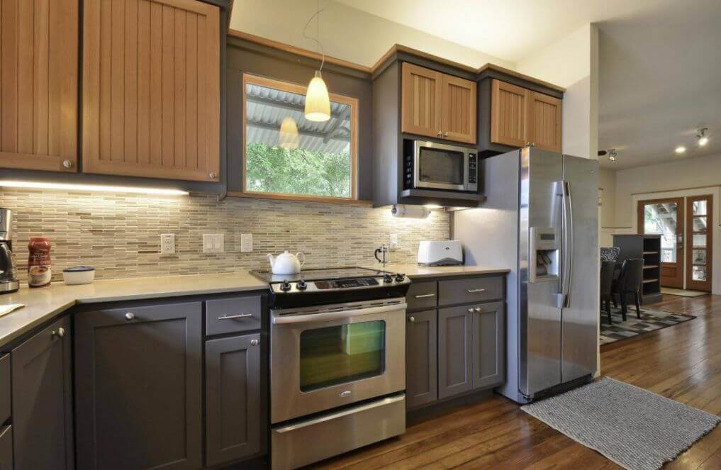
A subtle change in cabinet doors can transform the look of a kitchen without extensive remodeling. These brown vertical slat doors are different from the slate gray shaker doors of the base cabinets.
However, the angular nature of both doors still makes the entire look harmonious. The matching trim at the top of the wall cabinets and around the kitchen window reinforces and unifies the kitchen.
7. Different Color Drawers and Style on Wall Cabinets, Cabinet Boxes all the Same Color
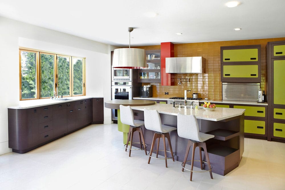
We are seeing a lot of retro looks in these modern cabinets, and this is no exception. Like a contemporary take on the Brady Bunch kitchen, this kitchen uses lime green to contrast with purple-brown or “wine” color.
The kitchen’s most interesting aspect is the cabinets’ structure. The European base cabinets are drawers, but the wall cabinets have flip-up doors, so the panels all match each other.
8. Different Color Cabinets, One Color Over the Range and Island, but Different Color Elsewhere
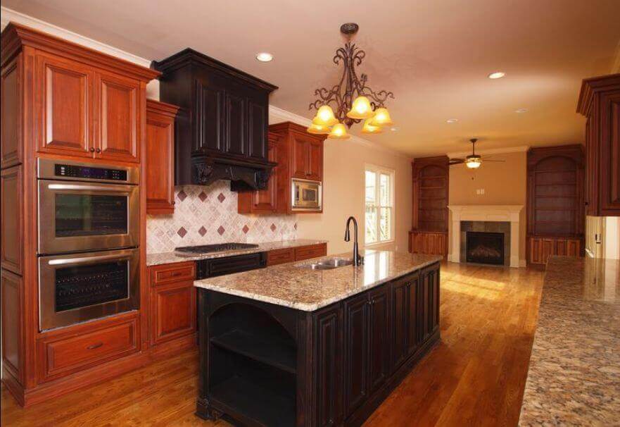
Two-tone cabinetry does not always need to mean contemporary kitchen design, even though this is where it is prevalent. This is a more traditional-looking cabinet with raised-panel doors and the range column, and the island is all black.
All the surrounding textures pick up parts of black and brown, from the wooden floor to the terrazzo countertop. The entire kitchen is three colors, including white, so while these are neutral colors, they do not read as sterile.
9. Side-by-side Two Tone Cabinets
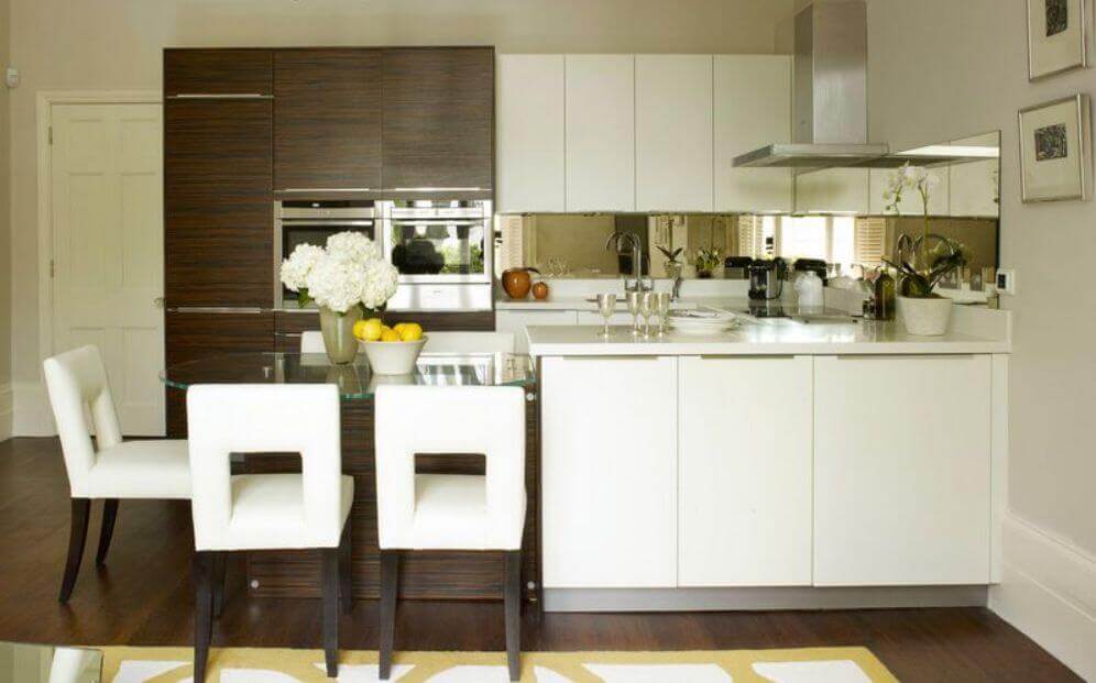
I’ve seen this bold way to do two-tone cabinets with this same picture all over interior design blogs. On the right-hand side, we see all-white European-style cabinets with handleless doors. On the left-hand side, there are dark brown wood grain cabinets with silver bar handles.
This would look like a mismatch in any other scenario, but this bold aesthetic completely works here. The entire appearance is anchored with angles everywhere, including the kitchen nook chairs, and in neutral colors.
10. Different Color Base and Matching the Doorway, Different Color Elsewhere
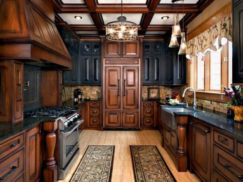
This regal gothic kitchen has cabinets with either dark wood and stain to highlight the raised-panel doors… or black doors. Doors with raised panels are some of the most popular choices, so they blend with existing cabinet choices.
However, highlighting the cabinets above the entrance gives the appearance of a grander doorway. This illusion is even more pronounced when the surrounding cabinets are blackened to emphasize the height of the door.
11. Two Tone Cabinets with the Backsplash Acting Like a Third Tone
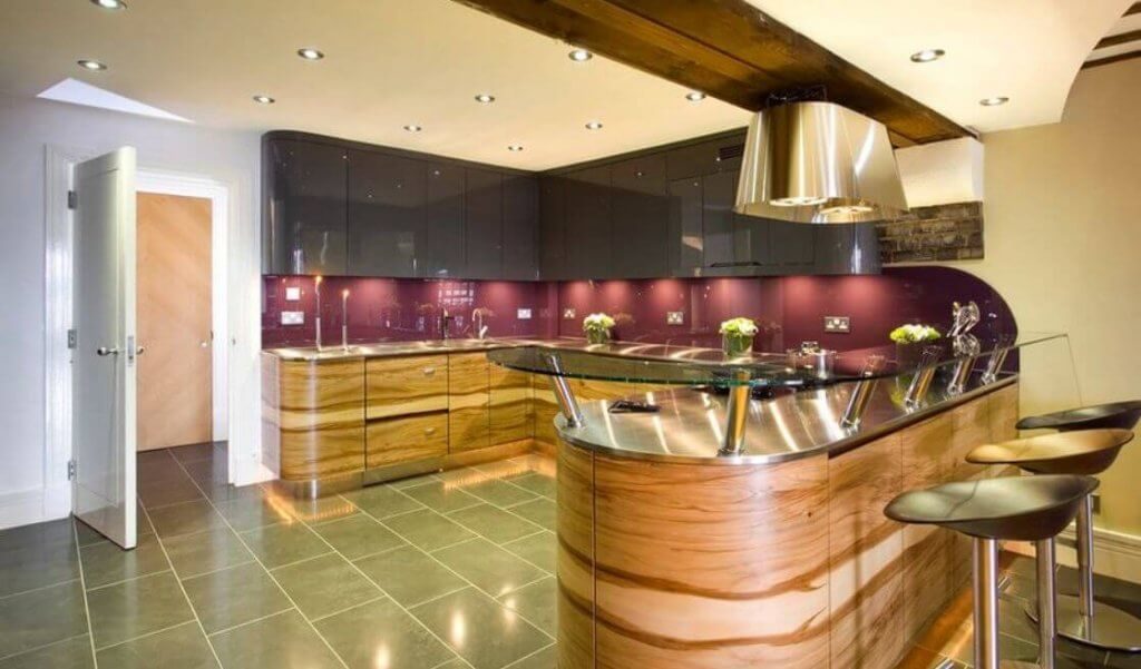
This spectacular and luxurious-looking custom cabinetry uses bold design to transform the space completely. Earlier, we showed a backsplash that was an extension of the wall cabinets.
We have a plum backsplash between the granite wall cabinets above and the magnified wood print base cabinets below. This creates a three-tone appearance combined with the backsplash, expanding how you can decorate your kitchen.
12. Two-Tone Arch
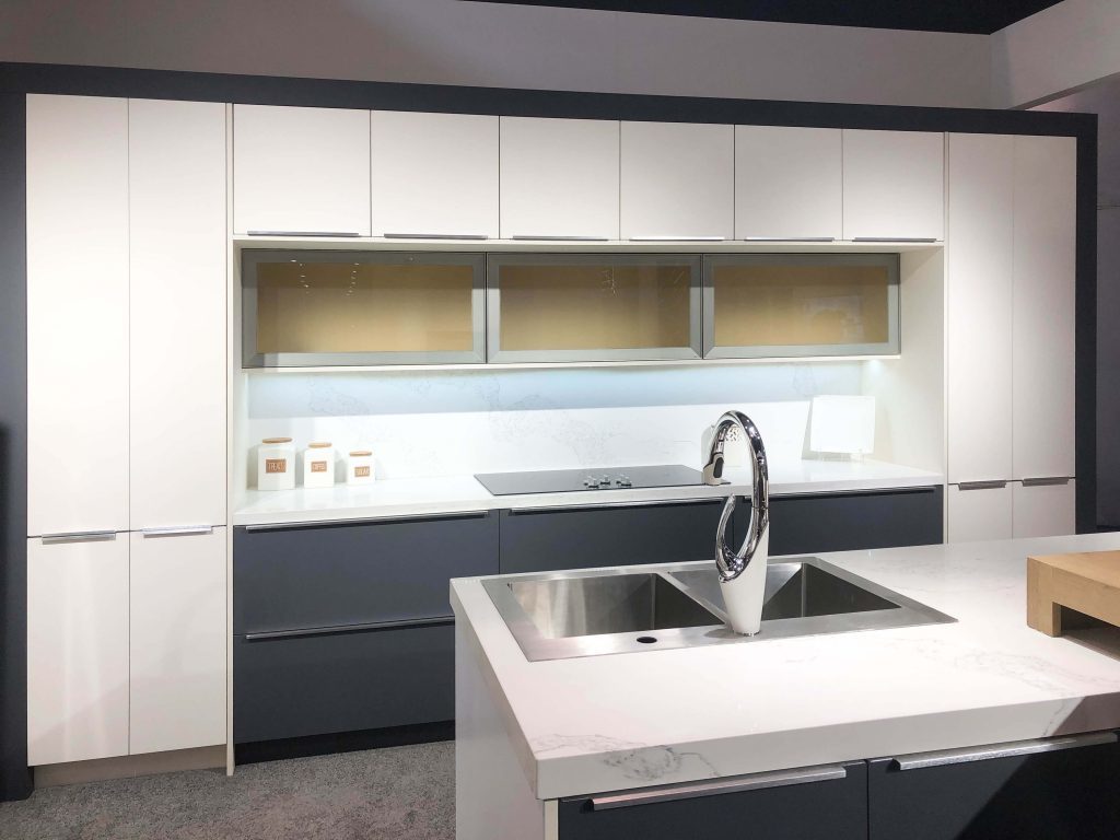
This display at KBIS 2019 (Kitchen and Bath Industry Show) created an arch from light and dark cabinets. Innocraft Cabinetry created an outside border that matched the central base cabinets, leaving the light-colored cabinets to make the arch.
To add to the shape, three lift-up cabinets with frosted glass read nearly invisible from a distance. This is a case where the design was thought out way in advance to create an intended effect.
backend

