Undertaking a home design or renovation is a big deal, and it can be hard to know where to get started. Many people want to put off the kitchen because it can be daunting and sometimes very expensive.
Ordering and installing new cabinets, appliances, and plumbing is no small task, especially compared to the relative ease of a fresh shade of paint and a new couch in the living room.
The kitchen is the heart and soul of the home and should receive extra attention and care, but it is understandable to want to make the design process as simple as possible. One way to do that is to create a white kitchen.
White kitchens are the most popular designs for amateurs and professionals. Why?
Simply put, white kitchen designs are the most durable and flexible. A white kitchen will never go out of style and can be made and modified into any theme. You can find antique white kitchens, rustic white kitchens, modern white kitchens, and many more.
The bottom line is that there is a type of white kitchen for everyone, and by making white your base color, you will save yourself a big headache.
Timeless and Practical White Kitchen Design Ideas
So we’ve convinced you a white kitchen is the way to go. Now what?
It’s time to get those design juices flowing; this is the right place. In this article, you’ll be able to explore various kitchen designs and find the one that most inspires you.
You can choose your favorite aspects of these rooms to create a kitchen that will feel like home!
1. Grey and White Antique
Grey and White Antique Kitchen
One of the identifying characteristics of antiquity is expert craftsmanship. This design displays the kind of woodsmanship prominent in traditional pieces throughout the islands (why have one when you could have two!), white cabinets, and even the fume hood surroundings.
Now, dark grey isn’t typically a shade associated with antiquity and does dominate the space a bit, but the top antique cabinets still stand out in contrast to the dark tones.
2. Light and Dark
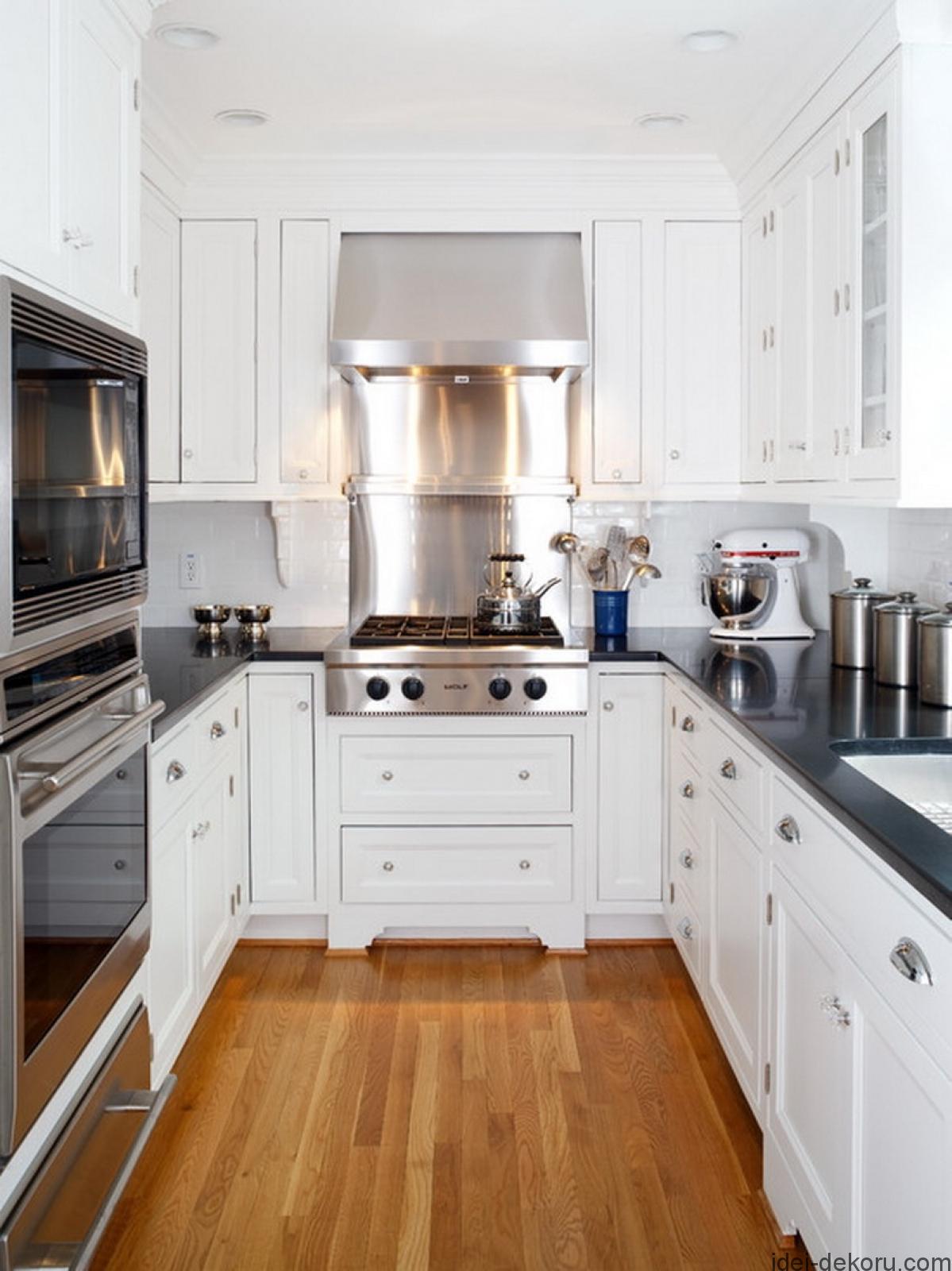
Most white kitchens use light woods and shades to complement the main white color. However, the right amount of dark contrast can make the white pop, but it’s important not to overdo it.
In this kitchen, only the countertops are dark, and it is the perfect amount to make the kitchen bold without shrinking the illusion of size given by the white cabinets and light floors. It would have been easy to do too much dark — you might be tempted to match the countertop with the knobs, handles, and hinges or use a backsplash with dark colors.
But that would be a mistake. The dark counter is sleek, but adding deeper color will be overdone, ultimately making a small kitchen even smaller.
3. Shades of Grey-White
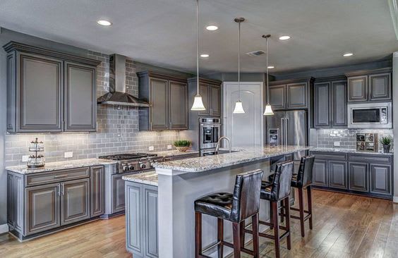
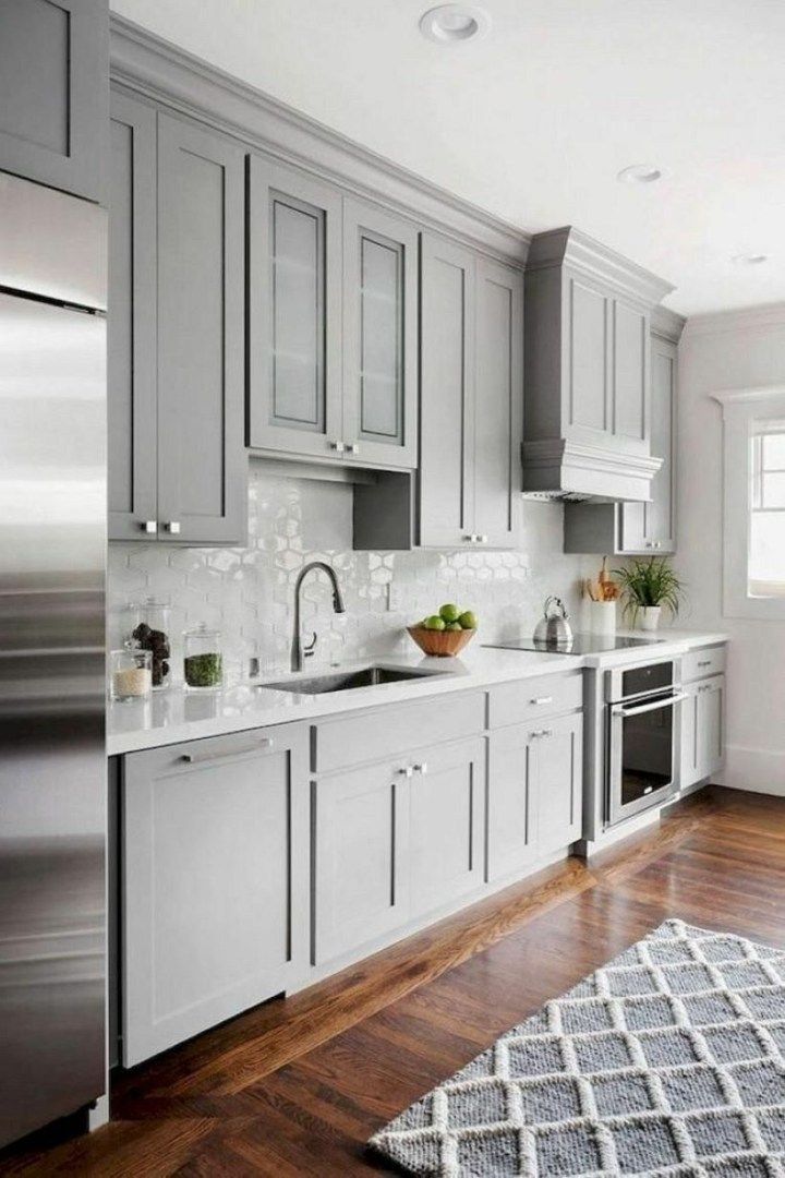
Grey is not usually a color found in traditional-style kitchens, but this design proves that it can work. In this style, the subway tile backsplash looks more like exposed and painted brick when set against the traditional grey cabinets. The marble countertops complement the gray-dominated room and perfectly reflect the soft hue of the pendant lights, which is essential without a direct source of natural light.
4. Big and Beautiful
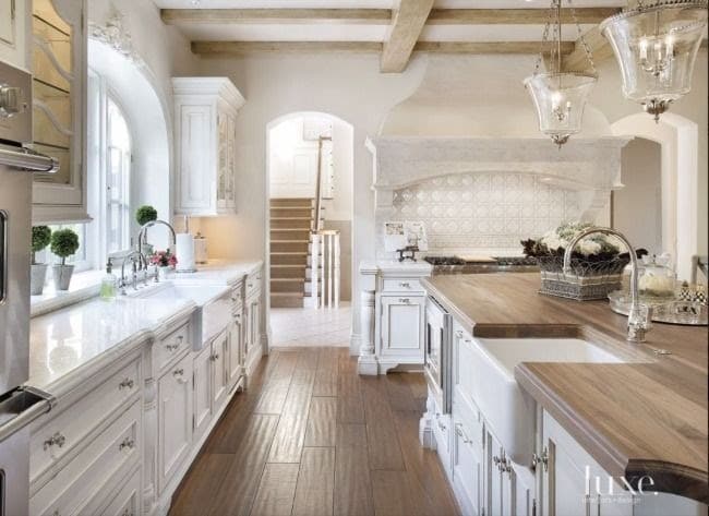
This elegant and rustic kitchen could make any house a home. The space is very large, and the design perfectly utilizes every part of the room. The pilasters and cabinets along the counters and island give the kitchen a distinct antique style, and the wood countertops define the rustic theme.
This design has such attention to detail — the island's wood matches the floor, and the double faucets are mirror images of one another. Lastly, the pendant lights add glamour to the rustic room. This is a truly beautiful room!
5. Super Subtle
It can be risky to choose a grey room and kitchen cabinets in a small space without a kitchen island. However, this room shows that it can still work. The key is not to go for a dark grey but instead favor a lighter shade that softens further in natural light.
There is great reflectiveness in the white tile backsplash and stainless steel appliances (but notice the dishwasher is disguised with the same paneling as the cabinets. And like any small kitchen, it’s best to keep as much as possible off the counter and store it away so you can utilize all the counter space.
6. Snug and Bright
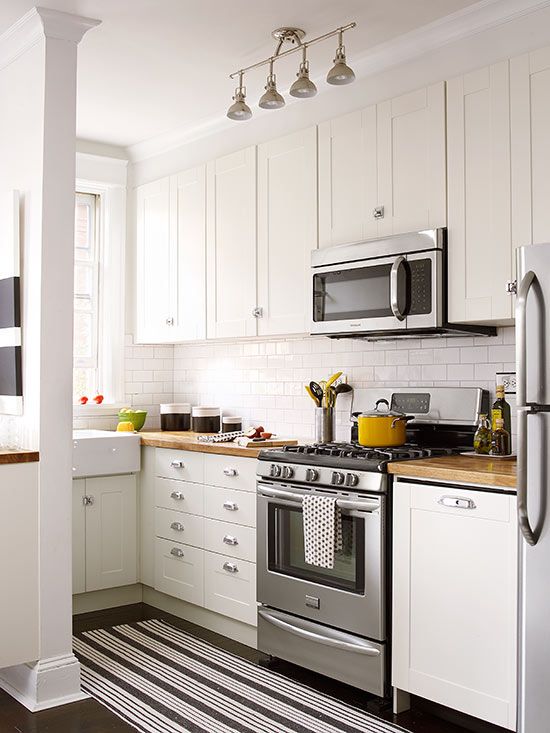
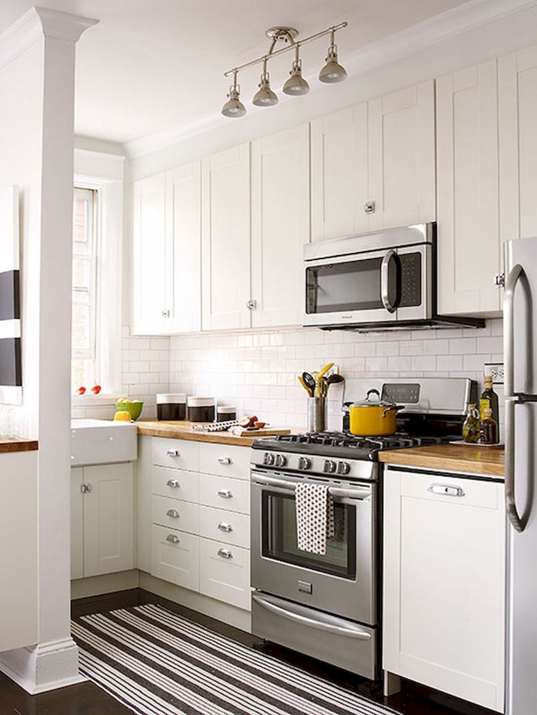
Kitchens don’t get much cozier than this. Even though there is barely room for a stove and sink, the space is extremely functional. The all-white cabinets open the room beautifully, using the natural light over the sink. Importantly, the counter space is not cluttered.
When working with snug spaces, getting as much stuff as possible off the counter, onto shelves, and into cabinets is best. A few tasteful storage containers add some life to the white backsplash without dominating the room, and the pots and bowls add some color to the all-white scene.
Lastly, the track lights will spread light evenly across the room once the sun sets.
7. Tiled Wall
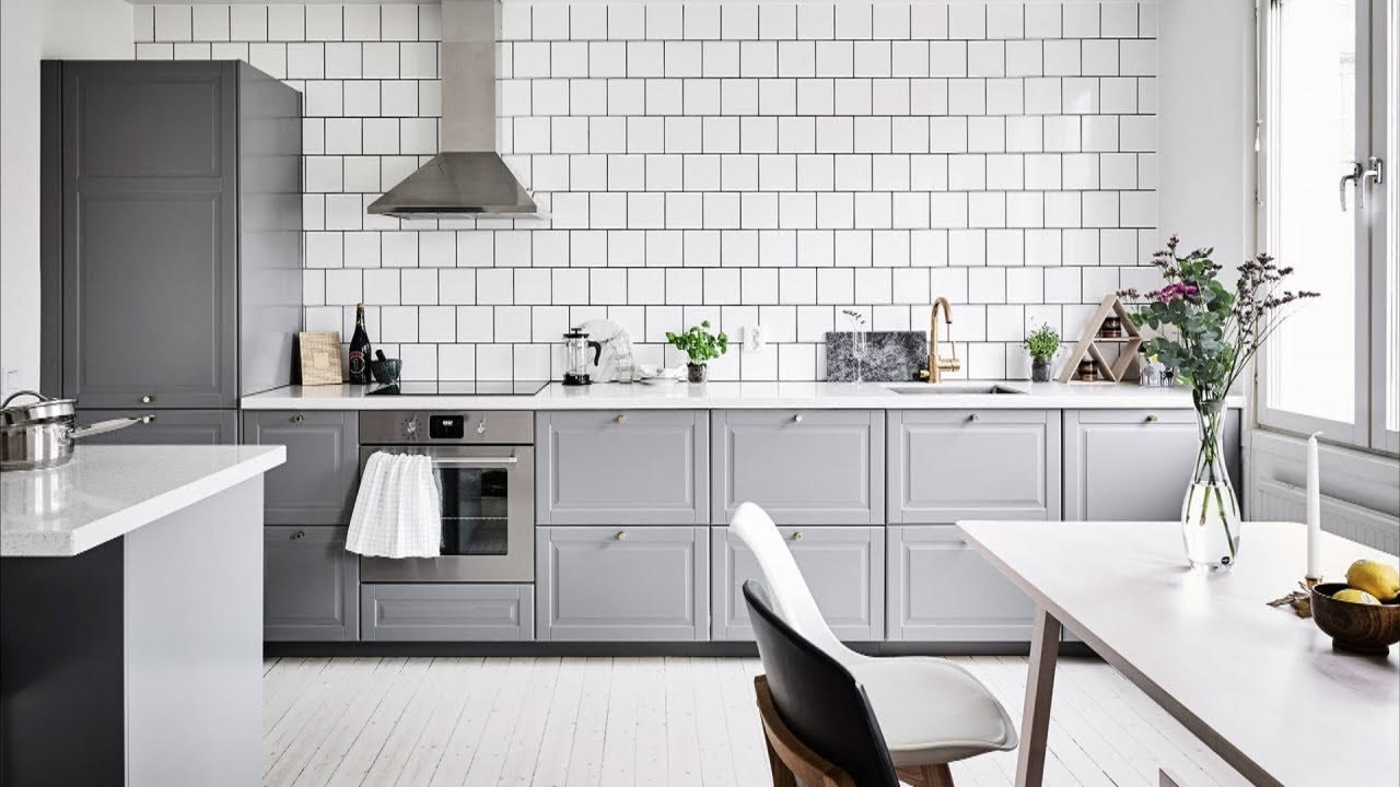
This kitchen is crisp, clean, and bright. With ample storage below the white counters, there was no need to top cabinets, which is a perfect way to open up a kitchen. The natural light plays wonderfully with the natural light coming through the right wall window, creating an ombre effect on the light grey lower cabinets.
Where a backsplash isn’t needed, it can be tempting to leave a wall bare, but this design shows the advantages of tiling the back wall either way. Lastly, the gold faucet is an unlikely pairing with a white and grey kitchen, but it is a great pop of color and adds some dimension to the room.
8. U-Shaped
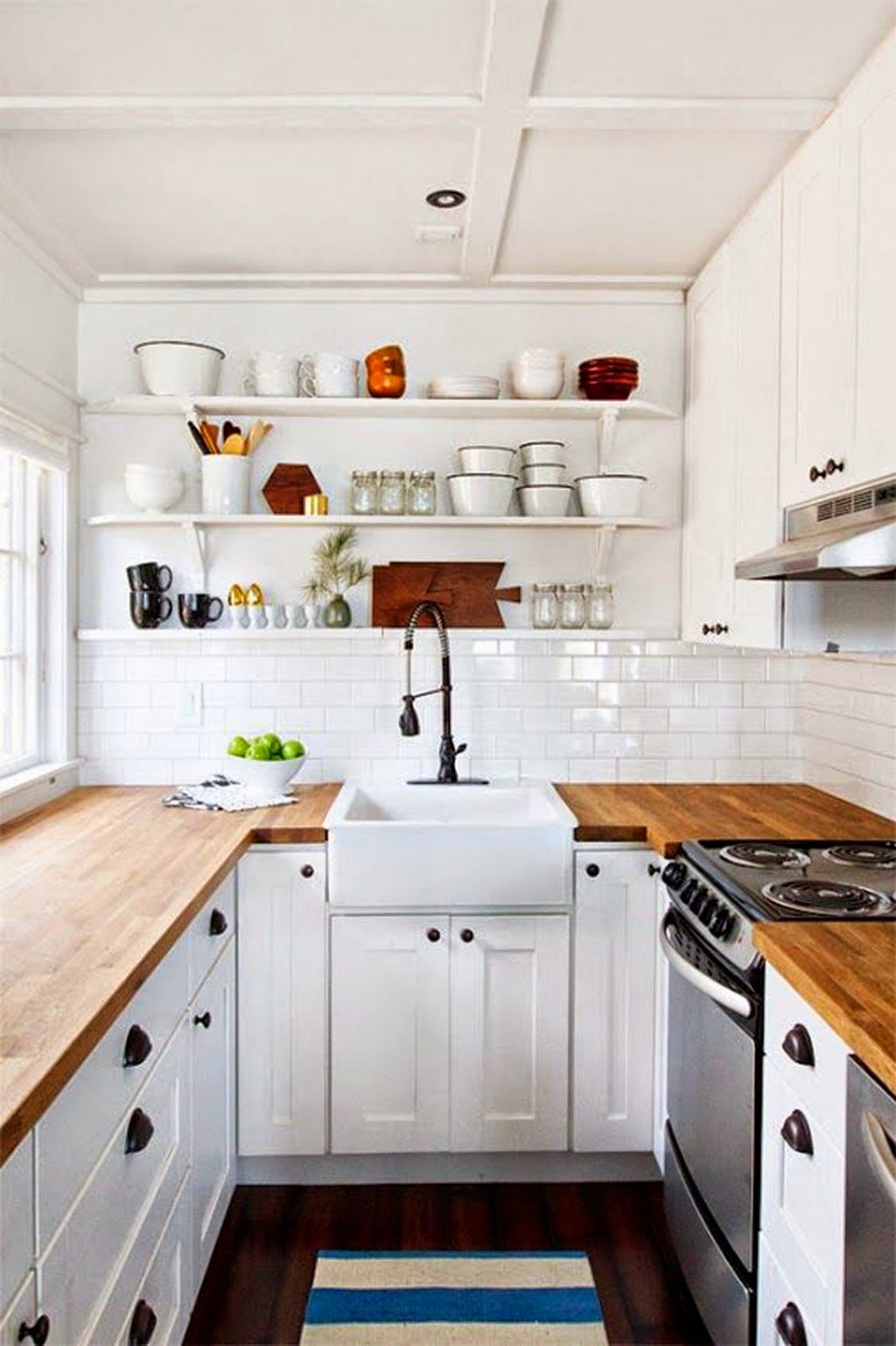
This small kitchen is maximized for storage and function. The U-shape allows ample cabinet space on the bottom and counter space on the top. Dark and bold accents such as knobs and faucets are a great way to add dimension into the room, without going overboard.
But the best part about this kitchen is the shelving on the back wall. Open storage can make a room feel larger — just seeing a wall greatly impacts that claustrophobic feeling. You can add pops of color and modern storage options without cluttering the counter space.
9. Just a Touch of Modern
Rustic White with a Touch of Modern
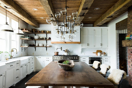
This kitchen has a few great features that make it stand out among rustic designers. The exposed brick on the right wall is absolutely gorgeous, and the dark wood table looks handcrafted and ready to feed several generations of a family.
The wood from the table also matches that open shelving in the upper left corner of the room. Even the pots and pans around the room are brass and help rewind the clock in this room. The only thing that dates this room is the modern lighting fixture over the table.
10. Paneling and Open Shelves
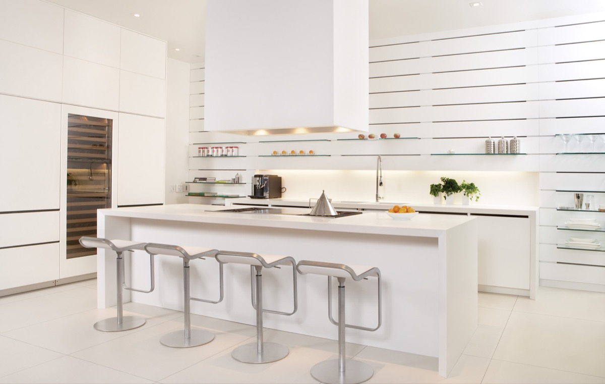
This kitchen design is both modern and simple. It has an extremely modular design with white kitchen cabinets without knobs or handles and a fridge disguised in the paneling. Additionally, the backsplash is plain but well-lit to create warmth amidst the sharp whites.
However, the best part about this kitchen is the shelving on the back wall. Instead of more white cabinetry, there is open glass shelving. Because of the design, the shelves can be adjusted to various heights and can be spaced out to accommodate your storage needs. Open shelving gives the illusion of a bigger room, and while this kitchen is certainly not small, it is a great inspiration for small and large kitchens alike.
11. Rustic
Beautiful White Rustic Kitchen
This is a very narrow view of this kitchen, but it is safe to say that it is small, a great example of incorporating a rustic theme into a snug space.
Open shelving and light wood keep the room from feeling catastrophic. Plus, the open shelves showcase some rustic decor. You’ll notice the milk jug and glass pitcher. Lastly, the white appliances keep the room on theme. Stainless steel is certainly the go-to nowadays, but keeping everything white ties the room together.
12. Curves Galore
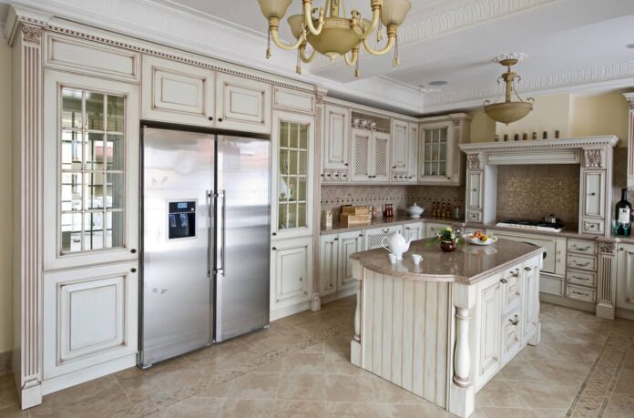
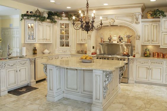
The soft edges and curves in this kitchen are staples of period pieces, and they are incorporated in the most creative ways, such as via the island and the fume hood. They are complemented with detailed pilasters and carving to add to the traditional feel.
Additionally, the color combination of white and light brown evokes antiquity—much more so than dark grey or black. The light brown in the countertop and backsplash is further complemented by the dark brown accents in the faucet, decor, and chandeliers (and what says antique more than faux candlelight).
13. Fun Decor
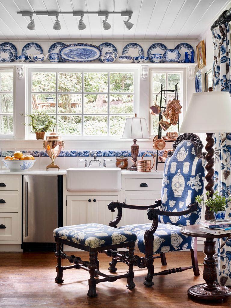
Unique Antique Blue and White Kitchen Design
This design creatively incorporates shades of blue into a small space without overpowering the room. You can find boxes of unique antique plates and other decorations at flea markets and yard sales and put them on display in a room like this. The decor might seem busy, but it’s perfect for a small apartment or remote cottage that needs a little life!
14. Just the Island
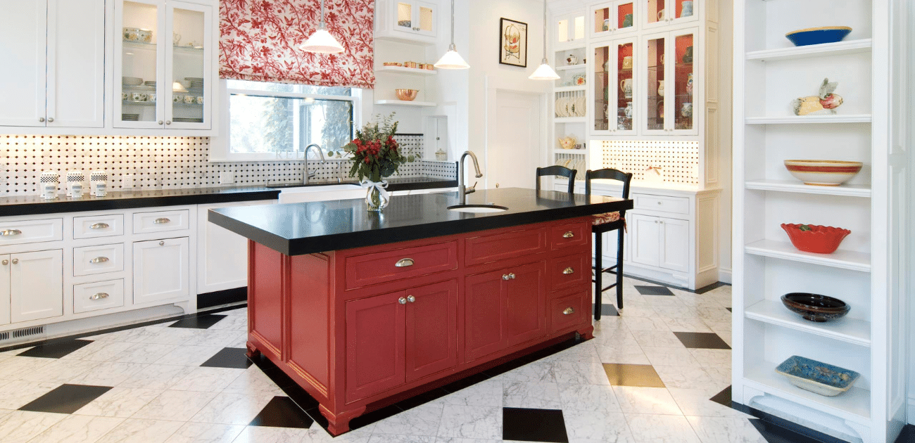
For many people, incorporating red into the kitchen might be a little too much. This design shows a great way to incorporate some color into an otherwise simple room. Just adding some red to the island cabinets and using red and white for the window shade will liven up a space without feeling like it is dominated by a bold red.
15. Just the Decor
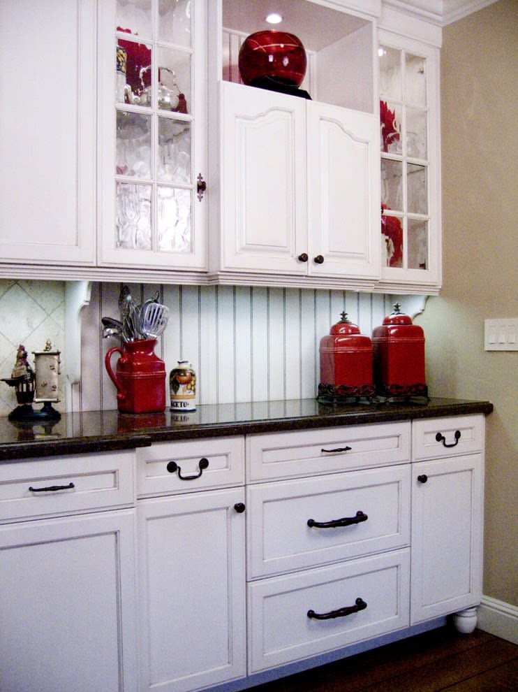
This is a mostly white kitchen, but the decor adds pops of red to give the room some life. It has an antique style that will make anyone who enters feel right at home. This is a narrow view of the room, but the kitchen is on the small side. For this reason, it’s best to keep the foundation light — use white cabinets and white walls. The decor is vintage and gives the kitchen the red pop, making it a beautiful white and red kitchen.
16. Glossy Red Cabinets
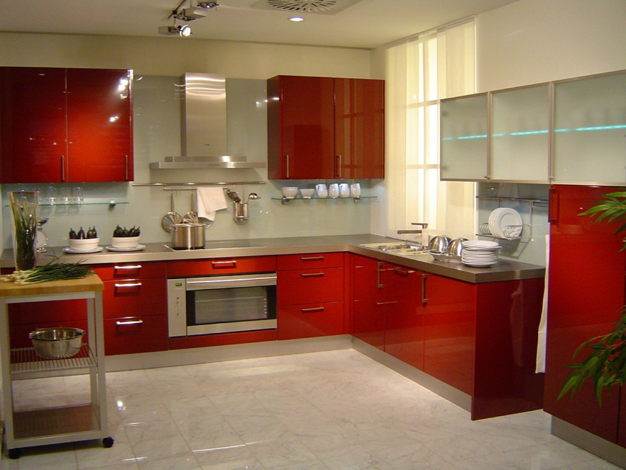
It’s probably best to say that glossy red cabinets are not for everyone. If you are going to be chic and sophisticated, it’s best not to go for a bold cabinet. However, if you want a modern kitchen or a 50s vintage vibe, the glossy red could be for you. Like with most bold designs, if you go bold with one thing, it’s best to keep the rest simple.
Otherwise, the room will become busy and lose its desired retro or modern flair. In this case, there is just a solid countertop and no backsplash. It would be a mistake to try to make anything more of red cabinets.
17. Statement Piece
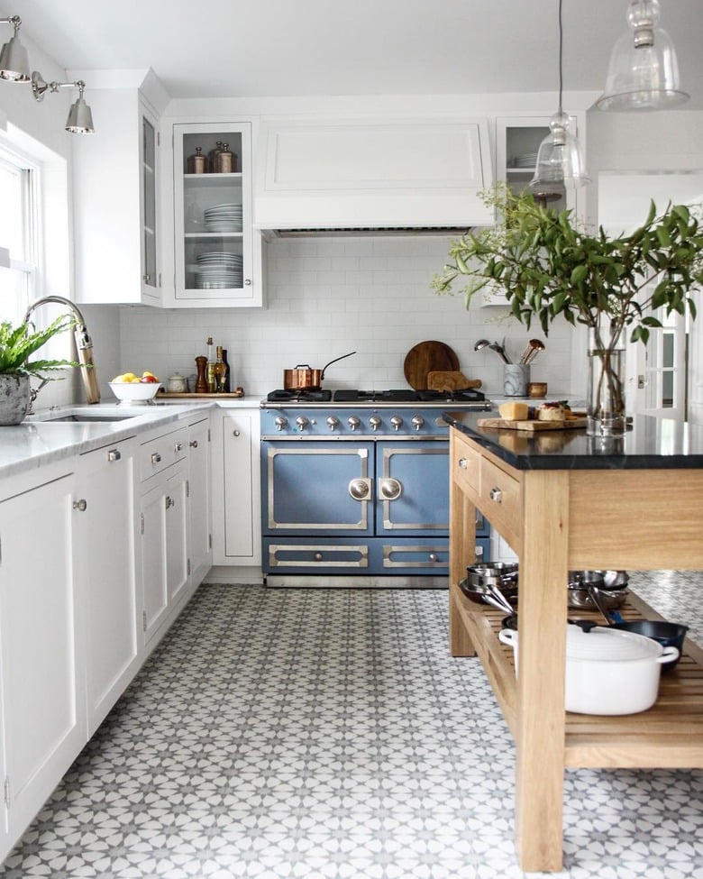
Magnifying White Kitchen with a Statement Piece
One of the best ways to design a room is by identifying a statement piece and building around it. For this kitchen, that would be the blue stove on the far wall. It is a beautiful item and defines the entire feel of the room.
The wood of the kitchen island perfectly complements the pale blue, and the white cabinets keep the room from looking too busy and allow natural light to brighten it much more than dark cabinets would.
18. Mixed Cabinet Colors
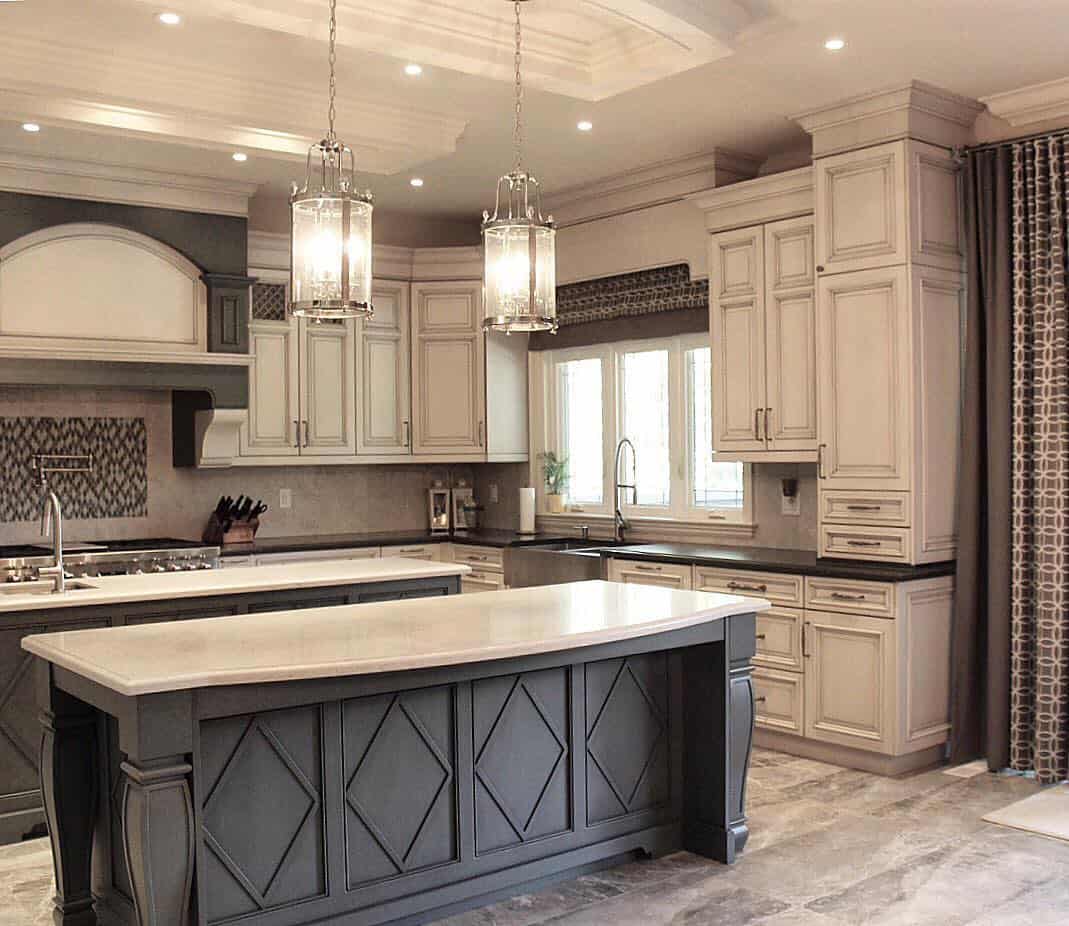
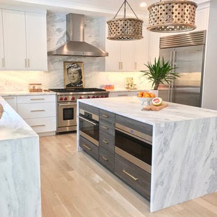
This unique and fun kitchen has white cabinets but a marble counter and backsplash. Modern kitchen designs are rigid and simple, but this is anything but. The pendant lights help draw the eye upward, emphasizing the high ceilings and large room size.
We love this design because it is modern but not boring. You wouldn’t initially think the marble pattern would complement the muted shades, but everything set against the white all comes together perfectly.
The grey drawers in the kitchen island add a nice contrast and help bring out the grey on the marble counter. The room is minimal, but the kitchen design elements make the whole room pop.
19. Bold Backsplash
Kitchen with Cobalt Blue Ceramic Tile Backsplash
Can you say backsplash? Well, this kitchen obviously can. There isn’t much to discuss here because the kitchen is so small and the view so narrow, but we couldn’t discuss blue and white kitchens without including a bold backsplash. This kitchen went for it, and they complemented the backsplash with blue knobs and blue mugs in the glass cupboards. It may be simple, but this blue kitchen is beautiful.
20. Bright Walls
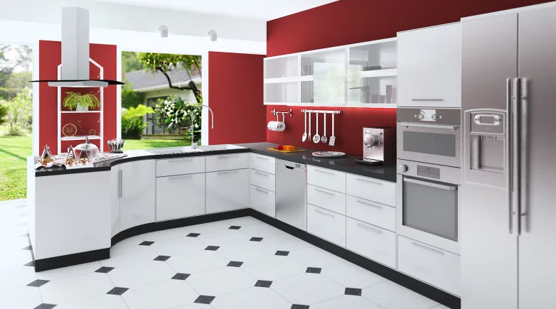
This modern and sleek design can be paired with any color. Simply adding red paint to the walls brings this room to life. If you're bold, you can replace the red with blue, green, and/or purple.
This is an easy and adaptable design that will go with any house. Add a fresh coat of paint, and this kitchen will feel brand new.
21. Best Backsplash
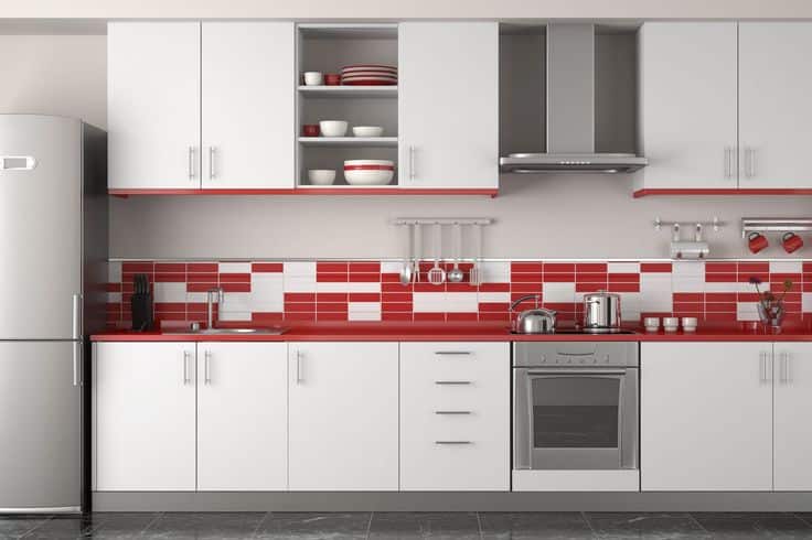
White and Red Backsplash Combo
Besides adding some paint, the easiest way to incorporate red into the soul of a kitchen is the backsplash. Using tile to make a great backsplash can be expensive, but it doesn’t have to be. A simple design is a great and cheap way to add life to a space. This kitchen also uses a red countertop to complement the backsplash, plates, and decor and contrast with the white cabinets.
22. Red, White, and Blue
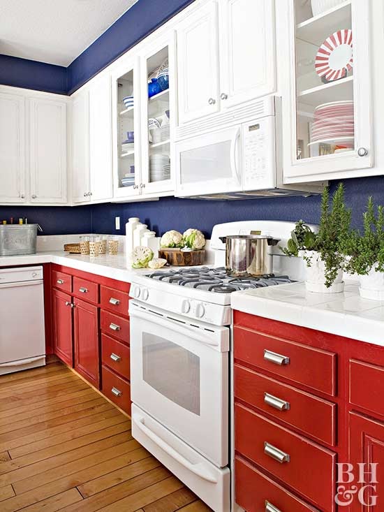
The kitchen isn’t the most common place to flaunt your patriotism, but with this design, it works. You get the red through the cabinets, the white through the counters and appliances, and the blue on the walls. The key to adding a third color to a white and red kitchen is to match the shade of the red and the third color.
That is done well here—that is, if the walls were electric blue or the cabinets bright red, that room would look gimmicky and poorly designed. So, if you want a tri-color theme, do it! Just be sure to do it right.
23. Cozy and Clean
Cozy and Clean White Kitchen Design
Kitchens don’t get much cozier than this. Even though there is barely room for a stove and sink, the space is extremely functional. The all-white cabinets open the room beautifully, using the natural light over the sink.
Importantly, the counter space is not cluttered. Getting as much stuff as possible off the counter, onto shelves, and into cabinets is best when working with snug spaces.
A few tasteful storage containers add some life to the white backsplash without dominating the room, and the pots and bowls add some color to the all-white scene. Lastly, the track lights will spread light evenly across the room once the sun sets.
24. Subway Tile Anyway
Kitchen With Subway Tile Backsplash
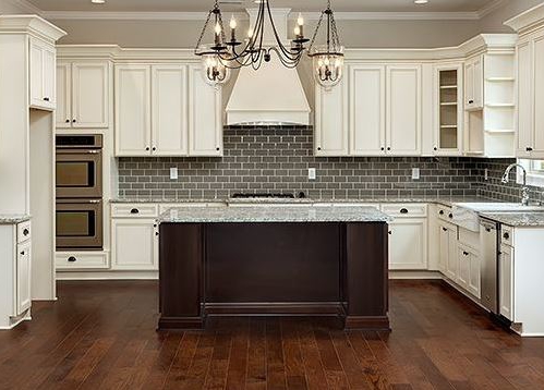
This kitchen is unique among antique kitchens due to the subway tile backsplash, a relatively modern addition. However, other aspects of the kitchen are perfect to give it that feel of antiquity.
For example, the chandelier is a glamorous piece that replaces the more commonly used pendant lights and even mimics the look of actual candlelight.
The antique white kitchen cabinets are tall and beautifully crafted. Plus, the handles are great accents and match the island to emphasize the dark brown.
25. Blue and Gold
Stunning Kitchen with Royal Blue Cabinets and Gold Hardware
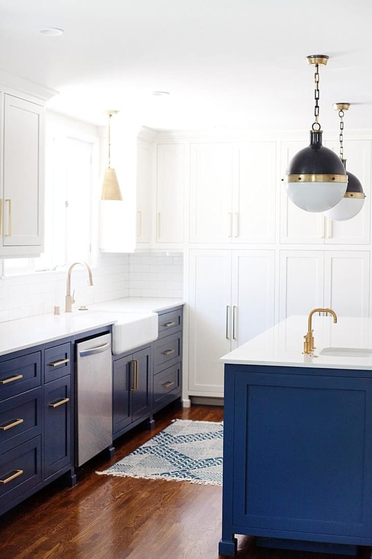
The navy blue in this kitchen is concentrated below the counter. Keeping the top half white brings light and warmth to the whole room, but the dark lower half creates a bold contrast. The gold accents are the perfect choice for this shade of blue, even if they vary between the faucet, handles, and light fixtures.
Lastly, the best part of the decor in this design is the pendant lights over the island, which invert the room's color scheme.
26. Deep Blue Cabinets with White Backsplash
Deep Blue and White Color Combo
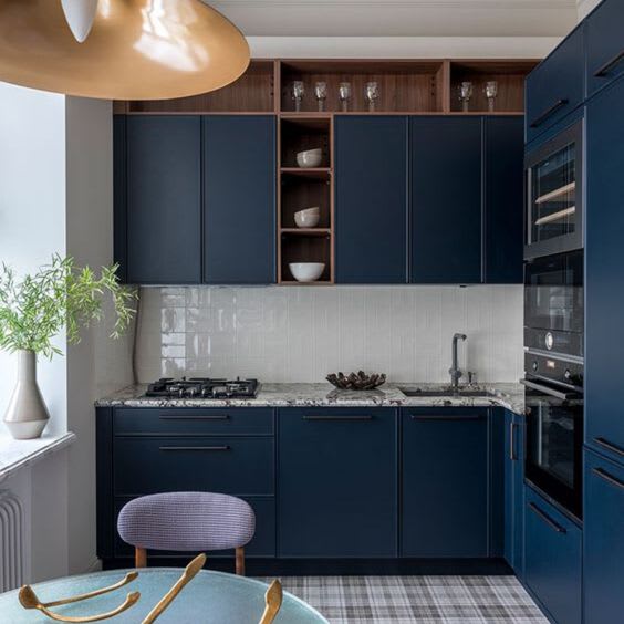
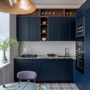
Dark cabinets and walls are usually a mistake in small spaces, as they make the space feel even smaller. However, this room looks and feels great with the deep blue cabinets, mainly due to the abundant natural light from the left wall.
The whole kitchen combines things most wouldn’t put together, such as the brown shelves with the marble counter and the grey and white floor.
But this is the reality for many people renovating on a budget and can’t replace everything, and it looks great! A minor thing, like painting the kitchen cabinets blue, can make a huge difference for a home.
27. Mix & Match
Multiple Shades of Blue in the Kitchen
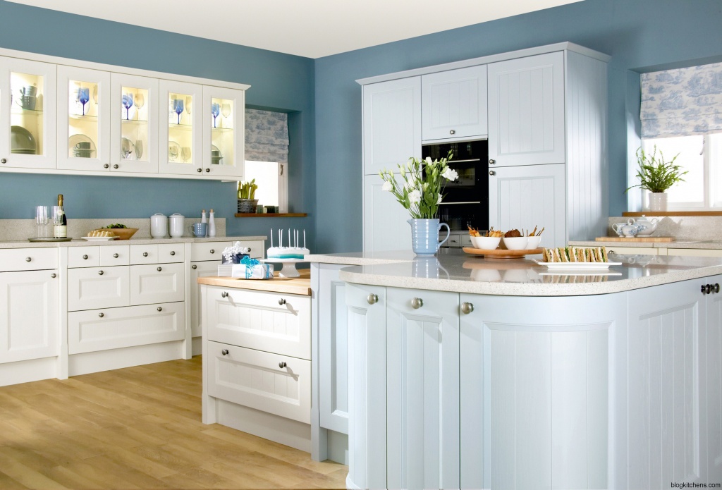
This design is a great example of incorporating multiple shades of blue into one room. Both white and blue kitchen cabinets are used, and then a different shade is used for the blue paint. The cabinets in the kitchen are a pale blue and therefore don’t clash too much with the stone blue of the walls.
Additionally, more shades, such as wine glasses, mugs, and window shades, are incorporated into the decor. This room would look great in any home, from a modern house to a seaside beach house.
28. Electric Blue
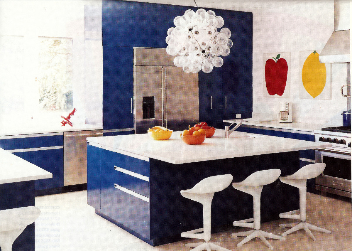
The last of our kitchen design ideas is a fun one! Most hues used in kitchens are subtle or deep. However, this kitchen went for electric blue and it really stands out. This design is like a modern take on a classic diner. It incorporates the bright blues, red accents, and white stools.
The rest of the room is extremely simple – if the kitchen design was any busier it would be too much, that’s for sure. The only thing that could be better is disguising the stainless steel appliances that stick out against the electric blue.
29. All White Antique
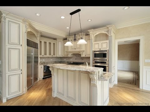
Everything about this design screams antique. The indents and carvings in the kitchen cabinets, island, and borders add dimension and give the entire space that traditional feel.
The attention to detail is extraordinary—just look at the detailing on the pilasters on the island and near the ceilings. This type of kitchen is great for those with an open floor plan who are still gunning for that old-time feel.
30. Checkered Floor Love
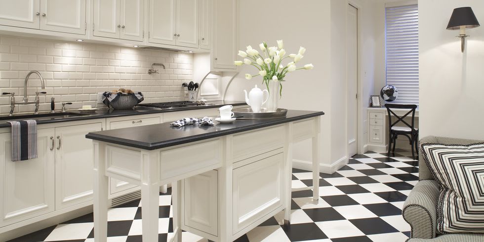
Of course, the go-to black-and-white move is a tile floor, and this is the perfect room for it.
It is a smaller kitchen, so the tile isn’t overwhelming. Instead, the rest of the kitchen can stay simple while the floor takes care of the fun. Since the space is small, it’s best to use white cabinetry and walls to keep the room from shrinking.
Leave the black to low-level items like counters. Plus, the subway tile backsplash is the perfect go-to for a black-and-white theme.
31. Bold Black Cabinets
Bold Black and White Combination
Black cabinetry is always a bold choice, and there are a few must-haves to consider before making the move (all are shown here).
One, the space must be large. Dark walls can create a claustrophobic feeling, while white walls can open up a small space. Two, the whites must be sharp and clean. Warm whites or cremes will be dull compared to black, and any imperfections will be amplified. Lastly, the kitchen must let in a lot of natural light.
Without natural light (or floodlights), the space will be dark and have low energy. Plus, you can’t go wrong with subway tile and marble countertops!
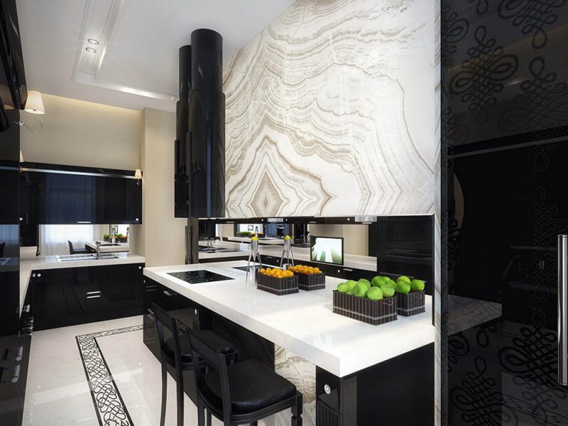
32. Ying-Yang
Most black-and-white kitchens rely on a dominant color for the cabinets and walls and the opposite color for the counters and accents. But this kitchen decided to go for a yin-yang design instead, with the marble countertop bringing it all together.
It is a very bold idea, but it really can pay off in the right space. If you notice, this kitchen has a lot of mix-and-match pieces, not just the black-white parallel. One wall has open shelving and the other black cabinetry.
Even the pendant lights are slightly different from one another. This is a bold design, but if you’re going for something fun and unique, it will be a great inspiration.
33. Open-Shelving for the Win
Glass Open Shelving White Kitchen Design
This kitchen design is both modern and simple. It has an extremely modular design with white kitchen cabinets without knobs or handles and a fridge disguised in the paneling.
Additionally, the backsplash is plain but well-lit to create warmth amidst the sharp whites. However, the best part about this kitchen is the shelving on the back wall. Instead of more white cabinetry, there is open glass shelving.
Because of the design, the shelves can be adjusted to various heights and spaced out to accommodate your storage needs. Open shelving gives the illusion of a bigger room, and while this kitchen is certainly not small, it is a great inspiration for small and large kitchens alike.
34. Expert Pairing
Expert Pairing of Design Elements
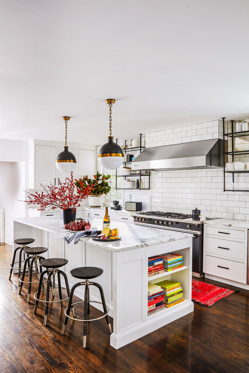
This kitchen is a bit busier for a modern room but still qualifies. Every piece in this kitchen is expertly paired with another to tie the whole room together. The marble countertops match the marble storage containers on the shelves, which are a great alternative to bulky cabinets, especially given the dark accents.
The black oven matches the stools, shelves, lights, and handles. Even the flowers on display complement the rug. And I haven’t even mentioned the tile backsplash. Subway tile can be a cheap way to spruce up a kitchen.
As a pro tip, try adding the same tile to your bathroom to tie your interior design together.
35. Dark Cabinets
Dark Cabinets To Contrast White Backsplash
Usually, in small spaces, using dark cabinets and walls is a mistake as it makes the space feel even smaller than it is. However, this room looks and feels great with the deep blue cabinets (due mainly to the abundant natural light from the left wall.
The whole kitchen combines things most wouldn’t put together, such as the brown shelves with the marble counter and the grey and white floor. But this is the reality for many people renovating on a budget and can’t replace everything, and it looks great! A minor thing, like painting the kitchen cabinets blue, can make a huge difference for a home.
36. Pop of color
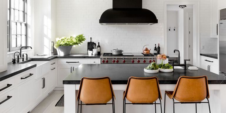
This black and white kitchen is absolutely gorgeous. Two things stand out about this space: the orange stools and black hood. Since black and white are neutral and concentrated, a pop of color is a great idea, and simply having a black fume hood instead of a typical stainless steel one creates a design piece out of a mechanical necessity.
Lastly, since this kitchen has ample storage below the counters, the lack of upper cabinets opens up the room, and tiling the entire wall adds dimension but not clutter.
37. Antique Decor
This design creatively incorporates shades of blue into a small space without overpowering the room. You can find boxes of unique antique plates and other decorations at flea markets and yard sales and put them on display in a room like this. The decor might seem busy, but it’s perfect for a small apartment or remote cottage that needs a little life!
38. Brown and White
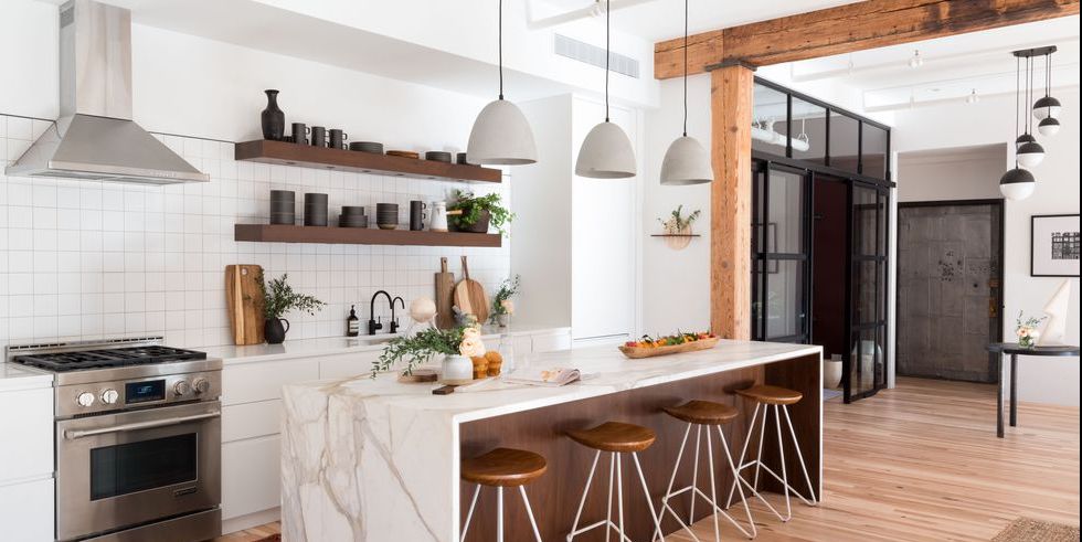
This kitchen combines white and brown to create a rare rustic modern look. To say it works with this design would be an understatement. The room uses various shades of brown incorporated throughout the rooms via the marble counter, floor, open shelves (that eliminate the need for upper cabinets), stools, kitchen island, and accents.
However, all the browns still don’t overshadow the white because of the predominately white countertop and square tile backsplash. The only part of this room that doesn’t work extremely well is the stainless steel appliances, but that is a bullet you can take if you want to incorporate brown.
39. Do It Yourself Rustic Kitchen
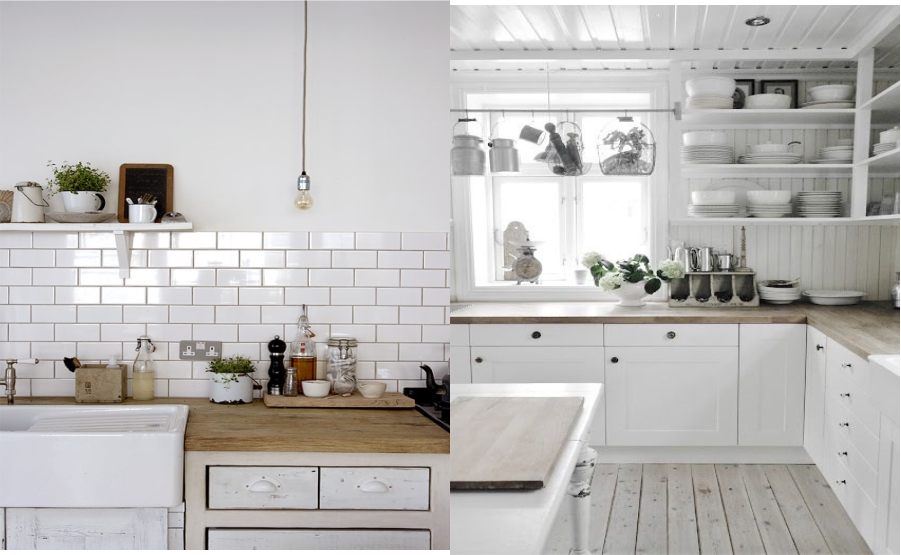
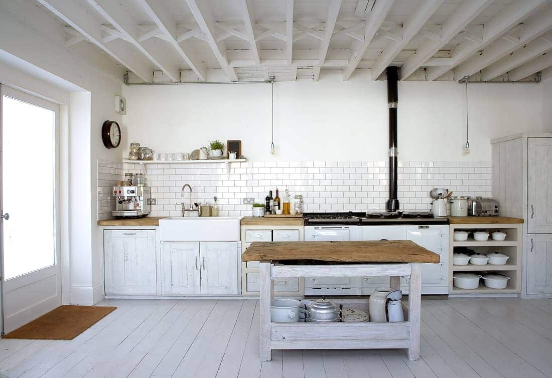
This is a great model to emulate if you’re looking to create a DIY rustic kitchen. The wood is worn and tattered but looks purposeful. The subway tile backsplash gives the illusion of exposed brick and helps set the scene for the rest of the rustic decor.
These white cabinets can be fashioned from any available wood and white paint, and the island is easily constructed to match. With the espresso maker on the counter, I might be fooled into thinking this kitchen is centuries old.
40. Victorian
Victorian White Kitchen Design
The soft edges and curves in this kitchen are staples of period pieces, and they are incorporated in the most creative ways, such as via the island and the range hood. They are complemented with detailed pilasters and carvings to add to the traditional feel.
Additionally, the color combination of white and light brown is very reminiscent of antiquity—much more so than dark grey or black. The light brown in the countertop and backsplash is further complemented by the dark brown accents in the faucet, decor, and chandeliers (and what says antique more than faux candlelight).

